Formstorming Jan Rac

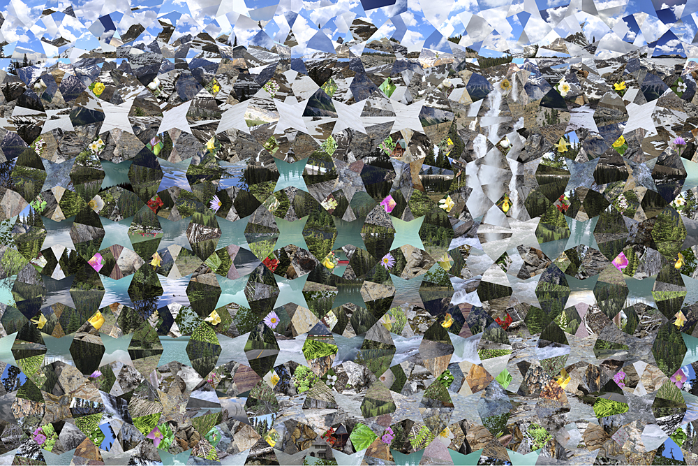
For my blog post I chose Marian Bantjes Sesqui VR-360 Waterfall because the images that had been created its very unique the images it reminds me of stainless windows the amount of time that this piece she probably uses strenuous amount of time. another reason why i chose this type of art because its very complex piece of art which i find fascinating and eye popping.  I think that VR is an important piece of technology since we are facing into the realm of technology and its a booming industry. the amount of shapes and different conceptualization through this piece feels like I’m in a different world. 
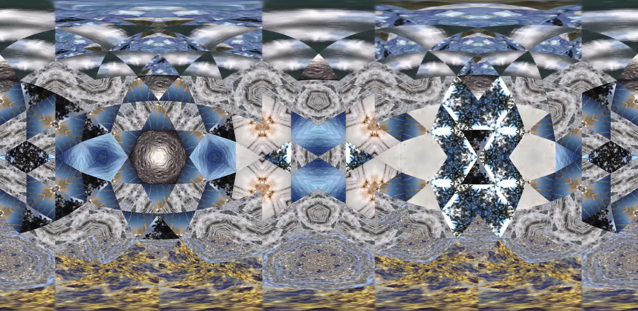
Posted in Uncategorized | Leave a comment

Formstorming and Modularity – Sean Mirts


Before My Memory Goes by Marian Bantjes. 2011.

Modularity is the use of some form of rule used in the design of a piece. This is typically something that is asked for by a client or a direction the artist is tryin to go. In this piece by Marian Bantjes that was designed for AGI Congress for use in a special project. The AGI Congress gave Bantjes a requirement of incorporating the theme of Modular and the colors yellow and black in the design. Which ultimately dictated how this design turned out as it could be something entirely different if the contrasting between yellow and black was not taken into account by Bantjes.

This small difference could have entirely changed the piece and the way people interpret it or go into thinking about it. Which brings about formstorming. Formstorming is the use of visual elements to invoke a viewer to engage with the piece while thinking in a creative and deeper way. This is a trait of design that makes a piece be more meaningful to some people that view it.

Before My Memory Goes does a great job of showing both modularity and formstorming in its design principles. The piece in its entirety in completely modular as all the elements are based off rules that the AGI Congress gave Banjtes. As for formstorming, the design is very complex but the message is straight forward. At a second glance though there is more going on in this design, with little actual whitespace there is more to indulge in other than the words.


Posted in Fall 2018 Archive (336) | Leave a comment

Formstorming and Modularity: Grey Kumar

I have chose the Kitten-Flakes wrapping paper to help me discuss formstorming and modularity. When first glancing at this wrapping paper, I immediately noticed the constraints and modularity that were implied. Since Marian Bantjes was designing a wrapping paper, she had to incorporate a winter theme somehow. So, instead of designing a very generic wrapping paper with a blue and white snowflake pattern, she created the “snowflakes” from stock images of kittens.

If Marian Bantjes were to have just arranged the kittens in a circular pattern, it would have been hard to identify that the design was meant to be a holiday wrapping paper. However, by using the kaleidoscope effect to duplicate the kittens, she was able to create an accurate representation of a snowflake without actually using snow.

As you can see, the final design looks much more like a snowflake wrapping paper when examined closely (apologies for the poor quality photo). Due to the surplus of cat and kitten photos on the internet, Marian Bantjes most likely had many options to pick from when designing the tile. This would have led to many different variations and iterations of the pattern, giving her options an ideas to play around with and eventually landing on the final tile. Like she discusses in her TED talk, she applied her interests in visual structure and her ability to figure things out to combine and manipulate a variety of kitten images that allowed her to structure each “snowflake” into a holiday wrapping paper. Bantjes also had to factor in the use of color to properly structure this design. She chose cats of lighter colors with a few darker ones to create contrast across the tile. Additionally, using lighter colors was a constraint due to the nature of holiday wrapping paper, but using too many light colored kittens would have lowered the contrast and reduced the visual structure of the pattern

Posted in Fall 2018 Archive (336) | Leave a comment

Formstorming and Modularity – Peyton Taffe

I chose to look at  Marian Bantjes’s Mountain Spectrum. This piece first caught my eye because, like most of her other works, had a lot of randomness and wonder. At first glance the piece reminded me of a kaleidoscope, because of the many pictures she used and the arrangement of them. Bantjes was hired to do a project for project for Destination BC, to make a piece on the Yoho National Park.

Mountain Spectrum by Marian Bantjes

For the project she took around 1000 images and compiled them for the tourism company. The pictures feature images from lakes, forests, and mountains she saw on the trip. Bantjes arranges the pictures in the same shape that fits together in the same way a pattern would. She used modularity to arrange the pictures in a random order of modules, that when looked at all together, looks like it fits perfectly. The piece is titled “Mountain Spectrum” and I think that that name fits it perfectly. The image shows a spectrum of natural landscapes that capture the vibe and energy of the area well. This piece is different in her other works in that it doesn’t feature any typography. This decision was probably made as the collage was used as a pattern. She uses formthinking by going outside of her normal typography box. I havent seen another artist use images to make a whole pattern that would fit perfectly with a logo over it or as a background to the website. The pieces are also arranged like a puzzle. The sky at the top of the piece flows together beautifully although its all from different images. Although she dictated from her usual style, I think she was very successful in what she set out to do.

Posted in Fall 2018 Archive (336) | Leave a comment

Formstorming and Modularity- Emily Deichmann

The image I chose, as a reference was a design created for Walrus magazine. Marian Bantjes was asked to create a design to describe a schizophrenic man trying to contain the voices in his head. The first page was made to look the most intensified, the second page was a little less, and the third page was completely different and very controlled. This represents the voices being controlled. This design goes along perfectly with modularity. “The endless variety of forms occurs, however, within the strict parameters of the system, which permits just one basic kind of connection.” Modularity makes design very intricate things simple. It is sometimes hard to get all of your thoughts together when there is so much that could be done. A well-defined constraint can make it much easier to keep your design organized. The same symbol or shaped is used throughout this design, but the color and the shape changes creating the design. I think it is very cool how a simple triangle shape can create a crazy design and be symbolic to a story being told. Marian Bantjes worked with many rules while creating this. It is clear that she worked with a grid because everything matches up. Rules can be used to generate form as well as organize content. On the second page of her design, I think the main technique she used was repeating and rotating. The shapes are all the same, but places at different angles.

Posted in Fall 2018 Archive (336) | Leave a comment

Formstorming and Modularity: Miranda Frasier

After reading through the chapters and watching the Ted Talk by Marian Bantjes I started to have a better understanding of formstorming and modularity. I started to notice it more in other peoples work as well as it inspiring me to start focusing on doing it in my own work. The presence of these two concepts are extremely present in Bantjes’s work. It’s actually what she focuses on when she is creating a new piece of art. She wants the viewer to think about what she is doing and really take a good look at her work and what she has created.

I found formstorming to extremely noticeable in her piece called Tolerance Poster. She was asked to create a poster for a an exhibit. Formstorming is a way of using visual elements in a deeper and more creative way to make the viewer really think and engage with what they are working on. In my opinion this poster is a great representation of that because the poster is so abstract but if you really take a moment to look at it you can see the words celebration, solidarity, acceptance, compassion, understanding, and many others as the poster goes on. But as the words change so does the color scheme and the words being used become less kind. Not only does she make you think deeper she also showed moods and feelings with the words by her color choices.

As for modularity, which is a constraint or rule for the piece that you are working on and  you can see her use of that as well in the poster. She had to create a poster with a theme of tolerance and she did that by sticking to words that go along with tolerance and created a really nice thought out poster.


By Marian Bantjes

Posted in Fall 2018 Archive (336), Uncategorized | Leave a comment

Formstorming and modularity: Kelly-anne Cubley

The Year in Poetry

New York Times Cover by Marian Bantjes

Marian Bantjes has done many works and you can see the inspiration and some of the thought process that she goes through in each one. The piece that I will be taking a look at is the New York Times Book Review.

The formstorming or visual thought of this piece can be broken into many pieces. She says that in order to make this piece she had to consider the feeling of poetry and when doing this, she was thinking about rain and tears. In thinking of these concepts the letterforms were made. These letters had water dropped onto them while still wet allowing for the spread of ink. She took these letters and then arranged them in a grid-like format with the individuals making up the names of authors. Each element is important. I can only imagine how many iterations she had to go through to get this final product.

The requirements of this piece were to create a cover that says “The Year in Poerty” and include a long list of names. She had further restrictions after creating the font because unless she went back, she only had the images that she scanned in. This had to show up in both print and screen views. The circles vary in size but stay true to the grid.

I enjoy Marians work because she keeps creativity in her work even as she has restraints. I love the ability to follow a grid but keep it fresh and with movement and motion.

Posted in Fall 2018 Archive (336) | Leave a comment

Formstorming & Modularity: Victoria Henry-LeMaster

In the year that I started the Valentines, I also started sending out Halloween greetings as well. While the Valentines have lasted, I dropped the Halloween thing after the 3rd year. This was the first, and I still like it. – Bantjes 2005

I chose Bantjes Halloween ’05 design it stood out to me in particular amongst her other designs. Many of which consist of bright colors and abstract uses of other familiar objects. However, this design the text is easier to read in comparison to the puzzling attributes of her newer works. Halloween ’05 most definitely has an eerie vibe about it and evokes an almost haunting aesthetic on the viewer. Overall I think that this design looks unique and like tentacles rather than light and normal object.

Rather than her other designs which often represent puzzling and confusing pieces with lighter colors this design is unique in its modularity. Other than the words themselves, I think that this designs overall modularity is the black organic lines. Something like tentacles or overgrowth streaming out from the type. The type font in itself similar to the overgrowth creates an ancient or old feeling to the design itself. As a whole, however, there seems to be less focus on the Formstorming of creating a puzzle to the design. I don’t see anything other than the intertwining lines and then the type. Banjes in her newer works utilizes Formstorming to create that challenge or puzzling attributes to involve the viewer in figuring out what is going on within the design.

There is little to no “confusion” within this design, the viewer does not have to look very hard to find the words within the design because the contrast specifically makes it rather easy to find the lettering. Overall, however, I think that it is simplistic and beautiful, showing a different style of design than her newer work. Her Halloween grams are something that she no longer does; possibly because they are darker than her normal, lighter designs. Yet, the gram itself is beautiful in its defiance from her norms.

Posted in Fall 2018 Archive (336) | Leave a comment

Formstorming & Modularity: Matt Behnen

I chose this design because to me it looks like what a blueprint would look like with the blue background and the white, chalk like, lines creating the design. Also the use of three dimensions and words not only going left to right, but forward and back and up and down makes it interesting to look at and keeps the eye moving around the image. This design also spoke to me because it was about an event that was in Seattle and that is where I am from. In this design you can see how Marian Bantjes used formstorming to go beyond what someone would normally create for an event. Bantjes used formstorming to help create a more in-depth image that is beyond the normal 2D image that is created for events. This image took a long time to create and could of started on a piece of paper before going to the computer to create the final image. In this design you can see how there are many layers and dimensions to the design. The way Marian Bantjes created this also has the feeling of modularity in the sense that the design looks like pieces of a puzzle that are put together to create a bigger design. Each word is designed as a block and that block is added to the overall design that creates this mysterious structure. This creates individual modules that each have a story on why they are on the image.

Posted in Fall 2018 Archive (336) | Leave a comment

Formstorming and Modularity: Eilish Rising

This image found on Marian Bantjes’s website helps us understand how form storming and modularity act in graphic design.  This is an image she created for WIRED 15.05.  There was not much information about it on her page, but the short description talking about wired popped out at me.  The thin lines that move throughout the page look like wires all connecting together.  Many wires can create some chaos, which this does in some way.

The idea behind form storming and modularity is to use basic symbols, or reconfigurations of them, that are known by the majority of public and using them to create a deeper meaning.  The symbol is representational of more than the basic, immediate meaning it portrays, and how the designer uses it depends on how the end result of the design is seen to the viewer.

Posted in Fall 2018 Archive (336) | Leave a comment