
Publishing for Print: Page Layout in Adobe InDesign
Overview
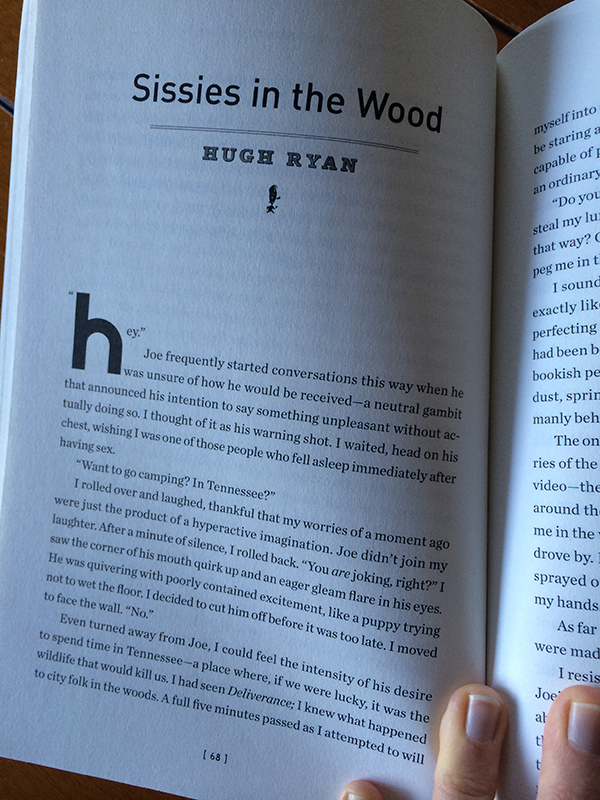
In addition to making sure your paragraphs of text are nice and readable, you can give your journal style with drop caps at the beginning of each story.
You have worked hard to create a visually engaging graphic and photo sequence inspired by your short story. Now imagine you have the opportunity to publish your work alongside the original text of the story in a small literary journal. Small creative writing presses began flourishing in the 1980s and 1990s, publishing innovative or unusual work, due in part to the affordability offered by the advent of personal computers and desktop publishing. The print publications disseminated by these presses have much in common with the self-published ‘zines and comics that you saw in the Alternative Northwest Comics show at the WSU Art Museum: They are relatively cheap to produce and distribute, thanks to page layout programs like InDesign and the fairly low cost of printing. When well-designed, these publications can feel quite professional.
Your creative goal is to layout a booklet, or ‘zine, in InDesign that will showcase four of the short stories from “Arriving Late: Scenes from the Greatest Class I Never Saw.” You will use your own story and digital comic strip, as well as three other stories and comic strips that will be assigned to you (scroll to end of this page for your assignments). Strive to make a visually cohesive publication that does justice to both the text of the stories (font choice, font size, line-spacing, and margins for comfortable reading) as well as the digital comic strips that accompany them (placement in relation to story, size, image resolution/print quality).
Choose your fonts carefully, and make sure to use page numbers. Be as creative as you want, additional embellishments are welcome.
Requirements
- Your journal should include the four short stories and their accompanying digital comic strips.
- Make a table of contents at the beginning, with story titles and author names
- Make sure you use linked artwork that is scaled proportionately
- Make sure you choose fonts that suit the mood of the stories. Also, make sure you choose fonts, font sizes, line-spacing, and margins that make for a comfortable reading experience.
- Design a cover for your journal. At minimum, the cover should contain the following information: “Arriving Late: Scenes from the Greatest Class I Never Saw, Edited by Bryan Fry, Short Stories from English 251: Introduction to Creative Writing at Washington State University” What image(s) could go on the cover? For up to 5 points extra credit, you may design a more ambitious cover that involves editing/creating new imagery in Photoshop and/or Illustrator. Make sure to note this effort on your reflection sheet if you wish to receive extra credit.
- Make a list of citations at the end of the journal, crediting the creator, title, website, and creative commons license for each image in each comic strip. It is ok to use the abbreviations for the creative commons licenses: So, for example, Attribution-ShareAlike would be “by-sa.” Use this format: “creator, title. website: creative commons license.” So, this image would be cited: “Catholic Church England and Wales, Snow in Bethlehem. Flickr.com: by-nc-sa”
- Give each digital comic strip a caption that credits the student in your class who made it.
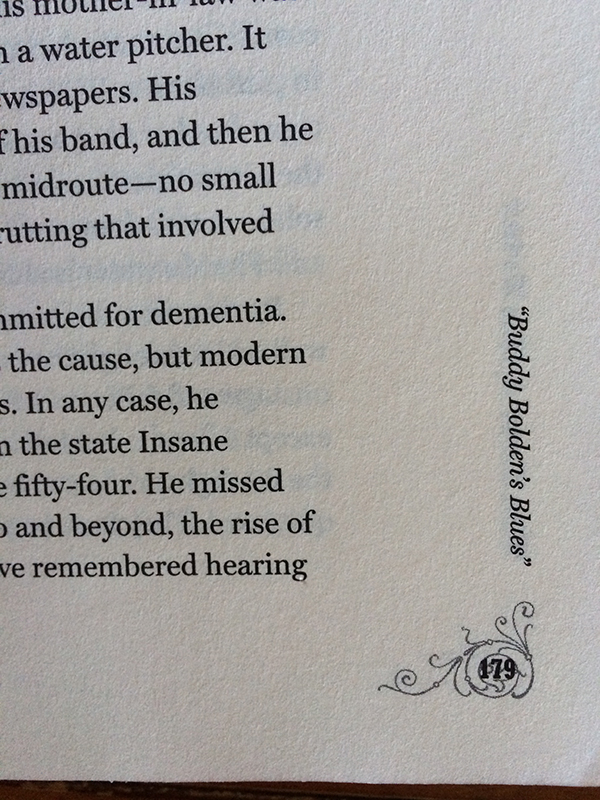
- Make sure your journal has page numbers.
Tutorials
There are no required tutorials for this project, so it is important that you attend class lectures on InDesign during this project. These optional tutorials will be helpful as review, and I expect you to use them:
- Create a new document
- Add pages to your document
- Add text and art in frames
- Also on adding art in frames: InDesign Help / Placing graphics
- Also on text frames: InDesign Help / Text Threads
- How to edit text
- Page numbers using master pages
- How to get page numbering to start where you want it
- Bulleted and number lists (useful for table of contents and citations)
- Printing as a booklet to AML 103 Color
- Saving as a package (including your fonts and linked images)
Adobe Help and the InDesign tutorial page on your class website are good places to start to find even more help!
Resources / Inspiration
Ugly Duckling Presse: Online Chapbook Archive
On Macs, a nice way to preview fonts is on the Font Book. You can open the Font Book from the applications folder on your Mac.
Font Recommendations
For paragraphs of text, avoid fonts that evoke script, handwriting, typewriters, and anything else that is overally illustrated. This is hard to read. Also, avoid condensed, bold and italic font choices for paragraphs of text. These are some well-designed fonts that are probably available on your computer:
Serifs: Baskerville, Bell MT, Book Antiqua, Bookman Old Style, Calisto MT, Century Schoolbook, Cochin, Constantia, Didot, Garamond, Goudy Old Style, Iowan Old Style
Sans Serifs: Avenir, Candera, Gill Sans, Helvetica
Wide fonts, such as Century Gothic and Franklin Gothic Book, should also be avoided for paragraphs, but might be useful for page numbers or headings and titles.
Workflow
Your instructor will list the steps we follow together in class here. See above “Tutorials” section for help on these topics outside class.
- Make a new document with facing pages (each page is 5.5 inches wide by 8.5 inches tall because we will make our booklet from standard 8.5 x 11-inch pages that have been folded in half).
- Thread the texts of your short stories through sets of text frames.
- Choose a consistent font, font size, leading, margins, indents, and dropcaps using the Character panel and the Paragraph panel (Window > Type and Tables > Character or Paragraph). Give your journal a visual style but also make sure it is pleasant and easy to read.
- DO NOT hit the tab key to indent or the return key to make extra space between lines. Use the tools in the Paragraph panel.
- Use File > Place to insert artwork for each story. Check the Links panel (Window > Links) to make sure your jpgs are linked files.
- Use master pages in the Pages panel to insert page numbers
- Use what you have learned so far to make a list of image citations at the end of the booklet, a cover, a table of contents, and captions. See details in “Requirements” section above.
- Print your booklet to Avery Color 103 (see Printing as a booklet) and save as a packaged file, using instructions in “Tutorials” section above.
What You Will Turn In
Printed:
- 5.5 x 8.5-inch Booklet, folded from 8.5 x 11-inch pages
- Written reflection sheet (download and print).
Digital Files (make sure you can hand in your thumbdrive):
- Final InDesign file called “yourlastname-yourfirstname-03.indd”, packaged with all the images and fonts you have included. When you package the file, it will put everything in a folder called “yourlastname-yourfirstname-03 Folder” This is what you will have on your thumbdrive to hand in.
Your files/folders must be named, organized, and saved exactly as specified here. You will lose a point for each time you fail to follow these instructions. Capitalization and spaces count when naming files (No caps! No spaces!)
