
Color Theory Diagram
- Overview
- Readings
- Tutorials
- Introductory Activity: Color Collection (due 2/18)
- Design Guidelines
- Illustrator & Photoshop Guidelines
- What You Will Turn In
- Learning Objectives
Overview
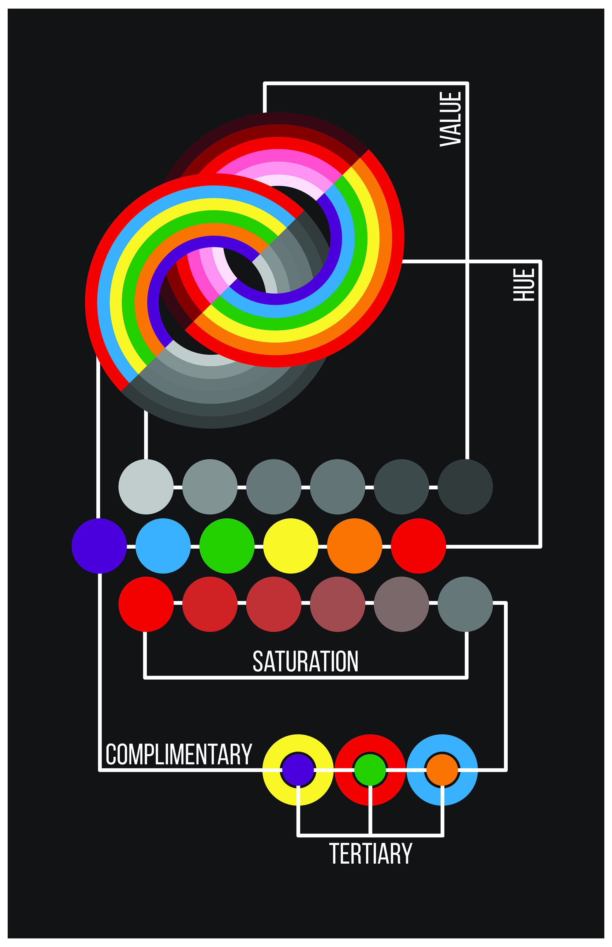
This is an example of a diagram that attempts to demonstrate relationships among hue, value and saturation.
Create a detailed diagram using Adobe Illustrator that explains color theory as expressed and organized in the color wheel, aka Sir Isaac Newton’s spectrum. Your diagram should show not just the relationships of the primary, secondary and tertiary hues, but also variation of saturation, value, and temperature for each hue. Rather than having separate, smaller diagrams to explain these principles of color, as you see on pages 83 to 85 of your textbook, your goal is to explain and relate them to one another in one larger, more complex diagram. In addition to showing solid swatches of color, your diagram should incorporate the photographs you collected for the Color Collection assignment (at least one photograph for each hue).
You are encouraged to be creative with your solution as long as you use the guidelines and requirements outlined below. For example, you may depart from the typical wheel shape if you wish, as long as you are still showing the relationships and variations of the colors in the spectrum. Use the Diagram chapter from your textbook as inspiration!
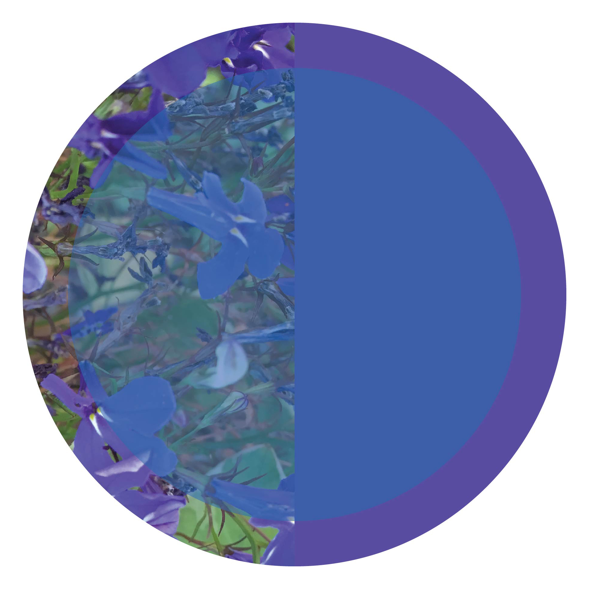
Students this semester will incorporate photographic elements into diagrams alongside solid areas of color.
You may use Adobe Photoshop to make color and contrast adjustments to your photographic images, but your diagram must made in Adobe Illustrator, and your photographic images should be placed in the Illustrator file as linked rather than embedded files. This will make it easier if you need to adjust the color or contrast of a photographic component of your diagram.
– – – – –
Readings
Your primary readings for this project are:
- Color from “Graphic Design: The New Basics”
- Diagram from “Graphic Design: The New Basics”
- Color and Information from Edward Tufte’s book, “Envisioning Information”. Think about color as label, color as measurement, color as representation of reality, and color as enlivening decoration.
Also make sure to consider information from these required chapters in “Graphic Design: The New Basics”:
- Framing
- Layers
- Transparency
- Pattern
- Grid
Tutorials
Important information regarding use of Illustrator and Photoshop will be delivered as lecture material during class. In addition, students are expected to review Adobe tutorials as needed. Links to recommended topics for this project are:
Photoshop:
- Change the image size (17 minutes). Make sure your photo images are high resolution!
- Adjust the image quality (16 minutes). Adjust color and contrast in a restrained way.
- Save photos in the best format for your needs (3 minutes)
Illustrator:
- This PDF covers many of the color panels shown in class, including the Color panel, Color Guide panel, and Swatches panel : Using Color in Illustrator
- How to use the Color Picker (3 minutes)
- Create and Edit Shapes (17 minutes)
- Transform and edit artwork (19 minutes)
- Change color and strokes/lines (20 minutes)
- Adjusting paths you have drawn (6 minutes)
- Drawing a geometric shape (10 minutes)
- Selecting artwork (5 minutes)
- Locking, grouping, and hiding content (5 minutes)
- Rotating, reflecting, and shearing (5 minutes)
- Combining shapes (5 minutes)
- Clipping Masks
– – – – –
Design Guidelines
Your diagram must:
- Explain the relationship of these hues: yellow, yellow-orange, orange, orange-red, red, red-purple, purple, purple-blue, blue, blue-green, green, green-yellow. You may go even further with the tertiary hues if you wish. You may use the name “violet” in place of “purple” if you wish.
- Explain primary, secondary, and tertiary hues
- Show variation of saturation for each hue, both as tints and shades
- Show variation of value for each hue, as well as indicate inherent value of fully saturated hue
- Explain/show comparison of color temperature
- Explain/show complementary colors and how they have contrasting relationships
- Show a solid area of color for all of the above categories, but also incorporate photographs you collected for the Color Collection assignment (at least one photograph for each fully saturated hue), to give a sense of environmental color from day-to-day life. This means incorporation of at least 12 photos, one for each primary, secondary, and tertiary. Note: photographs may be cropped for use in diagram.
- Include at least the words in bold above, to assist in the explanation of color theory. Be mindful of font choice. Make text-based information feel well-integrated with the rest of your diagram. See examples from the Diagram chapter of your textbook.
Dimensions:
Your diagram should be at least 11-inches in the shorter dimension. Beyond that, decide if you want your presentation to be square, rectangular, landscape or portrait, etc. Plan to print on at least 11×17-inch paper in AML 103 or at CougPrints. You may go larger if you wish, and plan to print at BCU large format printing services on campus. Plan ahead to get your print to class on time. We will critique this project both in print and on screen.
– – – – –
Illustrator & Photoshop Guidelines
- Your diagram must be designed in Illustrator using vector-based shapes and lines, as well as type. Recommended tools and techniques are listed above in the tutorials section.
- Make sure “High Resolution” is selected when you set up your document. Check File > Document Setup > Preset: [High Resolution] if you have already set up your file.
- For your photographic components showing color, use File > Place to insert image files and make sure “Link” is checked. You can check the Links panel as well (Window > Links) if you have already inserted photos. You will need to make sure to include all these image files along with your Illustrator file when you hand in the project.
- Make sure photographic components are high resolution. Open in Photoshop before placing in the Illustrator file and check Image > Image Size.
- Save each solid color you use in your diagram as a swatch in the Swatches panel.
- Make sure you use layers and grouping to organize the components of your design in a way that is logical in the Layers panel. Depending on the complexity of your work, you may have fewer or more groups and layers.
- Delete stray paths and objects that are not part of your final design(s). You should include more than one artboard in your final file if you attempted multiple versions of the diagram.
- Save your file as a copy and convert all type to outlines before submission. This will ensure you do not have missing fonts in your final file.
- Name the file “yourlastname-yourfirstname-02.ai”. File naming must be exact.
- Save a version of the final file as a high resolution, high quality PDF. [File > Save As: Choose “Format: Adobe PDF.” Hit “Save.” In the next dialog box choose “Adobe PDF Preset: High Quality Print” and Uncheck “Preserve Illustrator Editing Capabilities”. Hit “Save PDF.”]
- Save a version of the final file as a high resolution, high quality JPG. [File > Export > Export As: Choose “Format: JPG,” and have “Use Artboards” checked. Hit “Export.” In the next dialog box choose “Maximum Image Quality” and “Resolution: High (300 ppi)”. Hit “OK.”]
– – – – –
What You Will Turn In
Digital Files. Turn in your digital files via your shared OneDrive folder. Only these final files should be placed in that folder:
- Illustrator file: named “yourlastname-yourfirstname-02.ai”
- Illustrator file saved as PDF file: named “yourlastname-yourfirstname-02.pdf”
- Illustrator file saved as JPG file: named “yourlastname-yourfirstname-02.jpg”
- All photographic image files that were placed in your Illustrator file as links. Do not change the names of these files or the links will be broken.
Printed:
- Diagram: A high quality print of your final diagram, printed at full design size. You may print this in Avery 103 on the 11×17 printer, at CougPrints, or, if your design is bigger than 11×17, at BCU large format printing services. Make sure you are getting a good quality, high resolution print. Plan ahead so your print is ready at the beginning of class. You will need your PDF or JPG file if you print outside of Avery 103.
- Write-Up: A one-page double-spaced write-up that defends your design decisions for this project. Your write-up should demonstrate comprehension of readings and course material, as well as the requirements of the assignment described on this page. At minimum, make sure to address: 1) How your design explains relevant color vocabulary from the Color chapter of “Graphic Design: The New Basics,” 2) How your design shows connections and overlapping relationships among colors, inspired by the Diagram chapter of “Graphic Design: The New Basics,” and 3) How your design uses color as label, measurement, representation of reality, and/or enlivening decoration, inspired by the Color and Information reading by Edward Tufte (Note: How does the incorporation of photographs relate to Tufte’s ideas about representation of reality?)
