
Modular Typeface Design
- Worth 200 points total
- Final files and presentation due Monday, 5/4 at 11:59 PST
- Note: Due to unexpected circumstances this semester, this final project incorporates some of the work we would have done in Project 3, but we will not be doing a large-scale Type Anatomy poster design as originally planned
Required During This Project
- Read Modularity, Hierarchy, Gestalt Principles, and Time and Motion from “Graphic Design: The New Basics”
- Read Thinking with Type website: Letter page, Text page, and Grid webpages
- Review Grid from “Graphic Design: The New Basics”
- Visit MASC to see typography, calligraphy and handwriting (or see photos by your instructor)
- Watch “Helvetica” documentary by Gary Huswit (available via Kanopy Streaming Video on WSU Libraries)
- Look at typographer and graphic designer Marian Bantjes’s portfolio
- Complete Introductory Assignment: Type Anatomy Diagram (due Tuesday 4/7)
Overview
For our final project, design a new typeface using a modular system of your own definition. Remember from your reading on Modularity that an endless variety of forms [may] occur within the strict parameters of a system (Lupton/Phillips pg 168). Find a way of working that interests and engages you, using digital and/or physical tools.

This illustration from Timothy Samara’s book, “Design Elements: A Graphic Style Manual,” is another good resource for learning type anatomy vocabulary, along with the assigned Letter reading from Ellen Lupton’s Thinking with Type.
You will design all the letters in the Roman alphabet (A-Z) with both capital and lowercase versions. You want all the letters you create to feel they belong to the same family—we might call this family unity—so your understanding of type anatomy vocabulary will be key for this assignment. You should strive for consistent weight, width, contrast, posture, and so forth. You will need to consider individual parts of letters, such as ascenders, descenders, x-height, and so forth. A choice about a lowercase “g” for example, will influence your design of a lowercase “j”. We will complete a type anatomy exercise assignment to help you review and practice this vocabulary before you begin the larger project (see link in “Required During This Project section above).
There are many examples from the Modularity chapter demonstrating the variety that may happen within a strict design system. Pages 170-171 show two different type designs, both using a nine-by-nine-square grid of circles as their modular system. The weight of the “junk” design is much lighter than the weight of the “soil” design. Likewise, page 172 shows three very different solutions using a square, a rectangle, and a quarter circle, assembled in any way but with relative scale remaining consistent. You are encouraged to use examples from this chapter to inspire your project.
Design Guidelines to Follow
- Design both capital and lowercase letters
- Follow a modular system, which you should be able to explain/define
- Make sure all the letters feel like they belong together (have family unity). Knowledge of type anatomy will help you with this.
- Give your design a suitable name. Do you remember how/why they named Helvetica?
- See also “What Tools and Techniques Will You Use?” section below
Final Presentation
When you are finished designing the letters, plan a final presentation to show them off. The final presentation may be in any format you wish, as long as it lets you show off your work clearly. For example, the presentation could be a static design, like a poster, showing your letters in different combinations, or it could also be interactive or time-based, like a website, a video, or an animation.
- Your final presentation should show your letters in alphabetical order as well as in a pangram of your choosing. A pangram is a sentence in which every letter of the alphabet is used at least once, such as “the quick brown fox jumps over the lazy dog.”
- Your final presentation should show off your understanding of type anatomy vocabulary that is especially applicable to your design.
What Tools and Techniques Will You Use?
You may choose to use digital tools and software to complete this project, or you may use physical and material tools that you have around you.* Or you may try to use both in combination. There are many, many examples in the Modularity chapter that demonstrate how you might be creative in your use of tools, either digital or physical. For example:
- Don’t have the Adobe Creative Cloud but want to use computer-based software? What other common programs might help challenge and inspire your thinking as you define your modular system? On page 185 of “Graphic Design: The New Basics,” you see students using Excel spreadsheets to create elaborate drawings. This idea could be modified and used for type design too.
- In Readymade Alphabets, letters are designed using objects from the environment (pages 174-177)
- In Manual Type, designers use everyday objects as modular units to build a word or phrase (179)
- In Clean and Dirty Systems, digital and material methods are combined (170)
Any of these ideas could be adapted for use in your work!
* If you use physical materials and tools to create your type design, you will still need to document your work to hand in. Taking good quality, high resolution photographs is one common option. Please talk to your instructor about how you plan to document your work if you are working with physical materials and tools.
What Will You Hand In?
Since the tools and techniques you use to create your type designs will vary, the file types you submit to your shared OneDrive folder will also vary. Name the files with “yourlastname-yourfirstname-type-design” at the beginning of the file name. Strive to hand in files that show how you made each letter and that are of high quality and resolution if they are raster-based graphics (as opposed to vector-based graphics, such as the ones you create in Illustrator). This should include:
- Design file(s) for the letters
- Final presentation file(s) or link(s)
- One to two-page write-up (details below)
Details about Write-Up: Your one- to two-page double-spaced write-up should defend your design decisions for this project. Your write-up should demonstrate comprehension of readings and course material, as well as the requirements of the assignment described on this page. Make sure to cover:
- Explain/define your modular system
- How did this modular system affect your design?
- What type anatomy vocabulary is especially relevant for your design?
- What did you name your typeface design and why?
- What other concepts from Graphic Design: The New Basics are relevant to your design?
Examples of past student work
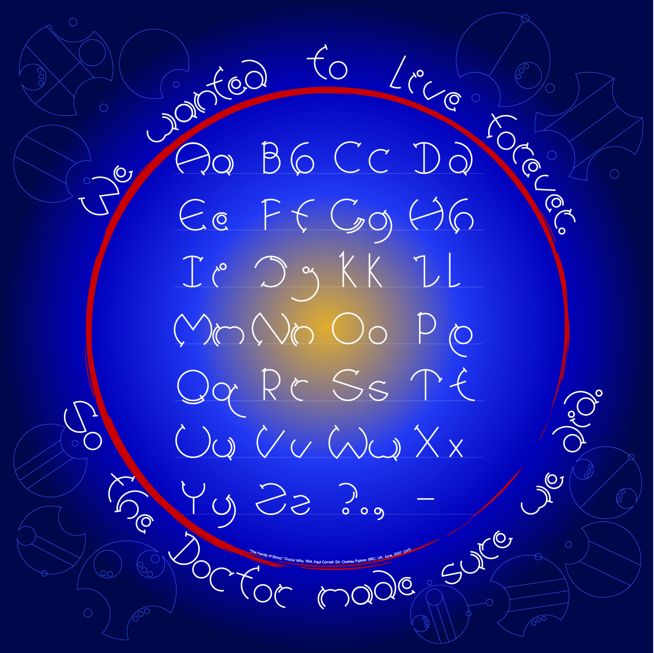
This typeface designed by Jessica Colvin was inspired by ciphers used in the science fiction show Dr. Who. This is an example of a modular solution completed in Illustrator using vector graphics. Download the PDF to see the grid system used for design.

This design was inspired by chess pieces and puzzle-solving (work by Keisha Brokaw)
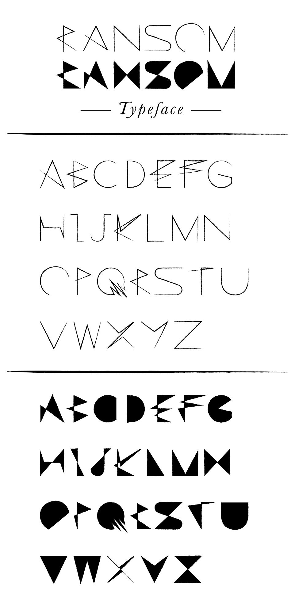
This typeface design was inspired by C. S. Lewis’s “Space Trilogy” novels, which chronicle the adventures of Dr. Elwin Ransom (work by Jacob Granneman).
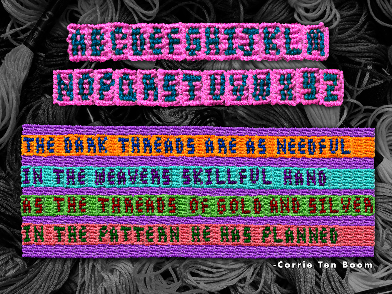
A modular design that also incorporates materiality (work by Camille Oppedal)
