
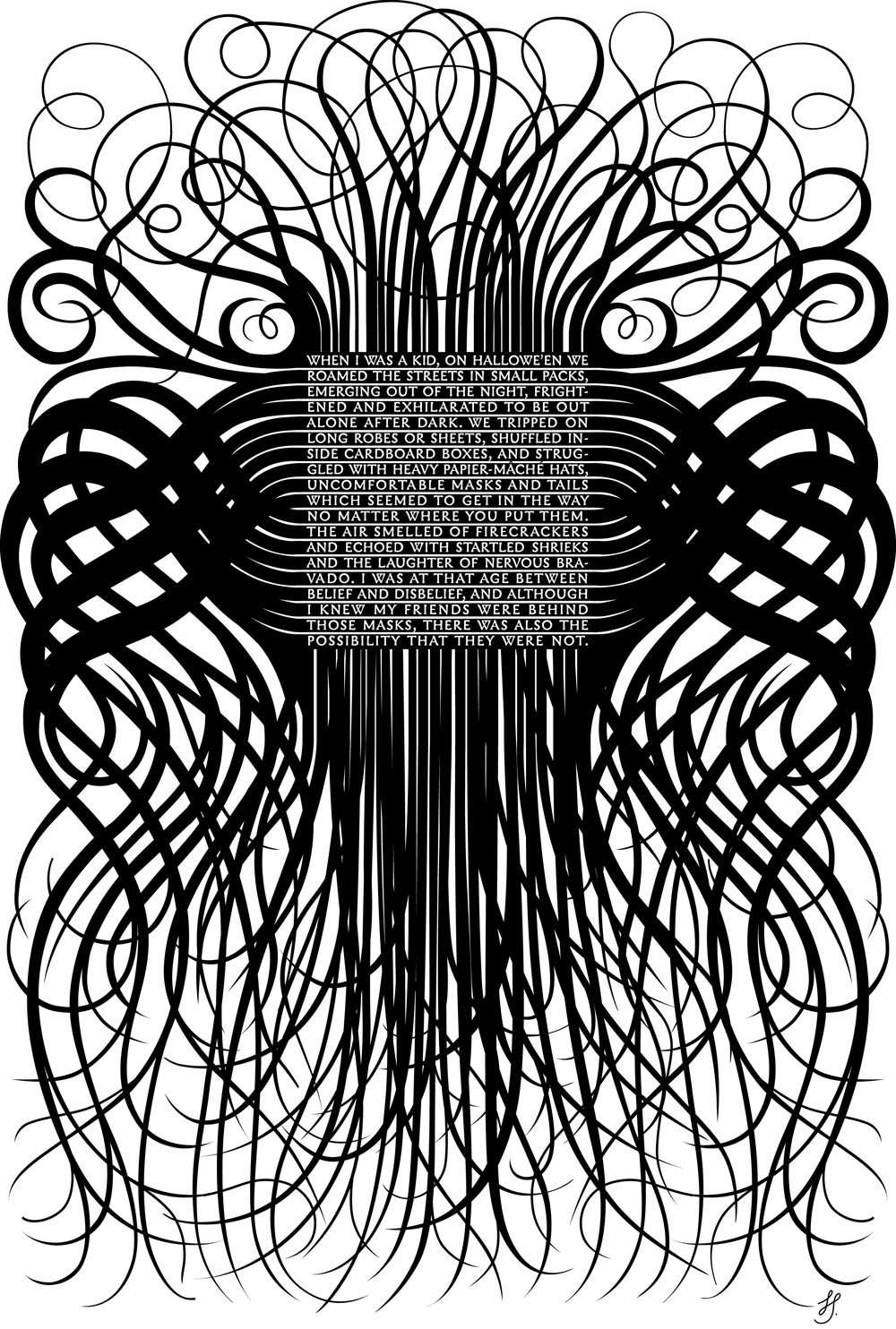
In the year that I started the Valentines, I also started sending out Halloween greetings as well. While the Valentines have lasted, I dropped the Halloween thing after the 3rd year. This was the first, and I still like it. – Bantjes 2005
I chose Bantjes Halloween ’05 design it stood out to me in particular amongst her other designs. Many of which consist of bright colors and abstract uses of other familiar objects. However, this design the text is easier to read in comparison to the puzzling attributes of her newer works. Halloween ’05 most definitely has an eerie vibe about it and evokes an almost haunting aesthetic on the viewer. Overall I think that this design looks unique and like tentacles rather than light and normal object.
Rather than her other designs which often represent puzzling and confusing pieces with lighter colors this design is unique in its modularity. Other than the words themselves, I think that this designs overall modularity is the black organic lines. Something like tentacles or overgrowth streaming out from the type. The type font in itself similar to the overgrowth creates an ancient or old feeling to the design itself. As a whole, however, there seems to be less focus on the Formstorming of creating a puzzle to the design. I don’t see anything other than the intertwining lines and then the type. Banjes in her newer works utilizes Formstorming to create that challenge or puzzling attributes to involve the viewer in figuring out what is going on within the design.
There is little to no “confusion” within this design, the viewer does not have to look very hard to find the words within the design because the contrast specifically makes it rather easy to find the lettering. Overall, however, I think that it is simplistic and beautiful, showing a different style of design than her newer work. Her Halloween grams are something that she no longer does; possibly because they are darker than her normal, lighter designs. Yet, the gram itself is beautiful in its defiance from her norms.
