
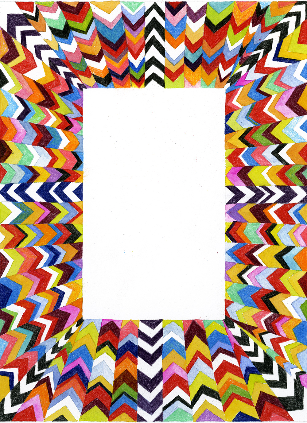
The image I chose, as a reference was a design created for Walrus magazine. Marian Bantjes was asked to create a design to describe a schizophrenic man trying to contain the voices in his head. The first page was made to look the most intensified, the second page was a little less, and the third page was completely different and very controlled. This represents the voices being controlled. This design goes along perfectly with modularity. “The endless variety of forms occurs, however, within the strict parameters of the system, which permits just one basic kind of connection.” Modularity makes design very intricate things simple. It is sometimes hard to get all of your thoughts together when there is so much that could be done. A well-defined constraint can make it much easier to keep your design organized. The same symbol or shaped is used throughout this design, but the color and the shape changes creating the design. I think it is very cool how a simple triangle shape can create a crazy design and be symbolic to a story being told. Marian Bantjes worked with many rules while creating this. It is clear that she worked with a grid because everything matches up. Rules can be used to generate form as well as organize content. On the second page of her design, I think the main technique she used was repeating and rotating. The shapes are all the same, but places at different angles.
OFFICE HOURS
Tues and Thurs, 4:05-5:00pm, Avery 479 (office) or Avery 105 (lab)
EMAIL: kristin.carlson@wsu.edu for an appointment
Blog Posts
- 201 Blog
- Archives
- Fall 2014 Archive (336)
- Fall 2014 Archive (338)
- Fall 2015 Archive (336)
- Fall 2015 Archive (338)
- Fall 2016 Archive (336)
- Fall 2017 Archive (336)
- Fall 2017 Archive (336)
- Fall 2018 Archive (201)
- Fall 2018 Archive (336)
- Fall 2019 Archive (201 Blog)
- Spring 2016 Archive (336)
- Spring 2017 Archive (336)
- Spring 2018 Archive (336)
- Sample Posts by Students
- Sample Posts by Your Professor
- Uncategorized
