Type Anatomy: Sanna Wright

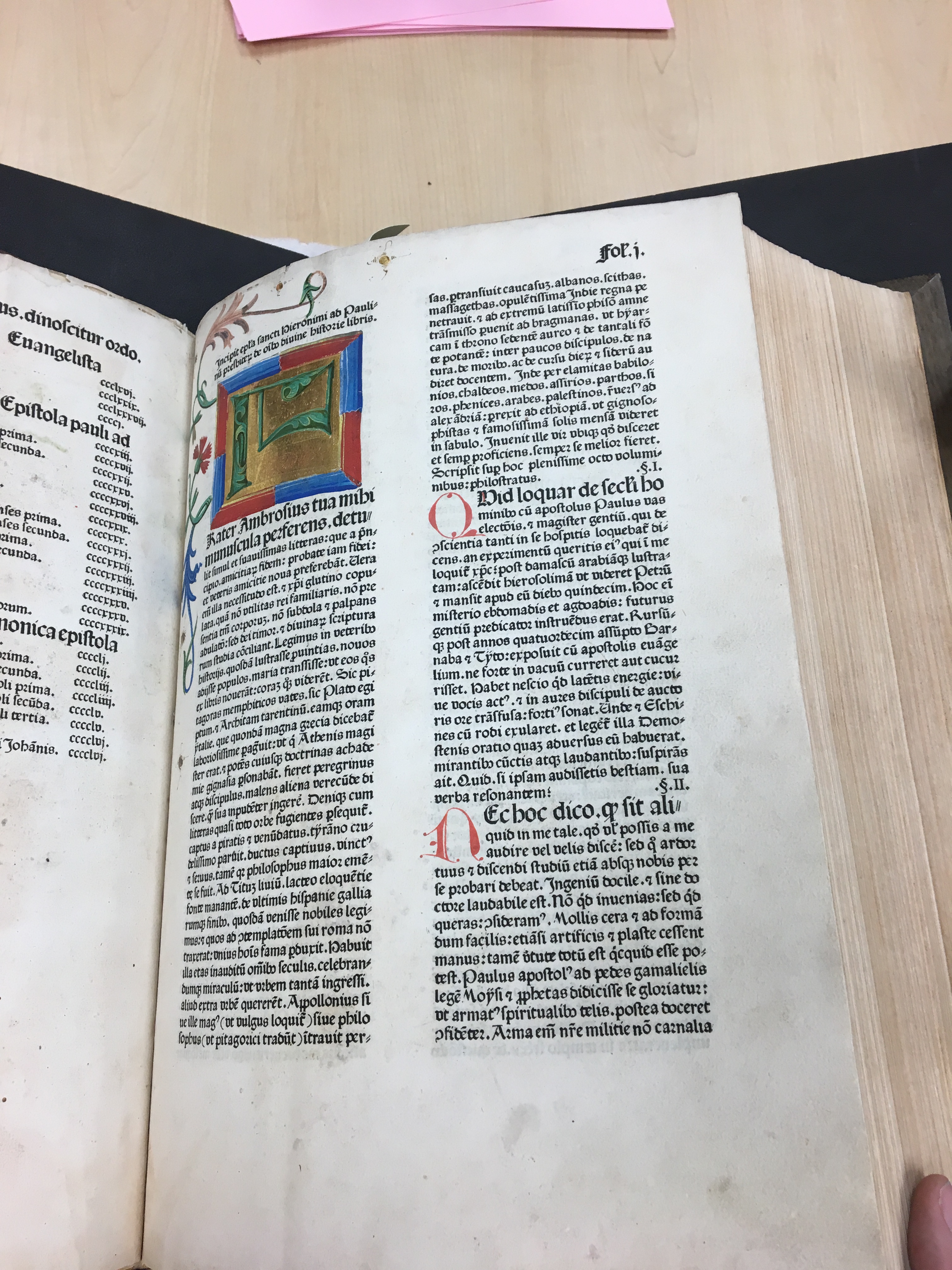
A 12th century bible by an unknown author. The bible likely was owned by a noble person based on the expensive production costs. This bible belongs to the Washington State University Manuscripts, Archives, and Special Collections. Photo by Sanna Wright, October 2018.

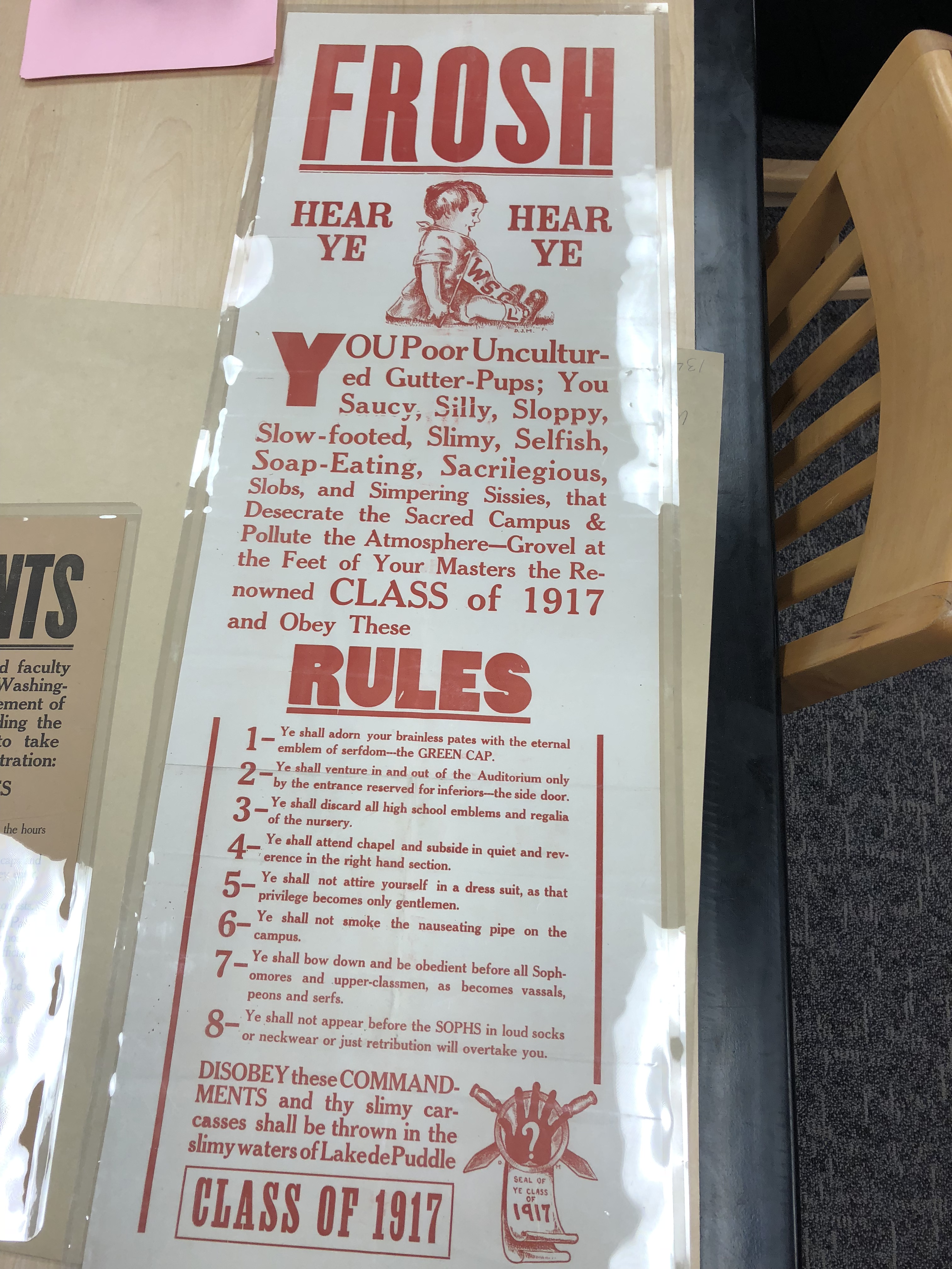
After the advent of movable type in the 15 century by Johannes Gutenberg, the production of books and other written text was quickly produced and lead to cheaper reproduction of written work. Once introduced to the gridded cases of movable type carved out of lead the world was changed forever. While there was some movable type in China before Gutenberg’s invention, it had not yet reached a level of practical use and was not used in  Western literature. This 12th-century bible was created before the advent of moveable type and was most likely slowly transcribed over many thousands of hours by special artisans. This bible was very expensive to produce and was most likely owned by a noble person. This bible is especially well crafted, with gold leaf elements, and ornate lettering.

Based on the grid-like lines (most likely to help the scribe write straight) the letters have an unusually high x-height.  The height of the body the lowercase letters take up a lot of room. There is a lot of overhang, which is to be expected from a handwritten piece. The ascender height is not very long, with the lowercase T, D, and Bs being the same height as the dotted I’s and only slightly larger than the other letters such as m. The descender height is very exaggerated. Gs and Ps often have a descender that the same length as a typical letter from the baseline to the x-height.

The bowl of capital letters such as A and C are rounded. However, the bowl of letters like capital D is very square and much more reminiscent of early movable type (which was designed to resemble handwriting). The beginning of each paragraph (or each sentence?) is very complex and colorful. While some other letters have small red decoration, these letters show how expensive this text was to create. The letters in some cases take up two whole lines or dramatically over the cap height. This contrast draws attention to the smaller details of the lettering.

Posted in Fall 2018 Archive (336) | Leave a comment

Formstorming & Modularity: Alex Allen

The graphic I decided to choose from Marian Bantje’s collection had to do with typefaces, seeing that our next project is directly related to this concept. I thought that by emerging myself to different styles of typefaces/calligraphy would force me to do more research into this art and ultimately help me decide on what kind of typeface I would like to make for myself. Marian Bantie’s created this work of art for the TypeCon conference held in Seattle (2007), hence the Seattle in the middle of the image. In the creation of this master piece, Marian wanted to come up with a design that would make her stand out from the rest. This is when she got the crazy idea to take “letterspace” and make it convey another meaning. Relating this typographic work of art to our readings is a little challenging seeing that this piece of art is really like none of the concepts listed in the chapter readings. The only two concepts I can relate this form of art to in anyway is “breaking the block” and “Alterego”. The reason I say “breaking the block” is because in this design it seems like the artist had “designers block (writer’s block)” and started to experiment with different shapes and lines until finding an inspiration. The next concept I choose Alterego, the reason I choose this design concept was because “Alterego” pushes designers to step outside and beyond their comfort zone and experiment with fresh design language, media, and making. Lastly, connecting this piece of art to the modularity chapter. After reading through this chapter I felt that the “working with constraints” was the only concept that could be relatively close to Marian’s work of art shown here. The way Marian uses basic shapes and try’s to connect the theme on the conference with her art give off a limitation on what she can do but also the freedom to be creative nad put her own spin on it.


Posted in Fall 2018 Archive (336) | Leave a comment

Art Museum Visit: Hunter Kozol

I chose to write about the Evacuation and relocation of Japanese American notice. It was created by John L DeWitt in 1942. This notice was printed on a 55 x 36 cm poster. The x-height of the letters is uniform and there is minimal descender height.  This font has a neutral set width and is geometric in nature. These qualities make the font very functional. This is important for posters whose job is to communicate information clearly and effectively. I’m influenced by this font because I think there is beauty in simplicity. This font is very functional, clean, and neat. I think those qualities are what draw me to san serif fonts including this form of Helvetica. I plan to create a san serif font because if the functionality and the clean lines. This font helped me realize that I like fonts that are geometric and simple. One way I think my design will differ from this font is in weight. I think the weight of this font is a little too heavy. A lighter san serif, perhaps with softer corners, it what I envision my font to look like.


Posted in Fall 2018 Archive (336), Uncategorized | Leave a comment

Type Anatomy: Clara Mui

Description of Russia’s geography printed with woodblock.

When I saw these collection of old geography books from China I was instantly drawn to it, not just because it was written in Chinese, but also how dated it is and how the Xuen paper felt in my hands. It made my little Chinese heart felt at home and curious.

The books were not written in just any type of Chinese, but Traditional Chinese, which is the Chinese I grew up writing. This type of Chinese writing, as the name suggests, was the original Han Chinese writing, but it got wiped out when the communists came into power in the 1940s and was replaced by the Simplified Chinese writing to help raise the literacy rate of the China.

The books were printed with woodblock printing method and are in oriental style, according to the description for the pieces. This is what made these books stand out from the others because they were printed vertically and are meant to be read from right to left.

All the Chinese character’s typeface was designed with the same width, like numbers in Western countries, so that they would align when put together vertically. To me, the height of all the characters are really similar, so they kind of feel like small caps style. I think it’s because Chinese characters are written not to just match the width, but also the height, so the rule for all characters in Chinese is that it fits proportionately in a square. (At least in printing)

Despite being another language, writing in Chinese also has details like serifs and finial. Calligraphy in Chinese is a discipline with set rules for how those details in characters are suppose to look, which I adore and aspire to put on everything I do in designing because it gives such a strong yet elegant look to words. However, I have never seen a typeface of English alphabet with Chinese calligraphy characteristics, so I think this would be a challenge for me if I chose to process with this direction.

Another interesting thing is the placement of the punctuations. They were printed on the right of each characters. Also, because Chinese writing has a different set of punctuations, it’s very interesting to see how they were presented in the 19th century.

A map of Russia using description printed in a different typeface that has ascender and descender above or below the x height.

Posted in Fall 2018 Archive (336) | Leave a comment

Type Anatomy: Emily Deichmann

I chose to focus on one of the old Washington State University’s posters trying to scare the freshman. I thought it was very interesting to walk around and look at all of the texts. It was cool to see how each era in time had different type of text, and the text kind of matched the theme to what it made up. For example, in this photo the message the authors were trying to get through was to frighten the incoming freshman. The type is bolded and very strong. Also, the “Frosh” and “Rules” are the same type of text. In the main text every word starts with a “S”. the spine of the S’s are very curved. I think this was done to make the S look more emphasized because all of the words are meant to take a jab at the freshman. The ascenders are also emphasized in the h’s. The type used in this poster does look traditional but also there is a twist. Bodoni and Didot, type designers, created a type that mixed traditional text with abstract ideas. They called this type Monster Fonts because they had created a monster. I think that the bold words in the poster fall under the category of Monster Fonts. With the rise of industrialization came more products to sell, which in return caused and explosion in advertising. With that, Monster Fonts were used more frequently to attract the attention of consumers. I believe that the students wanted to get the attention of the freshman by using big fonts.

Posted in Fall 2018 Archive (336) | Leave a comment

Comics: Luke Schauble

When looking at the comic I’ve created, I would say that it fits his definition of what a comic is very well. That being “juxtaposed pictorial and other images in deliberate sequence”. My comic fits all of these elements. First, all of my pictures are juxtaposed because they are all placed side to side. They are also all pictorial images created from scratch that are placed in a deliberate sequence so that they flow from left to right to tell a story. Like Scott McCloud’s print based book, I have decided to go with a print based comic as well. Comics are art as much as they are literature, and in my opinion, that side of my comic, and all comics for that matter, shine through more when there is a physical copy of it in your hand. Also, text has to be configured a lot differently depending on weather it is printed, or digital. I thought that the way the text is laid out in my comic, it was better to go with print.

I used many design elements that Scott McCloud discussed In his book. Most prevalent is the idea of making the characters in your comic as generalized as possible. I attempted to make the main character of the book as unidentifiable as possible so that anyone could see themselves in the character. I did this by never showing the characters faces at all, instead showing them from behind, with the intent of making it so that the reader is almost “viewing” what the character of the comic is viewing. He also talked about a style of comic most prevalent in Japan, where the characters are less realistic and more cartoony, while the environment is much more realistic, albeit not that realistic, but more realistic.

Posted in Fall 2018 Archive (201) | Leave a comment

Type Anatomy: Claire Martin

The typeface I decided to analyze is that of a Bible

A page of a Koberger Bible.

Ligatures can be found on the 8th and 9th lines of the section starting with ‘Q’.

created in Germany by Anton Kobergerduring the 15th century. The type is very interesting as it is an example of early printing in Germany. You can see the clear connections between the typeface and calligraphy as mentioned in our reading. While Koberger’s type is not as densely packed as Gutenverg’s, there is a resemblance between Koberger’s type and the blackletter example on page 13 of “Thinking with Type”.  The letters of the Koberger Bible are thick and pretty close together. There are also a few examples of ligatures, which are to letters combined to one, in the Koberger Bible.


A page of a Koberger Bible.

The tiny red and green detail of the letter is apparent.

The use of color in the Bible makes it particularly striking, the alternation between blue and red capital letters not only draws the eye of the reader but adds additional detail and beauty to the text. The addition of smaller green and red detail to parts of the Bible only accentuate the letters further. We learned when we visited MASC, that the colored letters were likely added after the Bible was printer. While these capital letters are very similar to the rest of the printed letters, they appear to be more organic in nature. They remind me of the lettera antica, mentioned in the reading, that was common during the Renaissance. I believe these letters were added more for their beauty than for functional reasons.

A page of a Koberger Bible.

The Q on this page is an example of where the artists turned hide a mistake.

I also really enjoy how a few small mistakes by the person writing the colorful letters were transformed into parts of the letters so that a new page did not have to be created. It really shows the immense amount of effort that was put into the creation of this Bible. The ascenders and descenders of the type appear to be fairly equal in height. I feel like many of the fonts we use today, the ascenders height is greater than the height of the accompanying descender. Serifs appear to be used differently in the creation of this typeface than they are for modern typefaces. I love the exaggerated spines and cross bars of letters like ‘S’ and ‘B’, they give the type a very beautiful formal feel.


Posted in Fall 2018 Archive (336) | Leave a comment

Type Anatomy: Jane Doe

An image of a page in Virginia Woolf's copy of Alice's Adventures in Wonderland by Lewis Carroll.

Virginia Woolf’s copy of Alice’s Adventures in Wonderland by Lewis Carroll

The typeface in this book is a humanist serif font.  It uses both upper and lower case letters.  The uppercase has a high capline that looks slightly taller than its ascender line.  The descenders do not descend very far.  There is a lot of space between the letters and punctuation marks.  The width of the type is still normal, however.  The typeface is all upright, except for a few exceptions, and on top of the baseline.  None of the lettering is heavy.  The ‘g’ and the ‘a’ letters are both double story letters.

It is a very simple and standard design typeface, which is why I found it so appealing.  It is easy to read and looks great on a page.  Easy to read typeface is essential in a book, especially one that is targeted to a younger audience.  The letters and spacing makes a huge difference in the book’s readability, which makes this so easily readable.

The other reason why I chose this typeface is for the page on the left.  The creator changed the look of the page to resemble the subject of the story, which was a mouse.  The text whips down the page like a mouse’s tail.  It is a great example of making the text an element of the story.

However, the mouse tail element makes the font less readable.  It had to be to create the tail.  The tail also changes the font size from the size it is in the book to a very small size at the end of the tail.  It does not appear anything changes about the typeface except the size due to the diminishing size of the tail.

Posted in Fall 2018 Archive (336) | Leave a comment

Type Anatomy – Grey Kumar

IMG-5179

1942 United States Civilian Exclusion Order No. 17

For my Type Anatomy example, I have decided to use the 1942 United States Civilian Exclusion Order. When first examining this example, I immediately associated the large, capitalized text at the top with a concerning feeling. The word “Notice” immediately brought up a feeling of uncertainty and drew my attention to the top of the page. If the letters were not capitalized, I think one would not be as alarmed or intrigued to read this document. The letters all sitting at the same cap height stresses importance. Additionally, all the text that sits in the header portion of the document is sans serif, which makes it easy to read and keeps the text straightforward and to the point. The big, bold letters also stress importance by contrasting heavily with the paper the document is printed on. The take up a lot of space on the page, which draws attention from the reader. As one reads down the document, they can notice that the text decreases in size. This also stood out to me because the text itself gets more serious as it gets smaller. The header text catches the attention of the viewer, while the body text conveys the incredibly grimacing and solemn message.

The body text also changes to a font with serifs, making it feel much more serious and almost sophisticated to some extent. I think this was done with the intention of creating a serious tone when reading the 4 body paragraphs.

Posted in Fall 2018 Archive (336), Uncategorized | Leave a comment

Type Anatomy: Matt Behnen

The type in this picture is a mix of all types of font. There are serif and sans-serif fonts as well as regular, bold, and indented. The poster uses bold sanserif fonts for headings and things that are important to see if you were to look at a glance. I believe the reasoning for this type of type is so that if you were walking by this poster, you could see the biggest red type and see what the poster is about, but if you had time, you could read more with the smaller, more detailed text. The poster uses a sans-serif font so that it is easy to read and people won’t mix up the letters that are close together. This font uses thick stems on all their heading letters to show the importance of the headings. small, thin stems would not be considered as important and vital information. This poster uses Bold fonts for the primary headings and then regular of the same font for information about that heading. It also uses a different color and smaller font for the fine details about a specific event. The x-height for every letter in headings is the same, making every letter the same size, even if it is capitalized. This poster also uses a red color for all their headings to show that it is the most important information and the other information is not as important.

Posted in Fall 2018 Archive (336) | Leave a comment