
 When looking at the comic I’ve created, I would say that it fits his definition of what a comic is very well. That being “juxtaposed pictorial and other images in deliberate sequence”. My comic fits all of these elements. First, all of my pictures are juxtaposed because they are all placed side to side. They are also all pictorial images created from scratch that are placed in a deliberate sequence so that they flow from left to right to tell a story. Like Scott McCloud’s print based book, I have decided to go with a print based comic as well. Comics are art as much as they are literature, and in my opinion, that side of my comic, and all comics for that matter, shine through more when there is a physical copy of it in your hand. Also, text has to be configured a lot differently depending on weather it is printed, or digital. I thought that the way the text is laid out in my comic, it was better to go with print.
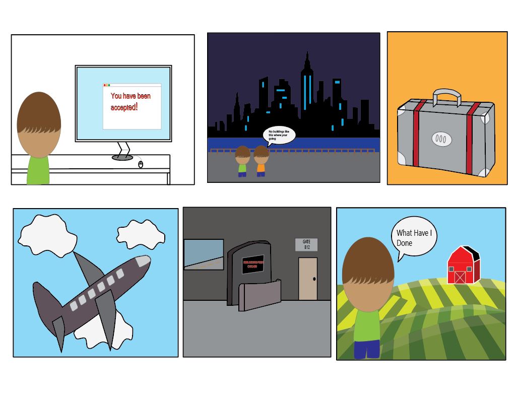
I used many design elements that Scott McCloud discussed In his book. Most prevalent is the idea of making the characters in your comic as generalized as possible. I attempted to make the main character of the book as unidentifiable as possible so that anyone could see themselves in the character. I did this by never showing the characters faces at all, instead showing them from behind, with the intent of making it so that the reader is almost “viewing” what the character of the comic is viewing. He also talked about a style of comic most prevalent in Japan, where the characters are less realistic and more cartoony, while the environment is much more realistic, albeit not that realistic, but more realistic.
