
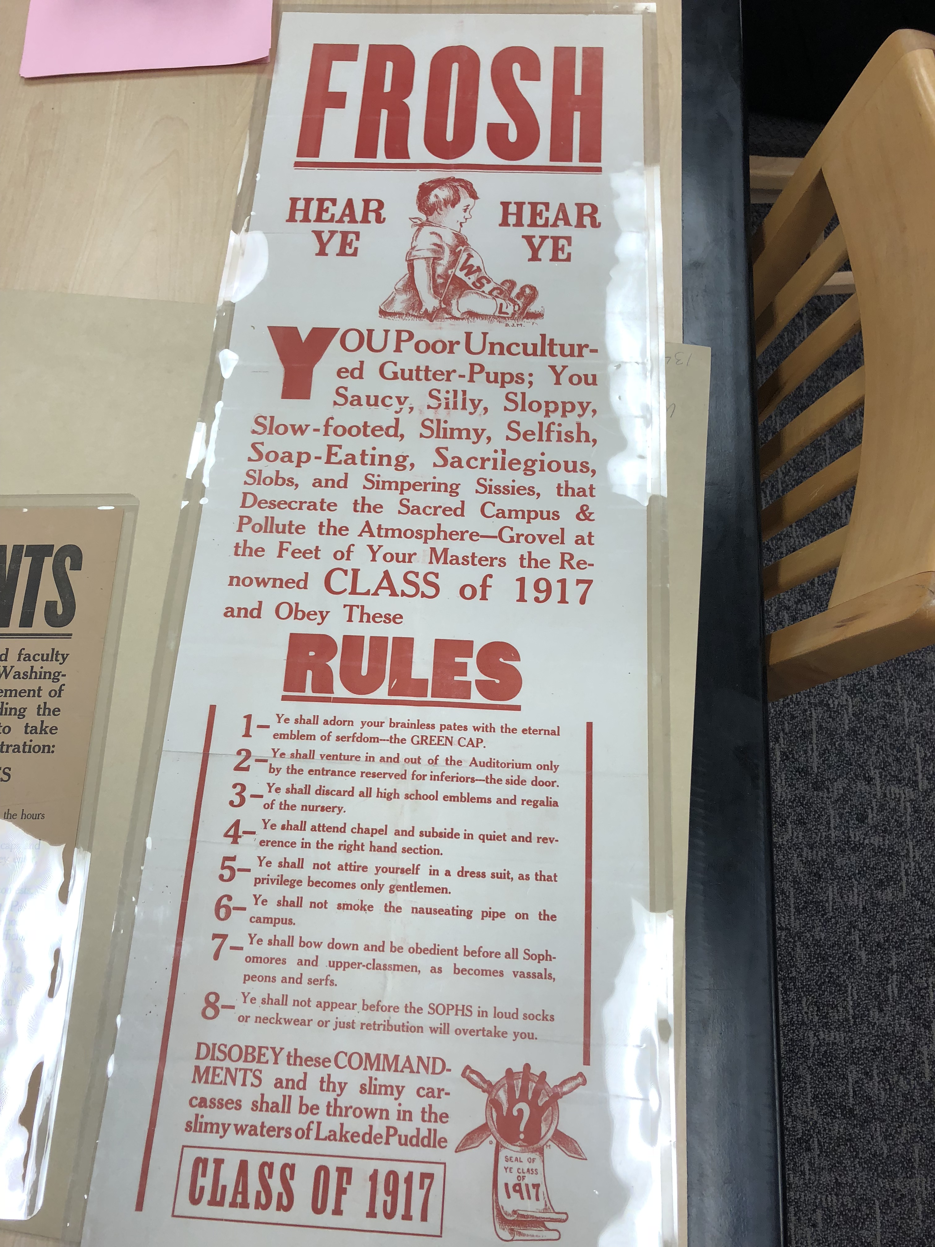
 I chose to focus on one of the old Washington State University’s posters trying to scare the freshman. I thought it was very interesting to walk around and look at all of the texts. It was cool to see how each era in time had different type of text, and the text kind of matched the theme to what it made up. For example, in this photo the message the authors were trying to get through was to frighten the incoming freshman. The type is bolded and very strong. Also, the “Frosh” and “Rules” are the same type of text. In the main text every word starts with a “S”. the spine of the S’s are very curved. I think this was done to make the S look more emphasized because all of the words are meant to take a jab at the freshman. The ascenders are also emphasized in the h’s. The type used in this poster does look traditional but also there is a twist. Bodoni and Didot, type designers, created a type that mixed traditional text with abstract ideas. They called this type Monster Fonts because they had created a monster. I think that the bold words in the poster fall under the category of Monster Fonts. With the rise of industrialization came more products to sell, which in return caused and explosion in advertising. With that, Monster Fonts were used more frequently to attract the attention of consumers. I believe that the students wanted to get the attention of the freshman by using big fonts.
OFFICE HOURS
Tues and Thurs, 4:05-5:00pm, Avery 479 (office) or Avery 105 (lab)
EMAIL: kristin.carlson@wsu.edu for an appointment
Blog Posts
- 201 Blog
- Archives
- Fall 2014 Archive (336)
- Fall 2014 Archive (338)
- Fall 2015 Archive (336)
- Fall 2015 Archive (338)
- Fall 2016 Archive (336)
- Fall 2017 Archive (336)
- Fall 2017 Archive (336)
- Fall 2018 Archive (201)
- Fall 2018 Archive (336)
- Fall 2019 Archive (201 Blog)
- Spring 2016 Archive (336)
- Spring 2017 Archive (336)
- Spring 2018 Archive (336)
- Sample Posts by Students
- Sample Posts by Your Professor
- Uncategorized
