
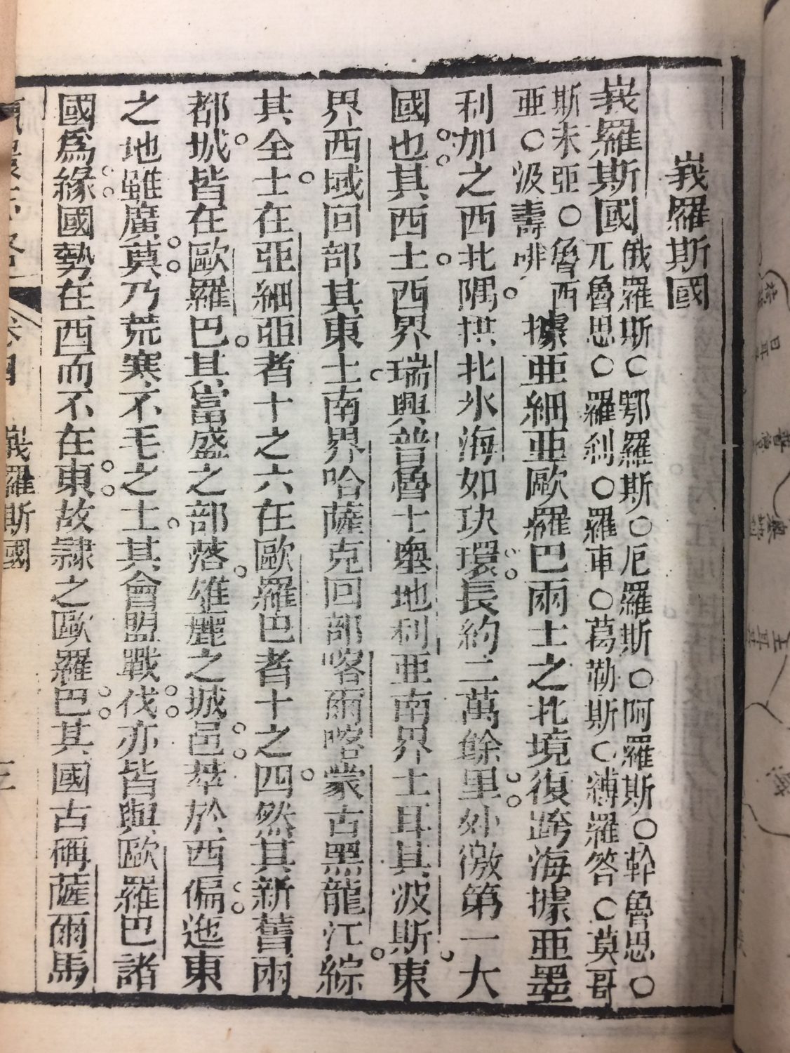
Description of Russia’s geography printed with woodblock.
When I saw these collection of old geography books from China I was instantly drawn to it, not just because it was written in Chinese, but also how dated it is and how the Xuen paper felt in my hands. It made my little Chinese heart felt at home and curious.
The books were not written in just any type of Chinese, but Traditional Chinese, which is the Chinese I grew up writing. This type of Chinese writing, as the name suggests, was the original Han Chinese writing, but it got wiped out when the communists came into power in the 1940s and was replaced by the Simplified Chinese writing to help raise the literacy rate of the China.
The books were printed with woodblock printing method and are in oriental style, according to the description for the pieces. This is what made these books stand out from the others because they were printed vertically and are meant to be read from right to left.
All the Chinese character’s typeface was designed with the same width, like numbers in Western countries, so that they would align when put together vertically. To me, the height of all the characters are really similar, so they kind of feel like small caps style. I think it’s because Chinese characters are written not to just match the width, but also the height, so the rule for all characters in Chinese is that it fits proportionately in a square. (At least in printing)
Despite being another language, writing in Chinese also has details like serifs and finial. Calligraphy in Chinese is a discipline with set rules for how those details in characters are suppose to look, which I adore and aspire to put on everything I do in designing because it gives such a strong yet elegant look to words. However, I have never seen a typeface of English alphabet with Chinese calligraphy characteristics, so I think this would be a challenge for me if I chose to process with this direction.
Another interesting thing is the placement of the punctuations. They were printed on the right of each characters. Also, because Chinese writing has a different set of punctuations, it’s very interesting to see how they were presented in the 19th century.
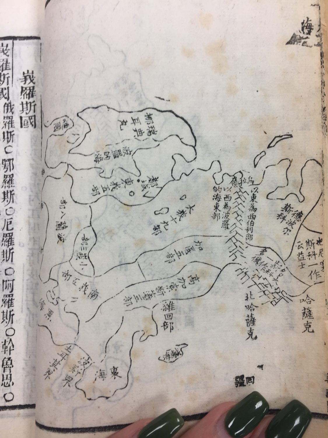
A map of Russia using description printed in a different typeface that has ascender and descender above or below the x height.
