
The typeface I decided to analyze is that of a Bible
Ligatures can be found on the 8th and 9th lines of the section starting with ‘Q’.
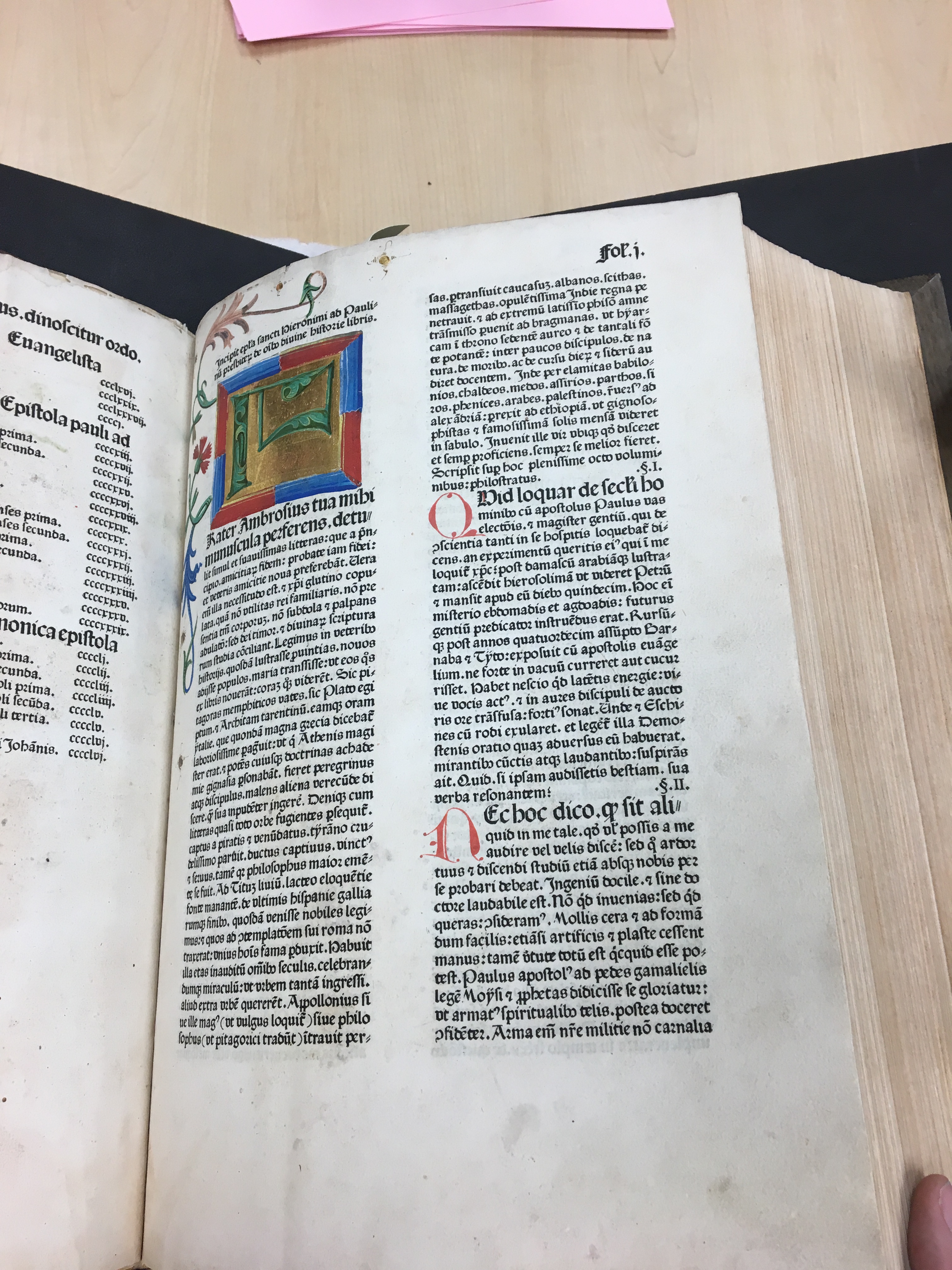
created in Germany by Anton Kobergerduring the 15th century. The type is very interesting as it is an example of early printing in Germany. You can see the clear connections between the typeface and calligraphy as mentioned in our reading. While Koberger’s type is not as densely packed as Gutenverg’s, there is a resemblance between Koberger’s type and the blackletter example on page 13 of “Thinking with Type”. The letters of the Koberger Bible are thick and pretty close together. There are also a few examples of ligatures, which are to letters combined to one, in the Koberger Bible.

The tiny red and green detail of the letter is apparent.
The use of color in the Bible makes it particularly striking, the alternation between blue and red capital letters not only draws the eye of the reader but adds additional detail and beauty to the text. The addition of smaller green and red detail to parts of the Bible only accentuate the letters further. We learned when we visited MASC, that the colored letters were likely added after the Bible was printer. While these capital letters are very similar to the rest of the printed letters, they appear to be more organic in nature. They remind me of the lettera antica, mentioned in the reading, that was common during the Renaissance. I believe these letters were added more for their beauty than for functional reasons.

The Q on this page is an example of where the artists turned hide a mistake.
I also really enjoy how a few small mistakes by the person writing the colorful letters were transformed into parts of the letters so that a new page did not have to be created. It really shows the immense amount of effort that was put into the creation of this Bible. The ascenders and descenders of the type appear to be fairly equal in height. I feel like many of the fonts we use today, the ascenders height is greater than the height of the accompanying descender. Serifs appear to be used differently in the creation of this typeface than they are for modern typefaces. I love the exaggerated spines and cross bars of letters like ‘S’ and ‘B’, they give the type a very beautiful formal feel.
