
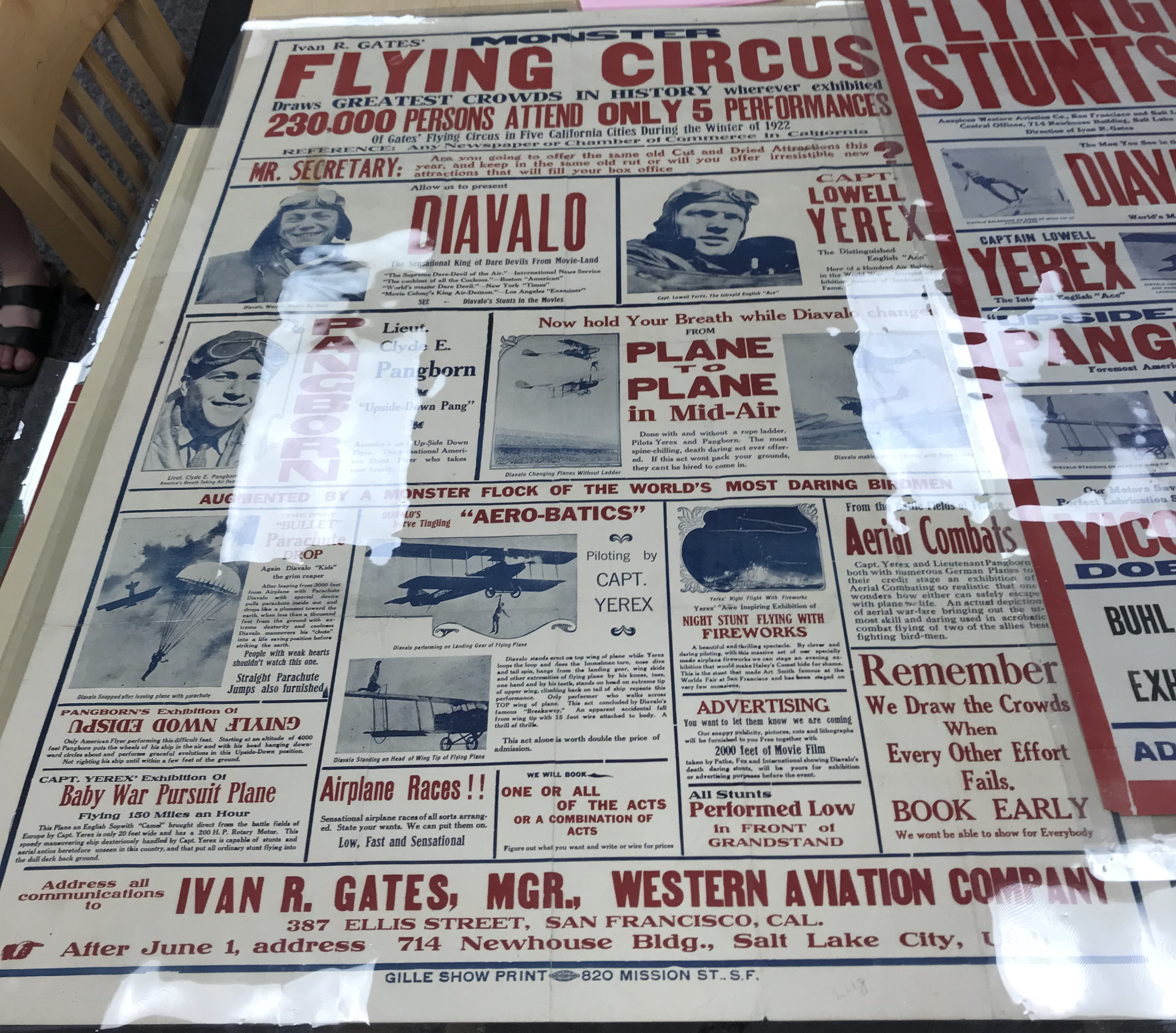
 The type in this picture is a mix of all types of font. There are serif and sans-serif fonts as well as regular, bold, and indented. The poster uses bold sanserif fonts for headings and things that are important to see if you were to look at a glance. I believe the reasoning for this type of type is so that if you were walking by this poster, you could see the biggest red type and see what the poster is about, but if you had time, you could read more with the smaller, more detailed text. The poster uses a sans-serif font so that it is easy to read and people won’t mix up the letters that are close together. This font uses thick stems on all their heading letters to show the importance of the headings. small, thin stems would not be considered as important and vital information. This poster uses Bold fonts for the primary headings and then regular of the same font for information about that heading. It also uses a different color and smaller font for the fine details about a specific event. The x-height for every letter in headings is the same, making every letter the same size, even if it is capitalized. This poster also uses a red color for all their headings to show that it is the most important information and the other information is not as important.
OFFICE HOURS
Tues and Thurs, 4:05-5:00pm, Avery 479 (office) or Avery 105 (lab)
EMAIL: kristin.carlson@wsu.edu for an appointment
Blog Posts
- 201 Blog
- Archives
- Fall 2014 Archive (336)
- Fall 2014 Archive (338)
- Fall 2015 Archive (336)
- Fall 2015 Archive (338)
- Fall 2016 Archive (336)
- Fall 2017 Archive (336)
- Fall 2017 Archive (336)
- Fall 2018 Archive (201)
- Fall 2018 Archive (336)
- Fall 2019 Archive (201 Blog)
- Spring 2016 Archive (336)
- Spring 2017 Archive (336)
- Spring 2018 Archive (336)
- Sample Posts by Students
- Sample Posts by Your Professor
- Uncategorized
