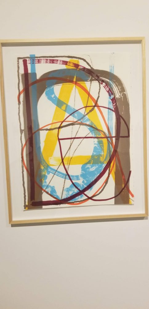
“Unalphabetic #1 (Unabashed)” Pat Boas (1932)
The work I chose was “Unalpabetic #1 (unabashed)” by Pat Boas. This work is the word ‘Unabashed’ with each letter painted over the other, in various sizes, colors, weights, and cases. The text here makes the image, the letters become the image, it would be impossible to separate the two from each other without compromising the composition of the piece. Each portion of the stacked text adds to the painting, it actually creates the composition. At a quick glance one might not even notice that the painting is made up of stacked letters, and when realized people will see different letter first, or not even be able to discern all of the letters.
This piece is rather symbolic and abstract. The word written is “Unabashed”, a word that is defined as, “not embarrassed, disconcerted, or ashamed, bold.” The word choice here is purposeful, the painting is unafraid to be bold, unabashed – The meaning of the word is reflected in the painting itself. It is purposefully chaotic, the idea is to “confuse the at of reading and looking.” The chaos and playfulness of each letter form is purposeful. Each letter is used to create composition and visual flow. The overlapping curves and edges of the letters create shapes in themselves. The viewer sees the lines and movement created by each brush stroke and can find meaning in the space between the letters, before even realizing that there are letters. This begs the question, ” is this a word, or an abstract thought.”
 Pat Boas was attempting to play with the idea of language and letter-form. To purposefully distort the perception of a piece to play with legibility. A viewer can decipher letters and portions of the piece, but as a whole it remains a mystery. The meaning is in the chaos, hard to decipher.

 When we visited the Art Museum on Washington State University’s campus, I felt that this particular graphic was the one that reached out to me, and related to me the most. The photo on the far left explains the man’s body, an outline of his actual skeleton. It also has his coordinates of his horoscopes. I thought this was interesting because it conveyed him as a bare, vulnerable person, expressing his insides and exposing himself as an individual. The next photo, looked like a thumb print to me. The artist was intending this, and around his thumb print was a writing of his life’s experiences. I thought that this was so inspiring to use text in this way. To use a serif font, in a matter to create another figure into something bigger. The text in this photograph also inspired me on my own font that I have been creating. On the far left photo, you can see how it is hand drawn, and clearly created by sketching. I thought this was inspiring to create my personal font, because it is something that I am creating with my calligraphy pen, that I am sure he used as well to create his art piece.