
Photo by Sanna Wright, November 2018
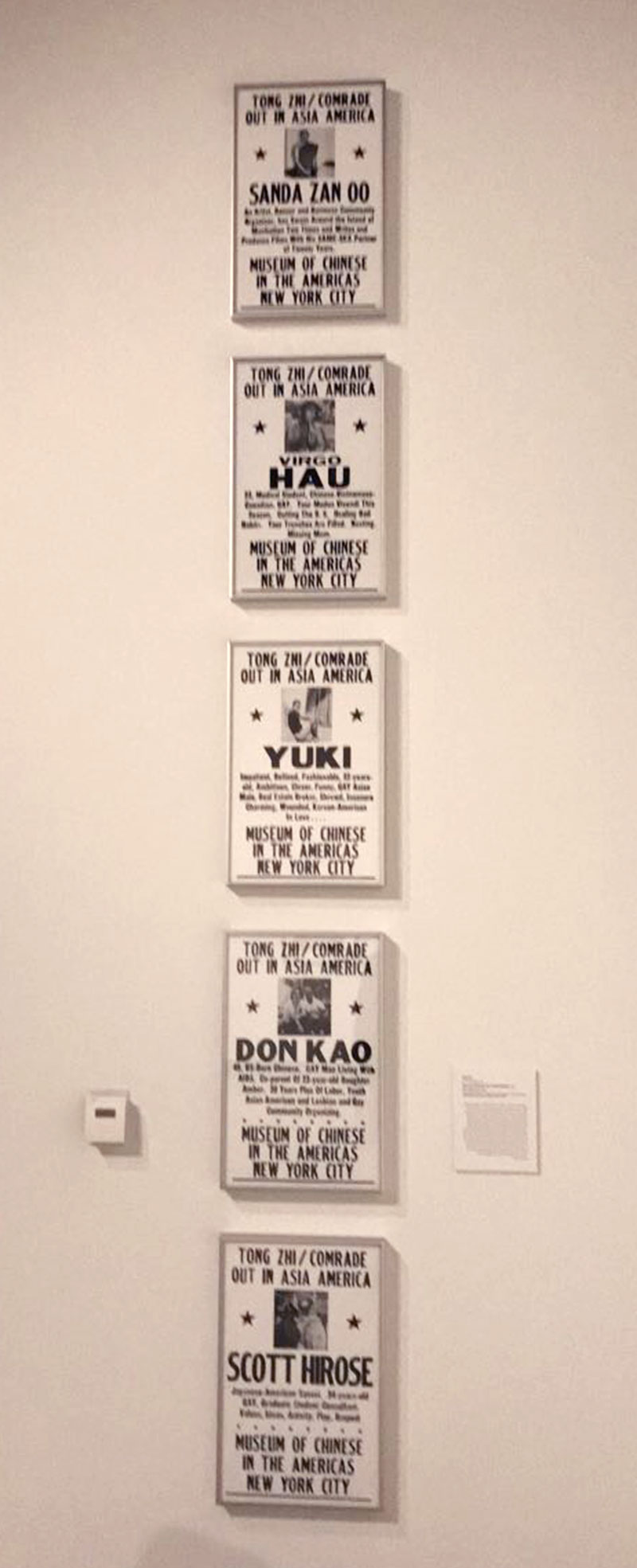
In the Washington State University art museum, these posters caught my eye. I think that they have a powerful message, and are very thought-provoking. The series of posters were created by Ken Chu to highlight and normalize the gay Asian American community in the US. His work Tong Zhi/Comrade: Out of Asia America highlights the lack of acceptance in Asian American communities in contrast with the US. The posters use an important and newslike text to explain the hobbies, interests, and family lives as well as their sexual orientation.
In these pieces, the text makes the images much more powerful. The images have little to no meaning to the viewer without the context of the words around them. Additionally, the style of typeface creates a serious tone, which impacts the message portrayed to the viewer. The typeface contrasts the otherwise playful images.

Photo by Sanna Wright, November 2018
These posters also demonstrate the concept “the medium is the message” from Timothy Samara text about illustration. The way that these posters were created is reminiscent of political posters, as well as posters that explained the forced relocation of Japanese Americans into internment camps, a dark side of America’s history. The typeface appears to be old-fashioned, created from blocks, with the strong emphasis and changing hierarchy throughout the piece. This medium transforms a simple message into a political one. It contrasts the normal description of their lives with the power of old-fashioned news poster layouts. The images also make the posters a college, with symbolic meaning. We are taking a look at the subjects’ lives.
The letters in this typeface are blocky sans-serif letters. The changing size and weight of the font bring extra emphasis to the name of the individuals and the name of the museum. The star elements draw the viewer’s eyes towards the image.
With these posters, I think that Ken Chu wants to draw attention to an important issue that has been swept under the rug in his community. Using this style of type he wants to emphasize his subject’s lives, and how they interact within their community. Overall, I think that his choice of typeface was very deliberate, and it helps spread his message well.
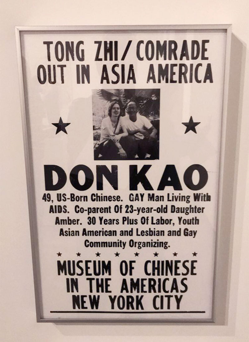
Photo by Sanna Wright, November 2018

Photo by Sanna Wright, November 2018
