
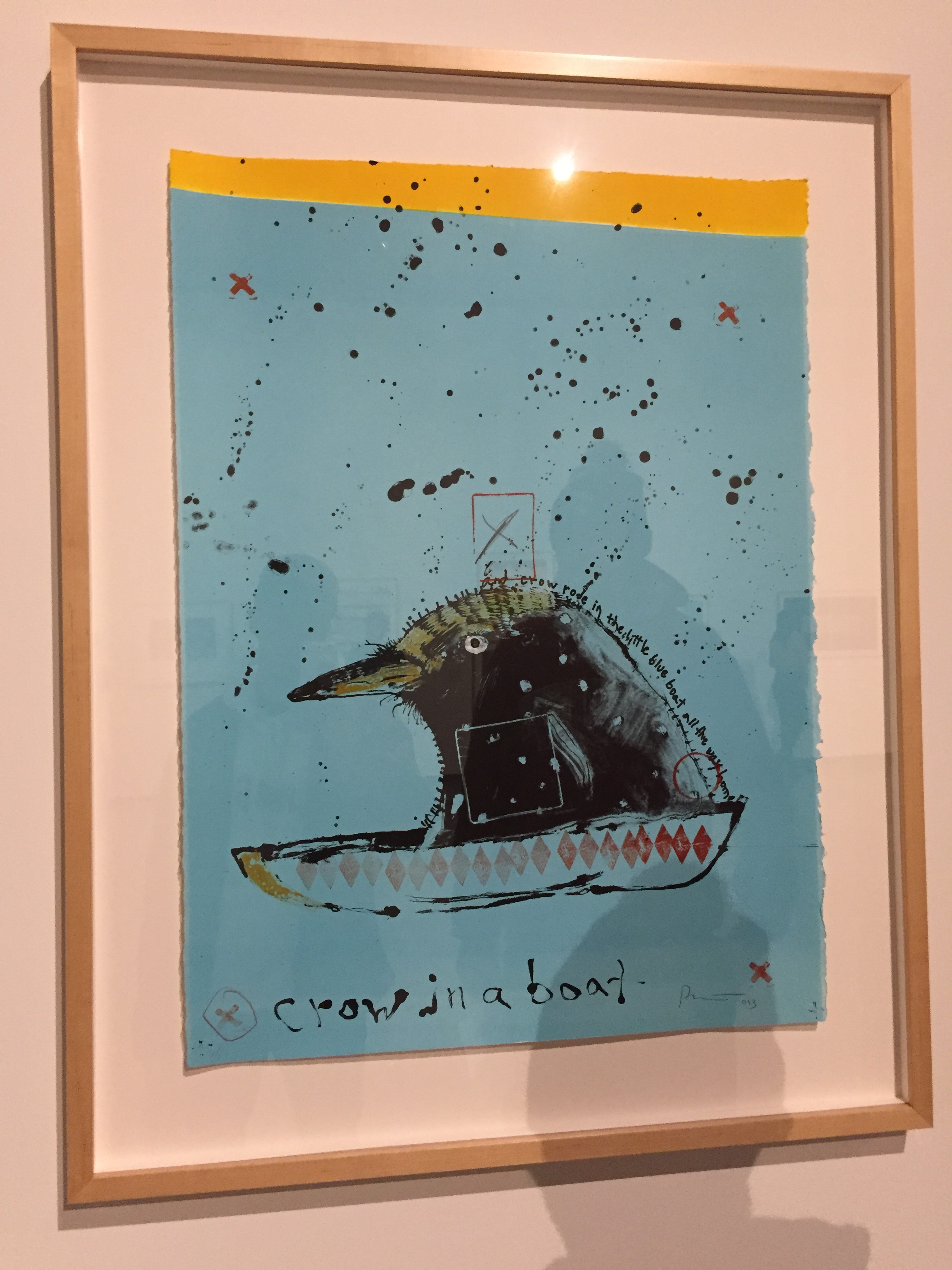
“Crow in a Boat” Rick Bartow, 2013
For my analysis from the Art Museum visit, I chosen the painting titled “Crow in a Boat” by Rick Bartow. This painting originally caught my eye with the bright colors and heavy contrast that is used. The heavy black from the head of the crow against the light blue background creates a very appealing contrast that I really enjoy, along with the slight strip of yellow that travels across the top of the painting. Another aspect of this painting which really stood out to me was the text that is placed in the lower left hand corner of the painting. In most works, the artist does not usually include the title in the same frame as the painting or creation. It is generally placed on a placard that sits in the same vicinity as the painting. I found this to be very interesting because it adds a sense of completeness to the painting. The text in itself becomes a separate entity within the painting, which allows one to draw meaning from just the text alone.
The text fits very well with the painting because it matches the aesthetic without overpowering the main image. If the typeface were to be styled differently, it would not fit with the painting and the black spots that cover the canvas. The two entities, the crow and the text, would class with one another making the painting feel incomplete as a whole.
For my type design, I want to use the same consistency that is shown in this painting between the image or graphic that I have in my head, and what the type actually looks like. For example, the text I have chosen revolves around the sea, yet also the battle between a man and a fish, and the peace that he finds at the end. To represent this in my type design, I have chosen to include straight portions of fishing line to create the letter, as well as curved and “relaxed” portions of fishing line. The straight pieces represent a taught line, one that is under pressure and in the midst of a fight. Whereas the curved portions represent a relaxed line, one that is at peace and in harmony with the sea.
