Final Poster Comic: Isaiah Wilkerson

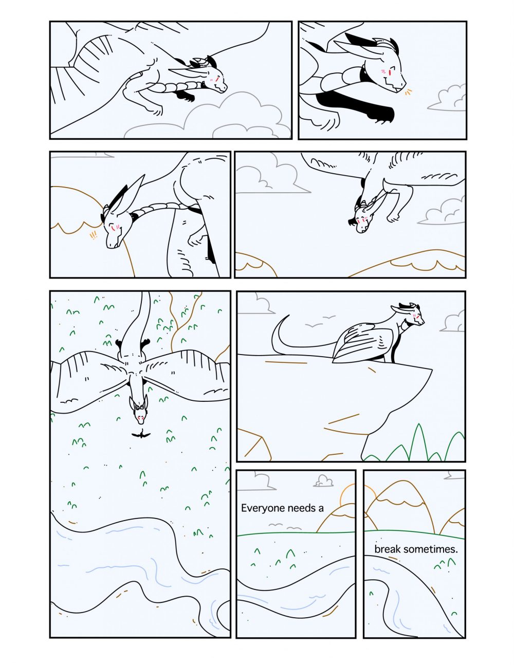
At first, I didn’t really know what to make a comic about. I’d doodle in my sketchbook to try and figure out exactly what I needed to do in order to make a good poster comic that met the requirements of my comic to challenge the audience from their normal “top-bottom”, “left-right” expectations. I decided to do a scene from one of my favorite shows: The Boondocks because I wanted to express my love for this show in an artistic, comic style way that caught the reader’s attention.

Wilkerson-Isaiah-project-02-01

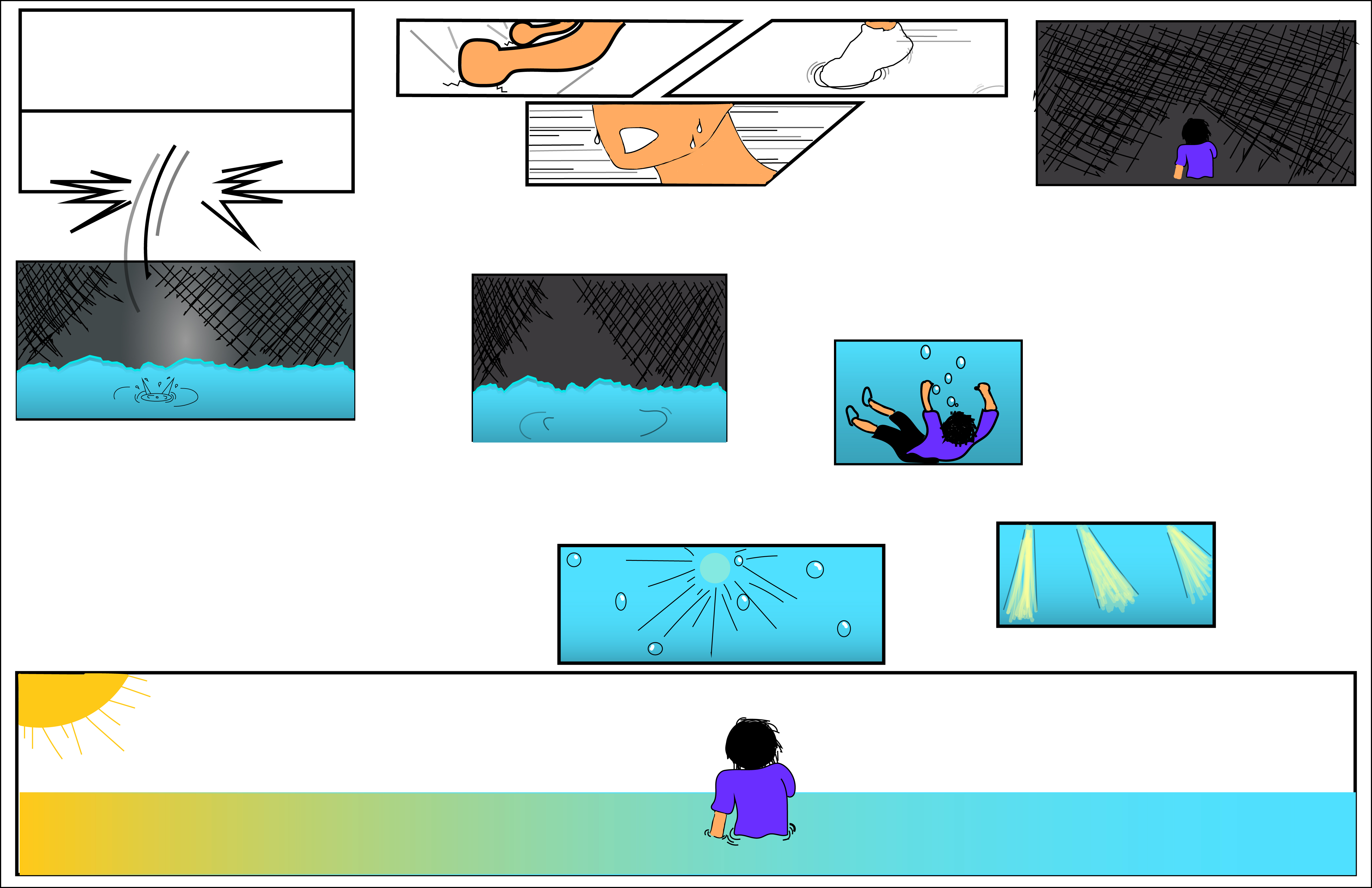
The Boondocks: Home Alone (remake) by: Isaiah Wilkerson

I chose a scene from an episode that had little to no dialogue to try and trick the readers to determine where to start when the drawings appear. This comic is still considered an “top-to-bottom”, “left-to-right” poster comic, so I feel like I kind of failed on challenging my reader. What I could do in order to fix it is to try and arrange my panels and still make sense to the reader. I believe that I used a “subject-to-subject” closure because I explained what was happening in my poster comic while staying within my scene or idea and gave the reader the opportunity to determine what could happen next. I used a little Linguistic mode for my poster comic to explain the relationship the two siblings have with each other. My comic describes the passage of time by creating an intense moment in time while staying within the same time frame.

Just like Photoshop, this is not my first time using Illustrator. However, because I was using a different computer from the last time I was on Illustrator, it took me a while to learn how to use Illustrator on a PC rather than a Mac. I used bold lines around my art to indicate that the scene was a loud and intense argument between two brothers. When the two brothers were pointing their BB guns at each other, I tried to make the lines a little thinner to indicate a quiet moment of them talking to each other quietly before the next scene that wasn’t displayed. I did this to create suspense as though the reader is reading the first page of a comic. The tools I used the most was the pen tool, the rectangle tool and the text tool. I used the pen tool for detailing my art and adding color inside each created shape, I used the rectangle tool for the panels and I used the text tool for the dialogue and title.


Posted in Fall 2019 Archive (201 Blog) | Leave a comment

Final Poster Comic: Madison Roby

First, discuss your creative plan for your comic. You were asked to employ inventive layout and design strategies to communicate the passage of time. How did you accomplish this? Second, discuss your experience using Illustrator.

Poster Comic Project, Madison Roby, 2019.

Overall, with my comic, I attempted to make a more snaking reading pattern, somewhat like a backwards “S.” At the end of the comic, there are 3 panels next to one large one; these panels are meant to be read in any order, whether that be from the large panel to the smaller panel then to the two smallest panels or from the large panel to the two smallest panels then to the smaller panel. In order to guide the viewer, I used some of the elements of the background, for instance, the last few panels where a river flows through three of the bottom panels. In this comic, I attempted to create closure between some of the panels through changing the viewer’s angle. For instance, the largest panel compared to the panel directly to the right (above the two) where the character goes from flying to standing on the edge of a cliff. I used very limited words in this comic (one sentence to be exact). I chose to place it in the bottom two panels where the character is not present, however, the panel space is taken up by the horizon in order to give a more peaceful scene to go along with the words. Overall, this comic shows the passage of time through the use of, mainly, the background. For instance, the third and fourth panels where the mountains in the background go from further below to higher up, implying downward motion. Along with this, using the drop shadow in the largest panel suggests the sun is directly above the character, then, directly after, the sun is going behind two mountains, implying that a lot of time has passed between the two panels.

For this comic, this was the first time I’ve ever used illustrator, as I have never used Adobe products before this class (and my Digital Media Print and Web class that I’m taking this semester as well). In this comic, I used simple shapes for the identifiable objects, as the character is not something that exists. For instance, the clouds, trees, sun, and mountains are deliberately simple and round to be easy to identify compared to the dragon character. Working with illustrator made it easy to create simple vector shapes using the stroke tool, however, it was difficult for me to erase certain things I didn’t enjoy, as it would change the entire stroke I made. The most helpful techniques were the selection and stroke color changing ones, as it made it easier for me to add color overall. Using the stroke tool was also easy, as there was a good amount of smoothing, so I didn’t have to worry about shaky lines due to using a mouse. Generally, nothing about Illustrator was confusing besides some technical difficulties involving the eraser tool and it leaving paths.

Posted in Fall 2019 Archive (201 Blog) | Leave a comment

Final poster Comic: Maria Alvarez

My creative plan for this comic was to make a comic about two bears who live in the same wooded area. My comic challenges the readers left to right because the boxes, as you can see, are not all the same size with the exception of two. They are not aligned and the two panels on the right are the same color/scene so it looks like you are supposed to read the whole panel but that is not the case. The reading is technically left to right but the size of the boxes challenges the reader to pay close attention to the story and words.

Bears Eat

I guide my reader through my comic by having the first bear (Jack) yell for Harrold which causes him to wake up, then he goes over to Jack to see what is going on. A guiding factor is the linguistics. I used the Additive concept in this comic where words amplify or elaborate on an image and vise versa. I think the reader would still be able to understand what is happening even without the words. But to be able to guide the reader, the words are helpful for determining which way to read.

When it comes to closure, I kept a few concepts in mind while creating this comic. I used a movement to movement concept while creating the bear sleeping and awaking. He is doing one action which is waking up which is a basic movement. I also used action to action because I had the grey and brown bear in different pannels where two different actions are being carried out.

My comic used the passage of time by having the sunrise as the beginning pannel and having a perfectly neutral and morning-like sky in the rest of the comic (with the exception of the last panel, that was used to demonstrate emotion.)

This was not my first time using illustrator, I have used it before to create logos but never to create a comic with characters. I was not experienced enough and still had to watch a ton of tutorials to accomplish my comic. I learned a lot of new things about anchor points and how to remove those to create specific shapes. In chapter 5: “Living in Line,” I learned about how lines can evoke emotion. I made my lines soft to evoke tranquility. I think I also do this by using soft colors and gradients. I wanted to emotion to be overall calming and funny.

I utilized the gradient tool a lot and I loved the way it made a lot of the colors look. Another useful tool was the pencil tool in the smooth setting. The last tools that were super helpful were the shape builder tool, the shape tools, the direct selection tool, and the selection tool. Those were my most used for creating this comic and were critical to creating most of my shapes.

Posted in Uncategorized | Leave a comment

Final Poster Comic: Sydney Seay

My poster comic for DTC 201 in the Fall of 2019.

My creative plan for communicating time in my comic was to play it simple, while also forcing the reader to participate. I chose to use the regular left-to-right and top-to-bottom format because I wanted to challenge the reader on time passing not forcing them to figure out where to read next. I guided my viewer through the comic using the typical comic boxes and flow. The closure I enacted was scene-to-scene because there are uncertain amounts of time passing between frames and actions that the audience can assume happen, but cannot be certain. I used the linguistic mode to show what class the character was taking at that point in time, making them picture-specific. The audience can understand the character is in class, but the words give more context as to what class. I see my comic as showing the passage of time as it does in life, sometimes obviously, what can feel like going on forever, or in other cases going by so fast the actions that happened are unclear.


This was my first time using Illustrator. I chose to use pretty basic iconography because I am not the most skilled artist. I think using more basic and familiar shapes makes the audience able to connect to the storyline better. Working with vector graphics was nice because it allowed me to be creative while not forcing me to go beyond my skillset. I don’t see the simplicity of vector graphics as a limitation, instead it made my confidence to make this comic higher. I used the pencil tool, especially holding the option key to draw a straight line, as well as the pen tool to create shapes. I used the brush tool to draw some backgrounds and food, along with the amazing layer quality of Illustrator. I pulled images forward and pushed others to the back by adjusting what order layers were being shown. I am still confused on the eraser tool, it does not work like one would expect so I just refrained from using it.

Posted in Fall 2019 Archive (201 Blog) | Leave a comment

Final Poster Comic: Nicholas Kawaguchi

Project 2 Poster Comic Final Iteration

Creating this comic within illustrator’s tools was certainly an interesting and difficult process. Figuring out just what to do as a concept was already difficult to begin with. However, giving it some more thought and managing to collect my thoughts, components of the main structure came about. Beginning with a more Japanese style, the panels are oriented to start from the top right of the page and goes left. Within these first few, aspect-to-aspect is used heavily. Despite depicting the same person, each panel shows a different angle of the person from the sweat beating down the character’s face to his foot splashing in the water. Going from the figure’s fists pounding against the ground to the next broken panel involves a bit more reader participation as there doesn’t seem to be an obvious link. Later it becomes apparent that the figure was pounding on the ground to break free from the panel only to fall into another. Then, the direction switches as it transitions downwards and moves to the right. From this point, the scenes where the character breaks through into the bottom panel and sinks in the water is seemingly non-sequitur, but is actually simulating more of action-to-action as the movement lines imply the character’s fall into the water. Before getting to the last few images, the panels that transition into to smaller sizes simulate moment-to-moment. Finally, moving further down the page, the last few panels are being seen from right to left again until the last large panel where closure goes from aspect-to-aspect with the figure sinking to the sunlight shining into the water to subject-to-subject as the perspective changes to first person when the character swims up and finally shows the figure standing in the water at a third person angle.

The closure very much differs throughout the piece as well with the middle section being more spread out while the upper and lower sections are more closely oriented. Due the the top portion taking place within a very fast paced and almost panicked moment, the spaces in between are kept close to keep that momentum going. As scenes transition towards the middle, the situation slows down, seemingly becoming still and quiet. For this, larger spaces are inserted to act accordingly to the slower atmosphere. Once reaching the end, that energy is slightly picked up again as the figure rushes towards the top of the water to finally end with him reaching that lighted point.

Although organized in a slightly stranger order, the comic maintains an implied, single line that threads through the entire thing. The lack of linguistic mode also contributes to that factor as some wordings spread throughout the comic would help to guide a reader. However, I enjoyed it more as comic that had no words, no guiding lines to lead a reader to a conclusion, but to rather have the reader purely understand the sequence of events in their own way.  

Having previously used illustrator, I felt confident I could get back into it pretty easily. However, this was not the case here. Many times I found myself stuck because I had an idea but was not sure how to do it. Referring back to tutorials helped to a certain degree, but many times I found myself utilizing the pencil tool to create certain lines that needed a more natural look or certain sections that were difficult to create with other tools. By using this tool more often, I get the feeling much of the comic does have a closer resemblance to being hand drawn in a sense but still holds some of that digital aspect  Although, some of the shape builder tools did help in creating, or at least, inspiring to other designs in the comic.

Posted in Fall 2019 Archive (201 Blog) | Leave a comment

Final Poster Comic: Bruno Signorelli

I struggled a lot to figure out what I wanted to do for this project, and I really didn’t know what I was going to do until I sat down and started working on Illustrator. I started off with the idea that I was going to do a comic recipe for something I ate the night before. This happened to be cereal with bananas in it which I believe is the best midnight snack, because I’m a firm believer that cereal is a better dessert than breakfast food. While working on it I realize that just making the recipe wasn’t going to be enough because it was really simple, so I decided to cut my project into two parts. The top side of my project would be a recipe and the bottom would be a scene of me eating it in my bed, which is where I usually eat it.

I believe my comic challenges the normal left-to-right reading experience because my project kind of works as a normal comic strip on the top half, and then just an image on the bottom half, but all together it really just makes a two panel comic strip page. I think my comic guides the viewer through the comic by having a very simple layout that is very clear to follow, and the use of repetition within the objects and the placements of these objects. The use of repetition also helps me achieve what I believe is moment-to-moment closure, because it shows a change of what is happening and also a progression in the recipe. The linguistic mode I used in my project I believe is additive because it gives a purpose to my images, which is stating my opinion that this meal is the “best midnight snack”.

I used Illustrator last year for a project, I didn’t really learn anything new in a technical aspect, but last year I used illustrator for the sole purpose to create logos, and this project forced me to learn how to use illustrator to say something, and create a story in a sense. The type of iconography I used in my project is something very simple and what I tried to go for is almost comforting because of its simplicity. This fit with what my project was trying to show, but Illustrator definitely had an effect on this, mainly because of my lack of experience and comfort on Illustrator. If I felt more comfortable with the program I might have tried to go for something different, but I did feel limited when it came to the creative aspect of this project, because for me Illustrator just seems very clean and perfect in a way, and that isn’t really my style. The tutorials helped me with how to create shapes and objects, how to mess with anchor points, using the gradient tool, grouping objects, and saving objects to my library. I used all this tools to mainly create my objects the way I wanted them to look, and also to keep my objects the exact same throughout the project. I don’t know if anything was necessarily confusing but my lack of experience and just not being very good with illustrator definitely made things difficult.


Posted in Fall 2019 Archive (201 Blog) | Leave a comment

Final Poster Comic: Libby Fletcher

This is the poster comic I created for DTC 201.

At the beginning of my creative process, I honestly had no clue as to what I was going to design. However, I was looking around online and found a comic that was organized like a pie chart. I immediately liked the idea of doing a kind of circular template. The reason I chose to design something that showed women’s history because I’ve been looking into activism and feminist movements for some of my other classes and I thought it’d be smart to incorporate my prior knowledge into this project.

My comic challenges the reader to read in a circular motion from the top left and around. I organized the panels in chronological order and I wanted the comic to lightly represent a clock. I guided the reader through this comic with the little captions that show the year that the events took place. However, I think the reader’s eye is naturally inclined to read the comic in a clockwise motion. I believe that my comic would be described to have scene-to-scene closure. I used linguistics relatively minimally. I mostly used text to make sure that the reader could understand what event I was referencing in the panels. For example, I decided to use text in the Equal Pay Act of 1963 to further push the reader into seeing the comic the way I’d intended. That being said, I did not write “We can do it” in the panel with Rosie the Riveter because I made an executive design decision to assume that the reader would know the history. Overall, my comic shows the passage of time through major historical events from 1840, when the first woman graduated college with a bachelor’s degree, until today where we are focusing more heavily on the rights and equality of all people, regardless of gender.

This project was not my first time using AI, but it was my first time extensively designing within the program. I think the most useful informationI learned was in regards to how to create and edit different lines to make them look exactly how I wanted. I’m definitely still honing in on these skills, but they’ve improved greatly from the time we started the project until now. I decided to use more cartoon like iconography for two reasons: 1. I am not skilled enough in AI to create hyperrealistic images and 2. I like the simplicity of the 2-D cartoon iconography.

Posted in Fall 2019 Archive (201 Blog) | Leave a comment

Final Poster Comic: Jake Bailey

“Like Clockwork”, a digital comic created by me detailing a technician racing against time to defuse a bomb unknown to the rest of the world

For my comic I believe that it challenges the readers right to left view because in my case it goes up to down in two separate columns with one side detailing the possible defusing and the other side showing the progression of the world as that is happening. I tried to guide the reader through the comic by having similar color schemes and semi-similar illustrations to help show which frames went together. As for closure I feel my comic uses two different types, one for each column. The first being subject to subject on the left where its the progression of trying to defuse the bomb in time but on the right side its more aspect to aspect where I’m trying to get the reader to just focus on certain parts of the drawings to show the passage of time in the outer world. I did end up using the linguistic mode in my comics and it was used as telling the unseen defuses thoughts under stress as he tries to complete his job and gets more and more panicked as time ticks down. I use the word image combo as the words just add more detail because without them you could tell the bomb was ticking closer to detonation but with the inner thoughts it adds to the drawings by showing the stress and panic someone in that scenario would be thinking. The strategy I used for the passage of time was in both the clock of the bomb slowly ticking down on one side and then almost a scene progression on the other side and I feel like I accomplished that by leaving just enough information in each panel to understand to the reader that they are supposed to move through those scenes like that which I feel like is an inventive strategy. Another approach I used which helps add to the margins and closure as well as the passage of time in some sense in the heartbeat background. If you notice as you move down the comic the heartbeat gets faster and faster which I believe help conveys how the character is getting more and more nervous as the time counts down, unknown to the images around the heartbeat as they are their own peaceful scenes that don’t understand the danger they are in.

This actually was my first time using Illustrator before so I had no idea what I was doing before this project. As for my line strategy I feel it was relatively simple as I just used many lines to create the different shapes that I wanted and didn’t deviate much from that approach. I think the reader will see it as a very simple style of line that I hope is easy for them to understand and process. I feel the inspiration I got from the vector graphics was to try and make the shapes I was imaging more that Photoshop because with lines it felt a little more like how I draw with a pencil in paper, one line at a time, so it was definitely more comfortable for me. The tools and techniques that I learned that most helpful was simply put, the line tool as understanding that allowed me to take the ideas in my head and convey them as best as possible on a digital campus. The only confusing was learning stroke and fill adn which to use and when which I eventually figured out pretty well by the end of the project/

Posted in Fall 2019 Archive (201 Blog) | Leave a comment

Final Poster Comic: Ivy Padayao

For this project, I decided to create a story about my dog and a few of his favorite things to do. I wanted to create a story line where the reader was able to start at any point and still interpret the same information, so the layout didn’t affect the plot line. I think this is really effective in that wherever the reader begins reading the comic, everyone can still get the concept I want to get across to them. I also wanted to incorporate a sense of time within

Final Poster Comic

this piece. I did this by creating a larger panel of Jax sleeping in the middle, and more panels of Jax sleeping just around the larger panel. This tells the reader that for most of his time he prefers and loves to sleep. As for creating a sense of closure, I believe my comic reflects the action-action type of closure. This is because in each panel you can view a different actin than what was in the last one, and the reader can kind of make up their own story in their heads of what Jax prefers to do between each of the actions you can see.

This was my first timing using Illustrator, so there was a lot of trial and error when it came down to the project, but overall i’m happy with how my piece came out. When creating this piece, i kind of wanted to make it to have a more “cartoony” type of feel rather than realistic or stick figures. I think this helps the reader relate their lives to my piece, with maybe comparing some things their dog does to mine. The tools that were most helpful for me during the course of this project that I learned from the tutorials were definitely creating clipping masks, how to use the pen tool, and using the brush/shape tools. I have learned a lot about this program and it was super fun to learn!


Posted in Fall 2019 Archive (201 Blog) | Leave a comment

Final Poster Comic: Bobby Brown

This project definitely came as more of a challenge to me, not only because I struggled to come up with a story for my comic, but also because of my lack of experience with Illustrator. When it was all said and done however, I was pleased with how it turned out.

My final poster project I created in Illustrator.

I tried to challenge my readers traditional method of reading left-to-right and top-to-bottom, but not enough that people are unable to follow it. While it wasn’t my original plan, I ended up having text boxes in basically every panel, and that alone definitely helps guide the reader through it. An example of closure from my comic would most likely be while the note is trying to travel to the oasis. The split-panel before he finds the oasis is designed to make the reader question how long it is before he actually gets back up to keep looking. I believe it best fits the description of scene-to-scene closure. My comic describes the passage of time both by the scene changes, and by the text boxes that are located at the top and bottoms of the panels.

This was my first time using Illustrator, and I feel that it shows. While I spent the time watching the tutorials provided by Adobe, I felt that I struggled understanding how to work in vector based workspace. The concept of creating shapes using different lines was difficult at first, and I’m still not super confident when it comes to creating them. When it came to choosing/creating an iconography for my comic, I wanted to lean towards a more minimalist style, both because I felt it would work well for my story, and because I was nervous to start adding lots of detail into shapes that were going to be resized many different times. Working with Illustrator was fun and inspirational at times, but when I started to get carried away with ideas, I found that I was unable to actually create them and bring the idea to fruition. Some of the most useful tools and techniques from the tutorials were learning the pen and anchor point tools, as well as the Pathfinder panel. The pen and anchor point tools were extremely important and useful when it came to creating both custom shapes and drawing the art for my panels. When it came time to actually combine the art I’d drawn into a custom shape, the Pathfinder panel along with the “unite” shape modes helped me make shapes that I could move around easily.

Overall, I found this project to be significantly more challenging than the Photoshop project, but I enjoyed it and felt that I completed my poster to the best of my ability. I would like to spend more time in Illustrator getting my bearings, then I feel like I would be able to push my artistic abilities a bit further.

Posted in Fall 2019 Archive (201 Blog) | Leave a comment