
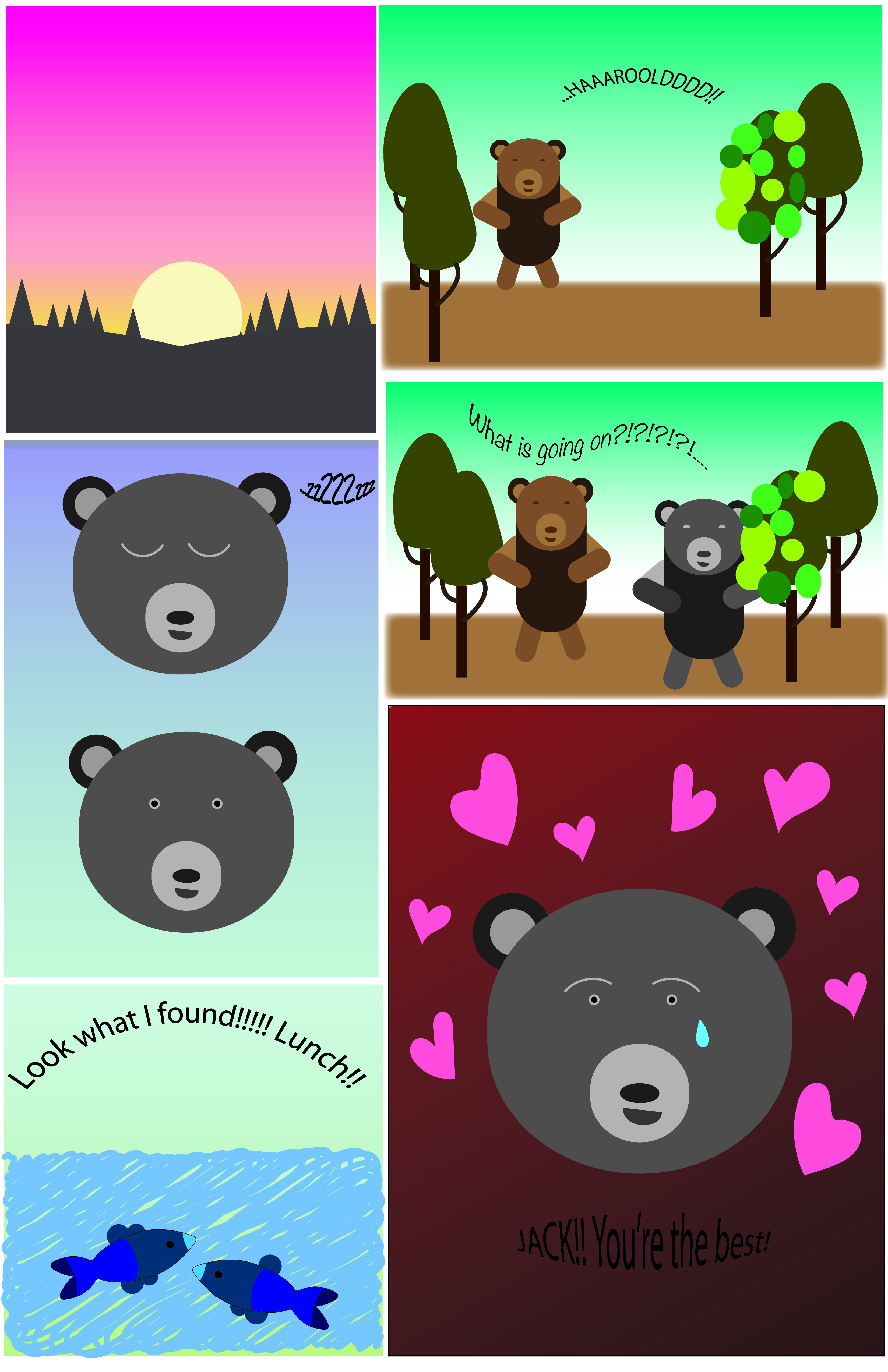
My creative plan for this comic was to make a comic about two bears who live in the same wooded area. My comic challenges the readers left to right because the boxes, as you can see, are not all the same size with the exception of two. They are not aligned and the two panels on the right are the same color/scene so it looks like you are supposed to read the whole panel but that is not the case. The reading is technically left to right but the size of the boxes challenges the reader to pay close attention to the story and words.
Bears Eat
I guide my reader through my comic by having the first bear (Jack) yell for Harrold which causes him to wake up, then he goes over to Jack to see what is going on. A guiding factor is the linguistics. I used the Additive concept in this comic where words amplify or elaborate on an image and vise versa. I think the reader would still be able to understand what is happening even without the words. But to be able to guide the reader, the words are helpful for determining which way to read.
When it comes to closure, I kept a few concepts in mind while creating this comic. I used a movement to movement concept while creating the bear sleeping and awaking. He is doing one action which is waking up which is a basic movement. I also used action to action because I had the grey and brown bear in different pannels where two different actions are being carried out.
My comic used the passage of time by having the sunrise as the beginning pannel and having a perfectly neutral and morning-like sky in the rest of the comic (with the exception of the last panel, that was used to demonstrate emotion.)
This was not my first time using illustrator, I have used it before to create logos but never to create a comic with characters. I was not experienced enough and still had to watch a ton of tutorials to accomplish my comic. I learned a lot of new things about anchor points and how to remove those to create specific shapes. In chapter 5: “Living in Line,” I learned about how lines can evoke emotion. I made my lines soft to evoke tranquility. I think I also do this by using soft colors and gradients. I wanted to emotion to be overall calming and funny.
I utilized the gradient tool a lot and I loved the way it made a lot of the colors look. Another useful tool was the pencil tool in the smooth setting. The last tools that were super helpful were the shape builder tool, the shape tools, the direct selection tool, and the selection tool. Those were my most used for creating this comic and were critical to creating most of my shapes.
