
First, discuss your creative plan for your comic. You were asked to employ inventive layout and design strategies to communicate the passage of time. How did you accomplish this? Second, discuss your experience using Illustrator.
Poster Comic Project, Madison Roby, 2019.
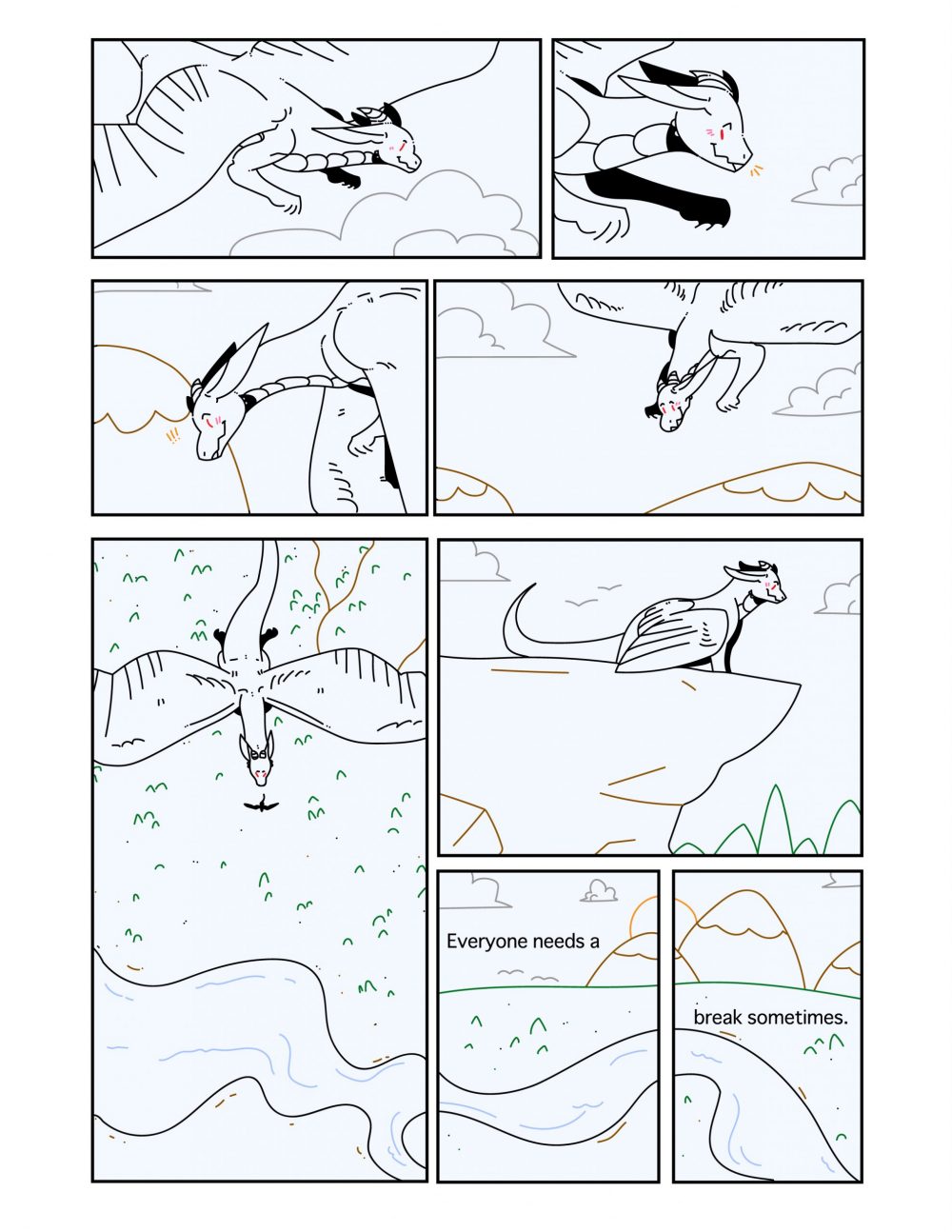
Overall, with my comic, I attempted to make a more snaking reading pattern, somewhat like a backwards “S.” At the end of the comic, there are 3 panels next to one large one; these panels are meant to be read in any order, whether that be from the large panel to the smaller panel then to the two smallest panels or from the large panel to the two smallest panels then to the smaller panel. In order to guide the viewer, I used some of the elements of the background, for instance, the last few panels where a river flows through three of the bottom panels. In this comic, I attempted to create closure between some of the panels through changing the viewer’s angle. For instance, the largest panel compared to the panel directly to the right (above the two) where the character goes from flying to standing on the edge of a cliff. I used very limited words in this comic (one sentence to be exact). I chose to place it in the bottom two panels where the character is not present, however, the panel space is taken up by the horizon in order to give a more peaceful scene to go along with the words. Overall, this comic shows the passage of time through the use of, mainly, the background. For instance, the third and fourth panels where the mountains in the background go from further below to higher up, implying downward motion. Along with this, using the drop shadow in the largest panel suggests the sun is directly above the character, then, directly after, the sun is going behind two mountains, implying that a lot of time has passed between the two panels.
For this comic, this was the first time I’ve ever used illustrator, as I have never used Adobe products before this class (and my Digital Media Print and Web class that I’m taking this semester as well). In this comic, I used simple shapes for the identifiable objects, as the character is not something that exists. For instance, the clouds, trees, sun, and mountains are deliberately simple and round to be easy to identify compared to the dragon character. Working with illustrator made it easy to create simple vector shapes using the stroke tool, however, it was difficult for me to erase certain things I didn’t enjoy, as it would change the entire stroke I made. The most helpful techniques were the selection and stroke color changing ones, as it made it easier for me to add color overall. Using the stroke tool was also easy, as there was a good amount of smoothing, so I didn’t have to worry about shaky lines due to using a mouse. Generally, nothing about Illustrator was confusing besides some technical difficulties involving the eraser tool and it leaving paths.
