Final Poster Comic: Tom McLean

My Final Poster Comic – Printed on 10/30/2019

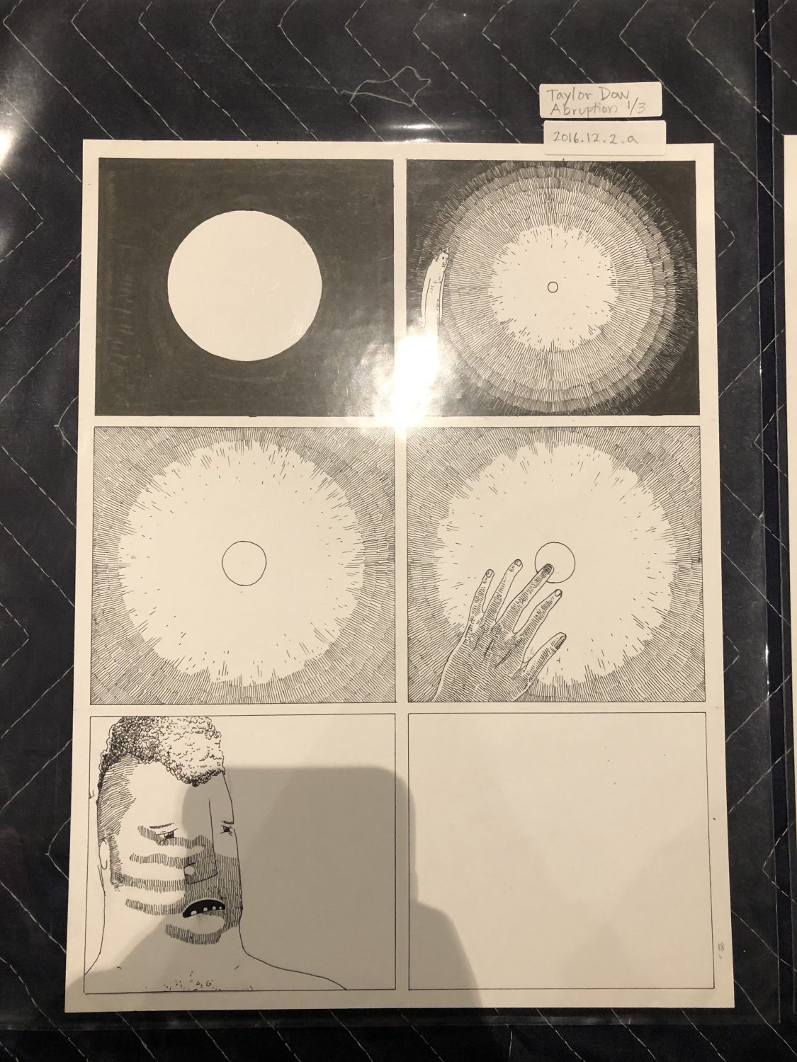
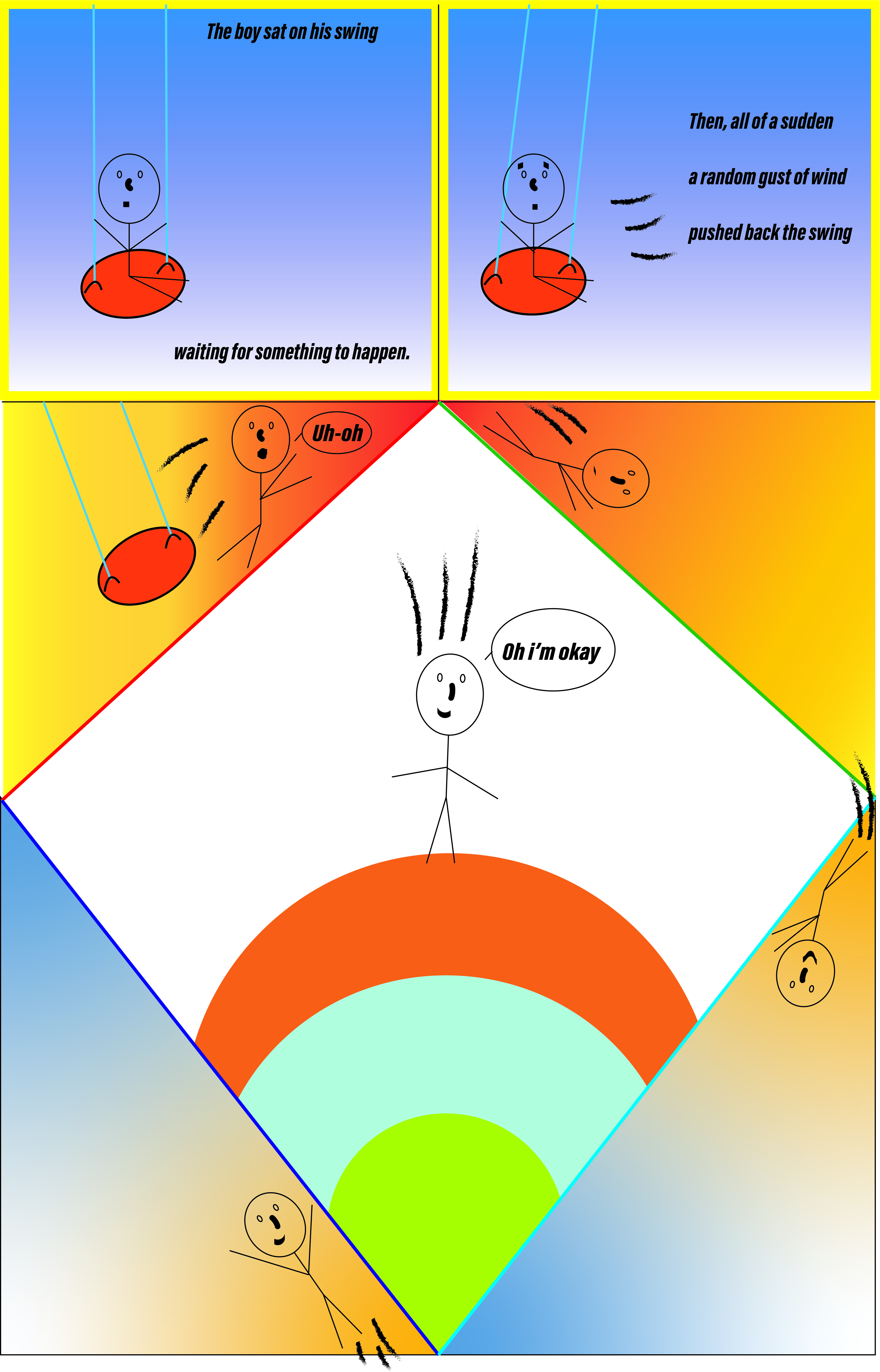
For my poster comic, I wanted to show the passage of time by drawing a character on a swing and his actions when a gust of wind moves him off the swing. I showed this as a timeline due to the action panels showing that he is in a continuous motion of movement. The way that I challenge me reader in how my comic is read is in how I made one large image in the middle of the comic and put the scene transitions on the outer edges of the comic. I also utilized the gutters of my comic in how the movement of my character can help the reader know where to look next.

The way that I show closure in my comic is in the way that I combine words and images in my last frame in the middle of the comic. My character tells the reader that he is ok after falling out of the swing and is firmly planted on the ground. I use words in the beginning as a narrating voice and as well as my character using his own words in the comic. These linguistic modes of information help the reader to understand why my character fell out of his swing, as well as to give a sense of closure to the comic at the end. My comic shows the passage of time in the sense of the entire comic showing an action sequence and the character reacting to it as a normal person would. The use of my frames shows the passing of time because of how my character is moving in a natural and flowing way.

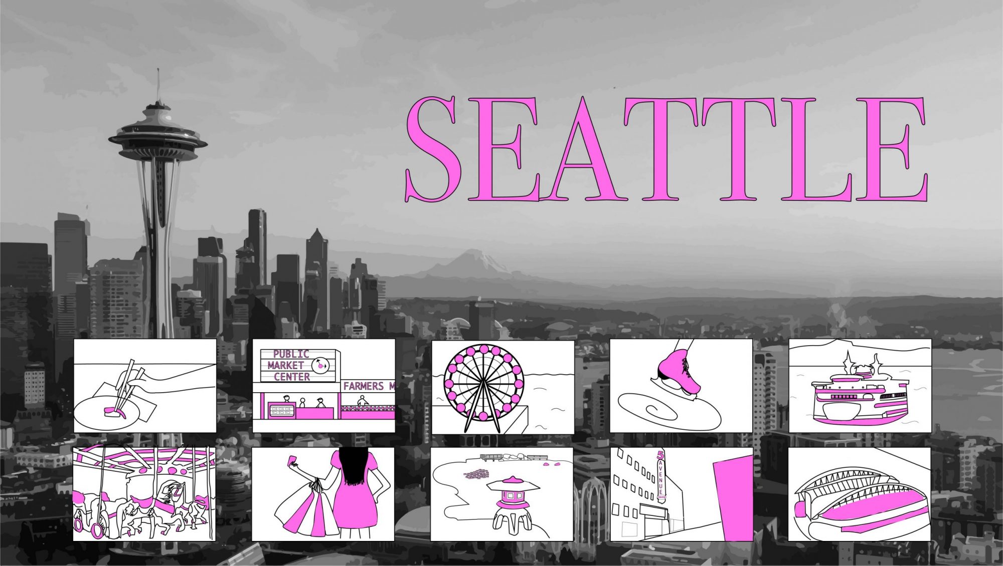
This was my first time using illustrator. So for me, everything was new to me. However, I did find illustrator more interesting to use rather than photoshop. My style of iconography used was the use of the essentials and I kept most of my artwork minimal. This was done because I have always enjoyed comics that keep their artwork simple so that the reader/viewer has an easier time when they are interpreting the comic. I don’t like the heavy use of lines in order to make a more detailed comic, I believe in that keeping artwork simple for comics it gives more control to the reader rather than the person who created the comic to tell the reader how to feel. I feel like illustrator give more tools to people that want to keep it simple rather than to make it more complex. For me, the most useful tool was the group tool. This made my life and experience easier when using illustrator due to me keeping my character consistent in how he looks as well as being able to move him around as a whole in one click.


Posted in Fall 2019 Archive (201 Blog) | Leave a comment

Final Poster Comic – Helena Matheson

For this project, I knew I wanted it to be about my hometown of Seattle. I have been pretty homesick recently and it helped remind me of the things I love about my city. My original idea was to have each of my comic squares attached to a certain point of the Seattle skyline but I felt that it looked really scattered and disorganized which bothered me, so I ended up placing my squares at the bottom.

Seattle by Helena Matheson

There is no specific way that you need to read the comics but I think they’re naturally read in a left-to-right order. I think when you first look at my comic you see where it says “SEATTLE”, then the skyline, and then the comics at the bottom. I think some examples of closure are shown in a couple of my squares through Scott McCloud’s action-to-action. My favorite action comic is the one of the ice skate, because I think it plays in your mind the action of someone actually skating in a loop. I tried to use minimal words in this project because I didn’t think they were really necessary. The few words that I did use were for the title and then also for the Pikes Place comic and the 5th Avenue Theater, because it would be pretty hard to tell where exactly I was talking about if I hadn’t directly labeled them as such.

This was not my first time using Illustrator but I think that this project taught me a lot about it. I really enjoyed learning about the image trace capability because I have never used it before but I think that it added a lot to my project and makes it look higher quality. I think the skyline draws viewers through the Space Needle being such a well known icon. I’m glad that I was able to use the image trace for it because I fear my own drawing of the space needle would be harder to recognize. My favorite tool I used was the straight line tool, because it is very versatile snd helped create many of my items.

Posted in Uncategorized | Leave a comment

Final Poster Comic: Grace Kannberg

For this project, I was asked to employ inventive layout and design strategies to communicate the passing of time. By doing this, I got a better understanding for comics and what goes into making one. When creating my comic, I challenged the reader’s normal left-to-right sequence by creating a snake-like pattern. I found this strategy to be an easy guide for the viewer, as well as keep them interested in the story I was trying to tell. When I gave my comic to my friends to look out, they all said that they liked the snake-like pattern because they had to pay more attention to the story.

Throughout the possess of making my comic, I used the strategies of closure and linguistic modes from Scott MacCloud’s Understanding Comics to help me create the final project. When looking at closure from chapter three, I used the scan-to-scan transition to convey the passing of time from in the classroom to Christmas day. This transportation of time suggests that the time frame the comic takes place in is both before and after Christmas. Therefore, giving the viewer a better sense of the setting and what is taking place.

A Christmas Story By: Grace Kannberg-October 31, 2019. A project created in Illustrator

The linguistic mode I used to enhance my storytelling is interdependent and montage. Throughout my story, the dialog and pictures go hand in hand to tell a story that, alone, they couldn’t. This interdepended linguistic element allows the viewer to better understand and enjoy the story. When using the montage mode, described by McCloud as words that are treated as if they are a part of a picture, I use it in a very deliberate way. I only use it once when people in John’s class laugh at him after sharing his letter to Santa. This was done to emphasize the emotion that John was feeling in a way that a simple dialogue couldn’t do.

Overall, the passage of time is described in my comic by the snake-like pattern and the splitting of time from before Christmas and Christmas day. It is also defined through the passing of movement. When John and his parents drove to the hospital there is a closer that we put together in our heads that time has passed for them to get there. I think that my strategy was inventive because it splits the time in a single comic.


Just like photoshop, this is the first time I have used Illustrator and I found it to be just as challenging. The tutorials were helpful, but I still found things to be puzzling when I sat down to make my comic. I am not someone who learns from videos, but more hands-on and from a person. When using the Illustrator platform, I used a shape and drawing iconography because the style allowed me to convey my story in a creative and emotional evoking way. For example, the style in which I made the lines and shapes in my first panel helps the viewer to get a feeling of a calm environment. Moreover, the circle shapes in my fifth panel directs the viewer’s attention to John and gives a more focused emotion that is sad. Working with Illustrator and vector graphs inspired me because it made me think more critically about what I was doing. This was because of both the possibilities and limitations from using the platform. I felt like I could make a very straight forward comic, but anything extravagant was limited because of the solid colors and tools that I had to use.

The best tools and techniques that I took away from the tutorials were the grouping tool and the drawing tool. I used the grouping tool to group shapes to make characters and objects (such as the Christmas tree). This made it easier to move things around and place things where I wanted them. I used the drawing tool to create most of the elements in my comic. It allowed me to be creative and add elements that I couldn’t with the shapes provided.  If anything, what was confusing was getting started and learning how to use all the different tools together.

Posted in Fall 2019 Archive (201 Blog) | Leave a comment

Final Poster Comic: Ana Maria Alaniz Mendoza

AlanizMendoza_AnaMaria_Project_02

Divorce – A comic written and illustrated by Ana Maria Alaniz Mendoza.

Creative Plan: For starters, even though I did use a left-to-right and top-to-bottom layout, a viewer will not necessarily know that they should read the top half of the page first and the bottom half second unless they are actually looking at/reading the comic and analyzing the details of the imagery.

A couple tactics I implemented to guide viewers through this comic include the spatial relationship of each panel, the color scheme in each panel, and linguistic symbols. Each panel has the same distinct rounded corners and space in between so that a viewer will know automatically that they all work together to tell one story. The purple panels versus the yellow panels represent two different rooms in the same house and two sides of the story altogether.

In chapter 5 of Scott McCloud’s Understanding Comics, he presses into the invisible worlds of senses and emotions that all aspects of comics show to some extent. In my comic, I pressed into sense and emotion with my character’s facial/body expressions, linguistic mode, and overall linguistic symbols. A few symbols, for example, include the steam coming from the pot on the stove in the top yellow panel, the sparkle on the high heeled shoe, or even the mouth shape each character has in each scene. Some of the words I added to this design are conversational, some are sound effects, and some are thoughts.

Most of the closure I see in my comic is subject to subject which stays within a scene or idea while still showing multiple parts. For example, every panel that has a box in the illustration shows different ways the little girl experienced and discovered new things while in her mom’s closet.

Experience using Illustrator: I’ve been gaining Illustrator experience over the last three years. This is only the second time I have utilized different layers in the layers panel on Ai and it was a great way to challenge myself/stay organized.

In chapter 5, p.132 of Scott McCloud’s Understanding Comics, he says, “When a story hinges more on characterization than cold plot, there may not be a lot to show externally, but the landscape of the characters’ minds can be quite a sight!” My iconography is very simple and playful, however, the message in my comic is more personal and serious. I did this because I think many people may find this comic relatable in regards to the extreme ways divorce impacts kids without people realizing it.

Lastly, I also am a stick-figure type of person which is why Illustrator is so great. Illustrator allows me to think with lines and shapes in a more advanced setting. I found the shape builder tool and the expand text tool the most helpful for this project specifically. Using layers was confusing sometimes, but only because I am not used to it yet.

Posted in Fall 2019 Archive (201 Blog), Sample Posts by Students | Leave a comment

Final Poster Project: Matthew Mollet

Final Poster “Dog’s Dream Day”

My inspiration for this poster came from me thinking about my dog back home. I was thinking about what he might enjoy doing, and decided to make my poster about thay. My comic breaks the timeline norm because it does not read in a determined consecutive order. My art inspiration came from looking at cartoons of dogs so I could see how to best draw them, and then I added different characteristics to my drawings. The reader can go in any order to see the comic, but I made the first scene (the dog sleeping) larger than most so the reader starts there. The comic shows what I would think my dog, and any dog, might be dreaming about when they sleep and what their perfect day would look like with a cartoony style. The passage of time did not really have a role in my comic because I wanted to show scenes that would be in a dog’s dream. I think my strategy is inventive because most comics have panels to follow, but my comic is more of a scatter of scenes with no real order.

This is not my first time using illustrator. I tried to make the scenes detailed with different colors and movements for the dog to do. I did have difficulty with he different angles of the dog’s face and that is something I wish I would have put more time into, and I feel that this was a limitation because it was difficult to make the dog look the exact same at different angles. I wanted to instill the feeling of a dream into the comic so I left a lot of white space, like the dog is in a clouded perspective.my iconography is only the title of the comic at the top, simply so the reader knows what is happening in the scenes. The tutorial techniques I used the most were distorting the shapes and creating curved lines with the pen tool. The thought bubbles on the outside of the scenes might guide the reader, but it would not make any difference if they read it in another order.

Posted in Uncategorized | Leave a comment

Final Poster Comic: Dahlia Xie

For my final poster comic, I originally planned to make a stereotypical multi-paneled comic but I ended up scrapping that idea. After reading the requirements for this comic, I spent a long time brainstorming ideas for how I’d convey time and closure, and challenge the typical way of reading comics from left-to-right and top-to-bottom. One idea I had was to have a comic that would read differently depending on if you read it in the typical western way versus the opposite (right-to-left and bottom-to-top). Unfortunately, I couldn’t think of a storyline that I liked. I ended up just making my comic only one frame. I focused it more on time instead of making it challenging to read. My comic pictures a skateboarder doing a trick off of the sidewalk. I opted out of using icons for motion because I felt as though the comic did not need any, the skateboard is in the air so that already implies movement. The rest of the comic is kind of up to interpretation.

The car could be about to hit the skateboarder, or the skateboarder could be about to hit the car, or maybe the skateboarder slipped on the strange slime-like substance on the ground.

I think my comic uses aspect-to-aspect closure the most. I used two smaller frames to highlight separate aspects of the comic: The skateboarder’s eyes, and the surprised driver. I used some text to express the distress of the driver because I felt like I couldn’t display his emotions very well through just his facial expression.

I had never used Illustrator before this project, I found that it was like a much more complicated version of Paint. I used the pen tool and the paintbrush tool the most. I found the pen tool to be really complicated because I forgot to connect endpoints so it made filling the shapes really complicated. I ended up trying to figure out the endpoint connections but I had mixed using the pen tool and paintbrush tool so I couldn’t use the fill option for many parts of the comic. I tried to make my comic relatively minimal but detailed enough to make sense and look nice. I think since I had no background in Illustrator, I didn’t want to try and do too much or else I’d have an even steeper learning curve but at the same time I didn’t want to just do stick figures or something extremely simple. I think my final comic project ended up being a balance between the two.

Posted in Fall 2019 Archive (201 Blog) | Leave a comment

Final Poster Comic: Elora Buschini

project 2

Project 2 comic: I made this with the inspiration of my dogs and how they interact with the world

My comic reads easily from left to right in four simple panels. Although there it does not require reading it translates a story. The viewer is guided by the dog throughout the comic and reading left to right like you would normally. This gives a nice opportunity for readers to have closure and intemperate what the story is without having to use words. This is represented by the different types of weather seen, this would alert the reader to know that the weather is happening at different times. My comic shows time over the course of a year ( or four seasons) through out four panels. So even though there is only a short amount of time read between each scene the reader knows that these are examples of different seasons.

This is not my first time using illustrator, but it is for a class requirement. My experience is from watching people I know use it- and from there using it for myself leisurely. I used iconography to show movement and location. Although nothing in the comic is a real physical thing, the reader knows that the sun is a sun, lines near the dog show movement as well as and the pathway of the butterfly and leaf. I mostly used the pencil tool and paint brush. This was the easiest way for me to make out my shapes using a stylus. I also used the shapebuilder to make my drawings whole. I also used a grid to make my panels so that they would all be the exact same size. Using multiple different layers make it more organized for myself. I started out with a pencil drawing and layered on top of that. This way I could create my background and shapes separately and then color on top of that while still being able to hide layers that weren’t needed (like my original sketch).

Posted in Fall 2019 Archive (201 Blog), Uncategorized | Leave a comment

Individual Voices: Erika Epperson

Unidentified Feeling Object by Mita Mahoto

When I was at the art museum most of the stuff that I liked were ironically from the same artist, Mita Mahoto. I really liked her concepts and also her cute, bubbly designs. The one I chose in particular is called Unidentified Feeling Object. It was about a ufo that accidentally dropped a heart into the earth. It shows how love is something hard to explain scientifically or make sense out of, its just a feeling we can’t explain either if it’s the kind of love that you have for your friends and family or the type of love that you have towards a significant other.

In these pages you can see the horizontal lines on the left side of the ufo indicating that the ufo is flying by very fast and in a hurry. Also in these frames you can see that they are movement to movement which creates very little closure in between. I really liked how the artist used the two frames and made her comic more 3-D by having the heart get stuck in between one of the frames making the heart fall from the sky. I really think it’s clever how she did that. 

Unidentified Feeling Object by Mita Mahoto

On this page you see the heart fall to the earth by following the squiggly line. You can tell that the heart is falling down and not up because of how we read comic, left to right, top to bottom. I think even without very many words it is a story that is easy to follow and I really liked how the artist kept it lighthearted while still creating a deep meaning to the story. I thought this was relatable and a really cute story that represents the mystery of love. 

Posted in Uncategorized | Leave a comment

Individual Voices: Brayden Jacobs

Art has been something hasn’t done much for me. I’ve enjoyed landscapes and the vast beauty that the nature in Western Washington has, but non-natural art has never been something that has made sense nor spoken to me. Throughout my college experiences and growing as an individual, I’ve come to appreciate art and the many forms it comes in, especially the messages that these artists are trying to portray.

Eroyn Franklin

Out of all the art that we had the opportunity to observe this past Tuesday, Eroyn’s image of this fantastical home burning with the assumed family peacefully sitting in front of the destruction struck a cord with me. The intense blues, often signifying sadness and depression are interrupted with the calm orange of the family, sitting in the lawn staring at the blazing inferno. The scene is almost blissful admits the chaos. It seems as if the burning house brings calmness and freedom to the four individuals.

If I were the one living in this art, I would be terrified, calling the fire department and trying to salvage anything I could from the house. House fires are one of the most devastating things a family with a decent income can go through. Not only are those affected left with nowhere to stay, but a house represents family, and contains all those memories and belongings. By the house’s size you can determine whoever owned it was decently well off; Its not some shanty shack. But even then, the family isn’t panicking, and the smoke coming off the house reinforces that feeling.

The plain white smoke, in a singular white color. A sense of new begging as if the smoke is clearing the artist’s canvas for new and exciting things. This picture isn’t just depicting the end of a home, but the beginning of whats to come. The blue’s that cover the majority of the canvas are of varying shades and dimensions, bringing emotion and change to the situation, but the white is pure and clear. Time is frozen in this still art piece, but there isn’t panic or fear; freedom and tranquility are what overcome this tragic scene.

Posted in Uncategorized | Leave a comment

Individual Voices: Eddie Abellar

“Abruption” by Taylor Dow
1/3

The work of art I chose to write my blog post about is called “Abruption”, by Taylor Dow. I chose this work of art because I related to it the most when we went on our visit to the WSU Art Museum Collection Study Center. To me, Taylor Dow is expressing a feeling that most people have experienced, one that I have experienced many times in my life.

In the work of art, there is a tall white figure that touches the tip of his finger to a floating bright ball of light. As the figure touches the ball of light, a shadowy figure slowly starts to appear. The shadowy figure is the same height and even has the same hairstyle as the white figure. As soon as the shadowy figure has fully appeared, it takes the floating ball of light with two hands and swallows it whole. With the ball of light shining bright within the shadowy figures stomach, he walks away with his head down, leaving the white figure alone and confused.

“Abruption” by Taylor Dow
2/3

To me, this work of art expresses how quickly or “abrupt” negative thoughts or feelings can come up even after experiencing a tiny bit of happiness. I have had this happen to me many times before. I’ll experience a happy moment with friends or family, or I’ll accomplish a goal that I’ve set for myself, and immediately after having that happy moment negative feelings start to creep up, ultimately making me feel low for the remainder of the day or sometimes for even longer.

“Abruption” does an excellent job of showing the passing of time within the artwork. The image that does this the best is in the third panel of the second page. In this panel, Taylor Dow shows the shadowy figure slowly appearing by using small black dots to

“Abruption” by Taylor Dow
3/3

represent the particles slowly coming together to form the shadowy figures hand.

Posted in Uncategorized | Leave a comment