Individual Voices: Dane Graves

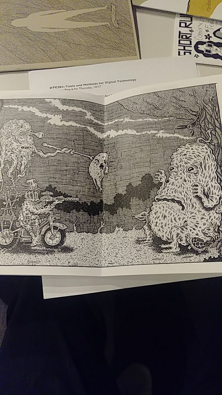
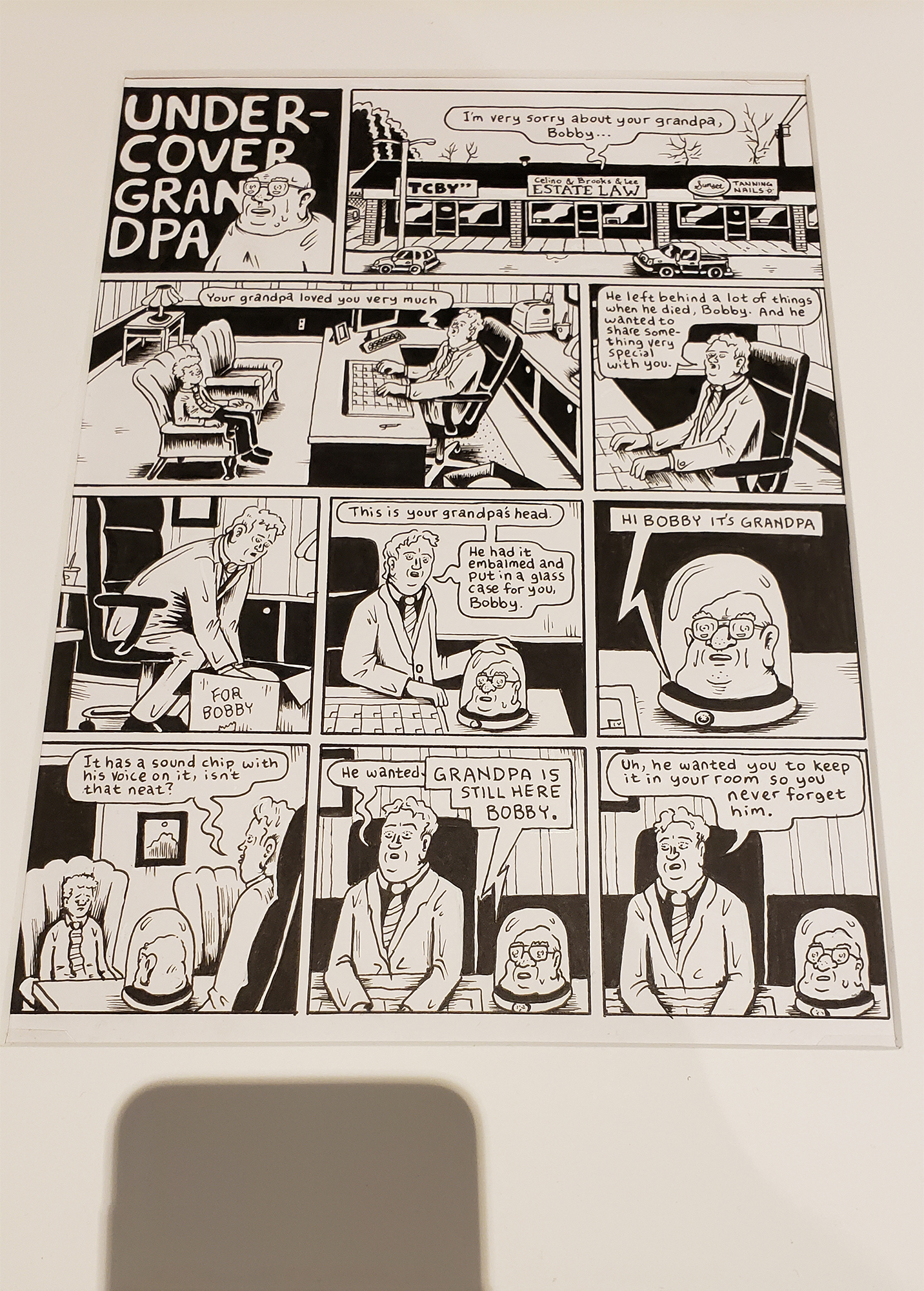
Undercover Grandpa by Tom Van Deusen

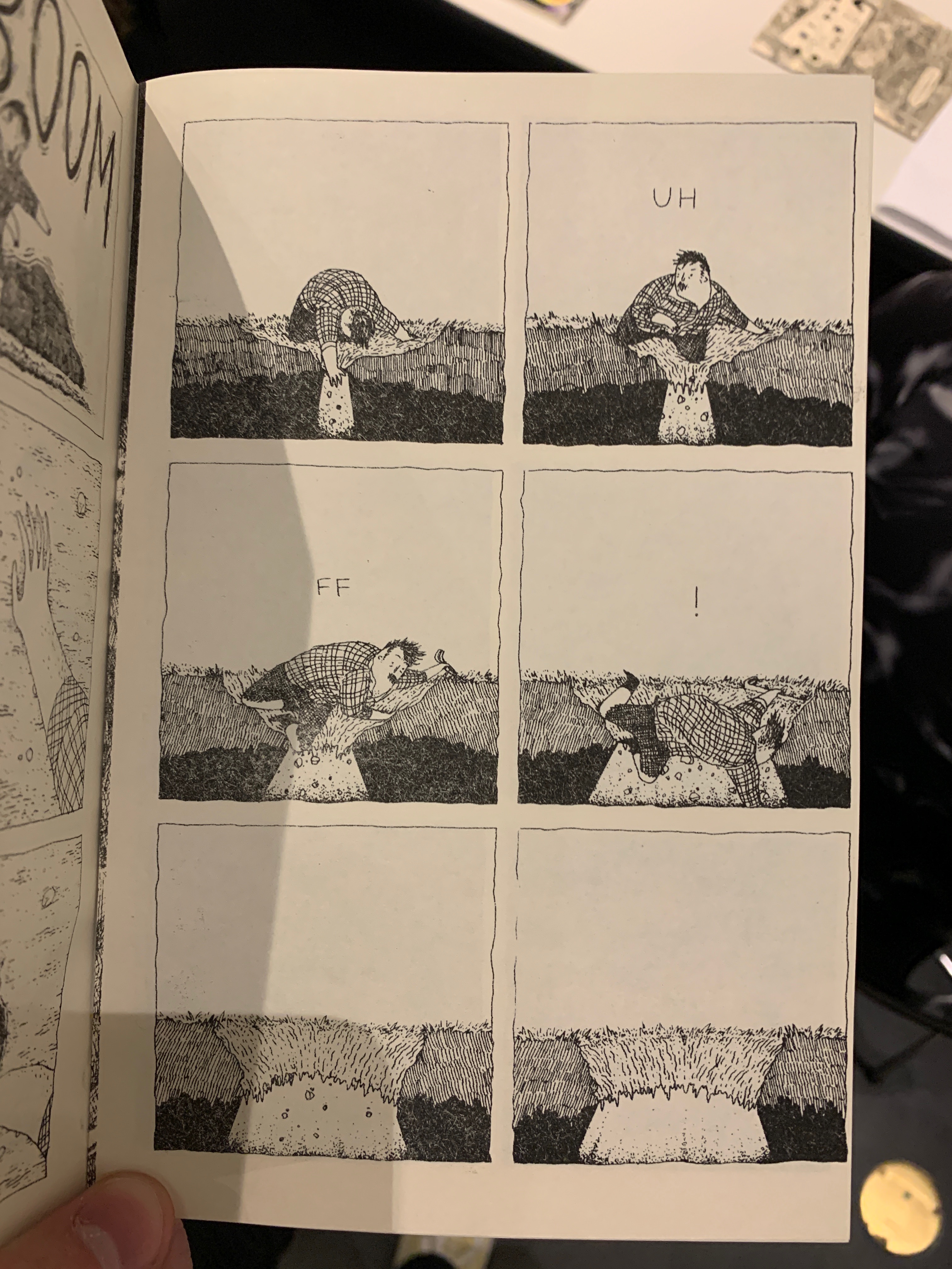
I chose a comic from the Fine Arts Center Collection called “Undercover Grandpa” to look at how it shows the authors individuality. There were many comics at the Collection that were appealing and showed the differences from artist to artist, but this one caught part of my sense of humor and what I find interesting. This comic is a two page comic, but I’m only showing the first page. This first page is really just a one sided conversation from a man in a suit working for an Estate Law Firm. The man is apologizing to a young man named Bobby whose Grandpa has just died. The estate agent is serious and mournful for Bobby during his conversation telling him his Grandpa loved Bobby “very much” and gives Bobby something “very special” that his Grandpa wanted him to have. This very special something is his Grandpa’s actual head embalmed and put in a glass case. The head even speaks from a voice chip to Bobby. While the agent is speaking the Grandpa’s head says “Grandpa is still here Bobby” rather creepily interrupting the agent before the agent continues telling Bobby that his Grandpa wanted the head put in Bobby’s room so he never forgets him.  This entire one sided conversation where Bobby never speaks and looks extremely unhappy the entire time is completely ludicrous and rather dark humor. His Grandfather has just died and gave him his real head with prerecorded rather creepy voice lines with the request of keeping the head in his room. This conversation is played out seriously by the estate agent adding to the uncomfortable rather dark humor wrapped around the situation. Expressions of characters are clearly unease and sorrow in Bobby with the estate agent playing everything straight. Grandpas head doesn’t change expression either, adding to the awkwardness of the moment. The humor is dark and uneasy which of all things I think really speaks to what type of person wrote it. I feel that humor is something that isn’t easily faked and comes through more true in work and is easier to notice than some other emotions, which is why I chose this comic.

Posted in Uncategorized | Leave a comment

Individual Voices: Patrick Istvan

Max Clotfelter “Andros”

Max Clotfelter’s artwork caught my eye from the moment I saw it. I have a bit of a fascination with the darker side of comic books and art. His art style embodies a very interesting take on things. The meatloaf type form his characters take gives me a sensation of boiling down to a sinister oneness.

Almost none of Clotfelter’s characters have straight lines in their depictions. I feel like this also emphasizes the imperfect quality of their personalities, as they are almost always doing depraved things in the mini stories. His artwork goes hand in hand with the stories he tells in his comic books. It is a great embodiment of the dark subjects that Clotfelter touches on with his stories.


Posted in Fall 2019 Archive (201 Blog) | Leave a comment

Individual Voices: Justin Pardini


Apocalypse Dad

For this activity, I wanted to find the image/s that spoke the most to me or gave me a reaction. One of the first books I picked up ended up giving me an emotional experience and was very eerie and creepy to me. Apocalypse Dad, was filled with cool images and depictions of a father attempting to find his ‘daughter,’ however, weird twists came about in the end. I chose these specific images because this is where the story took a turn and began to reveal the darkness beneath everything. The darkness, s well as the space the images were created in, gave me a sullen and tense feeling, which made me want to continue reading. This helped me to be drawn into this zine and showed its true purpose in the end. Ultimately, I had fun exploring these pieces of art, and wish to continue doing so in the future.

Posted in Uncategorized | Leave a comment

Individual voices: Arron Borja

I feel that this is one of the most creative and engaging zines that I have encountered. Time and motion is presented in this zine very well. I believe that the reader can make the indication that these two figures are in their older ages by simply examining their facial features.


Now regarding motion, the artist clearly takes it into consideration while making the two characters’ hands as they help the reader better understand what they are potentially talking about. I also chose this particular zine because regarding word-image combinations, this zine does not have any words besides on the front cover. I really respect that this artist was still able to strongly tell a story about two people and their seemingly toxic relationship.

In chapter 9, McCloud says that in today’s comics, there is only “one form of mass communication in which individual voices still have a chance to be heard. Taking this in mind, I think that the artist of this zine really hit the nail on the head in bending this commonality. The artists forces the reader to think outside of the box. I myself even feel like I have an accurate idea of what the story’s about.

Posted in Fall 2019 Archive (201 Blog), Uncategorized | Leave a comment

Individual Voices: Elora Buschini

Hitched by Mita Mahato was able to show them self through their work. I was drawn to this zine in particularly because of how personable it seemed. On the back they wrote a thank you to the person that they had received the maps they used. This made it feel more realistic that these were real maps had used from the road trip. At first when I read it I thought it was just memories they had from their road trip and were using it in story form to remissness on it.  Then as the story went on it became more of a whimsical story with things flying through the air. I felt like the Photoshop technique used made it feel like it really was maps and memorabilia from their trip. This reflected their voice to me because they let me seen into their trip which is seemly important to them.

I also chose Scorched by Tom Von Deusen who was writing about a character named Tom. I found this one interesting because of the way that the character was portrayed. They seemed like a slob, were rude and over all made you not really want to root for them. I thought this was an interesting way to show who they are (maybe tried to include flaws), that was until there was another character introduced. In this zine a second character named Tom was introduced and ended up with the girl. I wondered if as an artist this could be literally Tom based on the names, but also create multiple characters to reflect the multiple sides of Tom Von Deusen. Or is it more simple than that and he only relates to one of the characters, or maybe none at all.

hitched comic

Hitched by Mita Mahato

tom comic

Scorched Earth by Tom Von Deusen

Posted in Fall 2019 Archive (201 Blog), Uncategorized | Leave a comment

Individual Voices: Ruby Pitts-Cranston

Image of comic “Abruption” by Taylor Dow

During our visit to the WSU Art Museum Collection Study Center I looked at the comic Abruption by Taylor Dow. I chose this comic because I felt that it was very unique and I really like the art style used. This comic used minimal text, so the majority of the story was told through imagery alone. When looking at other comics by the same artist I noticed that this was a common theme in his work. A couple of pages from Abruption were also enlarged but I’m choosing to look at the comic as a whole. Since this comic had minimal text, and since the imagery was a bit bizarre, it was very open for interpretation, but there was a general storyline that was easy to follow. It starts with a person in a clearing, that appears to be on a strange, maybe alien planet. He starts to run from some weird human like creatures and ends up climbing up a giant tree in the ocean. In a hole in the tree there is another person who calls out to him, but he keeps running and climbs further up the tree while hands reach out at him. He then jumps off of the tree onto what appear to be clouds and finds a house that’s very dark inside. There he encounters another “person” who eats a ball of light and leads him up a ladder to what looks like a moon.

Image of comic “Abruption” by Taylor Dow

The two characters get separated by a canyon, until they run and jump towards each other, where the comic ends when they meet in the middle. It’s hard to know what the goal of the main character is, whether he is just running from the creatures in the beginning, or if he had some other goal in mind that started before the comic did. The artist definitely has a very clear voice, and its easy to discern their work from others. The strong black and white contrast as well as the unique use of line to show texture and value give the comic a dark and mysterious feeling. It almost feels like the whole comic is a dream, or just happening in someones head. The artist also utilized many different types of panels in the comic to show time and motion.

Image of comic “Abruption” by Taylor Dow

One of my favorite examples of this is when he shows the main character jumping into the water, where he has two different frames that line up to show a larger scene. Another part of the story where I feel that the artist utilizes time frames is towards the end, when each page is a full spread showing the canyon, and multiple pages in a row show the same thing to sort of extend the amount of time that’s passing. This comic was definitely very interesting, and I liked how open to interpretation it was.

Posted in Uncategorized | Leave a comment

Individual Voices: Joseph Alonso

Created by Steven Velozo, 2016.

The image I used is about pondering your actions and the consequences of them.  This image spoke to me because I couldn’t help but think about the concept of Intrusive Thoughts.  Intrusive Thoughts are where something happens around you, and you get a sudden thought that you would never act on, such as jumping off a high ledge or beating up and infant for crying too much on a plane.  I myself have had these thoughts before, like one time I was up on the Seattle Space Needle and was looking out over the city.  I glanced down and stared for a moment.  I suddenly found myself thinking about how easy it would be to just take that extra step forward.  Now mind you, I was thinking about how easy it would be, not about actually jumping off the monument.  As a disclaimer, I am in no way suicidal and know to never do anything of the sort because of how it would affect the people who know me.  I just used this story as an example of a time that I had an Intrusive Thought.

This comic made me think of Intrusive thoughts because of how closely it mirrored my thoughts of that time on the Space Needle.  The image of the person sitting on the edge of the fence, combined with the skull and the mentions of looking at the ground and thinking about falling, along with the title, “Backing Out.”  It all comes together to make one consider one’s actions, and in turn, made me remember my experiences with intrusive thoughts.

Posted in Uncategorized | Leave a comment

Individual Voices: Joseph Gardner

An image from “Life Lines”, a Zine by Mita Mahato.

These are images from a zine called “Life Lines” by Mita Mahato. The comic is about losing a loved one. Throughout the zine, there are four lines as seen in the second picture. They slowly morph over time and create different images. The creator of the zine seems to be slowly forgetting what the loved one looked like, which is reflected by the morphing lines. The soft line shown in the first picture reflects the love for the person who died. The lines outside are jagged and sketchy, which give the feeling of unease. 

The artist of this zine does a great job at conveying a lot of emotion in little space with only a few lines. It feels empty and lost. This is exactly how you would feel when you lose a loved one. At the beginning of the zine, the artist seems to remember the lost person better. The artist describes the person more vividly, and as it goes on, the person is less and less vivid. I also think that the emptiness of the zine makes you feel for the main character. Personally, I haven’t had anyone close to me die. However, it is one of my greatest fears, and I have friends who have experienced loss more intensely than I have. I feel like this zine does a great job showing what it’s like, and how hard it would be to forget what people looked like after they die.

This zine also uses picture and word combinations to tell the story. The short declarative sentences are very melancholy and straight to the point. It’s almost as though the artist creating it is in between tears, which makes it more emotional.

Another interesting thing that the author did was at the beginning of the zine. The box is created out of the number 4. If you look closely, you can tell that some of the lines are longer and still form a four. This is because the person died 4 years ago. The images in the box are all composed of memories of the person who died. It made an emotional connection for me to the person who died because it built the character, and it reminded me of my own family.

Posted in Fall 2019 Archive (201 Blog) | Leave a comment

Individual Voices: Jon Klaveano

I really enjoyed our class last period when we traveled to the art center at Washington State University. Personally I have never been to the art center here at Washington State University, and I am a junior. That being said I was really excited to see what our schools

“Concrete” by Paul Chadwick ’92  

art center had to offer. I can honestly say I was pretty impressed with the art featured in the museum because it varied a lot. That was one of the things I really liked about the art center. The art featured on the walls in the art museum was far from anything i have seen before except for a couple exceptions. The art museum’s faculty did a good job of displaying the different pieces of comic book art that my class was after. I took a ton of photos for reference, but one comic really caught my eye for its style and back story.

The piece I choose was made by Paul Chadwick. The specific photo I choose comes from his popular comic book called “Concrete.” What I really like about this specific photo is the art style. I really enjoy Chadwick’s use of black and white I think it gives the comic a lot of character.  His use of lines is also very different compared to any other comic I have seen. It is almost like the the lines give the people in the comic alot character. When considering how they look and what emotions they are expressing.  I also really enjoy the fact that much of the strip is just plain old black. It almost looks like he was sketching with a white colored pen on a piece of black paper. The black featured in the comic book strip also has a lot of character which is pretty interesting.

Posted in Fall 2019 Archive (201 Blog), Uncategorized | Leave a comment

Individual Voices: Dawson Bolen

During my visit to the WSU Art Museum, I looked at a lot of great artwork and graphic novels. A work that stood out to me was a graphic novel titled “Abruption” from the Northwest Alternative Comics Exhibition. The story is very open ended and can be interpreted in many different ways. She chooses to make it this way by using very little text which leaves it open for interpretation. The story starts with a sequence of dark frames with the last three containing a white ball that appears to be growing. It then shows the what seems to be the protagonist in the form of a man in a weird setting that seems to be a different planet. In the first few pages he is running from little creatures in the forest. He is running from something and trying to find something, but it’s not obvious what he’s running for. He then climbs a weird tree like object and goes into a hole at the top. Voices and hands reach out and call to him which frightens him, so he leaves. He continues to run and run for a long time and eventually finds another man that is dark colored. 

Page from comic “Abruption” Is a great example of how time frames are used.

While it isn’t obvious what the story is about, some common themes are light and darkness. It could be a positive message about racial equality, or a message about dark and light representing good and evil. Either way, the artist made they’re individual voice heard to the audience. Their use of contrasting light and dark colors mixed with warm and cold line work gives the story a sense of madness. I believe this portrays madness to create the tone of a story where the man is lost and doesn’t know what he’s looking for. The artist uses tones of light and dark very well throughout the story which I believe is a very important theme. Another important concept the artist uses in their work is time frames. He uses time frames very well in the image above to show how long the man man is running for. After reading the page despite it not having any text, the reader can assume that the man is running for his life for a long time across a barren strip of land. The story however, does have some text which is placed very carefully into the story. In the image above it says, “Give your eyes a moment to adjust” which is incorporated into the text as a picture specific relationship. The text is incorporated to give the images on this page a little more context. Overall, this story really spoke to me and I think it can be interpreted in many different ways. I would definitely recommend this to anyone who likes graphic novels or comics. 

Posted in Uncategorized | Leave a comment