
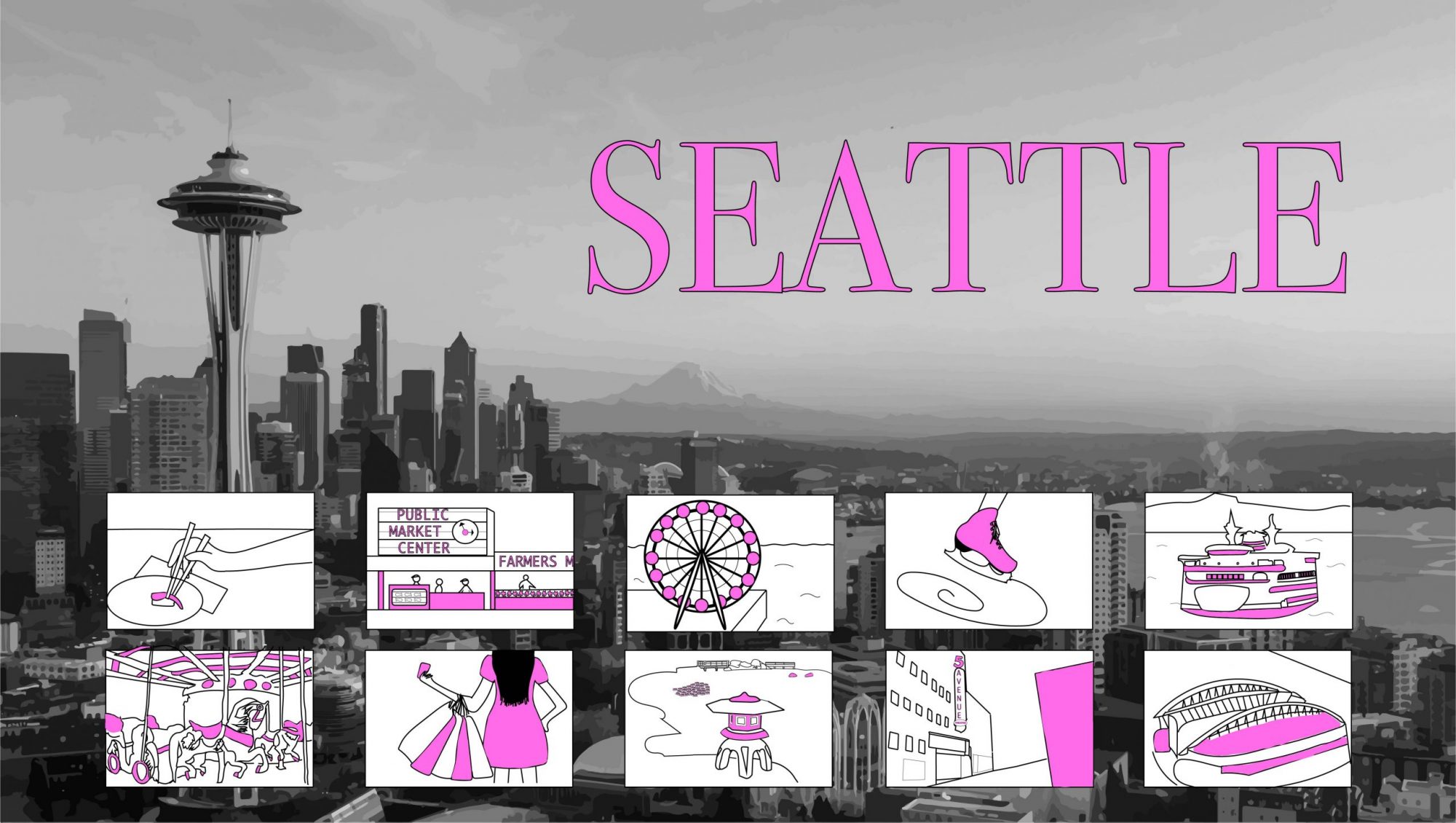
For this project, I knew I wanted it to be about my hometown of Seattle. I have been pretty homesick recently and it helped remind me of the things I love about my city. My original idea was to have each of my comic squares attached to a certain point of the Seattle skyline but I felt that it looked really scattered and disorganized which bothered me, so I ended up placing my squares at the bottom.
Seattle by Helena Matheson
There is no specific way that you need to read the comics but I think they’re naturally read in a left-to-right order. I think when you first look at my comic you see where it says “SEATTLE”, then the skyline, and then the comics at the bottom. I think some examples of closure are shown in a couple of my squares through Scott McCloud’s action-to-action. My favorite action comic is the one of the ice skate, because I think it plays in your mind the action of someone actually skating in a loop. I tried to use minimal words in this project because I didn’t think they were really necessary. The few words that I did use were for the title and then also for the Pikes Place comic and the 5th Avenue Theater, because it would be pretty hard to tell where exactly I was talking about if I hadn’t directly labeled them as such.
This was not my first time using Illustrator but I think that this project taught me a lot about it. I really enjoyed learning about the image trace capability because I have never used it before but I think that it added a lot to my project and makes it look higher quality. I think the skyline draws viewers through the Space Needle being such a well known icon. I’m glad that I was able to use the image trace for it because I fear my own drawing of the space needle would be harder to recognize. My favorite tool I used was the straight line tool, because it is very versatile snd helped create many of my items.
