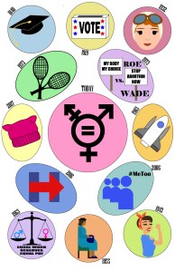
At the beginning of my creative process, I honestly had no clue as to what I was going to design. However, I was looking around online and found a comic that was organized like a pie chart. I immediately liked the idea of doing a kind of circular template. The reason I chose to design something that showed women’s history because I’ve been looking into activism and feminist movements for some of my other classes and I thought it’d be smart to incorporate my prior knowledge into this project.
My comic challenges the reader to read in a circular motion from the top left and around. I organized the panels in chronological order and I wanted the comic to lightly represent a clock. I guided the reader through this comic with the little captions that show the year that the events took place. However, I think the reader’s eye is naturally inclined to read the comic in a clockwise motion. I believe that my comic would be described to have scene-to-scene closure. I used linguistics relatively minimally. I mostly used text to make sure that the reader could understand what event I was referencing in the panels. For example, I decided to use text in the Equal Pay Act of 1963 to further push the reader into seeing the comic the way I’d intended. That being said, I did not write “We can do it” in the panel with Rosie the Riveter because I made an executive design decision to assume that the reader would know the history. Overall, my comic shows the passage of time through major historical events from 1840, when the first woman graduated college with a bachelor’s degree, until today where we are focusing more heavily on the rights and equality of all people, regardless of gender.
This project was not my first time using AI, but it was my first time extensively designing within the program. I think the most useful informationI learned was in regards to how to create and edit different lines to make them look exactly how I wanted. I’m definitely still honing in on these skills, but they’ve improved greatly from the time we started the project until now. I decided to use more cartoon like iconography for two reasons: 1. I am not skilled enough in AI to create hyperrealistic images and 2. I like the simplicity of the 2-D cartoon iconography.

