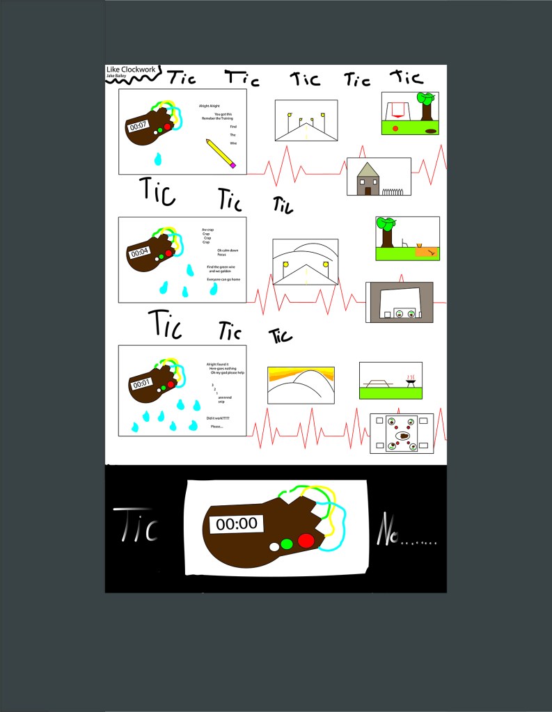
For my comic I believe that it challenges the readers right to left view because in my case it goes up to down in two separate columns with one side detailing the possible defusing and the other side showing the progression of the world as that is happening. I tried to guide the reader through the comic by having similar color schemes and semi-similar illustrations to help show which frames went together. As for closure I feel my comic uses two different types, one for each column. The first being subject to subject on the left where its the progression of trying to defuse the bomb in time but on the right side its more aspect to aspect where I’m trying to get the reader to just focus on certain parts of the drawings to show the passage of time in the outer world. I did end up using the linguistic mode in my comics and it was used as telling the unseen defuses thoughts under stress as he tries to complete his job and gets more and more panicked as time ticks down. I use the word image combo as the words just add more detail because without them you could tell the bomb was ticking closer to detonation but with the inner thoughts it adds to the drawings by showing the stress and panic someone in that scenario would be thinking. The strategy I used for the passage of time was in both the clock of the bomb slowly ticking down on one side and then almost a scene progression on the other side and I feel like I accomplished that by leaving just enough information in each panel to understand to the reader that they are supposed to move through those scenes like that which I feel like is an inventive strategy. Another approach I used which helps add to the margins and closure as well as the passage of time in some sense in the heartbeat background. If you notice as you move down the comic the heartbeat gets faster and faster which I believe help conveys how the character is getting more and more nervous as the time counts down, unknown to the images around the heartbeat as they are their own peaceful scenes that don’t understand the danger they are in.
This actually was my first time using Illustrator before so I had no idea what I was doing before this project. As for my line strategy I feel it was relatively simple as I just used many lines to create the different shapes that I wanted and didn’t deviate much from that approach. I think the reader will see it as a very simple style of line that I hope is easy for them to understand and process. I feel the inspiration I got from the vector graphics was to try and make the shapes I was imaging more that Photoshop because with lines it felt a little more like how I draw with a pencil in paper, one line at a time, so it was definitely more comfortable for me. The tools and techniques that I learned that most helpful was simply put, the line tool as understanding that allowed me to take the ideas in my head and convey them as best as possible on a digital campus. The only confusing was learning stroke and fill adn which to use and when which I eventually figured out pretty well by the end of the project/
