
Project 2 Poster Comic Final Iteration
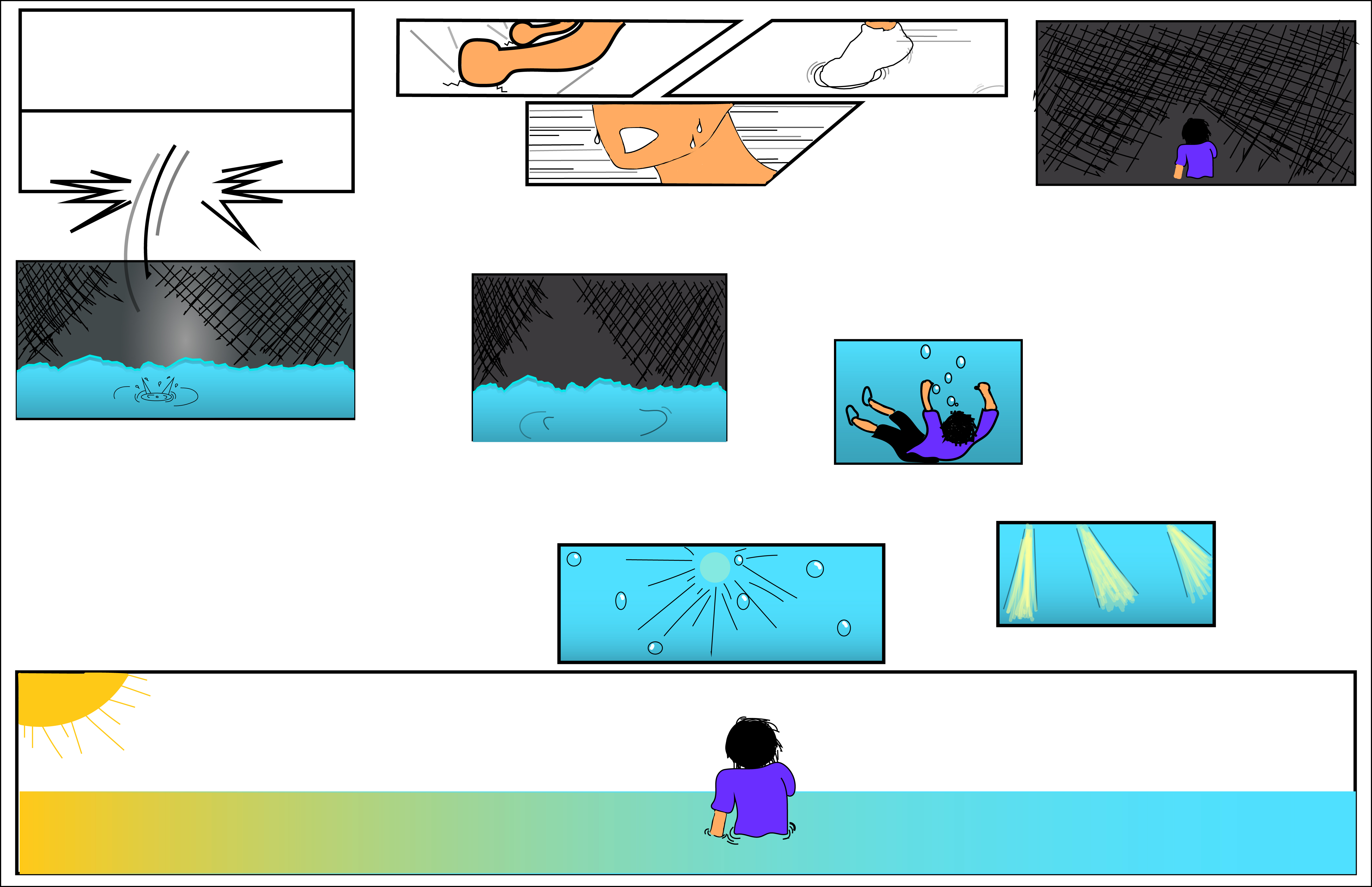
Creating this comic within illustrator’s tools was certainly an interesting and difficult process. Figuring out just what to do as a concept was already difficult to begin with. However, giving it some more thought and managing to collect my thoughts, components of the main structure came about. Beginning with a more Japanese style, the panels are oriented to start from the top right of the page and goes left. Within these first few, aspect-to-aspect is used heavily. Despite depicting the same person, each panel shows a different angle of the person from the sweat beating down the character’s face to his foot splashing in the water. Going from the figure’s fists pounding against the ground to the next broken panel involves a bit more reader participation as there doesn’t seem to be an obvious link. Later it becomes apparent that the figure was pounding on the ground to break free from the panel only to fall into another. Then, the direction switches as it transitions downwards and moves to the right. From this point, the scenes where the character breaks through into the bottom panel and sinks in the water is seemingly non-sequitur, but is actually simulating more of action-to-action as the movement lines imply the character’s fall into the water. Before getting to the last few images, the panels that transition into to smaller sizes simulate moment-to-moment. Finally, moving further down the page, the last few panels are being seen from right to left again until the last large panel where closure goes from aspect-to-aspect with the figure sinking to the sunlight shining into the water to subject-to-subject as the perspective changes to first person when the character swims up and finally shows the figure standing in the water at a third person angle.
The closure very much differs throughout the piece as well with the middle section being more spread out while the upper and lower sections are more closely oriented. Due the the top portion taking place within a very fast paced and almost panicked moment, the spaces in between are kept close to keep that momentum going. As scenes transition towards the middle, the situation slows down, seemingly becoming still and quiet. For this, larger spaces are inserted to act accordingly to the slower atmosphere. Once reaching the end, that energy is slightly picked up again as the figure rushes towards the top of the water to finally end with him reaching that lighted point.
Although organized in a slightly stranger order, the comic maintains an implied, single line that threads through the entire thing. The lack of linguistic mode also contributes to that factor as some wordings spread throughout the comic would help to guide a reader. However, I enjoyed it more as comic that had no words, no guiding lines to lead a reader to a conclusion, but to rather have the reader purely understand the sequence of events in their own way.
Having previously used illustrator, I felt confident I could get back into it pretty easily. However, this was not the case here. Many times I found myself stuck because I had an idea but was not sure how to do it. Referring back to tutorials helped to a certain degree, but many times I found myself utilizing the pencil tool to create certain lines that needed a more natural look or certain sections that were difficult to create with other tools. By using this tool more often, I get the feeling much of the comic does have a closer resemblance to being hand drawn in a sense but still holds some of that digital aspect Although, some of the shape builder tools did help in creating, or at least, inspiring to other designs in the comic.
