Archives Visit: Jon Williams

On our trip to the archives, I found novelty in some of the smaller comics. I felt that even though they were small and short, their purpose was reached and they were fantastic little distractions if nothing else. This, however, only brings part of what I want to do to mind for my final project, and didn’t help in a major way. Bellow is an example of a poster image for a comic that was in the archive. My first thought when looking at this image was “how amazing would this look like under a black-light”. What struck me most about this poster was it’s surreal nature and how the scale of the poster comic allowed for more in depth detail and texture to be prominent. At first, I thought of using a simple concept for a poster and letting the content of the poster project speak for itself. The problem is, without guidance, the mind is free to wander. With this in mind, I believe I’ll move more in a direction of figuring out textures rather than using flat colors or images. An idea that has occurred to me recently about potentially making the background a cloth texture. The familiarity of the texture will flow with my story I want to tell, but I’ve got to find a texture to use that works well.20170406_094430

Posted in Archives, Fall 2017 Archive (336), Spring 2017 Archive (336) | Leave a comment

Archives Visit: Tristan Moran-Salgado

IMG_3571

Pg 1 of a comic written by James Neel (1985)

While I was at the Manuscripts, Archives, and Special collection in the library I as browsing through the collections of comics and graphic novels that was put on the tables to be looked at. There was many different comics to be looked at but there was only one that caught my attention and thought that it might affect how I design my poster comic. The page the that caught my attention was the first page of a comic that was drawn in 1985 by James Neel although I don’t know the title of this comic that I had caught my attention. What intrigued me about what I see in this comic is how the artist had drawn everything and the style of how he drawn them that I like about it. I like the scribble texture of the that he had made for the scenery, objects, and characters and the different tones of how they are drawn to show what’s shaded and what is important showing some foreground and background in place. If there anything that I would do to emulate what I like it would by what I use for my sketches on the bottom part of my poster comic. I could do some scribbling in the future ideas portion on my poster comic and it would give me more variation in texture in the project that I think would fit well for my project but it might be something I’m going to think about in the future.

Posted in Archives, Fall 2017 Archive (336) | Leave a comment

Archives Visit: Makenna Coxey

In class archives visit, but I do not remember the name of the book or the author

The reason that I chose this particular picture was because of the unique technique of cropping used. The three large letters in the composition are used as frames to crop the picture that is supposed to be seen. I will implement this into my poster because around, near the states that are “popped” out I want big bubble letters like these that say the names of the states and in them pictures of what those places look like. the letters will be a clipping mask so that the shape of the letter is held. Another thing about this picture that I want to point out is the fact that it appears as if the letters are stuck in the sand almost like trees. This relates to the position and font of the lettering. The idea that this sparks with my poster comic is to make the letters appear as buildings in a city a and then the pictures inside will tell the story as well as the shape of the letters themselves. Something in this composition that I particularly liked was the fact that the letters are split horizontally into three pieces and each piece has a different picture. These slices in the letters serve to create frames, I like this abstract way of creating frames. In my poster, I was thinking about overlaying on the whole composition white lines that will split the map up into sections which may help tell the story. My design is complicated to follow so I am trying to think of a way to make it easier to follow.

Posted in Archives, Fall 2017 Archive (336), Spring 2017 Archive (336) | Leave a comment

Archives Visit: Aaron Uptagrafft

IMG_20170406_110633

Hand made colored woodcut and Illuminated letter

During the trip to the archives section I saw many elements that inspired my work, however one book that I found that was especially drawing to me was one of the really old manuscripts that were available. Part of the reason that I was so drawn to these in the first place was because they were books from periods like the 1400’s and really, how often do you get to look at something that unique, but the other half of why I was drawn to it was the illuminated letter and picture that the book had been flipped open to. Not only was it interesting that this part of the page seemed to stand out because of its color, when I got closer to the page the two elements seemed to pop out even more. I really liked how it caught my eye, and how when I got close I could tell that it had been hand drawn with the way that the color overlapped the borders of the frame on both objects and the texture that the area had due to someone pressing a dull point against the page. There was a trend, in What It Is by Lynda Barry, of overlapping handwritten objects and printed objects to make certain elements stand out. In my poster comic I want to try to incorporate both color and handwritten/digital objects to make things like speech bubbles for the characters seem like they stand out from each other and convey different emotion as each bubble is used to represent the main character’s state of mind.

Posted in Archives, Fall 2017 Archive (336), Spring 2017 Archive (336) | Leave a comment

Archives Visit: Dave Herman

IMG_0838

Page from Suurikur Pizza.

During my visit to the archives section of the library, I had a great time perusing the many old and interesting texts. I took quite a bit of pictures of images from the given comics and books, but I chose this one from a non-English comic called Suurikur Pizza. I am not sure what language the comic is in so I couldn’t get much more information on the comic. However I was intrigued by the layout of the page. I like how the top of the page is separated from the rest and the three images each have a different texture or design to them. I also liked how on the right side of the page, the artist used black space and white to edge shapes. The patterns all over the wall and the lady pop out from the layer underneath and look three dimensional. The whole page also has this goofy quality to it. The lady is taller than the door and everything is pretty simply shaped and geometric.

Posted in Archives, Fall 2017 Archive (336), Spring 2017 Archive (336), Uncategorized | Leave a comment

Archives Visit – Mikah Chan

archives-visit
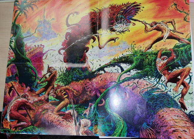
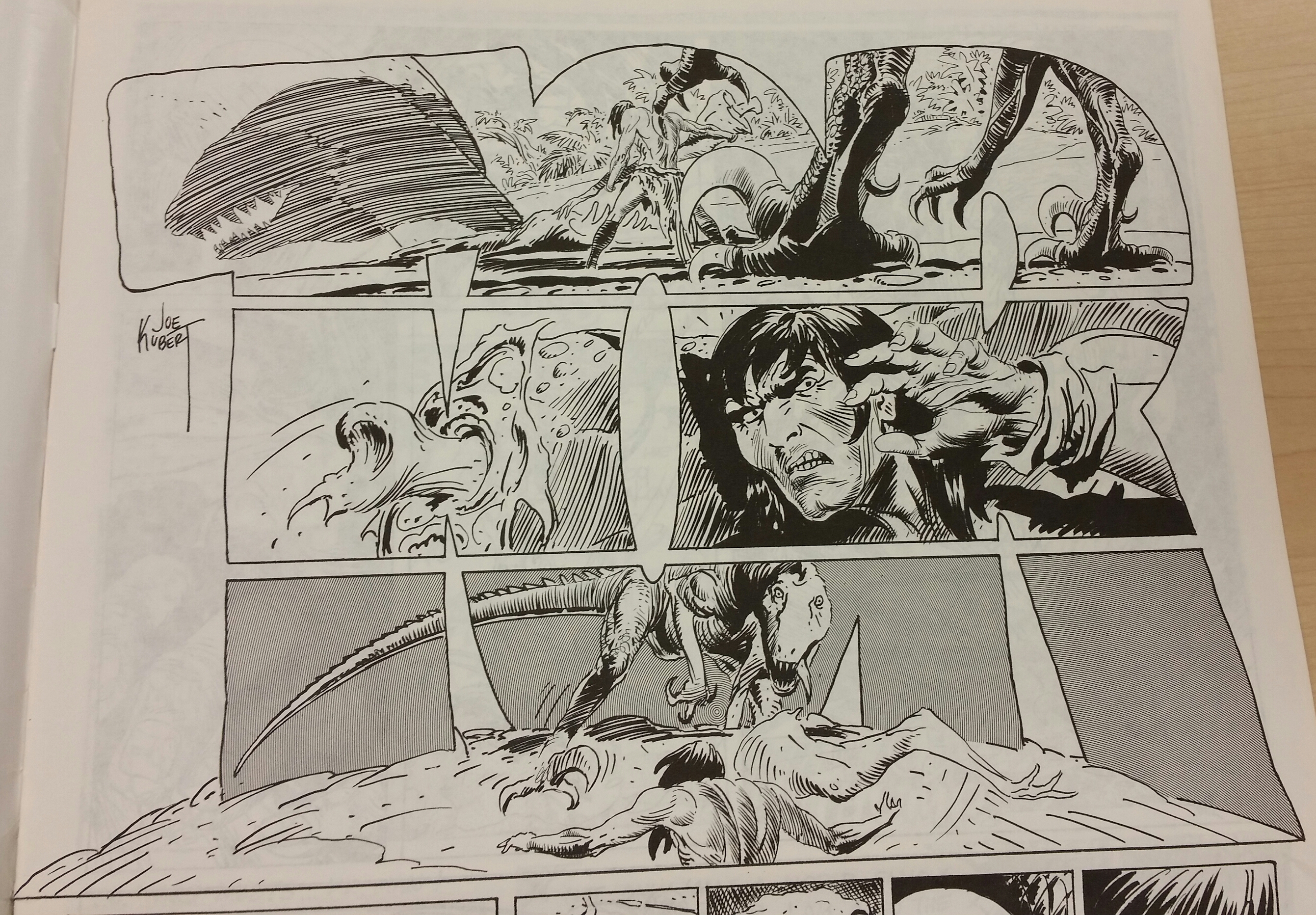
This example comes from Mark Newgarden titled Matchboxes (1980) , and really inspired an idea I had before visiting the archives. The original idea I had was to create a more rigid, punk rock inspired poster for my project. But this project asked for more of a narrative tone which really didn’t fit the the rock poster look. I feel like the framing of this comic would inspire the framing in my poster, each frame having a drop shadow detaching the picture from the background. Another design choice I am also inspired from this comic is the use of font in the comic. Using a mixture of images and text in my own poster, it was important to see the way text was used and placed in other piece like this comic to determine how to best use text.

With the punk rock design also, its background was going to be too busy. I planned on having different patterns and images as my background for my poster, but I figured this would be a poor choice in trying to tell a narrative (taking the audience’s attention away from the subject). So with this comic I was convinced to create a more singular, static image as my poster background. An image that would compliment the other elements telling a story, but not take focus away from the narrative. Overall I feel like this poster will help influence ideas for my poster, and looking at other peoples’ works was also inspiring for the brainstorming process.

Posted in Archives, Fall 2017 Archive (336), Spring 2017 Archive (336), Uncategorized | Leave a comment

Archives Visit: Jasmin Negrete

IMG_4225

“Cross Current” Comic Book back cover.

During our visit to the Manuscript, Archives, and Special Collections (MASC) I was able to look at a lot of different comic styles that could inspire my design for my poster comic. Throughout this collection of comic books there was a lot of interesting comics that reflected the direction I was going towards for my poster comic. One in particular was the back cover for the comic “Cross Current”. Throughout this comic cover there are various items laid out across the page, some bigger than others, as well as some over-lapping each other. However, what is inspiring me from this comic  is the idea of things overlapping each other, and making them seem like they are simply laying across a table. This is the type of style I am aiming for in my poster comic. From a distance, I want my poster comic to look like random objects scattered across a table. However, when you look closer at the items they are all connected in some way. For example, in my poster comic design I am going with the theme of life accomplishments, for both myself and family. So I want to make my design look like pictures, paper, awards, newspapers, and other objects scattered across a table. However, the importance of these individual items is determined by hierarchical scale, overlapping, as well as the location it is positioned in. Another feature from the “Cross Current” comic book cover that is giving me some type of inspiration is where and how the text throughout the comic is used. In the comic you can see that there is a few pieces of text being used in bold letters at the top of the page giving some type of guidance throughout the entire comic. I want to do something similar for my comic by using some text to help the viewer understand what the comic is focused on.


Posted in Archives, Fall 2017 Archive (336), Spring 2017 Archive (336) | Leave a comment

Archives Visit: Elise Detloff

17836618_716050175243871_766946009_o

(Jacobus, de Voragine, Albrecht Duren, Anton Kobergn, Legenda aurea sanctorum sive Lombardia historia, German imprints, 15th Century, 1488)

During our class fieldtrip to the Manuscripts, Archives, and Special Collections at the library I was immediately inspired by the older texts that had been placed out for us. I had been struggling to find to a way to convey a story in my poster comic without using huge blocks of text, but after flipping through the pages of the leather bound books from the 1500’s I decided to just use bits and pieces of text instead. I love yellowed and old paper and since the rest of my poster is already utilizing a sort of cut and paste/collage design, I felt that using clippings of words or numbers would match the style I’ve already started using.

17902596_716049251910630_983814854_o

(Rafael Reyes Spindola, El Mundo, Mexico: Compania Editora de El Mundo, 1896 (1906?))

                Another example from the exhibit was the Mexican newspaper compilation book, El Mundo. In El Mundo I found this page of sheet music and it also gave me an idea for how to incorporate my marching band and concert band experience into my poster comic more. As of the moment, the main focus of my poster is on bands that I listen to and how my taste in music has changed, but there really isn’t anything representing my personal experience in creating music. So I’m going to cut out notes, bars, and dynamics from music that I own and have played over the years.

                When it comes to what design concepts from the semester are important, it’s difficult to split them up because each concept we’ve discussed can be important in different ways depending on what the author is trying to create. But for me, I would have to say the really important ones are emphasis, point, line, and plane, scale, and color. These are all concepts that are present in every design, you literally cannot avoid these concepts when creating something. There are more that are also prevalent in every design, but I use and appreciate these ones the most. With emphasis, scale, and color I feel that an author/designer can really create an engaging piece of work, even if those concepts are used subtly or some are not present at all. But no matter what you create you are using a least one concept, even a pure white canvas was made with the intentional choice to use no color.

                I’m using all the concepts I listed in my poster comic and I feel that their addition to my design will make it all the more interesting and engaging for my audience.

Posted in Archives, Fall 2017 Archive (336), Spring 2017 Archive (336) | Leave a comment

Archives Visit: Tia Caton

For this blog post I decided to choose these two examples to talk about. The first example is from one of the comic books on the first table. I forgot to take down the name of the comic and who it was buy but I love how ti folded out and was one of the only colored pages of the comic. My second example is one of the large comics that was sitting on the last table. Again I forgot to write down who it was by and what it was called. I really loved both of these however, and felt as though together they incorporated a lot of the same elements that I want in my own comic poster. I think that the first poster has an amazing example of color being used. Through the use of warm and cool tones it helps divide the scenery and illustrate the feel of the comic. I think there is also a lot of use of lines and emphasis. By placing the large monster in the middle of the page it becomes the center of attention. I feel like there are different lines throughout the page as well to direct the eye. The second comic I loved because it almost had a scrap book feel to it from the news paper clippings and jagged edges it had in some of the photos put together. I know for my own comic I want to make it look collage like. I feel like this comic also uses emphasis well with the sizing of the man in the center along with organization and proximity. By placing certain elements closer to one another it creates more of a story than if they had been placed at random. For example, placing the wings near and on top of the baby head gives the appearance and idea of a cherub.


Posted in Archives, Fall 2017 Archive (336), Spring 2017 Archive (336), Uncategorized | Leave a comment

Archives Visit: Sophia Price

The example I chose from the MASC was from the comic “Today!” by Thiago Carvalho. I used this comic to influence my own alternative comic by paying close attention to the hierarchy of the page. My eye immediately goes to the woman’s face even though she is layered in the middle of the page. She is the image that the reader’s eye goes to because she holds the power in the page. I tried to use this in my own comic by putting the images around my main focus, a photograph. The machines all seem to outline her face. This draws the reader’s eyes to her due to the way they can quickly follow the story of the page. After you focus closely on her face you can then read the words in the top right corner. I also used this idea in my own comic. I have turtles that outline my main focus and carry the reader’s eye throughout my whole story.

IMG_1022

From Thiago Carvalho’s comic “Today!”

I opted out of words on my own comic because I wanted the story to be more implied. This author does that through her placement of the images. The scale of the woman, to me, seems out of place because she looks so large. I don’t really get the feel that she is closer either. It then makes you wonder why she is sitting there, and what the argument with her father was about. I also changed the scale of my images to make some seem more dominate of the page, and less of the other images. It puts importance on them.

Posted in Archives, Fall 2017 Archive (336), Spring 2017 Archive (336), Uncategorized | Leave a comment