Archives Visit: Nikki Aviles

During our field trip to the Manuscripts, Archives, and Special Collections at the library, we were exposed to a bunch of different comics, in many different ways. I was sitting at one table with a number of different comic books spread out, when I saw this smaller, blue book with an octopus on it called Not My Small Diary, by Delaine Derry. What intrigued me about this book was the octopus on the front cover, I love drawing them and sort of have a thing for them. I opened the book and what I noticed was that this book didn’t have one overall theme. In this book some pages were formal, organized, and everything has its place, but other pages are more loose, things are just placed wherever. I came across this these two pages and they were actually exactly like the idea or something similar to it, that I had in my head for the layout of my poster. The pages are kind of like one big poster, spread across two different pages. In these pages I wanted to replicate the footsteps walking along the pages, with the heart that my brother hand made for me saying “good luck in college sis”, as arrows to let my audience know which way / how to read my poster.

Some design practices these two pages have is scaling, the artist made what he thought was important bigger than others. Point line plane is being used with the footsteps through out the pages.

FullSizeRender-1

Not My Small Diary by Delaine Derry

Continue reading

Posted in Archives, Fall 2017 Archive (336), Spring 2017 Archive (336), Uncategorized | Leave a comment

Archives Visit: Emma Garcia

Paw Prints by Bill Fitts Pgs 1 & 2

During class we went to visit Manuscripts, Archives and Special Collections where I found the comic Paw Prints by Bill Fitts which was very simple yet interesting. This comic has the main characters being a dog and cat. The cats are standing outside of the jail cell as the dog is in jail for feeling like he should be able to protect his territory.  I took a picture of the first two pages because they inspired me through the details and attention to detail within the drawings yet it was a very interesting story as it used animals as the main characters. This might affect my plans for my poster comic when thinking of a background as it is an important part of my poster comic.

Throughout the semester there have been a wide range of design concepts that will be useful and important to the poster comic. A few of them include texture which is seen a lot through the comic Paw Prints, especially on the first two pages where the fur and the ground is drawn with multiple lines indicating a surface. Texture could be used in my poster comic through the use of the different objects which will provide the look of something more than just a flat piece of paper. Another key concept is layering, as every layer is important to the comic because it brings out more details which allow for the comic to tell a story. In order to uses layering in my poster comic, I will place things on top of one another and have the background as my main layer and everything I am passionate about on top of that.

Posted in Archives, Fall 2017 Archive (336), Spring 2017 Archive (336) | Leave a comment

Archives Visit: Alexandra Borders

After looking throughout the comic examples provided in the MASC, I really only found one that closely conveyed what I imagine for my own poster comic.

This comic is supposedly a zine of poetry called CrossCurrents zine, put together by the Small Press League. My primary focus of the zine, however, is both the front and back covers. I was immediately excited when I found this zine because there weren’t any others like it there and it was the only one that I saw give a close enough example of what I wanted to do with my own comic poster.The front and back covers demonstrate the collage-like idea that I have been trying to do. There’s a grouping of seemingly random items placed in seemingly random places. This example, however, appears to be more random that I think I want my comic to look like. I cannot really find a story or message trying to be conveyed through these covers, and I think it is in the higher randomness that the message or importance is lost.

This was nice to find and look at because now I have a better idea of what I want to do, as well as what I DON’T want to do with my comic. I want there to be an element of randomness, especially with placement of items, because the story I am telling doesn’t necessarily need to be read linearly to make sense. The information can be taken in pieces and still make completely sense in relation to everything else. And considering my items I’ve scanned are more related than the images on this zine, I think I can accomplish what I exactly want from this poster comic.

Posted in Archives, Fall 2017 Archive (336), Spring 2017 Archive (336) | Leave a comment

Archives Visit: Toree Boutz


ArchivesVistToreeBoutz

Page from Read Yourself RAW, edited by Art Spiegelman and Francoise Mouly (Pantheon Books, 1987).

Art Spiegelman and Françoise Mouley’s Read Yourself RAW, is a compilation of pieces from the graphic novel magazine, RAW. It was published in 1987 by Pantheon Books and features a number of different graphic novel excerpts.

In “Pussyfooting,”  we see a trail running through the entirety of the piece, as well as various events and happenings at different parts of the trail. The comic is meant to be read top to bottom, exemplifying the concept of hierarchy, because we can clearly see that the story starts at the top of the page and ends at the bottom, as we see the character moving through the layers of the comic. Additionally, the way we see the character multiple times, each at a different point, suggests time and motion. As time passes, the character moves forward throughout the comic.

For my poster comic project, I want to create a similar trail, or “road,” that takes the viewer through my journey down to southern California and the week I spent there. This comic reinforces my current plans for my project.

Additionally, I found it interesting that, in “Pussyfooting,” the trail moves through elements in the piece, rather than merely next to the elements, such as the triangle shapes for example. This is something I may take into consideration for my own project. I believe this design choice illustrates the concept of a journey through something in a more literal way.


Posted in Archives, Fall 2017 Archive (336), Spring 2017 Archive (336), Uncategorized | Leave a comment

Archives Visit : Andrese Collins

During our visit to the MASC (Manuscripts, Archives, and Special collection ) in the library, I found three really good short comics that are quick and to the point but also holds a serious tone for a serious moment. During my visit I was looking for a comic that focuses on small adventurers and travelers. Even though I didn’t see many comics such as this one, I was able to find similar comics that could help me with some ideas for my comic poster.  After time in the MASC, I had found a few relative comics within the collections but the stories that related the most was the comic named “Cecil C. Addle”, developed by Ray Collins in 1977. “Cecil C. Addle” was an alias name for the former mayor of Seattle who signed off bills to programs that didn’t support nor keep the beaches and the animals that reside within it safe.  Roy Collins uses his art in a comic in order to display a stance against the former Mayor’s attempts of promoting economic growth by installing new pipe lines, docks, refineries, and a gas station, something we may not really need to improve on for our lifestyles on the beach. I want to use this comic’s sense of freedom and show that even when it seems like there’s nothing you can do to help something you have a passion for, you can always use what you’re equipped with in order to explain your opinions in your eyes.

Cecil C. Addle

Image from Ray Collins,”Cecil C. Addle” in 1997

For techniques within the art, one of the things I found very interesting was the frames of the comic. Notice how all frames are the same size but a couple of the frames aren’t fully boxed in or closed, leaving a empty source of space between the single frame. In the third scene of the comic you see moving gestures drawn on Cecil in order to show implied motion as he scoots closer and closer to Cecil and Dipstick. The dialogue does most of the speaking and has an informative tone in order to persuade the reader on how unethical the Mayor’s attempts to restore life on the local beaches are.

Posted in Archives, Fall 2017 Archive (336), Spring 2017 Archive (336) | Leave a comment

Archives Visit: Eva Guillen

comic

Page 4 from the graphic novel written by James Neel.

This example from the comic written by James Neel demonstrates a different use of formatting and framing. This example changes my plans for my comic because it provides a better foundation to how I wanted to do my own. With this example now I have a better idea of how I am going to layer all of my images in the comic. I know I am going to layer the images based off the year or time of my life they represent. This is where hierarchy is used to help me create a more concise comic that will demonstrate the exact story I want to tell. I will layer each scan on top of each other based on the year. Then I am going to use some of the scans to format and frame the overall look of the comic; this was described as important during the readings done. Since framing is usually one of the key concepts when it comes to comic I decided to implement it based off of this example. Depending on how I shape or place my scans the framing will be similar to the example. I am doing this so I am able to add all the scans that I want but I want to do it in a way that will make my statement. This example does include text and I am debating on whether to add any to my final draft or just leave the comics’ scans to speak for themselves.

Posted in Archives, Fall 2017 Archive (336), Spring 2017 Archive (336) | Leave a comment

“Heartland” Review-Henry Buehler

1

Heartland, Page 1

Heartland is a one-shot comic written by Garth Ennis and illustrated by Steve Dillon (Preacher) that’s about an adult family living in 1990’s Belfast, Ireland while dealing with issues surrounding  politics alcohol, religion, familial drama, and The Troubles. The story follows Kit Ryan after breaking up with sorcerer/detective John Constantine in Hellblazer reuniting with her family while reconciling with an abusive past and memories of her alcoholic father.

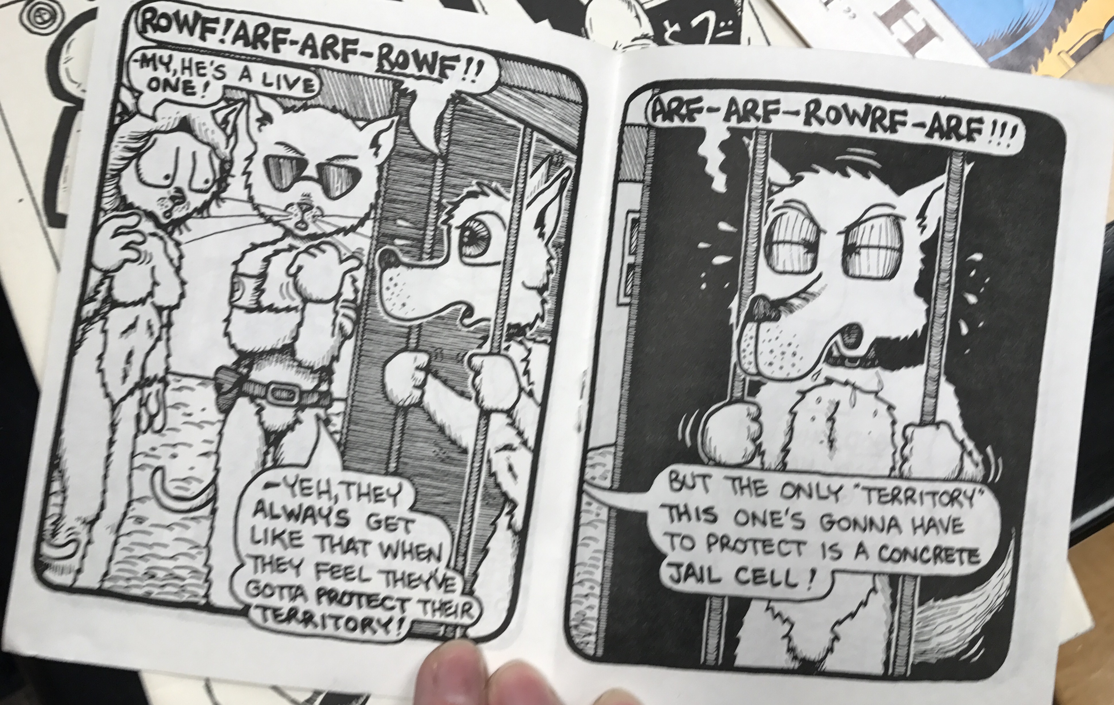
The story overall, is very dark and realistic. The cool, dull colors of the story reflect this very well along with the very realistic facial expressions of the characters. The dialogue is also clever, authentic, and comes from a place deeply rooted in the setting: All of the characters speak in a way that lends to Irish accents (aside from Bernadette’s British boyfriend) and are portrayed as people living in conjunction with very real hardships from the time period of the setting: Kit’s father was an alcoholic who abused his family, British solidiers are currently occupying Ireland at the time, and there’s a violent tension as seen early on when Kit’s stalker Neil gets accused of being a drug dealer by a UFF group and is then is promptly capped in the knees. This scene in particular also showcases something I really like about Dillon’s art: How many characters he can place nicely in a scene and the pleasing angles he chooses to display various expressions.

7

Page 5

This also lends vey nicely to closeups and a great use of shading on Kit’s face on page 52 in order to get an even amount of emphasis on both expressions in the panel.

As the story progresses, we are introduced to the rest of Kit’s family, including her spiteful sister Bernadette, and her sisters’ significant others. As the evening goes on, we learn a lot about the home Kit and her family grew up in thanks to very cleverly placed flashbacks that appear as if they were cuts in a film: The way these flashbacks appear are “logical” in terms of visual context and from context in dialogue. The color scheme in the flashbacks is exactly the same, and the only obvious visual clues are the inclusion of Kit’s parents in the scenes as well as her and her sister Bernadette being younger.

34.jpg

Page 32

As the story continues, Kit explains to Rodney how everyone has gotten used to the military being present. Later after going to the bar, Kit and Rodney return home and kiss. Bernadette then comes home early and accuses Kit of trying to ruin her life. The two fight, with Bernadette blaming Kit for the death of their parents and Kit trying to explain that their dad was an abusive drunk that made their life miserable. Bernadette’s only defense of her father was that he loved her more and Kit finishes the argument by lying that Bernadette was born from their father raping their mother. Bernadette runs out shocked and the scene settles down. The story then ends with Willy singing a song about Belfast while drinking on top of a pile of rubble.

Posted in Archives, Fall 2017 Archive (336), Spring 2017 Archive (336) | Leave a comment

Hierarchy: Hak Do

20170323_193226-min.jpg

I plan to tell a sort of time-line story using the poster comic format. The format is perfect to tell short stories and important events so I thought the story of the bond between me and my bestfriend (considered brother) was the best to do. I originally was going to do a story about my journey to pursuing the career that I am pursuing today but I felt as if it wasn’t that eventful. It arose from  the writing activity because the words and the story that I told reminded me of summer and summer reminded me of all the fun me and my friend went through. We spent nearly every day together every summer and it was probably the most fun moments of my life. I’m planning to use hierarchy in the form of color scale and position. I plan on making the objects that define our bond a lot more vibrant or colored than everything else. I am also using the object that is the most important to be by creating it into frame. As you can see on the concept draft of the comic the necklace is forming the main frame of the comic. The scale will be used on the objects to exemplify importance. The necklace is the biggest object out of every other object indicating that it is the most important object of them all. Also the title is scaled big to show that it is the title and what the comic is going to be about. I plan on making my name small because my name does not really matter. I want the audience to focus on the story being told. Position is the same as layering. I plan to layer it so that the objects sometimes are positioned on top of the comic frames. It leaves room for creativity. Texture will be included in the form of shading and fabric from on of my objects.

Posted in Spring 2017 Archive (336), Uncategorized | Leave a comment

Hierarchy: Noah Martin

For my poster comic I will mainly focus on my family and my friends. I am one of the only people from my hometown who goes to school here at WSU so I think that where I am from is also important part of who I am. I will use elements that relate to myself and my family and friends that will help to form a mountain scene with trees to represent my hometown. I will use scanned textures and objects to create this collage effect. The writing the unthinkable exercises were helpful because it helped to teach me to formulate my ideas in a new and creative way, the exercises train you to not overthink and just write what you are feeling in the moment.

When designing my poster an important element I will consider is Hierarchy. Hierarchy exists in almost everything from families to religion, in design hierarchy is used to show order of importance. A good example of the use hierarchy is seen in concert posters like Sasquatch-2017-Lineupthis one from Sasquatch. The name of the festival “Sasquatch” is in big bold letters centered at the top of the page because it is the first thing viewers will read. related information like the date and location is grouped directly above the Sasquatch logo. Also all the performing artists are grouped together in the middle of the page. The 3 main headliners are in a larger font than the other artists to show importance. Posters are typically read from top to bottom so for my poster I will put the most important elements at the top of the page to create emphasis. Another way I will incorporate hierarchy is by grouping related items. I believe if I use these methods it will make my poster easier to understand for the reader, and show importance in the elements.

Posted in Spring 2017 Archive (336) | Leave a comment

Hierarchy: Cesar Rubio

img002.jpg

I made this a while ago, I like to work with textures and line. I like to make things that look like they are not made on the computer. This is the inspiration for my comic. (c) Cesar Rubio 2015

Please excuse the late submission for this blog post. I looked all over to find prints of my past work, turns out they were in storage and not in my garage like I thought.

I don’t know exactly what narrative to tell in my comic, but I know that it will involve my love for older technology and music. I will scan a lot of my old mixtapes and vhs movie sleeves. I came to this decision, to go in this direction, after doing one of the writing exercises and the word “downhill”. I just remember that after completing that exercise (I had written out lyrics of songs that I used to listen to growing up) I could not get memories of growing up with my sisters and listening to music. Nowadays, we have very different music tastes, but we all have a soft spot for music that sounds like it is from the 80’s. Something about that aesthetic just brings us together. My comic will recount a memory of us three listening to music together.

I will employ hierarchy much like I did with the example above. Objects with busy textures will be in the forefront, while those in the back will be a lot less busy. I will try to employ drop shadows to imply depth to an otherwise two dimensional way of representing people and objects. Textures that I want to highlight will be above the rest, I did this with the leaves. I wanted the leaves to have implied motion as the male protagonist was pushing the wheelbarrow.


Posted in Spring 2017 Archive (336) | Leave a comment