Blog #9-“Hierarchy” Cleana Broman

comicbookimage

“Moral Geometry Pg.2” Sean Andress

For my abstract comic book I want to revolve my design around interesting borders such as the ones displayed in this picture. I’m going to use the road trip example from the exercises and show the road snaking through the page as a car is driving down it and illustrate a road trip I took over spring break. As for texture I might use some natural textures such as grass or leaves, and possibly some rocks. As for layering, I might use a stick or something for border separation which will be on top of the other images.

Posted in Spring 2017 Archive (336), Uncategorized | Leave a comment

Hierarchy: Nikki Aviles


For my poster I will be doing it on the topic of family. The reason I decided to do my project on family is because through the reading exercises, I noticed that a lot of the times when I would think back to memories that had to do with the nouns, my brother, or mom was right there with me. I don’t have a lot of things that remind me of my family up here because I am not from here so I left most of my valuables back in Hawaii so it was kind of hard to find objects for me to scan.

Hierarchy to me means an order of things depending on their value or importance. For my poster I will arrange my items in a similar fashion. I wan the most important things to me to be up front and center, and probably a pretty big size so it can catch the viewers eyes. The smaller items will be things that aren’t so important but are still relevant, and I will most likely be placed in the back. I would like to have my poster look more like a page out of Lynda Barrys book, where its a looser form, things don’t really have a specific place. The reason why I chose to design my poster this way is because I believe it adds more texture to the poster when you layer itmes, compared to an organized poster that looks flatter.

Posted in Uncategorized | Leave a comment

Hierarchy: Cass McKay

So my idea for “Project 2: Poster Comics” came from the “Writing The Unthinkable” excersises and I guess arose from my idea that Im deriving random thoughts and words through these so I might as well just tell a meaningless story.  Not that it wont intend to be intriguing but the concept is it to be a meaningless interaction I wouldn’t expand on otherwise.  Like me walking home from class I get home and my roommates out smoking a cig, then we talk about average unimportant things (squiggly line in speech bubble) I walk inside sit down and fall asleep in chair.  I believe this style of an idea will fit the poster comic format well.  Im still up in the air on the exact layout / hierarchy of it but will be more sure once I scan my items and get working on Thursday.   I will also be looking into today how I will be incorporating texture and layering into my work, one of my items I plan on scanning is a shoelace so that should help add to this as well as my other items!  Drawing storyboard idea today then will upload photo of plan after class!

Posted in Spring 2017 Archive (336) | Leave a comment

Hierarchy: Mikah Chan

I think the story I want to tell in my poster will be somewhat non-linear, creating more of a feeling or theme rather than a straight narrative.  When writing my Unthinkable exercises, I usually wrote about fragments of memories or feelings I had when remembering things of the past, which initially inspired this project. Creating a poster that reflects the past and the feelings associated, I think, will be interesting and more informal than a poster thats selling an ad or trying to tell a story step-by-step. I plan on using different receipts or stubs from events I’ve been too, pictures of myself and friends, and different magazine cutouts that I feel I relate to to create my poster. I also intend on finding different patterns (whether fabrics, doodles, or photos) to give more depth and interest visually to the poster, along with text that will probably include single adjectives or nouns strewn across the page to give some type of context to the poster. In terms of hierarchy, texture, adtc336-postersketchnd layering, I have plans for all three elements. I think the use of texture, such as the patterns or the ticket stubs, will give more of a made at home look. I noted in my poster sketch that it will resemble that old punk rock poster look, where the page is ripped or there is tape covering the edges of paper. I think this will be interesting visually, and create unique uses of texture. The layering will be important to my poster as well.  I plan on definitely crossing images on top of one another, my scanned items, the text used, and the patterns, to again create a collage-like effect on my poster. The layering and texture in my poster will help create the punk poster look I am going for, taking inspiration from older designs of the punk era and from this newer age of graphic design such as the use of transparent text. These two elements along with alignment, organization, text style, and experimentation with levels will help create my poster’s hierarchy. Dictating the emphasis and movement of one’s eye will be important in how the poster’s subjects and elements are interpreted. Strong visuals such as the images I plan on using will probably have hierarchical priority over the text and patterns, serving somewhat as centerpieces to my poster. Though text will likely be placed over images, I plan to use a more transparent look for the text so that it interacts with other visual elements without diverting to much attention to what I feel like are the more important elements within the poster.

Posted in Spring 2017 Archive (336) | Leave a comment

Hierarchy:Cora Kline


20170323_095025

Rough Draft for my Poster Comic

I changed my idea a bit for my poster. Originally I was going to do a tribute to Beauty and the Beast, inspired by my writing with the word “Witch”.  However, upon reflection, I realized I could make a better poster inspired by my time in Paris, inspired by the word “travel”.   I’ve been to France twice, and each time it has been one of the most amazing experiences I’ve ever had. As I wrote in the exercises, I realized I still have a lot to say about my time there.

For my poster, I’m going to make a map of Paris the background. On each of my significant locations, I’m going to put a memory trinket above it. I’m also going to scan pages of my diary from my first trip and highlight some significant moments.  I’m going to mix the memories of the first trip with the memories of the second.  I’m going to lay out my memories across the city from left to right following the routs I would take visiting different land marks and my day-to-day life.

I’m going to layer different images on top of each other. My tickets and flyers have different textures due to the type of paper printed on as well as some fading/wrinkling with age. I’m also going to include coins and a charging cord which will give the poster depth and dynamic interests. I’m going to add a picture of a key chain of the Eiffel Tower to give a three dimensional look to certain parts.


Posted in Uncategorized | Leave a comment

Hierarchy : Gilian Fejes

Hierarchy is the order of importance. This can be related to a social group, in a religious, workplace and politics. It Is mostly expressed through naming someone in certain cultures, but it can also be expressed visually through scale, value, color, spacing, placement and other signals. In music, there can be an hierarchy expressed through the tones, pitch and melody. These hierarchy’s help tell a story that is being expressed and define a social norm. Visually you can tell if something has a higher importance if it stands out more through size, scale and variation. It is important to have skills like this to story tell and not have to completely explain every detail.


When I was a kid, I used to be obsessed with Josie and the Pussycat comics. I had so many, so I decided to look into some of the newer ones and find an example. I found an example that visually tells and hierarchy story through the social placement. Josie, the main character and her name is actually in the title, is front and center and larger in scale representing her being the lead singer. Melody and Valerie (bass and drums) are more towards the back and representing a more band feel. The biggest diamond is landing on Josies head making it a focal point to look at.

Screen Shot 2017-03-23 at 9.09.45 AM.png

Josie and The Pussycat Cover – Marguerite Bennett, Camerson Deordio and Audrey Mok

Posted in Uncategorized | Leave a comment

Hierarchy: Aaron Scofield

Page 30 from Lynda Barry’s graphic novel, What It Is

In the book Graphic Design: The New Basics, Ellen Lupton and Jennifer Cole Phillips describe hierarchy as the “order of importance” in a design and that it “employs clear marks of separation to signal a change from one level to another” (129). Hierarchy can be seen all throughout Lynda Barry’s graphic novel, What It Is. For example, the image on the left from page 30 shows layers that are overlapping one another in order of their importance. I will be attempting to do something similar to this for my own project that will include layering and texture. I will be layering different objects over one another, such as text and images. By placing them over each other, I will be creating some sort of hierarchy. Textures will also be an important factor in my poster comic as I will be using different colors and textures across the page to create more variety. My plan for the poster is to show what I do practically every day of my life. From waking up to going to bed, I do almost the same thing every day and that includes going to school, learning more about my major, taking care of fraternity business, playing baseball, and worshiping God. I will display this on my poster using cutouts, images, and text. I plan to create separation between each of the different tasks that I mentioned above by overlapping text and images in order of their importance to my daily life.

Posted in Spring 2017 Archive (336) | Leave a comment

Hierarchy: Aaron Uptagrafft

IMG_20170323_084031

pg 124 Graphic Design the New Basics

After doing the Writing the Unthinkable exercises from the book What it is by Lynda Barry, I had several ideas as to where I could take the direction of my second abstract comic. The most appealing idea that I had while doing these exercises was to make a comic about my day as a graphic designer. I put a lot of personal effort into the designs that I make and sometimes the customers can be real characters, so I thought that this could be a fun story to tell through my own eyes.

I plan on using Hierarchy in the comic by using my images to draw the reader’s eye down the page, causing them to read in ways that may not be completely normal to the human brain. I will also use hierarchy to establish importance of some of the elements, in areas such as placing one image on top of others on a page in order to help me tell the story of the page, and then inserting text around it.

I plan on using texture and layering hand in hand to create a comprehensive page that does than just serves as something pretty to look at. I want my textures for my background page to accentuate the emotion that I want the reader to have coming into the page and I will use the laying of pictures and sections of text over the top of it to add to this effect. For example if I wanted the reader to experience the chaotic experience of making a logo for someone who doesn’t think they know what they want but in reality have an exact image in their head that they expect you to produce, I would use a crumpled t-shirt or a piece of paper or really anything crumpled up to give the page a hectic look and I can top that off by layering fields of text and images over each other that kind of obscure the page and make it look like you’re looking for something in the page that isn’t there because it got covered.

I really liked this image on page 124 of Graphic Design the New Basics as an illustration of how powerful using these elements together can be. Specifically I really like how they have layered textures on top of each other in such a way that it appears as if all the elements are stacked on top of each other and are each actually an entire layer of the pattern they show. This adds this incredible sense of depth that makes you feel like you can dive right into the picture and its something that I want to try and emulate in my own comic.

Posted in Spring 2017 Archive (336) | Leave a comment

Hierarchy: Jasmin Negrete

FullSizeRender

Page 21 of Lynda Barry’s graphic novel “What It Is”

The story I plan to tell through my poster comic is the story of me growing up and going off to college. While doing the Writing the Unthinkable exercise I noticed that I was writing a lot about the memories I had growing up  and what made those moment special and memorable to me. I also reflected a lot on some of my family customs, and some objects that reflect those things. What I plan to do for my poster comic is create a background with the main items I have, this is a blanket that my family has had for a very long time. This item will create a texture for my comic poster, because the way I plan to use it is as if it was just laying there, so you are able to see the folds and creases that appear. Then I plan on layering the rest of my items on top of this background (so it gives kinda the effect that the items are scattered around the blanket). The items that I pan to layer on top of the blanket are family pictures, postcards, a flag, etc. This is where hierarchy I will be using hierarchy, since some objects have more meaning than others I plan to scale a few objects up and make them the center of attention in my comic poster. For example I plan to put the flag that I will be using in the middle of my comic poster and it will be the biggest object on the poster, which will signify its importance in my comic. Then around the flag I plan to scatter the images around, however I will strategically place them so they show some kind of hierarchy of what images are more meaning full and important to me. The inspiration that I am using to create my comic poster is page 21 of Lynda Barry’s graphic novel What It Is. As you can see on her page there is a main image in the middle surrounded by smaller images that add to what she is trying to say. This is kind of the idea that I am going for, however I still uncertain if I will decide to change the layout of it.


Posted in Spring 2017 Archive (336), Uncategorized | Leave a comment

Hierarchy: Alex Gutzwiller


For my comic poster project I will be telling the story of my summer memories of the time I spent at my friend’s cabin in Minocqua, Wisconsin. The story behind this cabin goes much deeper than just being in the “Northwood’s” – what this area is known to those that live in Illinois and Wisconsin.  It’s about a bunch of my friends that developed a really strong friendship there. While studying What It Is, by Lynda Barry and thinking about her questions: “What is the Past?” (18) and “What Is The Past Made Of?” (19), often had me thinking about my Wisconsin memories and gave me inspiration for the comic poster. My friend whose parent’s owned the cabin is one of 4 boys and right across the street is another family of 4 boys and I lived 3 doors down. As you can imagine, I spent a great deal of time with all the guys down the street but at the cabin, where many of us went it seemed that those times were twice as fun. When I came home for some reason just before school started, I felt just a little bit older. Now that most of these friends are in college spread all over the country, I don’t get a chance to see them very often but Lynda Barry’s book brought back all the great memories I have.

SCAN0141
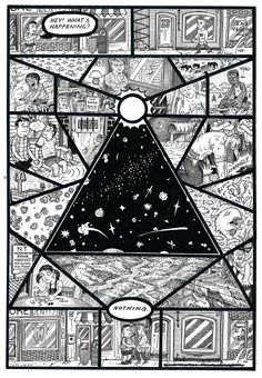
Therefore, I thought I would use a photo of the cabin as a visual hierarchy, possibly centered in the middle of the poster. I feel how I scale this photo will give it more value as the lake house is the reason for telling my story. Because this area is called the Northwood’s I will probably use a photo of the signs containing the words “Northwood’s” or Minocqua (because they are seen everywhere) to express placement of the area and use them with layering. Additionally, because of the dense woods I am thinking of using an image of tree spaced away from the cabin to give it it’s own sense of visual hierarchy. The tree can also represent the seasons I spent up North because a tree grows over time. To give the comic texture I would like to use contrasting images of nature such as bark, logs, acorns, pinecones, which contain rough surfaces alongside and layered manmade images such as fishing lures and skis, which are smooth hard surfaces. I do not have a design yet for my comic however, because Lynda Barry inspired my idea about past memories, I am posting page 18 from What It Is?, which also on this page Barry uses hierarchy as the centered image on the left visually stands out with smaller boxed images on the right.

Posted in Spring 2017 Archive (336) | Leave a comment