Hierarchy: Makenna Coxey


Page 8 from Lynda Berry’s book What It is.

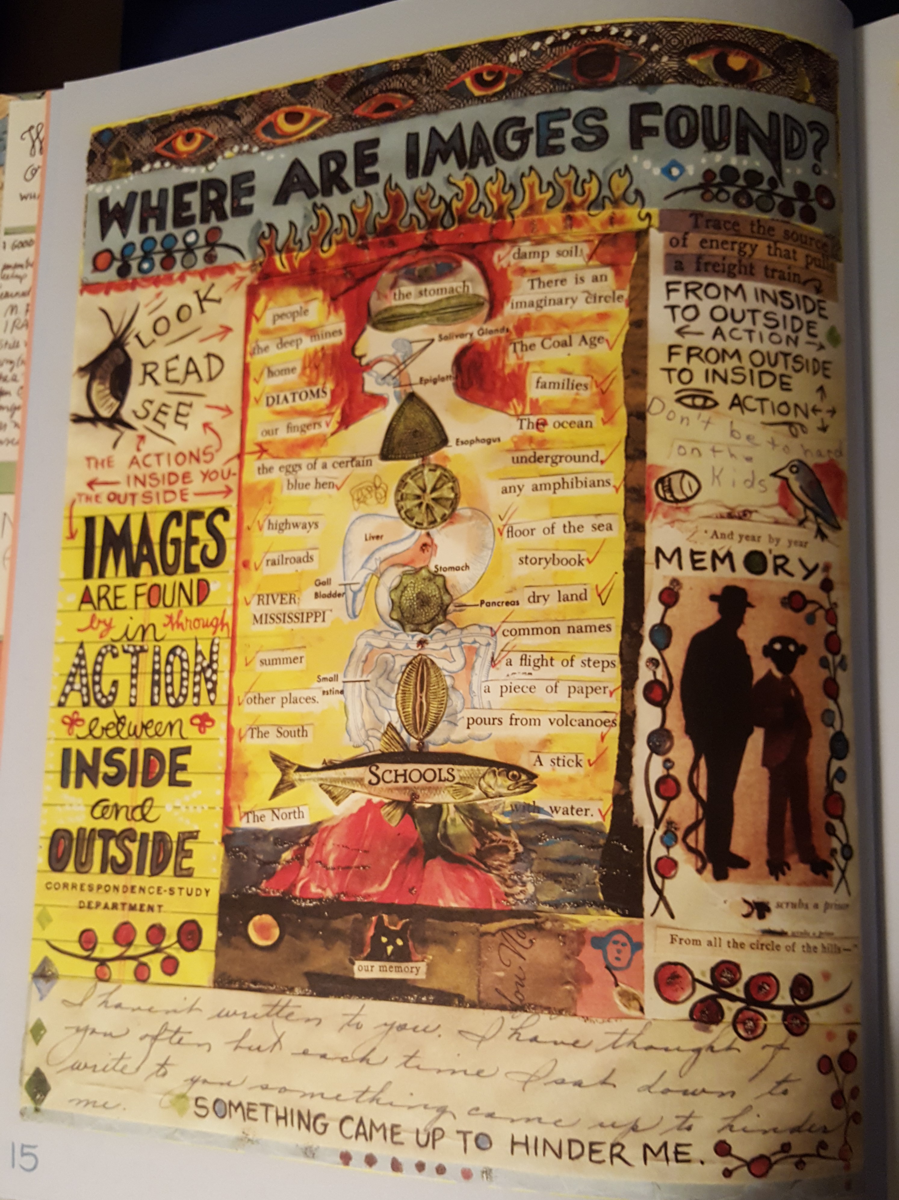
This is a page from Lynda Berry’s book What It Is. the reason I chose this page was because I plan to model my design off of this collage theme. My page will have some differences, it will be lighter in color and not so gloomy feeling, also it will have sharper edges and everything won’t be so blended together, this could be considered as different frames. In my design I plan to use a photograph as the background and layer other elements on top of that. This creates a Hierarchy with the use of layers, the things that are in the very front must be the most important element of the poster whereas the back ground will be noticed but not any more than a glance. With this post the way that I will create texture is with the fabrics of my old cheer uniforms. Also, I will be using words or quotes to create come element of texture and layering as well. For this assignment, it will really be a memory from my past. Hierarchy will also be present in this poster with the use of scale the things that are bigger and in the front, are going to have a clear understanding of importance within the piece. I will also be using different colors to help move your eye throughout the piece the way that it is intended. Unlike Lynda Berry’s which can seam messy or unorganized, this poster will be clear, concise, and relatively easy to understand.

Posted in Spring 2017 Archive (336) | Leave a comment

Hierarchy: Jon Williams

Hierarchy is importance of a group in a body of text. It can, however, also be visual importance, how certain objects are focused on or how they’re framed. When it comes to story telling, this is important to remember due to the subtle ways someone can tell a story using hierarchy. What one chooses to focus on visually, bringing it more in focus or making it more prominent can speak volumes in storytelling.

Take for example this scene from Bryan Lee O’Malley’s Seconds. You get the sense that what this girl is doing, however mundane it seems, is important because of how each frame lingers on each action. We learn later in the book, about two pages forward, that this is a ritual this character does to appease the “house spirit” that lives in the restaurant. This kind of subtle story telling is something I enjoy and like to see in any visual medium.

When I begin crafting my poster comic, while I may not use frames I will most definitely be using subtlety in my poster comic. While I have not entirely nailed down what subject or story I wish to tell quite yet, it’s between talking about how I was raised, or how difficult it is to get out of bed sometimes. Preferably, I’d like to do the former as the latter is depressing (unintended pun, since it would be about depression) but it really depends on the days I begin to work on this project which I will end up doing.

20170323_021940

Page 64, Seconds by Bryan Lee O’Malley, colors by Nathan Fairbairn.

Posted in Spring 2017 Archive (336) | Leave a comment

Hierarchy: Angelica Tibule

As I was writing my Unthinkable exercises, most of my memories that I wrote about took place in the island of Guam, where I was born and raised in. For my poster comic, I plan on focusing on telling a story about where I am from, and maybe add in my moving story to tibule_postercomicWashington. I plan on using layering by using different types of items I have collected, placed on top of one another. Through layering, it gives me the idea of making my poster comic like a collage, in relation to Lynda Barry’s style of What It Is? I would like to create some texture for the background of my collage with the items I have, but I am still not sure if I will be able to do it, since I don’t have some of my items I have thought of, with me. Although, layering a few items can also create some texture in my poster comic.

In Graphic Design: The New Basics, hierarchy is the order of importance and is conveyed visually by using different scales, values, colors, spacing, placement, etc. (p.129). For my poster comic, the items I use and how I will arrange them within my poster, will create hierarchy. Looking at my sketch,since I do not have that many items with me that I can use in my comic to make it more like a collage, it would be a much more clean and simple based on how I use scale, how I space the items around and where I place them.

Posted in Spring 2017 Archive (336) | Leave a comment

Hierarchy: Allyssa Puett

For my poster I’ll take inspiration from Lynda Barry’s What It Is by using layers to create texture, adding depth and detail, as well as hierarchy to create a sense of order and direction in my collage poster.  In this example from Barry’s book on page 88, she layers bits of paper and drawings to not only design a visually interesting page but to create a collage from things that would not normally make sense together.

Page 88 from Lynda Barry’s graphic novel “What It Is”

After completing the Writing the Unthinkable exercises and contemplating my options, I’ve decided not to use any of the stories I’ve written so far. What I had written did not conjure up or inspire any ideas for my poster. That being said, I plan on doing another writing exercise soon focusing on the idea of “home” for me to help spawn some more ideas.


Home is not simply a house or the town I’m from. Home is the places, people, and things that have helped me grow into who I am now and will continue to help me grow. I grew up in a small town with many evergreen trees and a constant view of the mountains in the distance. Also, my love for taking photos, design and art in general, and makeup is a central part to who I am. My idea is to use textures and scans of things I love, such as my patterned makeup bag from Ipsy or the details from a drawing I had done a while ago, to create a kind of mountain scenery. Also, I want to bring in my love of using geometric shapes and patterns in my design. The mountain scenery I am going to create will be made up of smaller geometric shapes (probably a triangle or a hexagon).

Posted in Spring 2017 Archive (336), Uncategorized | Leave a comment

Hierarchy: Cassidy Krahn

20170323_102449

Page 39 of Delaine’s “I am my own Stereotype, my Small Diary Collection”

So, my comic poster will be my journey of my first month of college. I want it to highlight the enjoyment of being involved and starting off strong. This idea came to me because it is a story that carries a lot of emotion and would be easy to convey as person seething this work potentially could relate to the same feeling.  During the writing the unthinkable exercise I always came around to friends and people I have met. The most impactful people I have to meet in my life now, I happened to meet that first month of college.

The hierarchy I want to use in my poster is to highlight the weeks. I am thinking I would create an image of the first week through first four weeks of the month. Showing the growth and elevated mood in my character’s physical poster and expression. But by labeling the weeks in a large scale they will be positioned higher than in the layers than other objects. Really having the weeks stand out will be the most basic form of hierarchy. The images will contain texture as walls of a dorm room, and objects being used pallets for clothes. Also, to illustrate real objects I have from my freshman year. This layering and texture effect will be less propanoate but add a great dynamic.

The image I choose it out of the “I am my own Stereotype, My Small Diary Collection” book by Delaine. She really inspired me that even though nothing super exciting happens a day or a few weeks in the life can be interesting. It’s fun to know you’re not the only one who thinks/does that certain thing. She drew and wrote about a lot of the things I could relate to and some things that I am waiting to happen. Having her share those experiences was entertaining and inspiring. I wanted to share one of my experiences like she did but in my own unique way. It may not be awe-shocking but it is interesting and relatable.

***I have to go to Avery to find the book and photograph it for this post, my deepest apologies, it will be done soon!!**

Posted in Spring 2017 Archive (336), Uncategorized | Leave a comment

Hierarchy: Tia Caton

hierarchy

Page 94 of Lynda Barry’s graphic novel, What It Is

In the text, Graphic Design: The New Basics, hierarchy is described as the order of importance in a group or in a body of text. Hierarchy is constantly seen in life whether it be the use of family order, naming systems or visuals. Visual hierarchy can be a difference in scale, vale, color, spacing, placement and more. It controls the way something is delivered and the impact of the message it sends to its audience. Hierarchy can be simple or complex, rigorous or loose, flat or very articulated. Another term is called dimensional hierarchy. This is where an object is in an environment and are bathed in shadows and highlights, distinguishing them from one another and carries the viewer’s eye.

For my project I am going to really focus on the use of hierarchy as a way to direct the viewer’s eye around my poster. By manipulating the scale, value color and placement of the items in my work I will be able to create different levels of hierarchy that will hopefully help tell my story. For example, I am gong to make more important objects larger and the lesser objects a little smaller. The story I plan to tell with this my interests and hobbies that have developed over the years. I want to try to express who I am and why I may have developed the way I have through various childhood memories and objects from those memories. I picked a lot of objects that are different in texture to give a little contrast and variation with my piece. I plan on using a lot of layers and layering multiple objects over each other. I really want my poster to have kind of a collage like look to them. Very similar to Lynda Barry’s work. Here I have an example of one of her pages. In it a lot of the images are layered on top of one another. They also seem to have different textures that make the page much more visually interesting. I like how it looks like it was all kind of glued or tapped together much like a scrap book.

Posted in Spring 2017 Archive (336), Uncategorized | Leave a comment

Hierarchy: Tristan Moran-Salgado

The poster design that I’ve been thinking about using for this project would be about my love for collecting plushies/stuffed animals have been and how it all started to where I hope it would go in the future. I’ve gotten this idea thanks to Lynda Barry’s exercise “Writing the Unthinkable” and I thought that out of all the ones that I wrote, doing a poster for my love of plushies would be the easiest to do as I have them with me in my room.

The book “Graphic Design the New Basics” By Ellen Lupton and Jennifer Cole Phillips on page 129 states that Hierarchy is the order of importance using various scale, value, color, spacing, placement, and other signals.The way I want to design the poster as I thought would be an interesting one where it would show my habits on collecting plushies is shown below.  The way I’m going to use hierarchy to design my poster is that I’m going to start off with a picture of my first plushy I had made on the top making it bigger than all the rest. I then going to cascaded downward zig-zagging in the order that I started to get them and maybe some other things that are related later where at the bottom would be my plans on what I want to make.

I plan to cut and paste my pictures of my plushies and layering them in front of my background having a couple of layers to work with having the pasted pictures in of the background. For the texture, I’m bringing different fabrics that could be used if it was real materials as the background. I’m bringing my scarf, shirt, jacket, and maybe a couple more items that are related to scan and I use those to sparingly as the background for my poster.

IMG_3566[1]

Posted in Uncategorized | Leave a comment

Hierarchy: Andrese Collins

For my Poster Comic Project I will be focusing on the essential elements that build up my life and who I am. I want to use a brainstorming and collage style that’s pretty similar to Lynda Barry’s “What It Is”. I want to create a quick outlook on the focuses of my life. My poster comic will consist of various items that refer to family, friends, music, sports, values and the college lifestyle. I also want to use unique patterned and textured frames that help represent me.

My writing experiences from the exercises in “What It Is” help me develop better ways to use my imagination. My ability to formstorm elements into one image or idea that I can apply. I also learned that pushing your skills past your limit helps you become a better drawer and writer all-around. With the use of the various writing exercises you can learn how to use the things in your life to help inspire your ideas and stories.

Pg.143 of Lynda Barry's,

Pg.143 of Lynda Barry’s, “What It Is”

My poster will have a darkened background in order to contrast and emphasize on all of the text, frames, and fonts that I want to scan. In order to bring unique backgrounds to my comic I will scan various clothes and items that possesses a complimentary texture.

Some of the items I will be using will be everyday supplies such as paper clips, postal stamps, and other valuable items. I will also space out and display my elements using separation. It all will be equally balanced out and they will all connect towards the center (focal point) of the image, me.

I will employ hierarchy through layering my frames to give a mix of different elements in one page even something as basic as the frame. Using various items to help build the frame would be something nice.

Posted in Spring 2017 Archive (336) | Leave a comment

Hierarchy: Elise Detloff

     For my poster comic I’m planning to illustrate my experience with music and how both my taste in music and my musical activities have changed over the years. My main background is going to be my first marching band t-shirt. From there on I’ll be using an assortment of music memorabilia and tickets I’ve collected to highlight the different musical periods of my life.

In the top middle, I’ll have a cd of Disney songs that my aunt make for me. Then I’ll go into The Cheetah Girls (the first album I owned), The Beatles (my lifelong obsession), Rocky Horror Picture Show, and then Supertramp.

This is where the hierarchy begins. Hierarchy is the order of importance with in a social group or in a body of text, according to Ellen Lupton and Jennifer Cole Phillip’s Graphic Design: The New Basics. It gives organization to texts through spacing, color, scale, etc. I want to include multiple cd’s from each era with one particular disc standing out.

Poster Sketch

Elise Detloff, Poster Comic Sketch, 2017

The emphasized one will be on the top and clear so you can read them with my other cd’s layering beneath them, peeking out on the corners. My intention is to use dimensional hierarchy, I want the emphasized cd to obviously be on top of another one. It should feel closer to the reader. My text blurbs and concert tickets may also overlap on the cd’s and everything will be on top of the marching band t-shirt.


I also want to include cut out letters that spell “Music” over the tunnel design on the shirt, but I want to make it larger than the shirt text. By increasing the scale of “Music” I hope to put greater emphasis on it and make it clear that “Music” is the title. This title technique is a cut and paste function that will give my poster a collage feel. I am also using placement to create a hierarchy in my poster. With English writings, we read from left to right and top to bottom, so while I may have my first cd in the middle center, the rest of my cd’s and text follow that guideline chronologically. This will lead the audience to read my poster in order of time.

I feel that my band shirt will provide an interesting texture since the majority of my poster elements are glossy and rigid. The fabric of the shirt will have slight ripples in it to add depth and shadows to the poster. The contrast of hard and soft will also reflect the nature of the music I listened to as I grew up; I went from somewhat childish, safe music to more mature and experimental musicians.

Posted in Spring 2017 Archive (336) | Leave a comment

Hierarchy: Alexandra Borders

After spending some time thinking about my poster and how I might want to organize it, I’ve decided not to use one of my stories from the Writing the Unthinkable exercises, nothing I wrote inspired me. However, the idea and process of storytelling is highly important to me as a writer, and so writing for these exercises inspired me in general.

Essentially, I want to try to employ a technique similar Lynda Barry uses, especially in

Page 15 from Lynda Barry’s “What It Is.”
Barry, Lynda. What It Is. Drawn & Quarterly, 2008. Print.

What It Is. In this example from her book, it shows her collaging well in a way that has a main point or message, and adds images and text to emphasize or add to it. I would like to create my poster somewhat like this. I would like a central theme or message, and then sort of revolve my images and other text around that. And I plan to arrange a question or statement larger than the rest, which will begin the hierarchy, to show that’s a focal point and everything else falls under it. I have yet to fully decide the poster’s layout.


I am not entirely certain how layering and texture might come into play exactly, as I haven’t fully decided what I’d like to scan or images to use. Layering pictures over one another could be interesting, especially since I do plan to scan some book covers and maybe text, if possible. This, it think would also help add some interesting textures into the poster.

Along with the images, I want to use text, which also can be layered and stand as a form of texture. So the font chosen will play as much an important part of the poster as the images will.

Overall, the poster will almost be a mimicry of Barry’s collaging, only probably a little more clean and organized, opposed to seeming completely random.

Posted in Spring 2017 Archive (336) | Leave a comment