Hierarchy: Sanaya Nordine

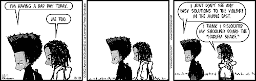
For my poster, I want to create a poster exploring my childhood up to the present. “What It Is” by Lynda Barry got me thinking about my personal history, specifically when was the point of time that I “grew up”. Since I’m also “young” in terms of average lifespan, I want to also reflect on how much growing is still to come.


In my writing exercises, I found that was reflecting most on images from my past. In my reflection, I realized just how different I became since my years in high school. I thought it would be sort of cathartic to focus my project over the passage of time, and change.


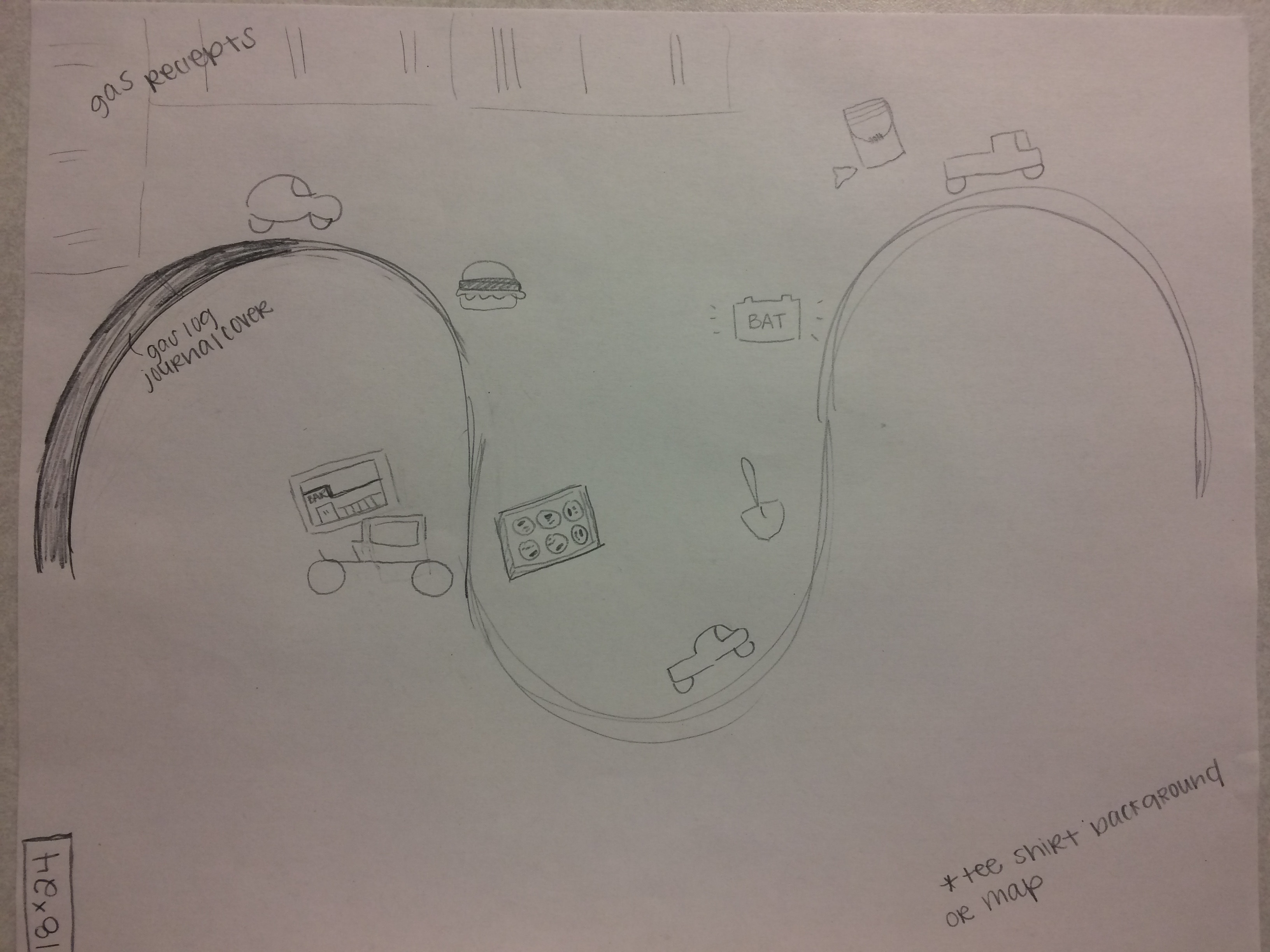
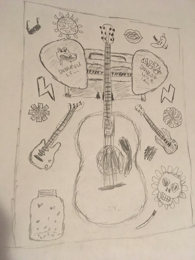
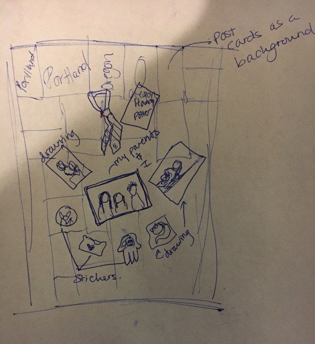
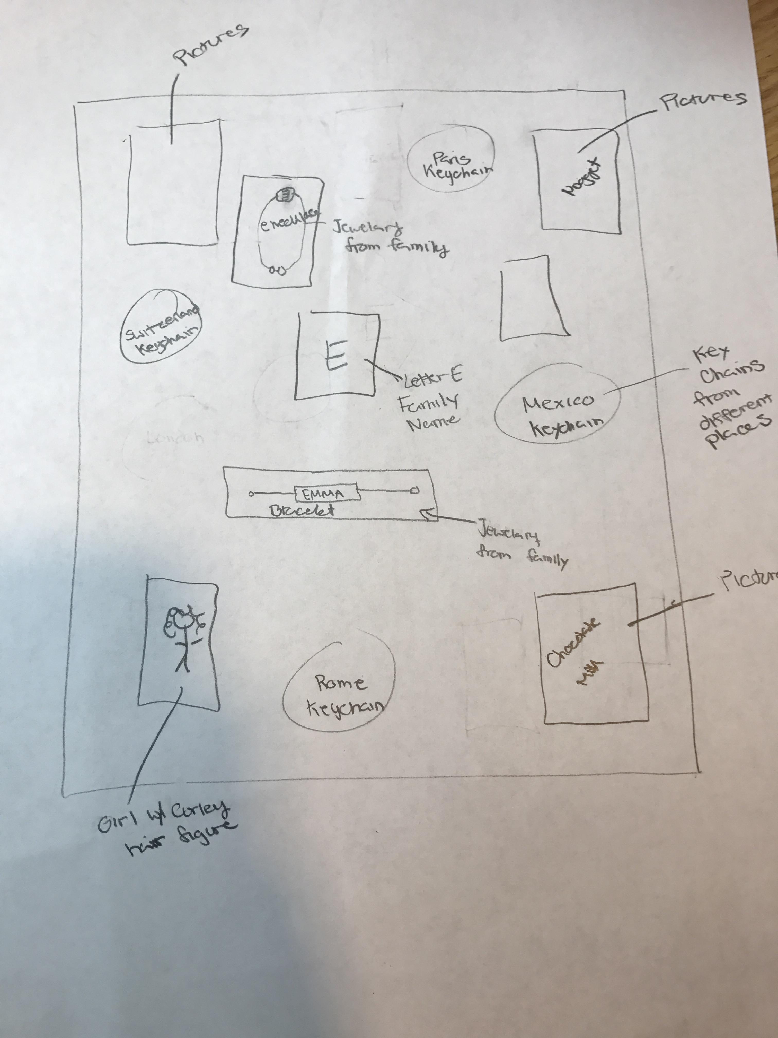
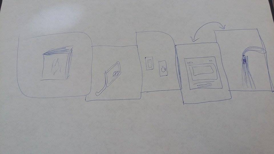
The texture and layering of the poster will resemble the style of Lynda Barry’s book. I will use a variety of crafting supplies along with illustrations and images that I’ve scanned or cut out. Most of the layering will come from how I employ hierarchy. I want to section the poster off into four corners with a center image similar to the one featured here. These four corners will emulate different stages in my life and in the future.  In some corners, items will be laid out in a organized matter, and other will be chaotic. Ideally, this poster will read from left to right in traditional comic style.

I can’t say for certain how I plan to lay out any of these corners or what items I may include. The process of actually putting everything together is probably going to bring up a lot of new ideas. I’m expecting a lot of this to look different in the final product.

Posted in Spring 2017 Archive (336) | Leave a comment

Hierarchy: Toree Boutz

IMG_0877Earlier this week, I arrived back in Pullman after a week in southern California. Over the course of ten days, myself, twelve other college students, and three cars journeyed to Los Angeles and worked with the Union Rescue Mission and its partners, serving the homeless community in California. It was one of the most incredible weeks of my life.

Over the course of the trip, we spent a lot of time on the road in our caravan. One of the “Writing the Unthinkable” exercises in Linda Barry’s graphic novel, What It Is, involves writing down the first ten cars that come to mind. With my week in L.A. being on the forefront of my mind, the three cars that made the trek were on my list.

For the second project, I want to tell the story of our time in California. I want to create a road map scene with different “stops” along the way, each depicting a moment from our trip.

The concept of hierarchy will be utilized in my project as the road I am planning to create will function as a timeline of sorts. In relation to design, Ellen Lupton and Jennifer Cole Phillips explain hierarchy as, “the order of importance… in a body of text” (page 129) in their book, Graphic Design: The New Basics. I will be using visual hierarchy in this project, as the placement and spacing of elements on my poster will express the order of events in my comic to the reader. Additionally, my layering of elements will naturally put some objects on top of others, also creating order. The road piece will be layered over the background, and elements that depict “stops” will be layered over the road. This layering of various elements that have differing textures, patterns, and colors will create texture within my poster. I plan to use very different pieces to physically and metaphorically illustrate the dynamic situations and circumstances we encountered during our trip.

Posted in Spring 2017 Archive (336), Uncategorized | Leave a comment

Hierarchy: Dave Herman

IMG_0814

I have decided to use my poster as a kind of reflection of my growth in music. I have been playing guitar and various other instruments for about five years now as a hobby and have improved my musicianship quite far over that time. I wanted to use this project to illustrate my personal experience with music  and my musical influences that have guided me in my playing. I decided that i would have an acoustic guitar in the center and as the biggest image to display it as the highest image in the hierarchy of my poster. Next i added the two guitar picks that i tend to use the most at an angle that directs the audience’s eye back towards the center of the poster. I did the same thing with a bass guitar and electric guitar below the picks.Next i decided to put a piano behind everything which kind of illustrates how piano and a kind of classical essence of music has never been very present in my education. The other various objects on the poster serve as illustrations for the various musical influences that have shaped my musicianship. I made these objects smaller to surround the guitars, picks, and other instruments in the center. I wanted them to kind of flow towards the center, illustrating how they have influenced me.

Posted in Spring 2017 Archive (336), Uncategorized | Leave a comment

Hierarchy: Leandra Choy

For my poster comic, I plan to show what my hobbies are, some background of where I grew up, and a little bit about myself (i.e. some of the things I like, favorite place to go, etc.) When I was doing the Unthinkable exercises, those were pretty random and consisted of things that were on my mind at that moment…. the result from doing the Unthinkable exercises consist of incomplete thoughts non sense in my opinion, not really suitable for my poster comic.

image1 (1).JPG

How I plan to lay out my poster comic is first establishing a background. I want to use these postcards I have (I collect them) and make a pattern with them. The postcards I have are Portland ones representing where I’m from and grew up. Using them as a background creates an interesting texture and a layer behind the other digitized items that represent characteristics of me.

Next, I want to place an old photograph of me and my parents in the center of my comic. Even though my parents were not in my life that much in my childhood, we have a close relationship. Surrounding that photo will be things like my artwork, some fandom things (Harry Potter and Alice in Wonderland, and My Chemical Romance), a manual to one of my favorite games, and some random items that represents a weird side of me. The photo in the middle with other items surrounding it is like showing different things that make me who I am.

My inspiration for my poster project comes from Lynda Barry’s collages in What It Is.

Posted in Spring 2017 Archive (336) | Leave a comment

Hierarchy: Sophia Price

As I think about my poster project, I have decided to use hierarchy in a way that changed the view of my objects that personally remind me of what my unthinkable writing provoked. My writing made me think of a time when I went to Maui with my family. To find some alone time I would walk to get coffee and then go to the beach and read, write, or play solitaire. I want to tell the story of my days broken up my morning and my family. I think I’m going to use six frames to divide my story between the three days. This will provide general hierarchy to my days- they were all about equal in my memory. Within the frames, I shall use layering to give a push to the hierarchal order of my objects.

IMG_0956

ROUGH drawing of what I plan to do.

I will have content glut to make each frame unique. I want to use my dress as the background in each of it, but change the angle, zoom, and textural view of it to change the setting of the frames. I will then place my other objects (book, cards, surfboard, coffee slip, and piece of coral) on top of it to tell different stories. I want to use layering to really give my story true depth, and to show which items have more urgency (more hierarchal power) than others. The dress is something I wore most days- its why I think its the perfect background. Everything else will be layered and textured differently to change its meaning for the day/frame. I’m hoping the layering might provide a content vacuum- taking away from the background images to pay attention to the more prominent focus of the frame.

Posted in Spring 2017 Archive (336), Uncategorized | Leave a comment

Hierarchy: Emma Garcia

For my poster comic, I plan on using the story of traveling especially including the vacations that involve family and spending time with my family. My family loves exploring new places and going on vacations this is a time where we learn more about the culture around us and spend time together. Although many of the keychains are not from places I have gone with my family, I will still use the key chains to represent travel. I will also use jewelry and a letter E to represent family which are important aspects of my family. These items will be incorporated into my comic through the scans and they will show how family and travel have been combined in certain ways and are all important aspects of my life.

When doing the Writing the Unthinkable Exercises I thought about what was something I love to do and what is something meaningful in my life. This is where I got the idea to create my poster comic on traveling with family.

Hierarchy is “conveyed visually, through variations in scale, value, color, spacing, placement, and other signals” according to Graphic Design: The New Basics (Pg. 129). I will employ hierarchy and texture and layering in my composition in many different ways. For hierarchy, I will display the scanned images of the different key chains I have collected from the places I have traveled to and make them the central background. This will present the idea that they are important but not the main focus of the comic. Then I will use layering by placing different memories with family or items from the family that connects to the area I had visited. Texture will also be used because I am going to include images past images which create texture within the overall poster comic by having a different surface that is manipulated.

Posted in Spring 2017 Archive (336) | Leave a comment

Hierarchy: Eva Guillen

I plan to tell the story of different major events that have happened throughout my life through the objects and pictures that I have. I am going to organize this compilation of images in a chronological order that the events have happened in my life. The story that I plan to tell using the poster comic format came from the writing the unthinkable exercises because as I thought about words it brought back memories. These memories have been part of major events in my life and that is why each word in the exercises held a certain meaning to them. These memories often triggered major events that happened throughout my life; I chose objects or pictures that defined and represented these major events in my life. I will then employ hierarchy by organizing these comic strip individual images by the order of importance. Then the texture that would be used would come from the different objects used throughout the comic strip. Then I would layer the images of the comic strip in the order I can see my representation the best fit. My comic strip draft below shows what I am planning as of now to do with my poster comic strip. At the same time it is still a draft because I still need to play with the best representation of my comic strip and how I may want to layer it. I want to continue playing with the overall layering of my images when I am creating the final piece; which is one of the main reasons why my draft is just a template of my final product.

This a draft of what my comic strip will look like but it is subject to change.

Posted in Spring 2017 Archive (336) | Leave a comment

Javin Nash – Hierarchy


boondocks pics

Illustrated by: Aaron McGruder

For my second project “Project 2: Poster Comics” I will be telling a story about my life growing up in across America, resulting in my final destination where I spent the last seven years in Seattle Washington. I will probably label each different place I lived as a new chapter until the final chapter: Pullman and show how my life has progressed and what I am doing in college now. Detroit used to be known as “Motor City” for their mass production of motor vehicles so I will use a visual hierarchy for the object of the Cadillac that I will be displaying. I feel that this will give a sense to the audience a little bit of what Detroit was like when I live there (1995-1998). Since I have not yet tried mixing media I will use that for the Philadelphia chapter with the layering, although I am not sure what I will be layering just yet, maybe old pictures of me and my family mixed with a popular landmark in Philly. As for the texture part of this novel I will use money (dollar bills) because when I was younger I would sell school materials and candy to my peers all throughout elementary and the beginning of middle school for cash and with the money I saved up I would buy my mom flowers and other heart warming gifts. I do not have a picture yet for this post so I will post one that inspired me to create my poster comic.

Posted in Spring 2017 Archive (336), Uncategorized | Leave a comment

Blog #7: Texture- Cleana Broman

As stated in Graphic Design the New Basics, texture can be achieved by layering various material on top of one another. Often times they are overlapped in a way that makes them look seamless and meant to be clustered in a more natural way, however recently some artists have been making the layering process obvious to give transparency and give a different take on the concept of texturing via layers.


lynda barry

Lynda Barry’s “What it is” pg 4

In Lynda Barry’s book on the 4th page i noticed an immense amount of layering. It looks like she painted watercolor on the original paper and then pasted bits of other pieces of paper on top of the paintings themselves. She also talks about how one form can change into another, and adding alternating mediums with varying textures can definitely ad to the feel of change she was trying to convey.

Posted in Uncategorized | Leave a comment

Texture: Alex Gutzwiller

Lynda Barry uses full-colored pages filled with texture in her book What It Is? Barry creates texture with combinations of text, written word, drawings, paintings and photographic collages depicting nature and childhood memories to tell Barry’s story and to ask questions about imagination and creation of design. By using these textured collages, I feel sets the mood of the book and helps to reinforce Barry’s points as images and words seem to stand out from the pages. Additionally, this artistic style of Barry’s helps the reader to think about the many questions she asks as these certain images stand out from others as a result of the textured collages layered on or juxtaposed to painted, hand-drawn and photographic images. As stated in Graphic Design: The New Basics, “Texture is the tactile grain of surfaces and substances” including textures “in our environment” that help us understand things around us, which are the elements Barry uses to create her book.

For example on page 7, Barry explores the passage of time and the changing of seasons through the use of texture. In the upper right hand corner an alarm clock sets the tone about passing of time. This man-made clock stands out visually with its’ hard, clear and smooth glass next to the contrasting soft images of blowing natural grasses and twigs. With the words, “Don’t Be Alarmed” on the clock’s bells, Barry seems to

page-7

What It Is? by Lynda Barry, Page 7.

tell the reader enjoy time’s passing. At the top of the page, Barry uses a collage of child’s writing about seeds from 1951. Manipulating the surface paper Barry gives it the textured appearance of being crumbled and aged with dark shadings. By combining the idea of seeds on a faded 1951’s paper the reader thinks about changing seasons and time passed. The center image uses the digital textures of blowing grasses in the wind and an overlaying painted red-winged black bird perched on a stiff branch. The stiffness of bird and branch and blowing grasses creates texture by placing these contrasting textures side by side (stiff/bendable). The bird also appears to be catching seeds made out of round dated postal stamps falling from the top of the page down to the bird’s peak. This center image is also a physical and virtual textured space combining environmental designs with typed descriptions of seeds traveling over and over again, making Barry’s questions about time passing stand out. Lastly, Barry explores the ideas of tides that change with passing hours. In the lower right corner Barry again uses a man-made object like the bumpy hard steel-valve, next to contrasting soft nature images of flowers and bubble, dot-like water. “Turn to Open… Then” on the valve tempts the reader to turn the valve and feel the texture of quick flowing water from a pipe. The fish on lower right is a bottom feeder and with the collage of the tree over the fish, I feel creates the look and texture of mucky mud associated the ocean’s floor where the fish lives.  Page 7, from What It Is? is one page of many throughout Barry’s entire book that uses the design techniques of texture to tell her story, ask questions and cause the reader to look over the entire page as Barry created images stand out purposely by manipulating surfaces, contrasting textures and with the use of physical and virtual textures. In this way Barry places meanings and connections between all images on the pages of her book.

Posted in Spring 2017 Archive (336) | Leave a comment