Javin Nash – Layers

IMG_1983

Lynda Barry “What It Is” page 34


IMG_1972

“And The Pursuit of Happiness” Maira Kalman page 68-69

On page 68-69 in “And the Pursuit of Happiness” by Maira Kalman she illustrated temporal layers. Temporal Layers are overlapping forms, images, and text blocks that suggest depth and motion. In one of the pictures above there is what looks like a white piece of paper white the numbers 7 and 8 in black on it laying in what looks like a field of green grass. This layering is important because of how it exemplifies depth. I could be using my own imagination but I feel as if the layers Maira Kalman made in this picture are what pieced the picture together perfectly. There is not much transparency on the image of the book or the grass but I get a feeling that the image of the book is lapping the grass.

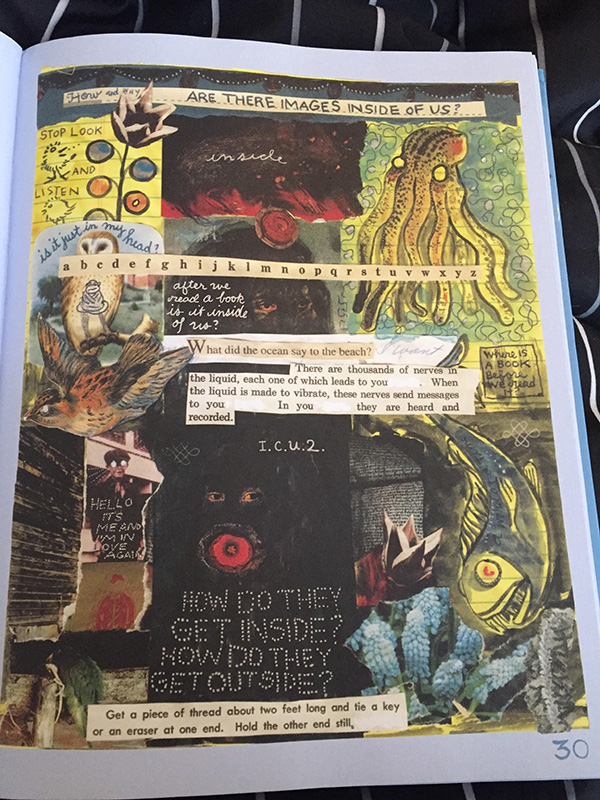
On the other hand Lynda Barry demonstrates many different important layering techniques on page 34 in “What It Is”. I immideately noticed the physical layers, layers that were not digital but real paper stacked on top of another piece of paper. Lynda used the cut and paste method with the image of the fish and blended that same printed layer image with a temporal layer ( low opacity). This deal of work is important because even though there are no real focal points you can get an idea of what is supposed to be read/looked at first/last. For instance the background itself is yellow like phonebook paper and the next layer on top of the background are pieces of paper that look like they were scanned on, a drawing of a fish on top of that layer, and then a little bit of typography is going on around that fish image. Perspective is everything and I feel like if you look too close at these images they will seem confusing but as you pan outward and look at it from a view further away all of this work makes more sense and can be read/viewed easily.  


Posted in Spring 2017 Archive (336), Uncategorized | Leave a comment

Layers: Jasmin Negrete

FullSizeRender-1

Page 48 of Lynda Barry’s graphic novel “What It Is”

Throughout Lynda Barry’s graphic novel What It Is there you can see many different forms of layers. On page 48 of her graphic novel you can see the form of layering known as Cut and Paste. Throughout this page you can see that many of the text has been cut out from other books or papers and pasted on to this page. The images along the right side of the page also seem to be pasted onto the page. As well as the upside down dog and the peanut ant and cow.It is important that Barry used this type of layering because it follows the theme/topic of the page, which is “Follow A Wandering Mind”. These images and text have been layered on top of one another to create a type of collage throughout the page. Which makes the page much more interesting to the reader, because their eyes go to different parts of the page. However, in Craig Thompson’s

FullSizeRender

Page 88 of Craig Thompson’s comic “Goodbye Chunky Rice”

comic Goodbye Chunky Rice you can see a less intense form of layering. On page 88 of Thompson’s comic you can see that he uses a form of Temporal Layers. On this page you can see that each panel of the comic is a layer. However, in the top  panels you can see that the three panels along the left side of the  page have been layered on top of the big panel (background) that takes up most of the page.The layering makes it seem like the three side panels are part of the bigger panel. At the bottom of this page you can also see that the left panel is layered on top of the right panel because parts of the bird’s body hover over the next panel, while he is looking at what is going on. I feel like the layering used throughout this page makes it easier for the readers to understand and for the story to be told because the individual panels becomes an entire picture.


Posted in Spring 2017 Archive (336) | Leave a comment

Layers: Cass McKay

This is my example of layers from Lynda Berry’s book “What It Is”.  Its from page 74, and I believe this one of the best examples of layering throughout the whole book!  Lets start from the top, all the writing looks as if it was cut from another source and pasted into this book.  Not only that but each form of writing has a different textured background such as brown paper, lined notebook paper, etc.  Taking writings from different mediums creates unlimited forms of layering, especially with writings and drawings living on the backdrop of this page, it gives you that scrapbooking feeling which is always full of layers.Layers.jpg

The second example is from (a graphic novel I want to read) DareDevil: The Man Without Fear.  The obvious reason I chose this from the graphic novel is because the layers show his progression from on top of the building, to jumping off and falling farther and farther downwards.  While looking at comics and varying graphic novels I have come to the conclusion that super hero / action ones tend to be full of layering to depict the sequence of events.  It is much easier to layer like this because the only other alternative is to stretch out this sequence over multiple squares of comic space and it just isnt as compelling as depicting their stages of movement through layering on one image.  This idea is used in every other mainstream comic such as Batman, Superman, Wonderman, etc.  It is the style staple of the comic franchise, and they just wouldnt be the same without the process of layering!Daredevil.jpg

Posted in Spring 2017 Archive (336) | Leave a comment

Texture: Theodore Nikolov

fabc1c4723b7070e27b61d32f27970e7

Page 43 from Lynda Barry’s “What It Is”

In “Graphic Design: The New Basics” by Ellen Lupton and Jennifer Cole Phillips, they describe texture’s purpose to “exist as an optical effect and representation” for a given variable. In Lynda Barry’s “What It Is“, we see that very thing being portrayed in page 43.

The trees are done in a texture that appears very much like water color (even though its a printed book). In addition, as explained in “Graphic Design: The New Basics” this page uses five squares and ten inches to change up the font across the page so that it represents the desired mood of the picture. Specifically the font at the bottom appears to be handwritten which contrasts with most of the remainder of the page. She uses surface manipulation to give the yellow notebook feel in the back in addition to helping achieve depth within the illustration.

Lynda Barry definitely took the time to apply texture on this page so she could create an ominous feeling to the entire passage. Visually, the page looks very eerie and she manipulated the fonts and the page using texture to give us that sought out feeling.


Posted in Spring 2017 Archive (336), Uncategorized | Leave a comment

Texture: Cass McKay

The example of texture I selected is page 71 from Lynda Barry’s book What It Is!  This book is full of  examples of texture, its really just up to the reader to select one that stands out in their eyes.  This page is a quality example to me because there are many factors almost rising off of the page due to their texture.  The tiny diamonds on the top of the page (as well as behind the bird & the heart) make it look like this page is actually badazzled and not just a copy to be mass produced. They give texture because realistically diamonds have many sides and are not 2-D, so their affect is giving life to this page.    (writing continued below example—–>)

Textureeee.jpg
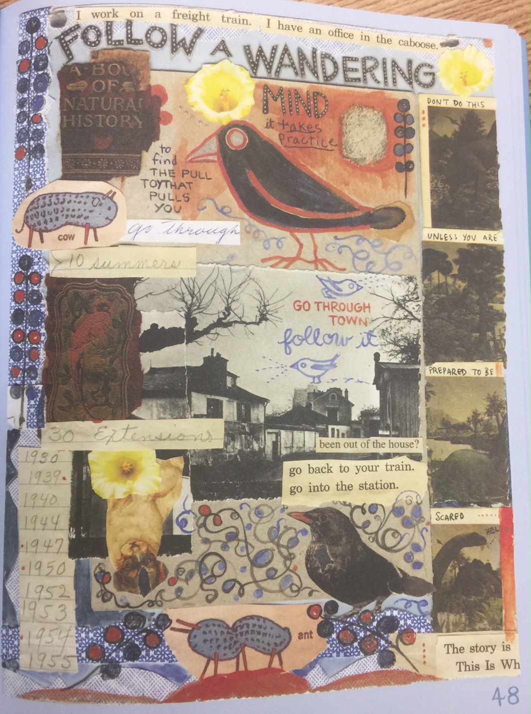
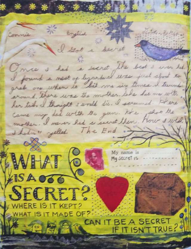
Another feature of this page that gives it texture is the cutout images, brown treasure chest, heart, stamp, the two geese, blue bird, etc.  These aspects give the page a handmade scrapbooking feeling, like they were just glued on top of this page.  It helps the page come to life and differentciates itself from the writing or background of the page.  The upper half of this page which is the half that looks like it was cut off from a piece of notebook paper also adds texture.  It to looks like it was glued by hand to this page, adding texture because we assume theirs a ledge on its borders.  The tree branches painted on would add no texture if they were just flat on the page but since it crosses from the background to the notebook paper t adds texture by being on varying dimensions.  In conclusion, examples of texture can be found on almost every page of “What It Is” by Lynda Barry, you just have to find one that speaks to your understanding of “texture”.

Posted in Spring 2017 Archive (336) | Leave a comment

Layers: Aaron Scofield

Page 30 from Lynda Barry’s graphic novel, What It Is

In their book Graphic Design: The New Basics, Ellen Lupton and Jennifer Cole Phillips define layers as “simultaneous, overlapping components of an image or sequence” (141). I completely agree with this definition because it is well-written and I think that overlapping is one of the most important aspects when creating layers. Overlapping is when an object has different layers and those layers are shown by one layer that is laying over the top of another, essentially covering up a percentage of the bottom layer. Cut and Paste and Mixing Media are two kinds of layering that Lynda Barry uses in her graphic novel, What It Is. This is a very unique style of art and it used on almost every page of Lynda’s book. For example, on page 30, she has several layers of images that are stacked on top of each other. Some of these images are paintings or drawings, some are printed cutouts, and some are even real digital photos taken from a camera. Barry also layers her text across the images in a variety of different ways, whether it be cutouts of printed text, hand-drawn text, or stylized text over the images. Her creative cut and paste method as well as her use of mixing media is what makes her work so unique.

Page 4 from Daniel Clowes’ graphic novel, David Boring

Layers are very important when it comes to adding depth to an image. As a designer, you want to create variation within your work so it doesn’t all look the same and so that different parts or layers stand out more than others. If some layers are deeper in the background than others, it can provide a three-dimensional effect and help the layers stand out more or appear as if they are in front of the other layers. A good example of this is shown in Daniel Clowes’ graphic novel, David Boring. As you can see in the majority of the frames, there are objects that are placed in front of others to add depth to the image. The frame in the bottom left corner shows a tree that is well in front of a house to make it appear as if the house is farther back. The tree layer is overlapping the layer of the house within the picture.


Posted in Spring 2017 Archive (336) | Leave a comment

Layers: Conor Reich

what it is

Lynda Barry’s, “What It Is”, Page 81

The image to the right-taken from Lynda Barry’s, “What It Is”-acts as a fine demonstration of creatively incorporating layers in the page’s design. There is a lot going on in this page, yet it all works due to her use of layers. The layers are evenly spaced out and discernible from one another. For example, we know the growth at the top of the page is perhaps the foremost layer. Whereas the center paragraphs that ends with “Doing both takes and Gives Time-” is perhaps on the bottom most layer.

It appears as though Lynda Barry used a form of layering known as Cut and Paste. This refers to the physical process of making a collage. After all,  a collage is just a sequence of layering when you think about it.

Lynda Barry’s use of layering allows her to treat each image as an asset. She is both able to single out the image, as well as blend it together with other images and texts. In other words, Each image could be viewed individually, or the reader could step back and simply enjoy the collection.


Posted in Spring 2017 Archive (336), Uncategorized | Leave a comment

Texture: Conor Reich

The Walking Dead 158-009

The Walking Dead By: Robert Kirkman, Issue 158, Page 9

Texture allow illustrators to clue the reader into the nature of things within the world they are creating. Texture can refer to the type of paper the final product is being printed on, or more likely, it refers to the physical manipulation of surface details within the illustrations. Take the picture above as an example. The dead truly appear to be alive, not because they are simply walking upright, but due to the textured details littered throughout the illustrator’s work.

The zombies’ clothes have been ripped and torn. They are dirty, and their skin is rotting and decaying before our very eyes. Overall, they look rough. This further emboldens the theme of a lost world present throughout the series. Essentially, these rough creatures are bringing about an end to the character’s previously finely tuned, polished, and luxurious lifestyles. The humans struggling to survive as pale and smooth in comparison to the rough and darkened dead.

The reader can even easily identify the types of materials characters are wearing. For example, in the third smaller panel, we can see a man wearing a leather jacket over a white t-shirt. The picture is small, yet texture is the only thing needed to truly make the image identifiable.

More textures appear throughout the page, Each blade of grass adds to the page in the same way that each whisker adds to the face of the bearded hero in the third small panel. Texture makes the world feel authentic and alive.

Posted in Spring 2017 Archive (336) | Leave a comment

Texture: Aaron Scofield

Page 21 from Lynda Barry’s graphic novel, What It Is

In Graphic Design: The New Basics, Ellen Lupton and Jennifer Cole Phillips describe texture as the “tactile grain of surfaces and substances” (69). I like this definition because when I think about texture, what comes to mind is the individual grains of a particular surface that help define that texture. Those individual grains can be smooth, rough, soft, sharp, and a variety of other different textures. Different textures can be used to give us an understanding of how something feels or how it differs in appearance from something else. In her graphic novel, What It Is, Lynda Barry discusses her life and how she came to find herself as both a writer and an artist, or in other terms, graphic novelist. She talks about how she wasn’t treated well in her youth and how her struggles helped her become who she is today. There is no doubt that Lynda Barry’s work is very creative and many of the concepts she uses are difficult to understand. On page 21 of her book, she uses several different textures while telling her story. There are birds that have a more smooth, watercolor paint texture and then there’s another bird that is drawn with a lot greater detail. Lines, colors, and different shades help define a feathery texture on the bird. Lynda also uses a good amount of texture in her text. Some of the text that is on this page is drawn in marker with thicker lines, while some other pieces of text are drawn in pencil or pen. At the bottom of the page, she even uses a typed out font that looks like it has come out of a book based on the tan, grainy, book-like texture that the text is laying on. According to Ellen Lupton and Jennifer Cole Phillips, texture can be either physical or virtual. Artists can take pictures of physical objects with unique textures and then attempt to recreate that picture digitally, or virtually, with some sort of editing software like Adobe.

Posted in Spring 2017 Archive (336) | Leave a comment

Layers: Sanaya Nordine

In this page from Lynda Barry’s What It Is  we are invited to explore the concept “Can You Stand Being Lost?” She asks us to follow a wandering mind, and seems to be one of the few pages without any intended purpose. Interestingly enough, we ourselves become lost, looking for an answers when Barry just invites us to enjoy the ride.

She uses various cut, paste, & splicing techniques to present us these wandering images. First, we see a cut-out of a cat, which is layered on top of a drawing of octopus legs, and has an overlayed string of lace. Other images include another “flower” of lace with attach leaves of cut-out script. These layers placed on top of one another create the idea of depth despite lying in a 2-dimensional space, and mimic a child-like practice of cutting and pasting images for a collage. This playful practice helps us to “wander” as BArry intends us to.

IMG_0518 (1)

Page 49 of Lynda Barry’s “What It Is”


Posted in Spring 2017 Archive (336), Uncategorized | Leave a comment