Layers: Alex Gutzwiller

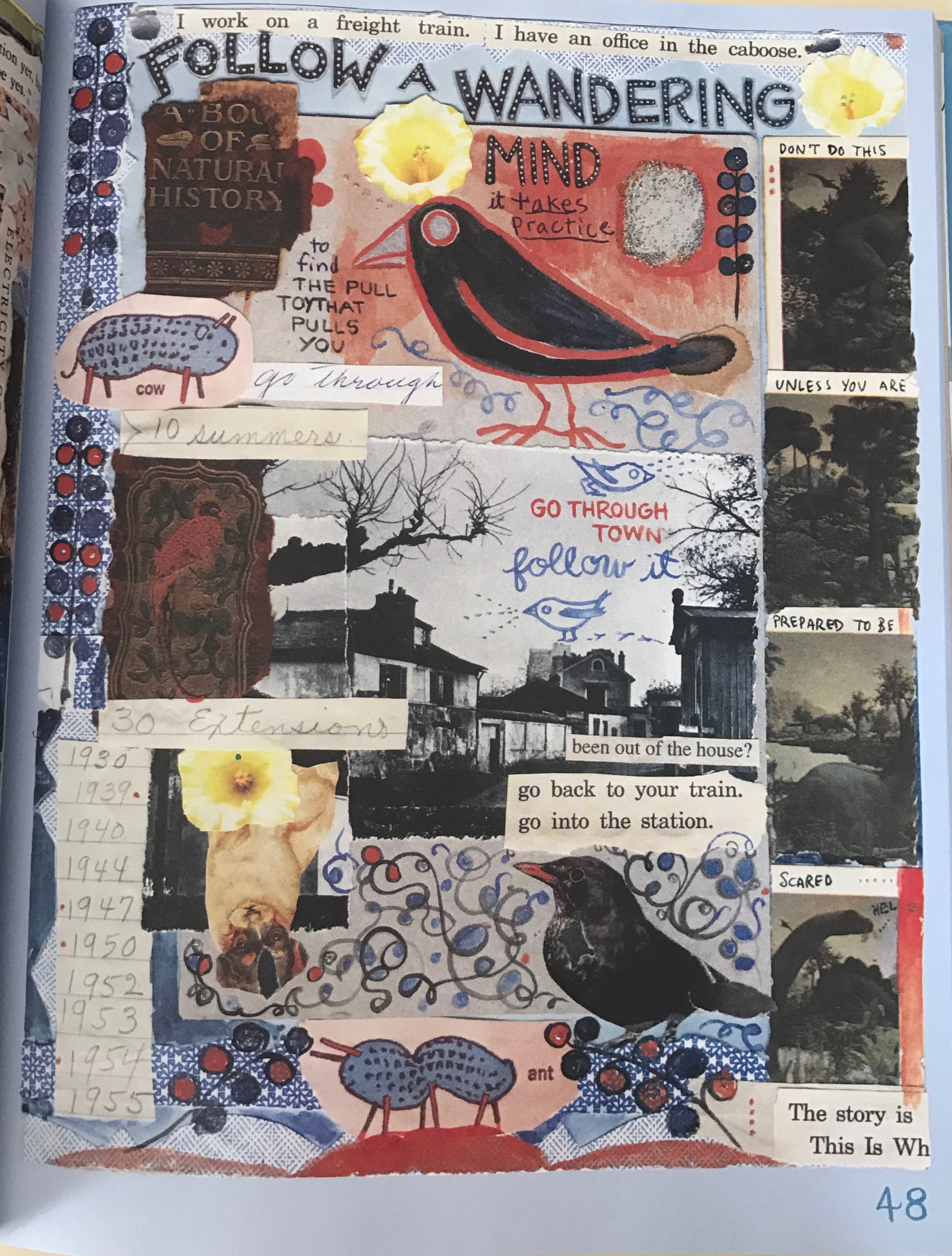
In Graphic Design: The New Basics by Ellen Lupton and Jennifer Cole Phillips, the artistic element of layers is defined as “simultaneous, overlapping components of an image or sequence”. Through layering designers can use images as a collection of “assets” that shows variations within the piece. The use of layers is found throughout Lynda Barry’s book, What It Is? On page 48, Barry uses the cut-and-paste techniques and the

page-48

What It Is? by Lynda Barry, Page 48

overlapping collages of different papers, images and texts to create a collection of designs to illustrate the idea of following a wondering mind. Barry used a torn photograph of a town to anchor this page to the idea. One can see that the left side of the photo was torn leaving jagged edges, but was put back into place that reveals the cut-and paste technique. However, the bottom of the photo is partially covered also by a jagged-edge designed blue paper filled with scrolled designs, which is not part of the original photograph indicating it was layered on top of the photo. Additionally, Barry continues to layer at the bottom of the photo with collages of text and a cutout upside-down dog with a flower on top of the dog. These juxtaposed layered images create depth that moves from a low of the photograph to a high of the flower on lower left.  Additionally, Barry cut, cropped and pasted parts of text that gave fragments of sentence like “The story is”, showed that Barry spliced the pieces of paper and layered over other images throughout this page.


From the coming of age graphic novel, Bad Houses two teenagers meet at an estate sale. On page 52, Anne is seen sleeping on a chair amongst the “treasured” belongings that like Barry’s techniques are seen as collages layered over other items in the room. Unlike Barry, the collage images are not layer from the cut and paste method but rather are purposely drawn in a layered manner. However, the drawn collage images seem misprinted because these items are normally very small. A book of matches, a newspaper clipping

63109840-FCDD-4990-B36D-A5840B7E3719

Bad Houses by Sara Ryan, Dark Horse Book, 2013. Page 52

and a small jar are oversized in comparison to the room emphasizing the importance of these “treasured” memory things because they are brought to the forefront of the page. However, drawn in this way also creates the oscillation between depths of larger oversized images in front and normal sized images behind that gives the design it’s varying layers. Additionally, the room and it’s belongings also shows layers as the image moving from front to back starting with close-up stairs on the right, then chair followed by boxes and finally the curtains of the window. As a result, the viewer’s eye moves through the room, as if one is standing in a 3-dimensional room covering the distances and stepping over the layers of belongings to get to the other side. This is different from Barry’s layering affects, which are 2-dimensional Bad Houses by Sara Ryan, Dark Horse Book, 2013. Page 52

Posted in Spring 2017 Archive (336) | Leave a comment

Texture: Sanaya Nordine

According to Ellen Lupton and Jennifer Cole Phillips’ Graphic Design: The New Basics texture “corresponds with [the designs] visual function.” In Lynda Barry’s “What It Is” we are taken through a series of short excerpts on her childhood and pages in between that contemplate the concepts of her experiences. She questions what it is to even have an experience, and what elements make up the things she remembers.

This page in particular contemplates “What is Attachment?” At this point in the graphic novel, Barry is questioning how she grew out of the playful mindset she had as a child. She uses a textural harmony and contrast to emphasize certain thoughts running through her mind. Images like the dark figure with a flower and the creature with a seashell on it’ head have a sort of color harmony, but are separated by other pasted elements such as cutout images (the bunny) drawings (the squirrel and owl-cat), and various clippings of text.

These contrasting images are effective because they allow us to understand the concepts Barry is introducing to us. Like how she struggles with recaptures her playful youth, she is inviting us to recapture ours by “playing”-making sense of the visual text in our own words.

Posted in Spring 2017 Archive (336), Uncategorized | Leave a comment

Layers: Cora Kline

Linda Barry’s image shows layers in several ways. Primarily the image of the deer is layered behind blue shapes, which are implied to be flower petals, and little silver/white dots which could be dew or snowflakes. Another major example of layering is the second image of the deer on the right side of the page. Its framed within a square, creating the illusion that we’re looking through a window and that deer is back at a distance. Linda also creates a vine with flowers by layering different shapes. She layers the branch with flowers and diamond shapes. Each layer in Linda’s book has a different style. Linda uses layers to create depth, interest, and texture.

Contrast this with the image from Noah Van Sciver’s “The Hypo”, which has very few layers. This lack of detail and layering is consistent throughout the book and gives the focus more towards the story. There is some layering with the setting in panels 2 and 4 but most of the images are relatively flat and the few layers there are have the same art style.

Posted in Spring 2017 Archive (336), Uncategorized | Leave a comment

Texture: Jasper Barbosa-Rodriguez

Reading about texture made me think of the hands that flipped the pages of my book. It made me think about the shiny and dull surface of skin, speckled with flecks of freckles, along with tiny nicks of discolored skin where scars from Boy Scout outings and whatnot remain after years of supposed healing. Being the “tactile grain of surfaces and substances,” according to Lupton and Cole-Phillips Graphic Design: The New Basics, texture almost gives the identity and life, or lack there of, of the subject matter. There’s a reason why we cant tell the difference between an actual human actor versus a character made from CGI. While proportionally they may be similar, and even have the same gestures, there’s something about the skin that always gives the computer graphic away. We can argue that the “something” is texture.

Texture is most often created to give the essence of depth and variety to a piece, as seen in typographic portraits, or it can be used to show the difference between two objects, like hard and metallic and soft and organic.

FullSizeRender (1)Lynda Barry crafts together texture in this example of her graphic novel What It Is. In page 158, we see one of her popular octopi covered in what appears to be suction-cups, which characterize such creatures, until closer inspection reveals it is actually argentine puff paint. This is an example of surface manipulation, and while she could have left the octopus alone, she took the opportunity to give variety to the entity. Within the same box, the background is also given texture and variety with points of taupe on a tangerine and lemon-hued sky. Just looking at interaction between subject and texture makes you want to brush your fingertips across the tentacles, only to find they are smooth, because of the print.

Posted in Spring 2017 Archive (336) | Leave a comment

Layers: Theodore Nikolov

d8fbc304fcb44f342b1dca53b520755b

Page 143 of Lynda Barry’s What It Is.

Layers allow us to understand what content is supposed to be more important to the reader and usually helps us determine the order of which we are supposed to read the material. They are important in all types of media, ranging from print to screen. “Layers allow the designer to treat the image as a collection of assets, a database of possibilities” as said by Ellen Lupton and Jennifer Phillips in Graphic Design: The New Basics. In this specific example from Lynda Barry’s What It Is, there is definitely a collage of layers formed to help convey the message and draw the reader from section to section. There are a lot of physical layers, where objects are stacked over each other  such as the newspaper looking boxes appearing to be on top of everything and even the green tab on the right seeming to be below it.

RCO016

Page 16 of Flashpoint by Geoff Johns, Andy Kubert and Sandra Hope.


I would love to finish reading Flashpoint because it is based on an alternative universe for all of our favorite DC heroes and has been interesting thus far. This page in particular was an excellent example of layering, from the text boxes using red to establish an angry version of Batman, to the overlapping of characters between frames. There are temporal layers that help convey how Batman apprehends his target after a long rooftop chase. The images are connected through being layered, primarily through the villain character overlapping between every “chase” slide. Luckily the story also goes from top to bottom, but sometimes without proper layering some details could get lost and people might not know where to look to quickly understand what is happening on the page.

Posted in Spring 2017 Archive (336), Uncategorized | Leave a comment

Texture: Cora Kline

Linda Barry uses texture in several different ways on this page, both in the literal sense, where if we had the original picture we could feel it, and in implied texture, where it wouldn’t have a noticeable physical difference, but looks like it could. There is the literal texture coming from the pieces of paper she ripped and physically glued together. These pieces create a ripped texture with frayed edges giving the edges a soft-looking texture.

texture.jpg

“What It Is” by Linda Barry, Pg 88

These pieces of paper are also thick, where if you ran your fingers over the page, you could feel a noticeable difference between them and the page below. There is also larger pieces of paper that are crinkled creating another type of texture.

There is also imagined or implied textures through the painted dots. The little dots created the illusion of a rougher texture while not physically creating such a texture. Linda uses water color paint to create a smooth texture in the lower third of this image, which is in major contrast to the rougher-looking top half of the image.

There is also a textural difference between the hand written words, the computer printed words and the painted images. The pen written words are less solid than the others. The solidness of the lines varies within each stroke, giving a little bit of a rougher texture. Contrast this with the computer printed words which are evenly solid throughout the whole word. The painted images are solid, but have a thickness to them that makes theme seem heavy.

Posted in Sample Posts by Students, Spring 2017 Archive (336) | Leave a comment

Layers: Jasper Barbosa-Rodriguez

Layers seem to be right up there with Point, Line, Plane and Scale, in regards to the frequency of graphic components we see in our everyday lives. Whether they’re in the complicated form of collages (cut and paste), or simply the progression of time mapped out onto a single surface (temporal), layers constitute “the simultaneous, overlapping components of an image or sequence” (Graphic Design: The New Basics, Lupton and Cole-Phillips, 141).

FullSizeRenderIn Lynda Barry’s What It Is, layers might be an understatement for describing her mixed-media-saturated pages, and really any page you choose could be an example, but on page 95 of the graphic novel, we can easily see the layering. We can see the jagged edges of pieces of paper she ripped out and then drew over, like with the fish with the projectile coming out of its head, or the macabre butterfly she cut out, colored, and pasted onto the page. We also see the essence of a complex red border she uses as almost mountains in various places on the page, and the usage of water color that truly saturates the page and gives it a wash of consistency in the chaos.

FunHome-580Then we see a slightly different example of layering in the graphic novel Fun Home by  Alison Bechdel, where we see the implied printed layer of a house, but that’s cut into so as to peer inside. This is an example of layering, because the circles aren’t consistent to the background, giving them the nuance of being cut out and pasted on top of the house, which in a sense they are, at least how they’re represented on the page.

Posted in Spring 2017 Archive (336), Uncategorized | Leave a comment

Texture: Jasmin Negrete

IMG_3967

page 93 of Lynda Barry’s graphic novel “What it is”

According to  Ellen Lupton and Jennifer C. Phillips in their book Graphic Design: The New Basics, Textures are both physical and virtual design elements that contain a visual function (pg 69). Texture can be used to add meaning to a design or image in a way that it tells a story. Throughout the graphic novel What It Is, Lynda Barry uses many different forms of texture to tell her story. On page 93 of her book, you can see all throughout the page the texture she was trying to create for her story. Throughout the writing “Shop and Savew Hula Days” you can see a form of surface manipulation. It looks like she repeatedly went over this writing multiple times to add emphasis to these words. This form of design  texture can also be seen through out the rest of the page. The drawings such as the hula girl and the volcano, and also the little boy on the top right corner seem to have surface manipulation.  I feel that Barry decided to go with this design texture because it gives the feeling that these pictures are sketches. The multiple lines that go over an image give the reader a sense that this is not a final draft, that its more of a sketch of the image. Throughout this entire page there are also multiple thin lines that go across the page, which make the page seem like it’s a piece of notebook paper. Which adds to the meaning of her images being sketches.


Posted in Spring 2017 Archive (336) | Leave a comment

Layers: Logan Quaranta-Rush

layers2

layers

Persepolis pg 11, by Marjane Satrapi, source 

Layers help us depict what is possibly most important from what is not. We understand that what is most important is usually on the top or in front of all the other objects, thus making “crucial to how we both read and produce graphic images today” as said by Ellen Lupton and Jennifer Phillips in Graphic design the new basics. In the early twentieth century cubist artist began cutting images and creating collages much like what we see in Linda Barry’s comic what it is on page 87. Linda uses layers to give depth to her art but it differs from our usual understanding of importance in front. The collage of images that she uses seem to be placed with no thought to what should be in front and what behind giving us a disorganized feeling and belief that a small child made this book. While in the comic Persepolis by Marjane Satrapi we see a different approach, an organized approach to the layers. Because of the solid look of the content in this comic organization to the layers is far more needed or else details would get lost and the image would blend together creating a single shape.


Posted in Spring 2017 Archive (336) | Leave a comment

Layers: Cesar Rubio

page_97_72dpi

Page 97 of Lynda Barry’s What It Is.

Lynda Barry’s What It Is is an amalgamation of orginal work by Barry and excerpts and cutouts from others. There are two distict styles at play here, page 97 is my favorite to showcase layers.

Lynda’s work is made on yellow notepad paper, but it is not clearly evident on this page like on other pages. Here Lynda cuts and pastes objects on the page, completely covering the blue lines that are usually visible.

This in turn not only creates texture, but a hierarchy in what Lynda considers important. Text and photograph cutouts that are relevant to the subject she is discussing are on top, in the foreground, and background images and illustrations or on the bottom, in the background.

chunkyrice

From Good-bye, Chunky Rice by Craig Thompson.

I would like to finish reading Good-bye Chunky Rice by Craig Thomson. What really attracted my attention to the graphic novel was the turtle character, Chunky Rice and how much he resembled a character I made up for a project years ago.

The entire graphic novel relies on black and white drawings very much in the style reminiscent of woodcuts. The lines are sharp and there is a lot of contrasts, so this might not seem at first to lend itself to the best display of layers. But Thompson’s use of framing creates the effect of layers.

The dialogue boxes go above all else, even the borders that often form the frame of a particular comic panel. Next in this hierarchy that Thomas creates are objects in motion. Often times when an object, most notably in this page, like a shovel or a bucket is in motion by the character this object once again goes beyond the black borders that create the frame for the panel.

One more way that Thomas implies layers is when scenes last over several panels. It is really evident on the lower left panel and the one right above it. It almost appears that the black borders are added on top of the scene, there is a continuity in-between the frames that makes this possible.


Posted in Spring 2017 Archive (336) | Leave a comment