Texture: Cesar Rubio


page_40_72dpi

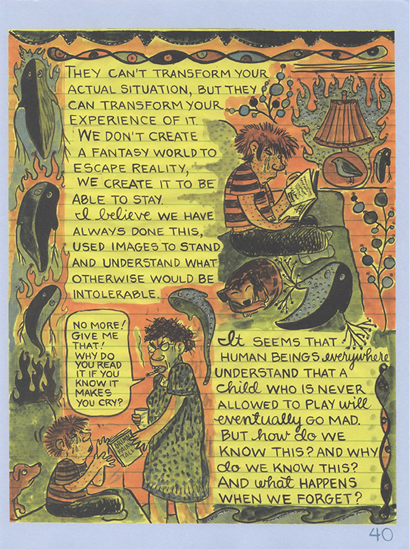
Page 40 of Lynda Barry’s What It Is.

On page 40 of What It Is, Lynda Barry recounts the impact that stories had on her childhood. The reason that I chose this particular page from the work to showcase texture has a lot to do with something she writes in this page.

“We don’t create a fantasy world to escape reality, we create it to be able to stay.”

I found myself rereading this passage and thinking about my own childhood. While rereading the page over and over, I did notice subtle things about Barry’s work that utilize texture.

I often found myself disregarding Barry’s choice of paper to make the work on, but after a while I saw how this choice of texture added to the work. Barry’s use of yellow notepad paper and its texture not only helps with the alignment of text, she often writes on the lines to structure the text, it gives a mundane and seemingly ordinary appearance to her work. This is in no way a criticism. This makes the work approachable and that much more personal. As if we are looking into someone’s diary. I think this textural quality of her work makes it captivating and unlike many other graphic novels which often lack a lot texture, instead relying on line and shape to depict a story. Not Lynda Barry.


Posted in Spring 2017 Archive (336) | Leave a comment

Layers: Jon Williams

20170306_233706

When looking at this particular page, the theming of a scrapbook is still very relevant. With this theme, the layers of the page are fairly obvious and straight forward. This isn’t necessarily true always. (What it is, by Lynda Barry. page 146)

With this page, the layers are mostly physical layers, objects that look like they’re actually stacked on top of one another. on the top of the page, there is the octopus page which acts as a header, but is separate from the dotted lines paper, to create a clear separation between the two pages. This separation helps divide the header that has directions from the paper the reader is meant to write in. It’s more evident that this is the idea as blue birds litter the sides of the page to kind of act as monitors to where the reader is allowed to write. This divide is important, and it wouldn’t have the same effect as if it were a digital layer, where the objects are divided by a clear, colored line.

20170306_233619

Brian creates this sort of cut out of the restaurant to quickly show the reader the layout of an otherwise chaotic area and to get to the point of the story on the next page.(Seconds, by Brian Lee O’Malley. Colored by Nathan Fairbairn)

In this image, a combination of digital layers and temporal layers are being used. Each room is in and of itself a new art piece, even if it shares a floor with another room. With each image, the border of each image is itself another image, the walls of the basement. Without these different layers, if say each room got it’s own page, not only would it take too long to get through the basement, but the reader would be confused as to where things take place were relative to other rooms in the basement, which is important for the story. So creating a sense of familiarity quickly is key, and layering the rooms like this is perfect.

Posted in Spring 2017 Archive (336) | Leave a comment

Texture: Jon Williams

20170307_003438

While society deems discussion of sex and sexual acts or those participating in the solicitation of sexual acts is generally taboo, this page references the thought process of someone who is directly involved with pimps and prostitutes. What it is by Lynda Barry, page 131.

Texture can be used in a variety of different ways to portray a story. On this page, Barry is using a combination of textures in the background and textures on objects in the foreground to tell a sort of hectic and chaotic story. Especially while looking at the octopus, the story of the thought process of the person speaking (possibly a prostitute) seems like it should be in black and white, like the octopus. In reality, it could be black and white, or it could just be showing the two sides of a person. The shading is very sharp and is composed of a bunch of strokes from a pen to both darken sides of the octopus and other creatures on the page, as well as creating spacing in the panel. For the spacing, the textured crosshatch creates both space and a different plane for the reader to recognize as space that’s not empty. Around the outside of the frame, to keep with the theme of the book, the frame is outlined in tape-like texture and legal-pad paper to give the impression of a scrap book. Combined with the sketching and cross hatching, the textures combine to show two distinct parts of the page. The frame, which has no cross hatching and no thin pen marks at all, and the center which is filled with thin pen strokes making up all objects.

Posted in Spring 2017 Archive (336) | Leave a comment

Blog #7-Texture

17155420_764998590317506_3931903334154268521_n

What It Is, page 110, Lynda Barry

If I were to judge this page as an art piece, I would say it represents introspection. The bird in the center left of the image is what should immediately draw the eye, but the text next to it is what I feel is the “jumping off point” of examining the page as a whole; It says, “What is Intention? What is having something in mind beforehand?” along with “An assignment?” in red text underneath the first question. Using that question, we can examine the “texture” of the page-Manmade imagery combined with natural imagery. The bird on the left has the thought, “you are” inside of its head and the monkey on the bottom right seems to be relaxing in a robe. There are also images of stamps, an old black and white photo of a boat, a flying fish that seems to be carrying leaves, other birds, and various other thought inducing questions, statements, and a “reading test” on the bottom of the page that is covered by a poem about someone’s shadow.

This page and most of the pages from the book have a “cut-out” style of presentation, reflecting the question of intent that seems to be the theme of this page. Everything in the image serves a purpose, filling up space, adding points of interest, and adding a lot of layers to the image. The poem about the shadow on the bottom takes priority over the reading test, the leaves placed on the flying fish make them look attached, and the various bits of text create add a very introspective yet absent minded tone to the page, prompting thought despite a seemingly random placement.

Posted in Spring 2017 Archive (336) | Leave a comment

Javin Nash – Texture

IMG_1982

Lynda Barry “What It Is” page 9

In “What It Is” by Lynda Barry on page 9 she illustrates texture beautifully in my opinion. At first I could not tell if the butterfly was concrete texture that I was observing or if the creature was real until I looked long and hard at the pages. Concrete texture is the physical quality resulting from repeated slicing, burning, marking, and extracting which results in a textural surface with robust appeal. Although this picture does not demonstrate textural harmony and contrast i did notice a similar example in our book “alphabet texture”. The book shows bananas for x,y,z and I feel like this butterfly does not display any letter but it does represent some sort of physical texture. I think she created the artwork for this book by looking back on her diary as a child or even a teenager. I feel like this because most of her drawings look like animals, creatures, stuffed animals, and lonely people especially on page 9. Her inspiration definitely came from somewhere inside of her; I do not think that there was much of an outside influence or inspiration for her artwork. I think she chose the method that she went with because it is unique and it probably feel true to who she is. For each of her illustrations there are not usually a focal point it is just a lot of different things going on all at once, which give the observer a chance to wander around the pages and find something new each time they visit. Either way Lynda has a great imagination for her artwork and because of how out of the box she thinks with her illustrations.

Posted in Spring 2017 Archive (336), Uncategorized | Leave a comment

Layers: Leandra Choy

image3

Page 48 from What It Is By Lynda Barry

There are many things that are made up of layers. Like cake, book shelves, wood, illustrations on Adobe Photoshop, rocks, etc. Layers are ,according to Graphic Design The New Basics, “simultaneous, overlapping components of an image or sequence.” Graphic designers and artists use layers when creating their art. Lynda Barry is a perfect example for an artist who uses layers. Her artwork always consists of collages which is a classic method to help understand what layers are. When you look at page 48 from What It Is there are layers of scrap paper, pictures, text, and paintings.These layers are also an example for “Cut and Paste” technique. Her mixed media that she uses to maker her art consist of paper shreds, paper quotes,  pictures. Barry uses these to frame important aspects of her collages. What I think from this example is that the black and white photo in the middle of the page is framed around Barry’s little doodles, text, and hand writing that tells us that it might be from her child hood. I guess from her child hood that’s when she remembers all the whimsical stuff and was more creative, hence the the little drawings and small comic on the right side of the page.

image2

Pages 26 and 27 From Mimi And The Wolves Act I by Alabaster

In my second example I think I see some typographic layers and maybe temporal layers on pages 26 and 27 from Mimi And The Wolves. Temporal layers are made from the frames. In a typographic way, our eyes read page 26 from top to bottom. First the story is one way but as we move along the page, it progressively changes each frame. Also on page 27,the bottom half the the time shifts all in one frame instead of being through multiple frames. This is what I think it means when something is Temporal.Our eyes move from the top of the frame on Mini, then shes being pulled down right beneath what we saw first. Then under that, there are these demon like creatures surrounding her. It gives it depth in a sense to the story and that frame.

Posted in Spring 2017 Archive (336) | Leave a comment

Layers: Allyssa Puett

Layers function to express overlapping bits of information at the same time. This can be done visually like in the way a map can show the terrain of an area, the roads, and borders. Layers can also be done temporally through audio, video, and animation.

20170306_231616

Page 15 of Lynda Barry’s graphic novel “What It Is”


The process of layering in digital technology is derived from the mechanical process of printing. When printing was first being developed, each layer had a different element where it would come together in the final print as one image. In Lynda Barry’s graphic novel What It Is, her entire book is done in a collage style. She uses the physical cutting and pasting to layer cut out words and often random images like on page 15 in her novel. Here she mixes media (handwritten letters and drawings as well as cut out typed words, phrases, and sentences). The effect is not only intense detail but a kind of depth. At first glance everything appears messy and disorganized yet when you take time to look at each of the separate parts, together they give meaning to the overall message.


MimiComic-Act1

Page 19 of Mimi and the Wolves: Act I “The Dream” by Alabaster

Another graphic novel I plan on reading, Mimi and the Wolves: Act I “The Dream” by Alabaster, makes use of layering as well. In this example on page 19, sound effects and speech bubbles are layered over the images to give meaning to the images as well as move the story along. The first half of the page is one thread of the story where one of the characters is focusing his attention on reinforcing a windmill in preparation for a tornado that may or may not come along in the future. The bottom half is another thread where the other characters build on the previous frames, talking about how he should focus his efforts in planting more food while they can.

Posted in Spring 2017 Archive (336) | Leave a comment

Layers: Noah Martin

IMG_0055
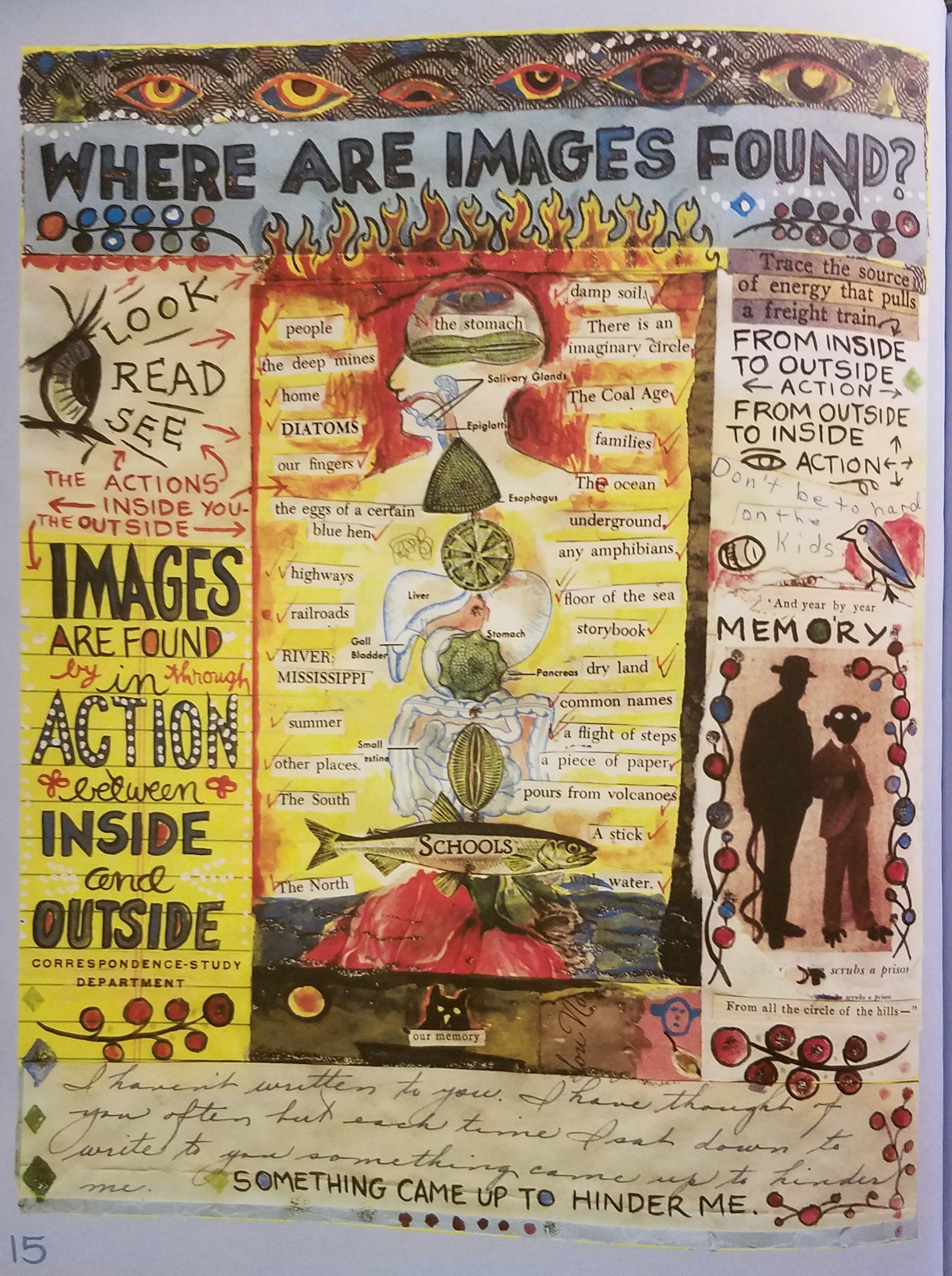
Layers are the overlapping components that create something. Layers can be used in many ways such as music, digital art and paintings. Layering can show emphasis or show sequence in an image. In graphic design programs like Photoshop layers are a very important tool. Layers can be independently edited through filters, masks, and other tools. Layers are also very important in print, because images created in programs like photo shop need to be separated into independent layers. For my example I am using page 24 from Lynda Barry’s book “what it is”. This image consists of many different layers, the largest of which is the background image of the rabbit looking out the window. This layer also has layers within itself, through the window the size of the buildings and use of perspective shows depth. Also the light from outside casting shadows in the dark room creates more layers.The text on the page is an example of a “cut and paste” technique. Most of segments of text are all framed in a light color with paper like texture, giving the effect that these sections were literally cut from another piece of paper and glued on. Another section that appears pasted on is the man resembling Abraham Lincoln in the bottom left corner. The combination of different layer styles creates a very visually interesting piece that is a great example of how layers can be used.


Posted in Uncategorized | Leave a comment

Layers: Tristan Moran-Salgado

IMG_3563

Pg. 69 Lynda Barry’s graphic novel “What It Is”

When you create picture on a software on a computer you are going to have layers while you work on whatever picture you create no matter what. In the book “Graphic Design the New Basics” By Ellen Lupton and Jennifer Cole Phillips on pg. 141 they claim that layering came from a long history in the traditions of mapping and musical notation and that layering means you overlap other pictures in different levels to get the whole picture but keep their own identities. Colors has their own layers depending on what it’s used on and layers could be independently filtered, transformed, masked, or multiplied while adjustment layers could change the levels and curves that can be revised or discarded at any time. By using layers’ designers can create different variations of a design by turning on or off a layer and mess with a layer without messing up the whole design.

In Lynda Barry’s graphic novel “What it is” she created many different layers on each page to come up with the whole page to look like it does. Using page 69 in the book as an example, this page has multiple cut outs of different pieces of paper and some of those papers are on different layers. She uses what looks like Cut and paste for those pieces of paper where they have been scanned in and pasted on the page having it look like it was physical layers turned into digital layers so she uses mixed media. There’s also some drawings and cut up animals as well that are as well on different layers where it’s noticeable in the rabbit creatures on the bottom. It was important for her to do this here because it would have been a mess if it wasn’t having it the colors be not as precise and that it made it easier for her to finish her work.

Posted in Uncategorized | Leave a comment

Texture- Tre Bobo

IMG_5092.JPG

Page from What It Is by Lynda Barry

IMG_5078.JPG

Page from Mimi and the Wolves by Alabaster


Texture in design is used to communicate the tactile feeling of a design. Texture can communicate emotion and help to understand the nature of things. Like most design concepts texture can be both physically and virtually represented in a 2-d or 3-d space by using different combinations of lines, points and shading.

In the example from Mimi and The Wolves by Alabaster shown above you can see how different elements in the frame have different textures to add depth to the illustration and make the design more visually interesting by contrasting textures to one another to make the various elements stand out from one another.

In the second example from What It Is by Lynda Barry you can see texture being used in a similar way to give different meaning to the different elements. The dog for example, in the left of the page has an extremely different texture compared to the other elements in the frame with less texture. You could also say that the scrapbook styling that she employs, not only throughout this page but the entire book, adds texture to Lynda Barry’s design, although the paper is flat the use of this ripped paper texture makes the book feel much more complex than it actually is.


Posted in Spring 2017 Archive (336), Uncategorized | Leave a comment