Layering- Tre Bobo

IMG_5091.JPG

Page from What It Is by Lynda Barry

IMG_5079.JPG

Page from The Best American Comics 2016 by Roz Chast

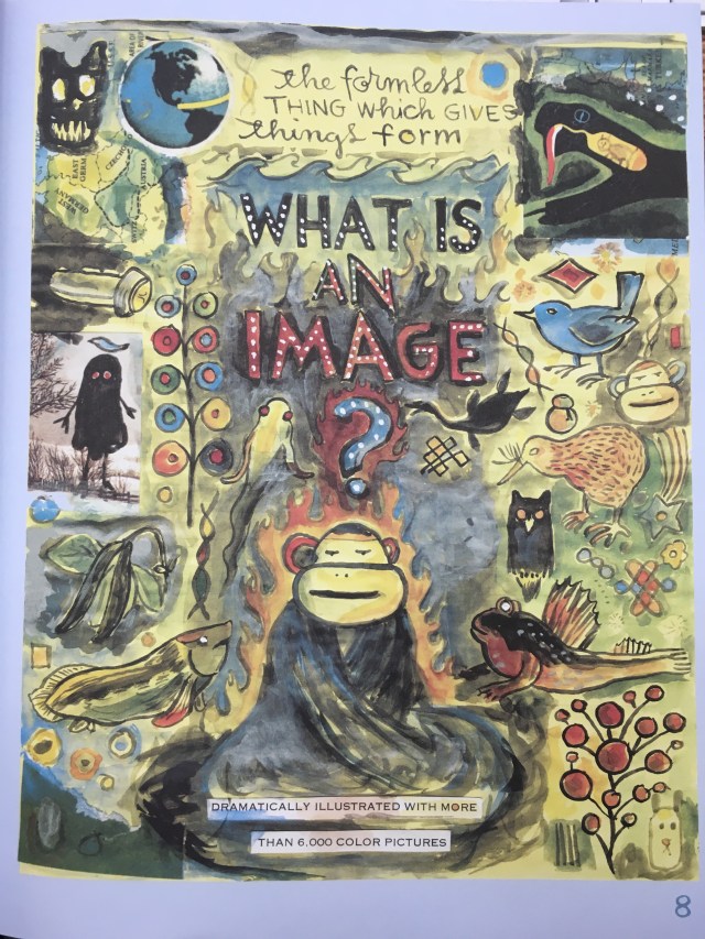
Layering in art is used to make a design more visually interesting and can be used to make effects that wouldn’t have been made otherwise. Layers have been created through aby combination of words, lines, shapes or planes.

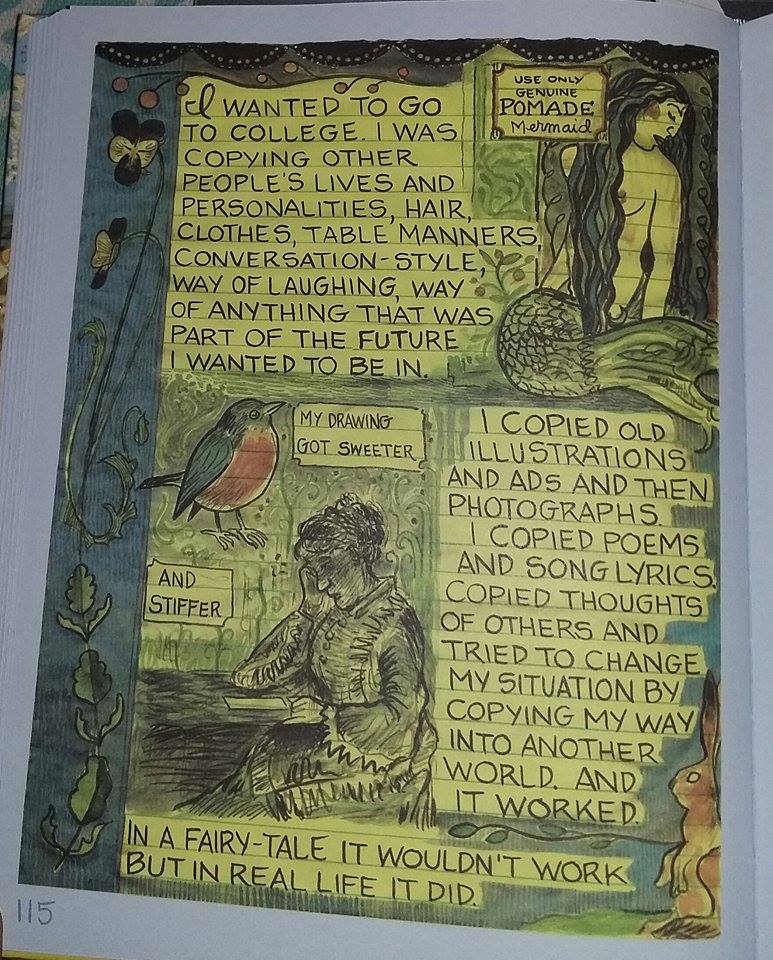
The book Graphic Design: The New Basics by Ellen Lupton and Jennifer Cole Phillips states how layering was used physically to develop photos but have since moved to things like Photoshop and other digital software it also describes how layering can give certain elements in a design more importance over others based on the way they are arranged. In the example from What It Is by Lynda Barry shown above you can see how layering can be used to create a cohesive and interesting design. The page looks like a collage because of the different layers being cut and pasted into the page along with these of color within similar layers like the images near the middle of the frame like the lock, matches, fan, etc.

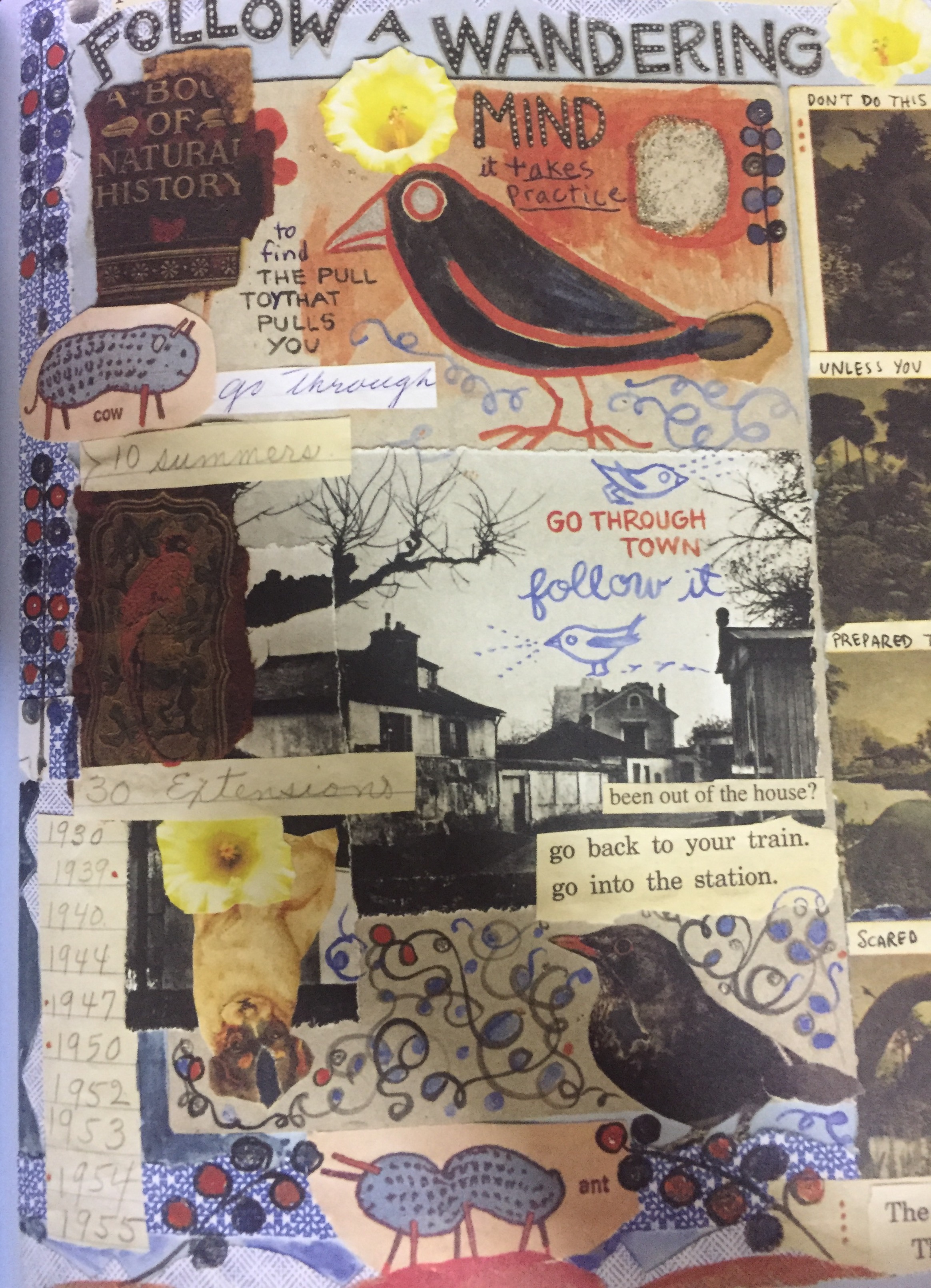
Another example of the use of layering in a design is from The Best American Comics 2016 also shown above this picture uses layering to show how different the room in the photo was throughout the years. It uses layering to show the years in the upper right corner along with different frames of different elements that look to belong in the room arranged throughout the design.

Posted in Spring 2017 Archive (336), Uncategorized | Leave a comment

Texture: Eva Guillen

Page 115 from the graphic novel What It Is by Lynda Barry.

In the book What It Is by Lynda Barry she uses the texture in the page through the images. For this particular page I can see texture used on the mermaid on the top right corner of the page. In the tail of the mermaid I can see the scales that look to be carefully placed. I feel like this is the textural harmony and contrast talked about on page 78 of the novel “Graphic Design The New Basics”. I say this because of the way that the texture is done on the mermaid, it made me think that you could feel the actual texture of it. The contrast done between part of the tail and the rest of it, makes the distinction more obvious. Then when I take a look at the clothes on the women in the lower left corner there is a similar technique used. This technique used gave this particular image a realistic feel with how it looks on the women. The texture done here is also a different way the author has taken art and made it more realistic. I feel as though the artwork was drawn out and transferred into the book. She might have chosen this method to give the book a more realistic and unique feel. It is more realistic because of the texture done and unique as it makes the novel more graphic.  This is how I found texture being used in this particular page of the graphic novel.

Posted in Spring 2017 Archive (336) | Leave a comment

Layers: Andrese Collins

Layers consist of multiple over-lapping elements that from an image or scene. Layering brings out many styles and techniques in order to display something whether its intentions are physical, virtual or temporal. Layers can also be used to separate different focal points, scales, colors, and many other essential elements that can affect the results of the piece.

https://goo.gl/images/AowDlK

Page from Gene Luen Yang’s graphic novel, “American Born Chinese”

Notice that in this image from Gene Luen’s comic, “American Born Chinese”, the young character is continuously multi-layered in order to show the viewer a change in motion. The character performs a sequence of morphology as he turns from one race to another.  You can also notice typographic layering within the yellow words,”click-clack”, and the red Chinese lettering that overlays the black background.

Notice that on this page of Lynda’s “What It Is”, there’s multiple layers of elements such as dialogue to read, images of octopuses, bird, and three mug shots.


72

Page 72 from Lynda Barry’s, “What It I

All of the layers and frames used on the page help the viewer know when and how to read the page. Lynda layers multiple fonts and patterns to help decorate the page.There are various windows and squares that are placed with the cut and paste technique to help frame the dialogue, displaying the collage type look.

Posted in Spring 2017 Archive (336) | Leave a comment

Layers | Cristian Gutierrez

Page 48 from Lynda Barry’s graphic novel, “What It Is.”

Page 54 from Gene Luen Yang graphic novel, “American Born Chinese.”

Throughout Linda Barry’s graphic novel she uses the technique cut and paste to create results that give some sort of meaning. In this particular image, the author created a collage to achieve a single viewpoint with the use of unrelated materials that in the end come together as one. To create the collage that is composed of many layers the author used typography, photographs, cutouts of illustrations and drawings. The illustrations include both abstract and literal shapes. Although the page is very crowded the use of layers helps each individual piece stand out, Lynda Barry was able to do this because the collage creates a high contrast between each piece.

Unlike Linda Barry’s graphic novel, Yang’s work has a more realistic professional image. His work is not actually composed of different physical cutouts, but it does seem to use layers to create what we see. Working with this image on illustrator or Photoshop, in order to create a depth of field vibe where the clouds are behind the house and the house is behind the trees, the most ideal way is to use layers. If the author completed every single illustration, the way to create what we see, each illustration must be a separate layer, which would allow the author to simply put whatever layer, under another layer to create the illusion of depth of field.


Posted in Uncategorized | Leave a comment

Texture: Alexandra Borders


Page 151 from Lynda Barry’s “What It Is.”
Barry, Lynda. What It Is. Drawn & Quarterly, 2008. Print.

Texture can play a large role in creating images, specifically in bringing the picture to life. Whether it be on a smaller scale or a larger scale, texture works to bring more detail to a picture. Texture can convey various things, including how an item might feel, the look of a surface, and giving a picture dynamic elements.


In her graphic novel What It Is, Lynda Barry uses texture in an unique way to convey different aspects of her images. From the example of page 151, texture can be seen all over the page, playing smaller parts of a whole.

First, she uses texture to convey a certain amount of a realistic look. The dresses on this page all are drawn with patterns that can stand to simply show a specific pattern, but they also work to show what the fabric might feel like (the dress placed behind the number seven, for example). There is also dots drawn over the octopus’s body, giving the creature a more dynamic textural skin, adding something real to it, even though it is quite clear it’s a drawing. She uses this aspect of creating some realism to unfold her stories or messages.

It can also be seen on this page that she uses different textures and patterns to decorate, creating borders and backgrounds. This serves as dividers or creating barriers between separate parts of the page, drawing attention to sections in individual ways. This gives her pages more contrast and more dynamic aspects that work to make all parts of the page cohesive.

Lynda Barry’s storytelling is indeed unique, and she uses several tools and techniques to do so, texture certainly being one of them. Texture adds more depth and understanding to her drawings, also acting as points that draw a readers attention to a specific part of the page, perhaps where her message or idea is being most emphasized.

Posted in Spring 2017 Archive (336) | Leave a comment

Layers: Tia Caton

layers 1.JPG

Page 61 of  Lynda Barry’s graphic novel “What It Is”

Layers are simultaneous, overlapping components of an image or sequence. Layers allow designers to treat images as a collection of assets. Many times layers are associated with collages and the cut and paste technique. Many modern designers use the collage technique to juxtapose layers of content, create layers that switch between flatness and depth and also create positives and negatives. In order to create collages, the cut and paste technique is used. Other examples of layer use can be seen in maps and music or video design. For example, maps use color, line, texture, symbols, icons, and typography to create different levels of information. This in turn allows for layers to be read independently and perceptions to be made about each layer. In music there are various layers to create certain sound tracks and songs.

In this example by Lynda Barry, “What It Is”,  there are a number of examples of layers. Her entire book is composed with the use of collage and the cut and paste technique. Many of her pages such as this page page 61, are created by compiling and combining a bunch of images to create a greater larger image. You can tell that each of the different elements are cut out, or even ripped out sometimes, and then added to the rest of the page. For example, the little blue peanut cat thing on the right edge of the page has a jagged edge to it that clearly signifies that it was ripped out and then added. This not only adds a layer element to her piece but also some texture.

star wars

Jason Aaron’s comic “Star Wars”

Another example of layering can be seen here. Instead of using the collage style of layering that Lynda Barry uses, Jason Aaron, the author of Star Wars, uses layering to give depth to his images. For example in each of the frames the characters are layered behind one another to indicate who might be closer in perspective or who might be farther in the background. Another example of Aaron’s use of layering can be seen in the third frame where all the lesser characters are layered within each other to create the appearance of a crowd. I think that this use of layering is a lot more common in comics. It allows the author to create more of a 3D scene and lets the reader get lost in the depth of their comics more.

Posted in Spring 2017 Archive (336) | Leave a comment

Layers: Dave Herman

IMG_0800

First page from Jeff Smith’s graphic novel “Bone: Out From Boneville.”

This page from Jeff Smith’s comic Bone: Out From Boneville is a great example of layering in a graphic novel. The first layer and most important frame takes up the whole page and establishes a setting for the conversation. This frame includes the sky, the mountains, and the characters on the rock. The next two frames are layered on top of this first layer and below to indicate that they happen after. Another cool layer on this page is the “Bone” in the top right corner. I believe this is the first page from the book so it would make sense that title appears here.

IMG_0798

Page from Lynda Barry’s graphic novel “What It Is.”

This page from Lynda Barry’s graphic novel What It Is is another great example of layering. This page, not unlike much of What It Is, is full of layers that exist as separate images. Arguably the most prominent image on the page is the monkey sitting in the center foreground. Because of his position and size, this layer has the most potential for meaning. Each of the animals and plants are shown layered on top of a colorful background layer.

Posted in Spring 2017 Archive (336), Uncategorized | Leave a comment

Texture: Leandra Choy

image1.JPG

Page 92 from What It Is by Lynda Barry

Texture can be something rough, smooth, or rigid. We can know a texture by mostly how it feels or by sight. In our other textbook Graphic Design The New Basics texture is described as “the tactile grain of surfaces and substances.”From looking at Lynda Barry’s book What It Is, each page is filled or should I say covered in different textures. For example on page 92 what caught my eye as texture were these tiny dots in the background of the page, her drawings of the TVs, and the little animals on the left side and at the bottom of the page. I believe the type of textures Barry uses in this book were concrete and maybe physical texture itself. Concrete texture can be seen through out What It Is with repetitive dots, little short lines, cross hatching, etc. on the little creatures she drew or in the backgrounds. Physical texture that I see in Barry’s book would be the paint dots, ripped paper scraps, paint smears, and different hand writing that occurs on each page. Without texture, each page or images would look bland and washed out or lack some character. I believe Lynda Barry created the artwork for this book by randomly putting together mixed media collages. Her choosing this method of art, making these random mixed media collages, probably ties into her struggle of being creative or imaginative as an adult artist.

Posted in Spring 2017 Archive (336) | Leave a comment

Texture | Cristian Gutierrez

Page 137 from Lynda Barry’s graphic novel, “What It Is.”

While reading through Linda Barry’s graphic novel, it is very difficult to ignore the child like illustrations. This particular image I chose seems to be composed of layers, which create a texture that, the readers could feel. However, since the image was digitized the actual texture disappeared, leaving behind the illusion of the texture, while creating a connection between virtual and physical texture. As for the actual illustrations, judging by the scale, and positioning the middle one seems to be the main subject of the page. The main illustration is created by a combination of different textures, used as design elements to provide a correlation to the visual function they have been assigned by Linda Barry. The most obvious of the textures are the dots that create a pattern that decorates and adds detail to the character. The second texture I noticed was the splashes of what seems to be some sort of liquid/oil painting; this texture creates the illusion of a rough surface. Both of these textures seem to reinforce the mood and point of view of Linda Berry’s graphic novel, which basically speaks to the child within us.

Posted in Spring 2017 Archive (336) | Leave a comment

Texture: Tristan Moran-Salgado

IMG_3562

Pg. 70 of Lynda Berry’s graphic novel “What It Is”

There’s a lot of different kinds of textures in the world and we could touch them to feel the texture the object is or for artists they could draw texture to whatever they are drawing to have the object more detailed. The book “Graphic Design the New Basics” by Ellen Lupton and Jennifer Cole Phillips on pg. 69 states that texture is tactile grain of surfaces and substances that it helps us understand the nature of things. In design elements texture correspond to their visual functions and that texture is both physical and virtual having the viewers of the work could see the texture in the optical effect and representation. Texture adds details to the surface quality of the image and that texture usually lies with its poignant juxtaposition or contrast. Texture can have many variations that could be shown whether it’s generated by hand, computer, code, or camera.

With Lynda Barry’s book “What it is” she had used many kinds of texture to give her drawing more detail but on pg. 70 is what catches my eye in the way she uses texture for that page. She had used hand drawn animals and what looks like abstract plants but there’s also pieces of paper integrated in the page as well. She mainly uses watercolor in the page for her texture so it gives it a drearier look to the page and throughout the book she had used watercolors look. On the page, she had also used textural contrast of the colors in the background to be light while the foreground to be dark and she put many textural spots on certain objects. She does this to bring out the object to make it stand out that seem important so that your eyes could be drawn towards them and this happens in a lot of pages in her book. She made the pieces of paper on this page like it had been crinkled a bit and have torn edges so that the pieces could be seen in the page and not have it blend in to make is seem like the rest of the images bring in another contrast of smooth and crinkled. With all those different textures the way it is visually it seems as though she had drawn this by hand and scanned into a computer for later edits but that’s what I thought by how it looks.

Posted in Uncategorized | Leave a comment