Texture: Allyssa Puett

On page 88 of Lynda Barry’s graphic novel What It Is, she makes use of various textures to tell her story. She does this though almost most all throughout her book with drawn details such as all the dots and drawings to give an optical appearance of texture, but she utilizes more physical texture (or at least a photo or scan of physical textures) in this specific example. Texture brings more detail to an image, which in turn creates more of a pleasing image to look upon.

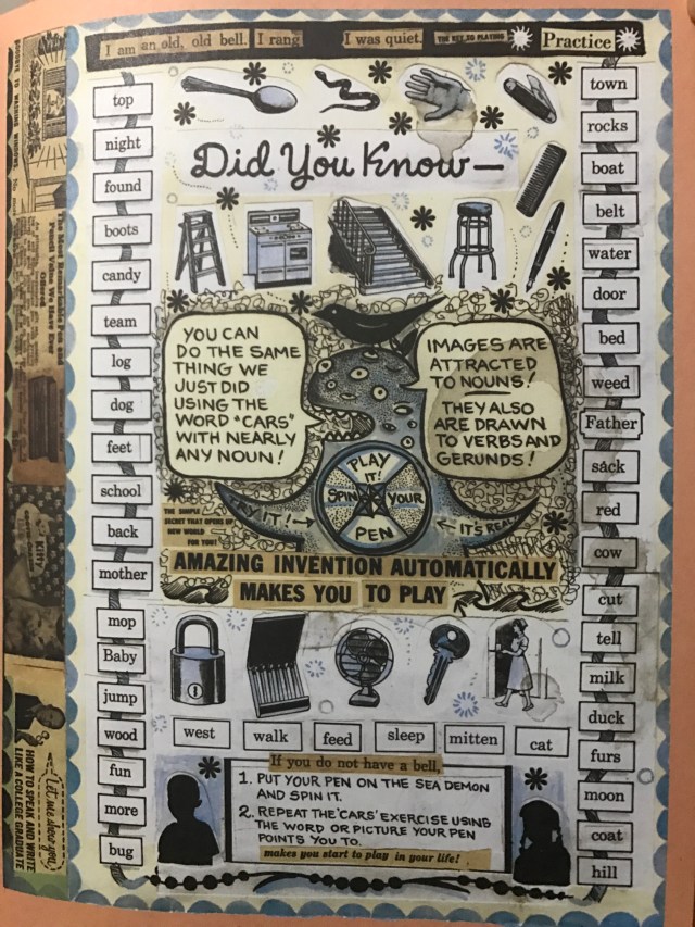
This page has a collage of images put together. Scraps of paper with random words that almost creates a full sentence are pieced together in a sort of tree branch. This is reminiscent of the Physical and Virtual Textures example on page 72 of the Graphic Designer book where images of typography are used to recreate the texture of the actual image they are portraying.

20170302_113447

Page 88 from Lynda Barry’s graphic novel “What It Is”

Other pieced together bits of torn paper in Barry’s book with words are scattered around the page. I believe that Lynda tore up pages of her messy handwriting with the tree branch image as well at the bottom of the page with the sentences explaining that image is a place “in and of itself”. There is a difference between these two scrapped together images with words on them. The image of the branch has words that compromise the branch, but they do not make much sense when seen together as a whole. On the other hand, the bits of paper with words along the bottom of the page compromise actual sentences to further her explanation of an image.

In contrast, Lynda included cleanly cut out pieces of paper from what seems to be a book or something about how electricity travels. Here she crosses out “electricity” replacing it with “image” and yet it still manages to make sense. By pairing together typed and handwritten words, it creates an overall texture much like the Five Squares Ten Inches example in Graphic Designer on pages 74-75.

Posted in Spring 2017 Archive (336) | Leave a comment

Layers: Elise Detloff

According to Ellen Lupton and Jennifer Cole Phillip’s Graphic Design: The New Basics, layers are simultaneous, overlapping components of an image or sequence. And an artist that embodies the use of layers extremely consistently has to be Lynda Barry. In the book What It Is, Barry utilizes layers in every single page. Even the pages that are drawn by hand with no outside elements like paper scraps or fabric are layered. Layers are just overlapping levels of data that help organize idea and contribute to a whole image. So when someone draws a sky and then a bird in the sky, it’s layered. We have a background and a subject in front of that background.

Back to What It Is, a specific example we can look at of layering is page 108. This is one of the more busy pages in the book (not that the others are exactly plain) and the use of layering here not only gives the page a cut and paste style, but also creates other design choices as well.

Layers Example

A page discussing motion in images. (Lynda Barry, What It Is, Drawn & Quarterly, 2008)

Barry uses this cut and paste technique to create the collage style which creates juxtaposition between the various layers of content. This creates depth in the image. While these layers are not transparent and therefore can’t be classified as solid layers that act as windows to the layers beneath it, some images do bleed over onto different layers. The bird in the bottom left corner for example, or the text, “IN TIME OR SPACE”. Despite the bleed over, the use of layers also creates framing. Most of the text provided resides in its own square and is framed by the other various layers occupying the page. This creates an organization of ideas into comprehensible paragraphs with some order to be read in.

Moving away from Lynda Barry, another graphic novel that

Layers Example 2

A dinner party of gods, goddesses, demons, and spirits in a story. (Gene Luen Yang, American Born Chinese, Square Fish, 2008)

utilizes layering is Gene Luen Yang’s American Born Chinese. Yang takes a far different approach to layering than Barry; instead of the collage art style with pieces of torn paper and fabric, the layering is done through Yang’s drawings. In this example, page 1 of American Born Chinese, the layering of the various Gods, Goddesses, Demons, and spirits gives the impression of a crowded room. Layering is used as a story telling device here, used to directly imply the characters space in time and dimension. If anything, this can be describes as temporal layers with the overlapping forms and images suggest depth and motion.


Posted in Spring 2017 Archive (336) | Leave a comment

Texture: Noah Martin

Texture is “the tactile grain of surfaces and substances” according to Graphic design the new basics. Texture can be created physically and virtually, for example a wood carving has physical texture and a painting of a landscape has virtual texture. My example from page 30 of Lynda Barry’s “what it is” includes illustrations that are an example of how texture is created virtually. This page also has physical texture since it is printed on glossy paper in a physical book. Texture is used to help us understand the nature of an object. For example the illustration of the octopus in the top right corner is surrounded by water, as readers we understand this because the squiggly lines and use of color create a texture that looks like water. Also the octopus itself appears rough due to the use of shading.

IMG_0056
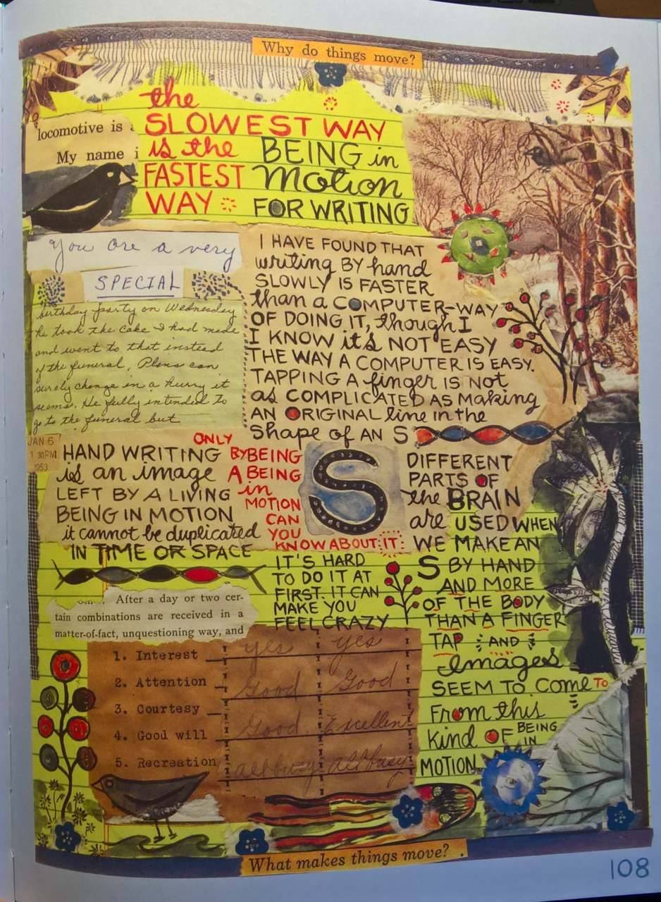
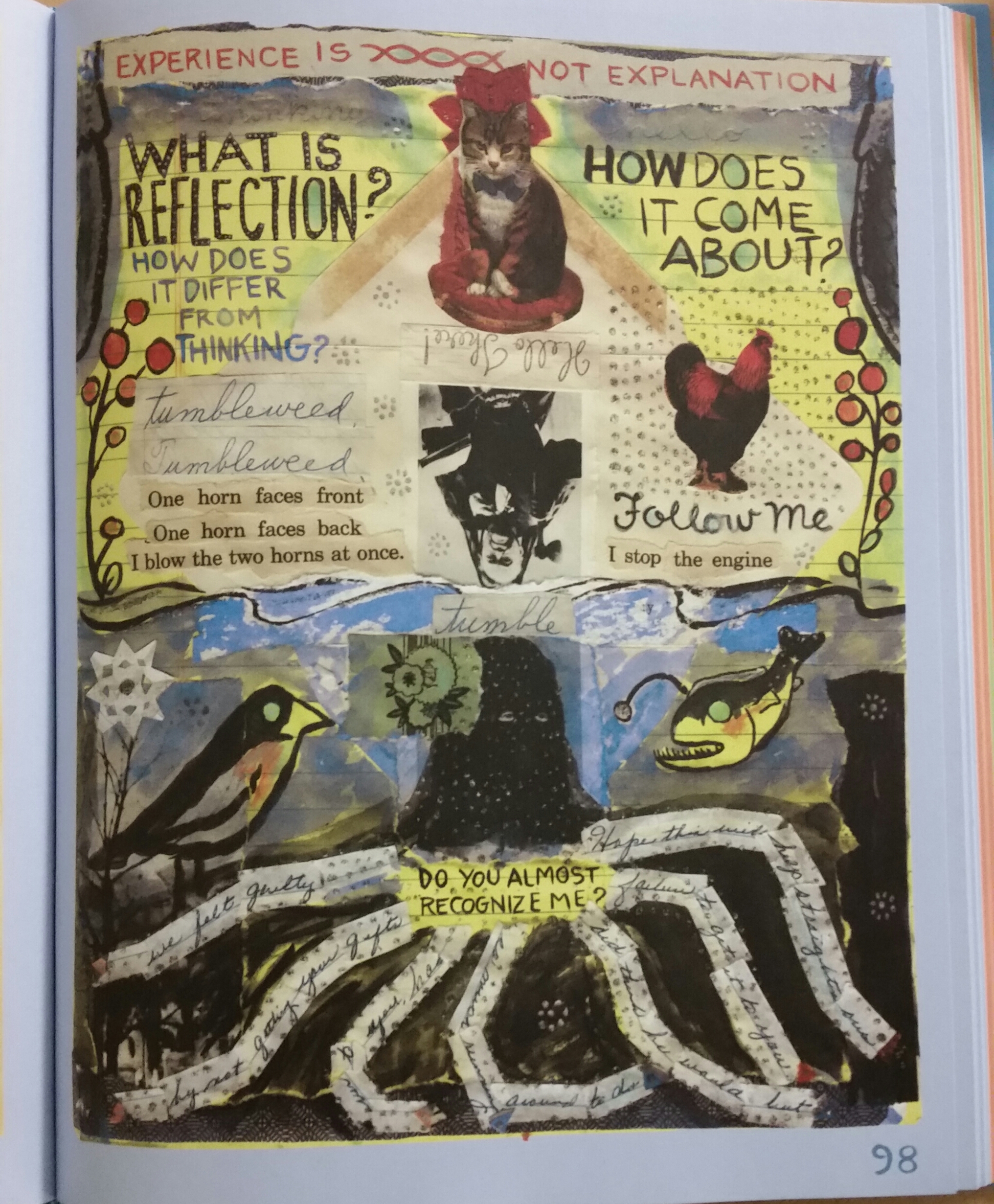
This page uses a variety of artistic styles which all create texture in different ways. The 2 birds on the left side of the page appear much more realistic than the octopus, this is because the birds use a larger variety of shades and colors and a higher level of detail. The feathers appear smooth but still somewhat grainy just like real feathers. Other interesting textures in this example are the blue coral in the bottom right corner, the petals of the flower in the top right and the yellow paper background seen throughout the image. This collage of images, and text in a variety of styles has an overall texture that seems like these elements were glued down to a piece of yellow notebook paper. This is an example of surface manipulation.

Posted in Uncategorized | Leave a comment

Layers: Alexa Berg

Layers constitute nearly every element of design. The overlapping components of an image sequence are crucial in how we both read and produce graphic images in the world around us today.

IMG_6839.JPG

Page 34 of What It Is by Lynda Barry

With in the advancement in digital technology that we currently face, layers are becoming more and more complex as well as diverse in terms of usage. That is why Lynda Barrys graphic novel What It Is is an interesting example of layering. Barry uses the cut and paste technique very often, as you can see the fish image pasted over the text, and the text at the bottom covering the image of the phone. I think this was used to provide depth, as well as to generalize a style which is doodling, and usually when you doodle, its messy and covers previous images you made. Even though these are digital layers, she has made them appear physical in appearance.


The graphic novel that I will be examining further is DayTripper by Fabio Moon and gabriel Ba. I think every design choice in this book was done beautifully.

IMG_7132.JPG

Page 1 of DayTripper by Fabio Moon and Gabriel Ba

For example… layers! The very first page on the novel opens up with the image of what appears to be a man daydreaming on a bench. Unlike Barry’s novel, which used many different types of mediums in order to portray layering, this novel uses color in order to get that message across. Images, as well as different colors are overlapping within the boarders of the “daydream” to give off the impression that he is reflecting on more than one experience in his life. The dark ominous color at the bottom which shows his typer writer (he writes obituaries and hates it because his fathers a famous novelist) , tells us that part of his life is not his favorite, but the warmer colors that start to fill the dream at the top, give us the impression that he is more fond of those memories. The colors give each image space and explain without words that this bubble consists of multiple memories.

Posted in Spring 2017 Archive (336) | Leave a comment

Layers: Alexandra Borders


A page from Chris Ware’s “Jimmy Corrigan: The Smartest Kid on Earth.”

An image might have a few objects or various components which, stated by Ellen Lupton and Jennifer Cole Phillips in Graphic Design: The New Basics, “allow the designer to treat the image as a collection of assets, a database of possibilities.” This is called layers. Layers make up several parts of an image, overlapping one another to create complexity and distinct designs, as well as conveying multiple meanings.

Here I have two examples, one from Lynda Barry’s What It Is, and another from Chris Ware’s Jimmy Corrigan: Smartest Kid on Earth. Both have layering used in different ways and for different reasons.

Chris Ware’s use of layers in this picture works to accomplish various things. Layering the characters in front of the buildings, poles, and signs establishes a setting and environment for the story. This is important, as for the story being told, it is working better with a background and place to set the story. His layering also helps show distance – the men and grey building seemingly closer than the McDonald’s sign and other shapes layered behind. Layering can be a clever way to convey size and distance.

This is page 108 found in Lynda Barry’s “What It Is.”

Lynda Barry, however, uses layers in a very different way. In much of What It Is, Barry designs the graphic novel to resemble a collage. The way she layers her pictures, objects, and text makes the page look like a thrown together picture, instead of a linear story, and conveys a certain message or theme. She places images over text or paper, text over images – she utilizes layering to tell her ideas unconventionally. This adds more complexity to the page, and calls for different interpretations based on a reader’s person perception.

Posted in Spring 2017 Archive (336) | Leave a comment

Texture: Alexa Berg

When dealing with design elements, textures similarly correspond with its visual function, since texture is what helps us to understand the nature of things. In design, texture can be both physical and virtual. To examine this further, I took a look at page 31 of Lynda Barrys graphic novel, What is is.  Lynda uses texture in many different ways on this page. For example, the use of code-driven text is evident within the octopus drawing at the bottom. By using points in a designated space within the object gives us the illusion that the octopus might be grainy or rough. Barry also uses this texture element where she draws what appears to little branches or plants. Also evident within this image is the concrete texture she gave to the side of the page where the flowers are drawn. Barry used repeated slicing to create the corduroy appeal. Another thing I noticed about this page was the surface manipulation. The background appears to be a piece of notebook paper with pen like writing consuming most of the page. By adding the lines and the washed out yellow look, she has successfully created the feel that this all was a doodle in a notebook.

IMG_6840 (1).JPG

page 30, What It Is, Lynda Barry

Posted in Spring 2017 Archive (336), Uncategorized | Leave a comment

Nikki Aviles: Layering

The concept of layering is usually seen when an author needs to convey more than one idea on a single page. On page 148 of Lynda Barrys What It Is, there is layering everywhere, more specifically, it looks like Barry may have used mostly used the cut and paste method to create this page. It looks as if she started off with one paper as the background with a blue boarder, then pasted scraps of other words and drawings she did and layered them strategically to create another boarder of words around drawings over the layers of paper.

IMG_0337

Page 148. Lynda Barry, What it is

The other example of layering I found was in the book Exits written by Daryl Seitchik. He does not number his pages in this book and uses very little text through out, but on the page I chose, where Seitchik is trying to portray  a scene where a girl is walking down a street then eventually gets to the end of that street. On the page before the one I chose, is somewhat of a birds eye view of the page. When you turn the page to my example, Seitchik tried to show that the girl was at the end of the road. He did this by zooming all the way in on a building making it seem like the last building on the street. Then he added another frame under that zooming in even more and adding water to it to make it seem like she was really at the edge of the road, about to fall into the water. The way the buildings are drawn with vanishing points also give the page a sense of depth.With the layering of these two frames you don’t need much words at all. Its simple and self explanatory. As I was reading through this book I felt as if I was the one walking through the street.

IMG_0245

Daryl Seitchik, Exits.


Posted in Uncategorized | Leave a comment

Texture: Tia Caton

what it is texture 1

Lynda Barry’s “What It Is” page 55

In “Graphic Design: The New Basics” texture is described as being able to establish mood, reinforce point of view or convey a sense of physical presence. Texture can be both virtual and physical and usually corresponds to their visual function. One of the major types of texture is concrete texture. This type is created by repeated slicing, burning, marking or extracting. As a result, the images look raw and have a robust textural appeal. Textures can also have harmony or contract when being used together. For example, high contrast textures usually have a larger elements in them while low contrast textures have fine, delicate grain. Textures aren’t limited to just a grain of surfaces, but can also be created from type  or text. Type can create a texture based off of the text’s attributes such as serifs, slope, stroke, width and proportion.

Here, I think Lynda Barry uses a lot of different textures to create a collage like image. I think that her use of different media and the amount of random text really adds to the depth and texture of this page. I think the way she created this page was by starting off with the usual lines yellow pages she has and then went on too draw, write, paint and paste different portions of the image. By using different media such as a pen instead of the paint or a cut out, Lynda is able to create a plethora of different textures. For example, if you look at the left side of the page at all of the written words she has you begin to get a sense of a rough texture from the pen ink and the text. While right next to it, the blue water color seems to give off a softer and smoother feel. She also creates a dotted almost bumpy texture wit the use of dots throughout the page. I think what really helps give this page a sense of texture is the range of different elements she used to create it. I feel like she didn’t stick to just one type of medium and by doing this she was able to make her work much more interesting and appealing. I feel like there is much more depth and feeling by doing this as well.

Posted in Spring 2017 Archive (336) | Leave a comment

Texture: Andrese Collins

            Texture is the various elements formed together in order to display two kinds of unique styles, physical and virtual textures. Textures can be used to help describe an object with details, differentiate elements, and display optically illusive effects. 

              Notice that in the image from page 202 of Lynda Barry’s “What It Is”, the pictures features multiple objects such as the fire flame, the ghost, snowman, monkey, etc. Lynda uses a lot of physical texture in the image. 

Page 202 of Lynda Barry’s

              Lynda gives a detailed physical texture to describe the hot feeling of the flame that sits next to the ghost. Lynda displays her textures best through the swirling boxed image that overlaps the monkeys head. She uses artificial textures to help detail the objects, giving the viewer a realistic idea of what’s being drawn. Texture contrast also plays a big part of the page by using three different shades of black and grey to separate elements from each other. The contrast also helps point out details such as the “dandelions” on the left hand side. It helps the viewer understand what kind of flower it may be and it’s purpose within the page. 

Posted in Spring 2017 Archive (336) | Leave a comment

Layers: Makenna Coxey

Page 98. Lynda Berry’s book What it Is.

Page 30. Craig Thompsons book Good Bye Chunky Rice

The first picture that I chose was from Lynda Berry’s book What It Is. the reason that I chose this page is because first it clearly demonstrates the Cut and Paste method that is talked about in Graphic Design The New Basics. This particular page does it in such a way that with the pieces that are “pasted” on the collage resemble an octopus like at the bottom of the page. Also on this page you see the idea of Temporal Layers in the sense that you can get a feel for depth and motion by the way that things are pasted, you can kind of tell what is in fro


nt of other things. The second page that I chose was one from Good Bye Chunky Rice by Craig Thompson, this particular page intrigued me because of the very different use of layers than the first page. In this page the first thing that I want to talk about is the speech bubble that almost seems like it is hoping out of the page. The use of layers here is to create emphasis or importance on the words. Something that also applies to this second page is the use of windows, it is interesting how in some places the physical frames are splitting what appears to be the same image for example in the bottom left corner. Each frame is essentially a window in the sense that it looks though to another layer, and some of the frames appear to behind the picture to again create that posing out effect or importance.

Posted in Uncategorized | Leave a comment