Layers- Miguel Bustos

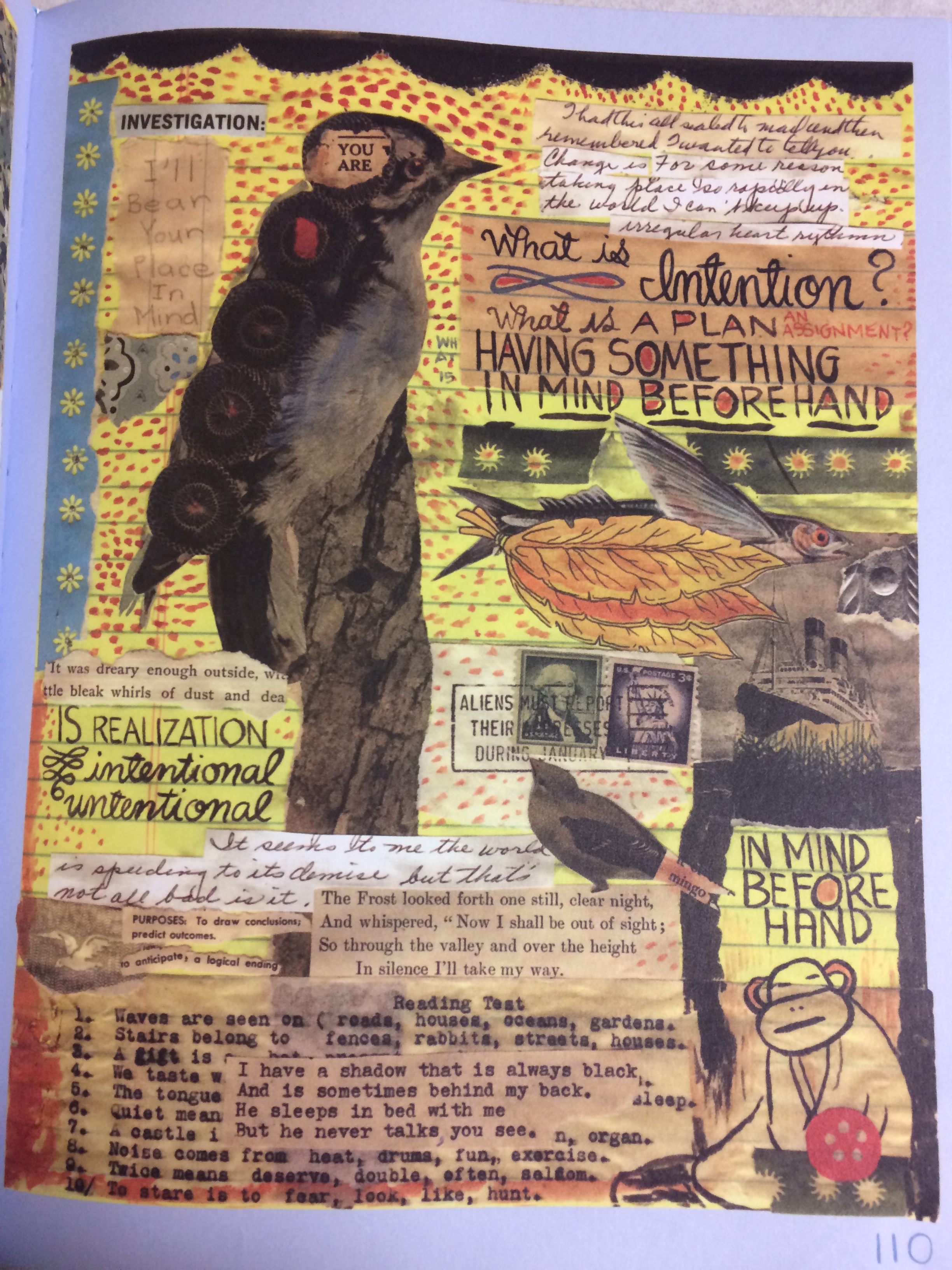
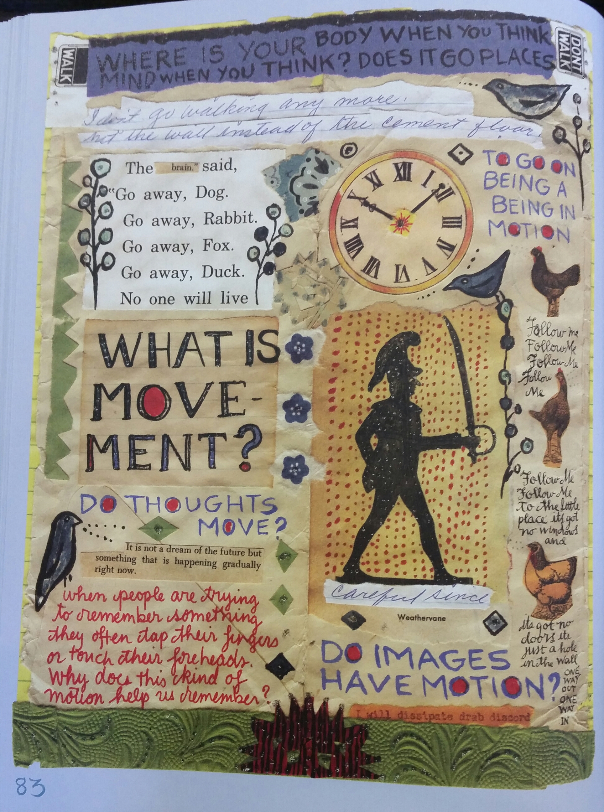
What It Is by Lynda Barry. Page 109. Text.

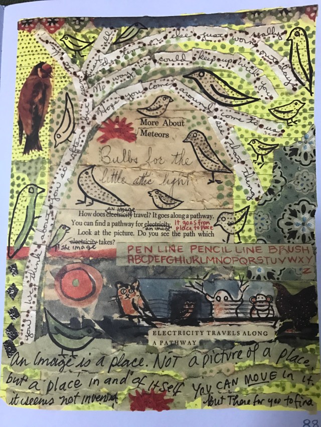
Layering is done when more than one story, idea, or point needs to be made at the same time. By adding a layer, a new idea can be introduced at the same time but differently to show distinction from the other things going on at the same time. This can become confusing but when it is done correctly, it can be lead to amazing results.

On this page, Lynda Barry is trying tell a story but from multiple different points of view.  She uses layering to show that they don’t all come from the same place.

She uses typographic layering to illustrate the different viewpoints.  She has printed, written, and typed script.  With each, she has different fonts, sized and structural formatting.  By adding each thought in its on way, it becomes apparent that it’s from a unique viewpoint.

The pictures and text are also in different layers.  The pictures are overlapping onto different texts suggesting that they are in the foreground and the text in the background.  This gives the overall piece some depth.

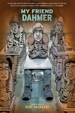
My Friend Dahmer by Derf Backderf. Cover. Print.

One graphic novel that seems interesting is My Friend Dahmer by Derf Backderf about his relationship as a child with the notorious serial killer, Jeffery Dahmer.  He uses layering in his cover by first placing Dahmer in his own row, offsetting him from the other children.  He also uses a shading to obscure the other children and draw attention to Dahmer.

Posted in Spring 2017 Archive (336), Uncategorized | Leave a comment

Layers: Mikah Chan

Layers allow for a designer or artist to build on top of work to create a finished piece or to continue building on to their art. Lines, shapes, colors, and other elements of a text can be used to create layers, as well as the mixing or relationships built between elements can also be used as layers. Either created by physical materials or through digital tools, different layers of

lyndabarry-layers

Page 111 of Barry’s What It Is (Jonathan Cape, 2009)

text are added together to create a complete piece of work. Two examples of layers I have picked out come from Lynda Barry’s What It Is and Marjane Satrapi’s Persepolis. Barry’s example creates layers primarily through collage and cut-and-paste techniques. As for all the pages in this book, the base of the text is yellow writing-pad paper, in which she creates layers on through written text and hand drawn illustrations and patterns. Further layers are created by cut-out pastings on the page such as the bird, the flower pattern on the left side of the page, postage stamps, or other pieces of paper with text pasted onto the page. Barry adds layers on top of one another on many of the pages within this book, and overall creates a technical theme for this particular text. The graphic novel I would like to read this semester is Persepolis, an image from a page of

persepolis

A digital image of a page taken from Marjane Sartrapi’s Persepolis (Pantheon Books, 2003). 

the book to the left. There are a lot of differences in uses of layers in this text compared to Barry’s. For example, only one medium is used here in the form of colored drawings, whereas Barry’s work carries layers made up of multiple mediums (paper, color, drawings, cut-outs, etc.). By using monochromatic colors (black and white), the artist creates layers through contrast and perspective. With objects in the image contrasting against each other, such as the hanging white laundry contrasting against the black background. These techniques create layers based on contrast which delivers a multi-layered text using a limited amount of tools and elements.


Posted in Spring 2017 Archive (336) | Leave a comment

Texture: Dave Herman

IMG_0796

Page 12 from Lynda Barry’s “What It Is.”

This page from Lynda Barry’s acclaimed graphic novel What It Is has a lot going on in terms of texture. The first thing I noticed when I flipped to this page were the fine black lines vertically stretching through a good portion of the page as a whole. These fine black lines seem to be simply made by a black pen. In fact, it seems that Barry had used one or two black pens for the entirety of this page, except, of course, for her ever-present borders. This produces a sketch-like, almost childish image. The characters and open spaces on the page are shown fairly open and only defined by their edges, while the clothes and background appear as an unclear mess of pen strokes and swirls. The boy at the bottom of the page also caught my eye. I noticed how his pants are not the same texture as his shirt, his socks, his hair, or the floor he is kneeling on. It can also be said that the boy’s texture is mostly defined by cross hatching, while the girl’s clothes (both on the top and bottom of the page) appear as a grouping of swirls instead. I also found it interesting how Barry used dialogue and narration as negative space and, in a way, to provide relief from this kind of shading and texture.

Posted in Spring 2017 Archive (336) | Leave a comment

Texture: Mikah Chan

lyndabarry-texture

Page 110 of Lynda Barry’s What It Is (Jonathan Cape, 2009). 


Texture in design relates to the interpretation of the “feeling” of objects in a computer generated piece, non-physical piece, or actual physical work. Texture helps to identify more details of a piece, the materials that were used, the message being conveyed, the viewers’ thoughts when viewing or holding the piece, and possibly the setting  in which the piece is presented. A textural example found on page 110 of Lynda Barry’s What It Is, showcases the use of many different textures within a single piece of collage. On the page, multiple different pieces of paper cut out with writing or quotes are arranged on top of one another. The page is seen as the base of the piece, while the sitting pieces of paper add a departure from the smooth texture of the page. These cutouts can be implied to be glued to the page, and those who have ever created a collage piece for a school project can identify with the texture created from media glued onto a piece of paper. Other textures in this piece include Barry’s illustrations of plants and animals that you can see throughout the page. These drawings also carry texture, the drawings of birds mimicking their feathers and the details of the plants that frame and border the page all carry patterns that imitate real life textures as well as textures relevant to this page. If felt in person, the textures felt will give context to how this page was constructed and how it is meant to be presented in physical space. Though through non-physical experience, the textures seen with the eye also gives context to the page, leaving more questions on texture as less senses are used to examine the piece, as well as the piece being interpreted in a digital form.

Posted in Spring 2017 Archive (336) | Leave a comment

Nikki Aviles: Texture

What first pops into my mind when I hear the word texture is something I can physically touch, or feel. Texture gives feeling to a certain object. To me, page 88 in Lynda Barry’s “What It Is” is a perfect example of texture. When I first saw this page I felt as if I was looking at a table with a bunch of different pieces of paper laid out on top of each other. I didn’t feel like I was looking at a page in a book. I felt like i could touch the different pieces of paper on the page if I wanted to and to me, thats what texture is all about.

I think the way she created this page was actually with different scraps of paper, then drew over them to add an extra layer, then scanned them on to a computer and printed the pages. I believe Lynda Barry uses this style because she is unsure of herself as an artist and often second guesses her style. I believe she is experimenting with different methods by jumbling all these different textures and ideas together to try and figure out who she is.

IMG_0268

Page 88. What It Is by Lynda Barry

Posted in Uncategorized | Leave a comment

Layers: Sophia Price

Lynda Barry has perhaps perfected the technique of layering. Her ability to stack images onto of images creates the idea that everything in the page intercepts to get her main point across. On this page, for instance, the background’s soft yellowish color plays into the idea of everything having subtle motion.

IMG_0922

From Lynda Barry’s What It Is, page 83.

The layering of the clock outline on top of the background color connects the clock to everything else, including the cut and paste technique she uses by putting certain words on top of the other images. They give these words more meaning. Its easy to see why she would give these words power on the page; the “Go away” phrases show motion within their words. They create an image in the readers mind of the animals running away. She also uses the temporal layering technique by including the words with the images, overlapping them to create a new way of looking at the idea. The layering of the birds on top of other things connects this page to the rest of her book, where the birds always seems to be watching what is happening. By putting them on a top layer its almost as though they are the narrator of the book.  Lynda Barry’s layering technique pushes her collage way of thinking into a visual aspect so that the reader can think more in the way she does.

Other artist, such as Vera Bristol, uses layers to give more scale to her images. This can be seen in her novel Anya’s Ghost. Images of the main character, Anya, are placed in front of images such as desks and computes to place her closer to the reader.

IMG_0924

From Vera Brosgol’s Anya’s Ghost, page 146.

She also uses typographic layers to explain how a machine is working while having one of her characters speak. It adds to the movement of the novel. It allows two separate things to be going on within one frame, projecting the story aspect of the novel without taking away from the images on the page.

Posted in Spring 2017 Archive (336), Uncategorized | Leave a comment

Layers: Eva Guillen

Page 164 from the graphic novel What It Is by Lynda Barry.

On the right I have an example of Layering from the graphic novel What It Is. I feel like this is a great example of typographic layers since the text is used to frame some of the images. Also the text is layered as a border and it creates a significant design aspect to the page itself. Then I feel like the way that the text was layered for the comic strip page was nicely formatted. I think this because the layering of text is important to tell the story, also so that the reader is not overwhelmed with everything on the page.

Page 27 from the Graphic Novel I Am My Own Stereotype The My Small Diary Collection by Delaine

On the leftt I have an example of layering from the graphic novel I Am My Own Stereotype The My Small Diary Collection by Delaine. I decided to choose this page as an example of the importance of layering. The images and text on this page were layered in a form that it is easier to read. A person naturally reads left to right, top to bottom. Which is why the comic is laid out so that we read it left to right, top to bottom. Then the text is layered so that it can be easily read around the images. This page is also from the another graphic novel that I want to read for the second half of the semester.


Posted in Spring 2017 Archive (336) | Leave a comment

Layers: Toree Boutz

linda-barry

Page 110 of Linda Barry’s What It Is (Drawn & Quarterly, 2008)

Layers are defined by Ellen Lupton and Jennifer Cole Phillips in their book, Graphic Design: The New Basics as “simultaneous, overlapping components of an image or sequence” (page 141). Each layer brings depth and variation, as every single layer functions as a different level of a complete work.

We are easily able to see the concept of layering in Linda Barry’s graphic novel, What It Is. Barry oftentimes uses mixed media and cut-and-paste laying techniques to create collages. On page 110 specifically, we can see numerous layers made up of different materials. Her initial layer is a sheet of yellow legal pad paper. On top of that, Barry has pasted smaller pieces of paper and paper cut-outs. There is evidence of cut-outs of a book with text, there are several cut-outs of birds of various sizes, and there are paper squares that Barry has layered with paints.

jeff-lemire

Page 14 of Jeff Lemire’s Sweet Tooth: Volume 1, Issue 1 (Vertigo, 2009).

Layering is also seen in a different form in Jeff Lemire’s Sweet Tooth: Volume 1, Issue 1 on page 14. Lemire using temporal layers to illustrate the passing of time. In this somber scene of the story, our eyes are first drawn to the rectangles that are layered over the background scene. In this illustrated timeline, we watch the withering of Gus’ father from the top left corner to the bottom right corner. When we shift our focus, we see that the bottom layer of this page is a transition from a dreary, withered, snow-covered winter scene into a lush, green spring scene. The use of foliage is also intentional. Vines are layered over the golden yellow borders of the smaller rectangles and the larger page. The vines start on the left side of the page as wrinkled and thin and end on the right side of the page full and blooming.

Posted in Spring 2017 Archive (336) | Leave a comment

Texture: Toree Boutz

linda-barry

Page 126 of Linda Barry’s What It Is (Drawn & Quarterly, 2008).

In Graphic Design: The New Basics, Ellen Lupton and Jennifer Cole Phillips define texture simply as, “the tactile grain of surfaces and substances” (page 69).  The authors go on to explain how texture creates unique details in both physical and virtual environments, enhancing the experience of the viewer.

Linda Barry’s work is a perfect example of an artist’s use of texture to convey mood. Specifically, in her graphic novel, What It Is, she tells the story of her life and evolution as an artist and writer, taking us through the neglect she faced as a child, the inner turmoil she faced growing up trying to be a “good” at art, and questioning her own creative processes.

Barry uses collage techniques to produce thick, rough, rippled textures, as well as line work and watercolor paints to create a variety of textures to physically illustrate the chaos of her mind and the messiness of her life. The various mediums she uses to form texture force us to read all over each page, making us as readers feel like our minds are wandering the way Barry’s has, jumping from one question and revelation to the next. The optical appearance of each page of her book are visually functional, allowing us to understand the context of the story on a deeper level.

Page 126 of Barry’s novel is an example of the line work she uses to imply texture. The denser lines around the octopus illustrate a shadowy, dark space – perhaps of Barry’s mind. These lines dissipate into more crosshatches that are more wide spread, signifying the lighter space of the “real world.” Additionally, the blue and gray watercolor paints Barry uses around the inner border of the page create a smudgy, matted texture, and the paper outer borders of the page create the illusion of a chunky, wrinkled page.


Posted in Spring 2017 Archive (336) | Leave a comment

Texture: Makenna Coxey

lynda-berry-page

Page 83. What it is by Lynda Berry

This is page 83 from Lynda Berry’s book What It Is. I chose this page because it really shows the use of a lot of different textures to create the story. The first thing that I want to point out is that at the very top of the page in the blue box it is asking you two questions without having to have a complete sentence. The words “Where Is Your, Mind” all have little white dots in then so it is clear that the beginning of the previous question begins the second question too. Surface Manipulation is also used in this page because the entire background of this page resembles a crinkled piece of paper which can suggest that it might be an old piece of paper. Another term from Graphic Design The New Basics by Ellen Lupton and Jennifer Phillips is Alphabetic Texture. This concept is used in this page because there are different fonts and hand written sentences to create a feel that this is a collage of things that different people said. for example the the clearly typed words are the questions and the more hand written words are the responses. Also, Physical and Virtual Texture is shown in this page by the green at the bottom of the page resembling grass. Although in Graphic Design The New Basics uses letters to create something in nature this resembles this technique because a series of dots is used to create this grassy plant like feel. These dots also have a sort of 3-D effect which is created by the shading and texture of the dots.

Posted in Uncategorized | Leave a comment