Texture: Elise Detloff

Lynda Barry’s graphic novel What It Is has a very distinct and unique art style that sets it apart from other books in its genre. From the collage-esque cuttings of paper to the rough handwriting scribbles on lined paper, Barry utilizes texture constantly and consistently throughout the course of What It Is.


17105820_696136020568620_776822067_o.jpg

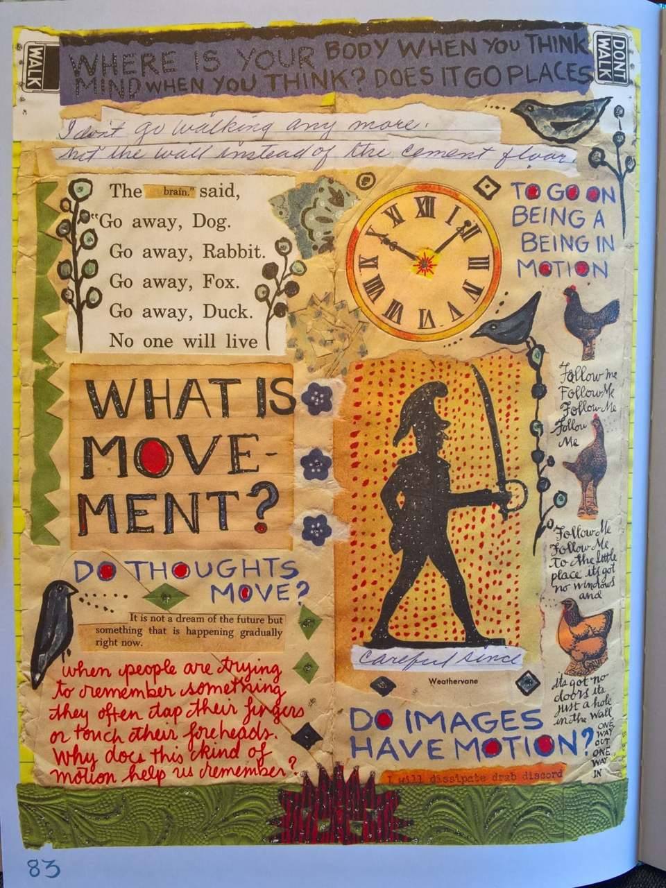
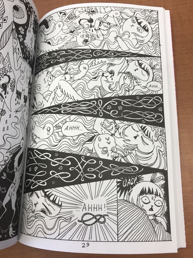
What is movement? ( Lynda Barry, What It Is, Drawn & Quarterly, 2008)

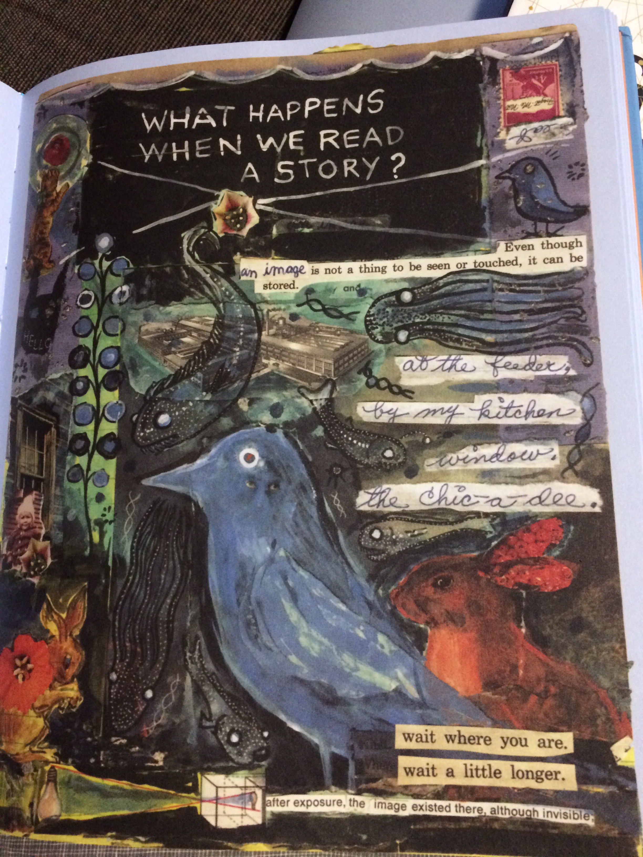
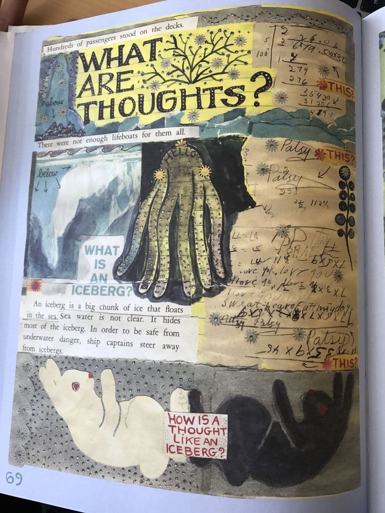
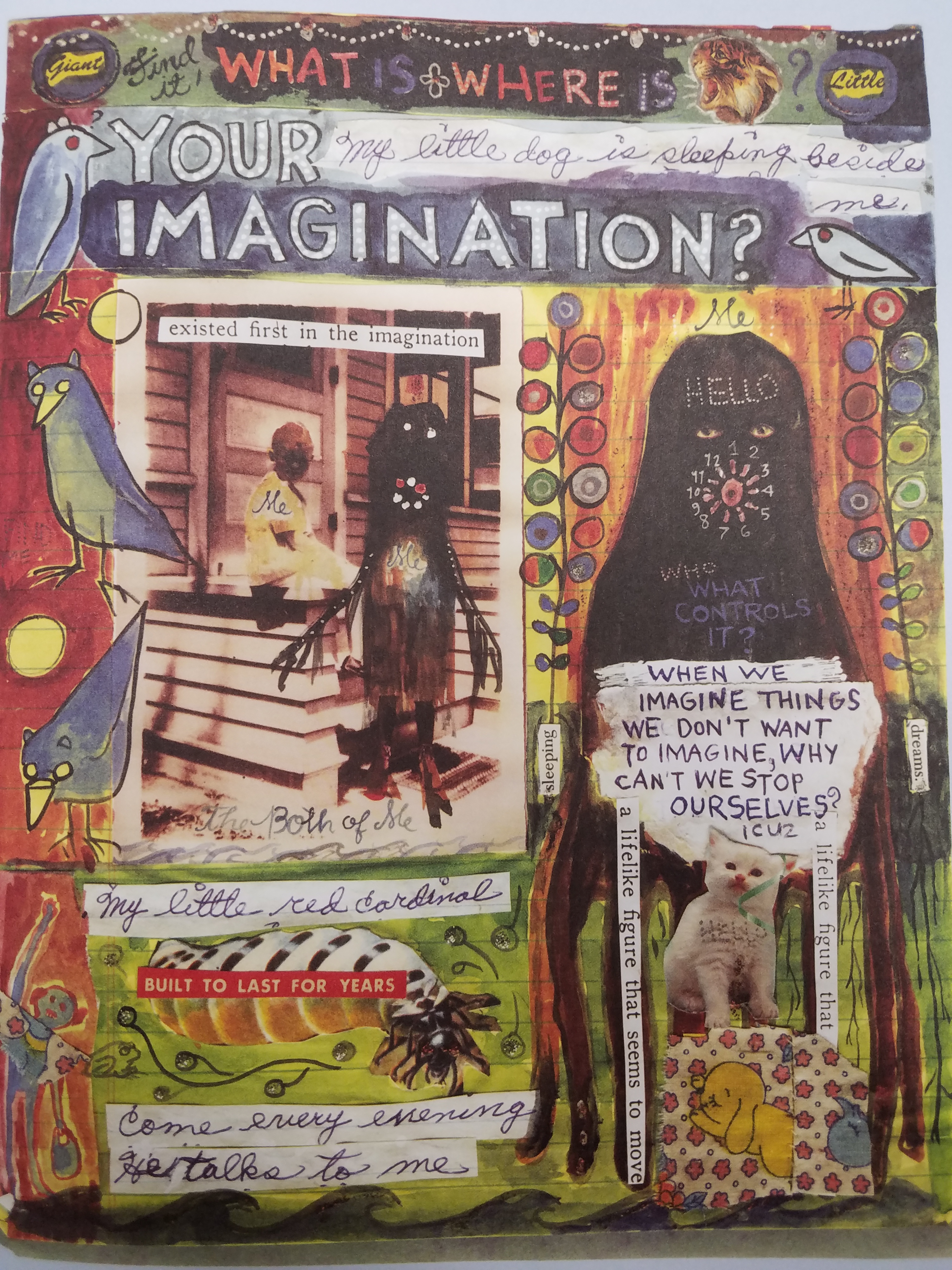
This example from Barry’s novel is a perfect representation of her use of texture. Like many of the other pages, page 83 also has the collage style with what appears to be bits of fabric, strips of paper, glitter, and even leathery materials at the very bottom. Texture is the tactile grain of surfaces and substances. While texture can be both physical and virtual, all of these elements only represent virtual textures. The pages themselves that make up this book are all smooth and exactly the same, if not a bit thick and sturdier than most book pages.


I believe that Barry designed her book using these methods because of the books subject matter. What It Is is a look at Barry’s past and the path that led her to becoming an artist. The scrapbook style reflects this idea of scattered memories, jumbled together after all the time that has passed. Sometimes the collaged pictures, text, and fabric almost make no sense textually, but have a deep overall visual cohesion. We can feel the soft fabric in our minds, the crinkled corners of the pages feel rough and bumpy, and the ridges of each overlap gives depth and emotion to the images. These pages look old, they would presumably feel old, and every bump, scratch, slice, stain and cut makes the pages feel real. This realness imparts an even greater sense of ingenuity to the reader. By making the images feel real and worn, it communicates the age of these memories being represented. It took time to craft this, in fact it technically took Barry’s entire life to craft the contents of this novel.

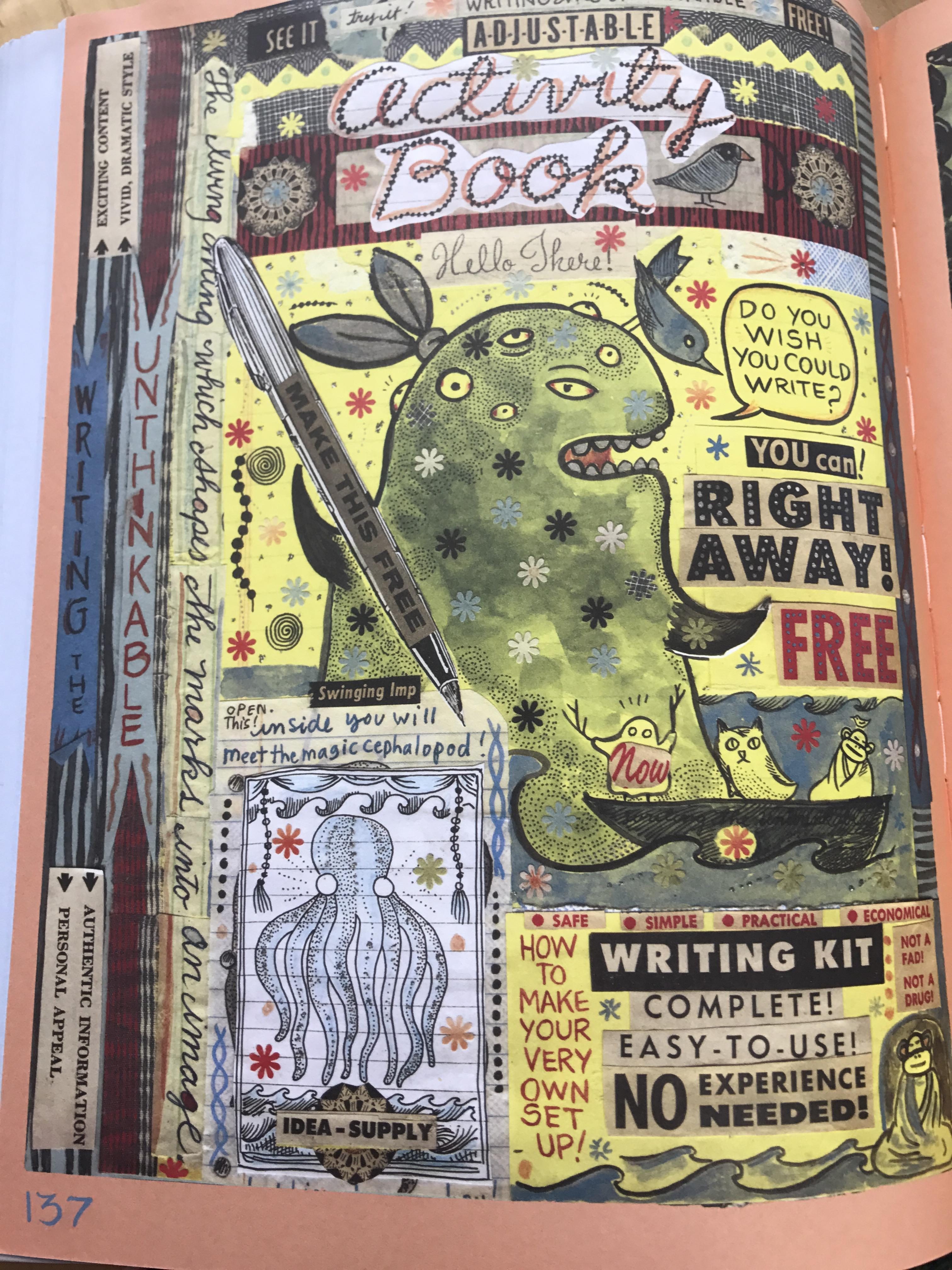
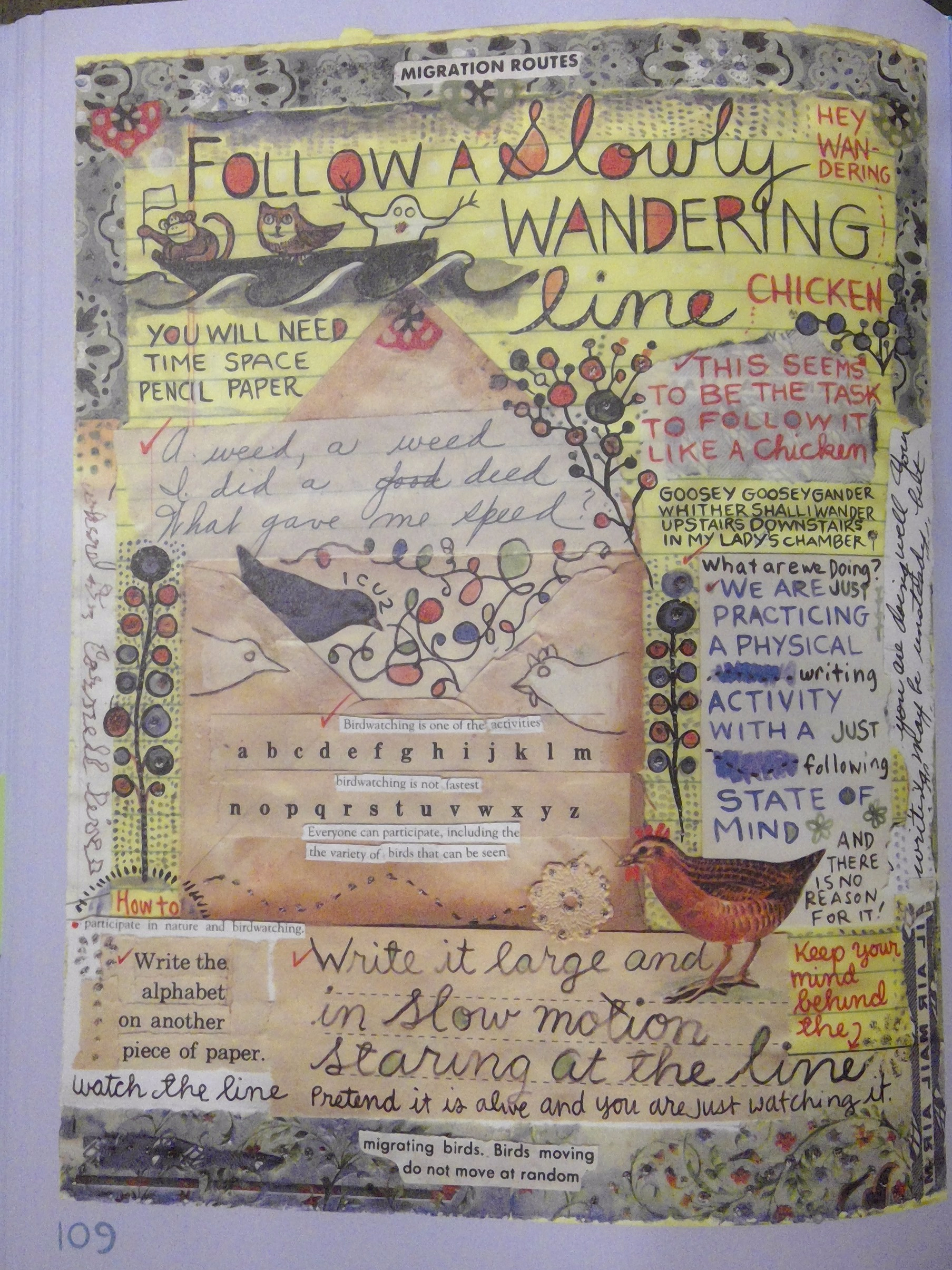
The scrapbook style also directly relates to the lesson Barry imparts on the reader in the last 72 pages of the book. In the last 72 pages Barry has created an activity page that encourages spontaneous thought and letting your mind just run as you write. This chaotic and fast pace approach to creating images and ideas is reflected in the layouts of the pages.

Posted in Spring 2017 Archive (336) | Leave a comment

Emma Garcia: Layers

powdered-milk-cover

Powdered Milk By Keiler Roberts Cover

According to Graphic Design: The New Basics “Layers are simultaneous, overlapping components of an image or sequence.” Layers enhance an image to make it more detailed. You see layers being used in so many ways especially in a book or on a project where you use Adobe Illustrator or Photoshop. These tools help to enhance the overlapping in the image. Two examples of comics that use layers are What it is and in Powdered Milk, both use layers in different ways.

An example in Powdered Milk is on the cover of the comic, with the stacking of so many presents. Since the cover and the entire comic is in black and white, you can see the details that go into drawing the 3-dimensional presents stacked on top of each other. By creating the 3D effect they are using printed layers because it is compiled to create the appearance of a seamless, singular surface.

What It Is By Lynda Barry Page 137

What It Is By Lynda Barry Page 137

Lynda Barry uses layers throughout all of her different comic books but especially in What it is on page 137 when she is talking about creativity and the freedom you have. In this example layers are seen when Lynda Barry uses Cut and Paste to put a wide variety of images on top of one another to explain the freedom of creativity. Cut and Paste is a type of layering in that you use a software application to copy, cut, and paste a piece of the image and move it to a different part of the page or rearrange it so that it is rotated into a different position.  Layers can be seen in a wide variety of ways, they are images arranged on top of another and make an image become more intrinsic.

Posted in Spring 2017 Archive (336) | Leave a comment

Layers: Cassidy Krahn

win_20170303_00_42_53_pro

Page 109, “What It Is” by Linda Barry

The book Graphic Design the New Basics by Ellen Lupton and Jennifer Cole Phillips says it best, “layers are simultaneous, overlapping components of an image or sequence.” I think layers need to occur to make art or design interesting. If we see a static image with a simple contrast of black and white. One of the two colors were still a layer on top of the other. That being the most simplistic example. I enjoy how the book related to the layers panel in Adobe Photoshop. Creating layers to an image creates interest and we can play around with how much we see or don’t see of a layer. Layers can also impact we see the shape or color of an object. If the image is less opacity than we might see the layered image change the intersecting parts and change the color and shape of the first image.

Linda Barry uses layers a ton in her graphic novel “What It Is.” I particularly loved page 109 in this book. The first layer is on a yellow legal pad, then she decorates it with layers of color draw in by hand. Adding further cut and pasted layers of an envelope, scrap paper, cut outs from books, and others. By adding physical elements to her base layer, it adds an interesting look and texture to the page. Also, I wanted to mention the typographic layer Barry added to her entire book. She uses a verity of fonts, cut outs, and writing utensils (pens, pencils, markers, etc.)  to create this layer of text. The text isn’t always in a line or even horizontal! This temporal typographic layer is used so well that it is hard to look away from! It creates such a unique experience for reader that I feel as though I cannot read the page the same way twice. This enhances my interest in the choices this designer made and my enjoyment of the book.

Posted in Spring 2017 Archive (336), Uncategorized | Leave a comment

Texture: Sophia Price

img_0910

Lynda Barry’s What It Is, page 42

Texture is a main part of Lynda Barry’s artistic style. Her drawings each are giving a unique feeling, causing the reader to sense how it would feel if her drawings came alive. She creates her drawings in a layering method- one on top of another. It gives the scale of certain images coming at us, while other ones are farther away. I would like to say she draws with pencil, pushing harder and lighter to change the coloring and texture of the page. Her scraps of writing pieces look like they were glued on but then shaded over to take away their harsh corners.

In this page of her book What It Is Barry uses contrasting textures to give each individual drawing their own feel, as they visually compliment each other on the page. The bird’s shading gives you fluffiness of it, manipulating the texture to bring its wings forward. The bunny on the right of the crow has a similar feel- the texture in the ears brings the eye directly to them. Their surface has been manipulated to give it a bumpy view. The vitality of this picture is mixed with the words. The top left text box has combining textures of word- this brings out the physical and virtual texture of the image. It gives the images deeper meaning, while drawing out all the different textures of the words. The textures blend the edges of the paper into the rest of the page. This gives the texture of the images more urgency, and takes away from the harsh texture of the words cut out.

Posted in Spring 2017 Archive (336) | Leave a comment

Layers: Angelica Tibule

unspecified-4

What It Is? by Lynda Barry. Page 69.

According to Graphic Design: The New Basics, layers are defined as simultaneous, overlapping components of an image or sequence. Throughout Lynda Barry’s What It is, she uses layering in a form of a collage as the theme and style of her book. An example of layering is shown on page 69, where Barry uses different types of papers, cutouts, and images, placed on top of one another. If you look at the yellow pad paper, you can tell that it is the base of the collage, because you can see the how the other cutouts are placed on top with the yellow paper peaking in between the images and cutouts. It is also easy to tell by looking at the octopus placed in the center of the page, where you can see the lines of the paper running across her painting. In addition, the edges of the paper show that Barry is creating a collage because of the imperfections of how she placed the cut outs and how she tore them apart to place them all together.

unspecified-3

Mimi and the Wolves – Act I: “The Dream” by Alabaster. Page 29.

Another example of layering is a comic called Mimi and the Wolves by Alabaster, shown
on the right. This page shows the part of the story where the main character has lucid dreaming of a dark and mysterious world. This style of layering is different from the style that Lynda Barry uses. The artist of this comic uses layering by creating three triangles that are stretched across the page. By adding a different shape to the comic on a 2-dimensional plane, gives it the effect that it is on top of the drawing that is going on in the background. Lastly, the way the artist drew the characters and used different forms of lines to give it that dreamy and mystical feel, uses layering to make sure that his audience can still see the main character clearly without adding any color.

Posted in Uncategorized | Leave a comment

Texture: Angelica Tibule

unspecified-2.jpeg

What It Is? Lynda Barry. Page 60.

According to Graphic Design: The New Basics, texture is defined as the tactile grain of surfaces and substances. Textures can either be prickly, soft, smooth, rough, etc. An example of texture can be found in many pages of Lynda Barry’s What It is, such as the one shown in the right. Looking at this page of the book, Barry dedicates this page towards her question of “Why are monsters in so many old stories?” (p. 60). The first image I see would be the black octopus that is positioned in the center of the page. Barry adds texture towards this character by adding dots all around the body of the octopus. I personally think that the dots make me feel that the octopus has a weird rough texture. Because the theme of this page is based on monsters, the textures that Barry uses to add into the images personally gives me the chills.

Another example of texture would be the owl shown in the left-hand side of the octopus, where Barry created fine details to the Owl’s fur. You can see the tiny strokes of lines and small dots to create texture. She also creates texture on the lobster, below the skull. If you look closely, she added small drops of water to give it the effect that it is an ocean creature. In comparison to all the other images included in this page, she did not add much detail to create texture towards each character. It seems like she used water color to some of the monsters, which creates a smooth and glossy texture. The two monsters on the lower left hand side only consists of strokes of lines and scribbles to create texture.

Overall, Lynda Barry uses repetition through texture by repeating the dot effect on characters, stokes of lines, and smooth paint strokes to the characters. Texture can also be found by analyzing the background Barry uses for her work. The black background makes me think that she used a matte black background to create a more darker feel to the monster theme. Lastly, texture can also be shown through the logotypes Barry uses, by using different fonts, mediums, and scaling them a certain way.

Posted in Uncategorized | Leave a comment

Texture: Emma Garcia

lynda-barry-page-167

Lynda Barry “What it is?” Page 167

Texture, according to Graphic Design: The New Basics is the “tactile grain of surfaces and substances.”It allows for an image to come to life and be more than just two-dimensional images, it brightens the pages by adding details that are normally only seen somewhere else.

For example, on page 167 of Lynda Barry’s book What it is? she uses texture to tell a story of the different dogs she met in her life. When drawing each dog you can see the scribbled lines that are creating the texture of each of the dogs and the area surrounding them. This allows for each of the dogs to seem like they are coming to life by using the rough details of the sketch. In this example, Lynda Barry is using Surface Manipulation by manipulating her pen or pencil to draw thick lines that look almost messy.  Another type of texture that Lynda Barry uses is Physical and Virtual Texture, which is when she includes text in her drawings to make the text a part of the drawing. This is also seen on page 167 on the bottom of the page.

Not only does Lynda Barry use many different techniques to create the appearance of texture on this one page but she always uses these techniques throughout her book. I think she used these methods because they fit the personality and style in a way that would make the book boring without them present.

On every page of What it is? you can see words and images scattered all over the page causing you to put more thought into reading the book. When she uses Physical and Virtual Texture, you are able to look at the pictures and it is clear that the words have a purpose and that they are there to create a glossy or rough texture in the image. This is also seen with Surface Manipulation as the details of the image come off the page.

Posted in Spring 2017 Archive (336) | Leave a comment

Layers: Hak Do

Layering is a really e

Page-109.jpg

Lynda Barry’s “What It Is” Page 109.

ffective method to convey a message as a whole through the use of multiple assets. It also gives more room for creativity because one can make changes to one layer without effecting the other assets. Which basically means there are more ways to use assets to convey meanings.

In Lynda Barry’s “What It Is” on page 109, she effectively uses various types of layering to tell her story. She uses cut and paste layering, physical layering, typographic layering and temporal layering. She uses cut and paste and physical layering through the pieces of actual cut out papers and the envelope. She uses typographic layering through her words and texts. She uses temporal and virtual layering through the birds only showing half their bodies, indicating that the walls of the envelope are some sort of portal or frame. That is also virtual layering because the birds are draw on top of the envelope. It’s important she uses layering in her case because she has a lot to say and convey, but it would be extremely hard for her to do so using only one method and one medium. So she uses a lot of layering to effectively put together a page that conveys a message that she intended. If she didn’t use layering, just the envelope part alone would be a whole page. Through layering she can cram everything into a confined space. Like there is first the envelope, then the paper, then there are words on it and birds drawn on. That shows how much layering can be involved in one space.

page-201

Brandon Graham’s “Multiple Warheads: Alphabet To Infinity #1 (Excerpt)” Page 201.

In Brandon Graham’s “Multiple Warheads: Alphabet To Infinity #1 (Excerpt)” on page 201, there is a multitude of temporal and virtual layering. There is temporal layering where only the wheel of the car is showing and where the hand is cut off, indicating that the frames are portals or boundaries. As for virtual layering, the two frames on top of the page is considered virtual layering and then the buildings and ground on top of the mountain background can be considered layering too. Layering is important on Graham’s part and it has to be so different Barry’s case because he is telling a story through one medium and one method. He is confined to a few options of layering so he uses them effectively to put in as much as he wants into one page without making it look so clustered like Barry’s book. Unlike Barry, Graham is telling a linear story so it can’t be so abstract like Barry’s work.

Posted in Spring 2017 Archive (336) | Leave a comment

Texture: Cassidy Krahn

20170302_110557

page 139, What It Is by Linda Barry

Texture is the feel of something. You may physical feel a glossy tile floor or the rough surface of a tree. You can also feel texture on a page. When the eye see a letter created by chunky paint our eyes understand that there is depth and a certain texture to that paint letter. We also get a feeling if an image is written smoothly, we read it smoothly, but if an images has may sharp or jagged edges to it we might interpret it as rough or course.

Looking on page 139 of Linda Barry’s “What It Is” we see a spectrum of texture. Most of her works contain a ton of texture but I enjoy the variety of this page.  The example of Five Squares Ten Inches from the book “Graphic Design the New Basics” by Ellen Lupton and Jennifer Cole Phillips is the first thing I thought of when I saw this page. Linda uses a lot of different typefaces and places them everywhere on this page. There are large letters that draw your eye immediately and then small letters that you read last (because they are hard to read and take a magnifying glass). The texture of the typeface choices dictate how we interrupt them. I read the “do you wish you could write” in a different voice than I do the glued on word strips. Both giving a feel to the words and how they are presented.

The glued word strips have a texture in the design all themselves. They look like cut outs which gives them a frame and that the design of the letters where chosen for Linda, rather than creating the texture her self. It feels bland and above the page because they are an outside source coming in. This contrast really well with her physical drawings. For example, the woman’s jacket is created from a shading and lines, but we gain the texture of the jacket because of Linda’s design choices. Also looking at the birds, fish, and octopuses we see Linda’s texture harmony and contrast with the page verse the outside sources. Her shading and lines give a much different texture than the pasted in clips or the darker side strip.

Posted in Spring 2017 Archive (336), Uncategorized | Leave a comment

Texture-Miguel Bustos

20170302_111039

From “What It Is” by Lynda Barry. Page 20. Print image.

Texture is something that have a feel to it.  It is a tactile sensation that we normally experience with our physical bodies.  This sensation can be translated into the visual realm with a few tricks. The way something is perceived can be manipulated and influenced by the visual cues an artist uses, and that texture, affects the way we see their work.

In this photo, Lynda Barry is exploring the difference between imagination and reality.  The images that are meant to be reality are photographs with clear lines and sharp images.  They seem hard and unchangeable.   The imaginary portions, are drawings with unfocused images and edges that blur and meld to their background.  They have a squishy feeling and could be easily manipulated.

There contrasting parts in both the imagination and reality, like the eyes on the black character to the left.  They appear to be in focus and clearly defined.  The caterpillar on the bottom and the boy on the steps are meant to be taken literally but there are artistic manipulations that have been used to soften them.  The artist is borrowing traits from both to share their textures and meld the two sides.  We are left to understand that imagination and reality share the same space and neither is complete without the other.

Posted in Spring 2017 Archive (336) | Leave a comment