Texture: Hak Do

Page-88.jpg

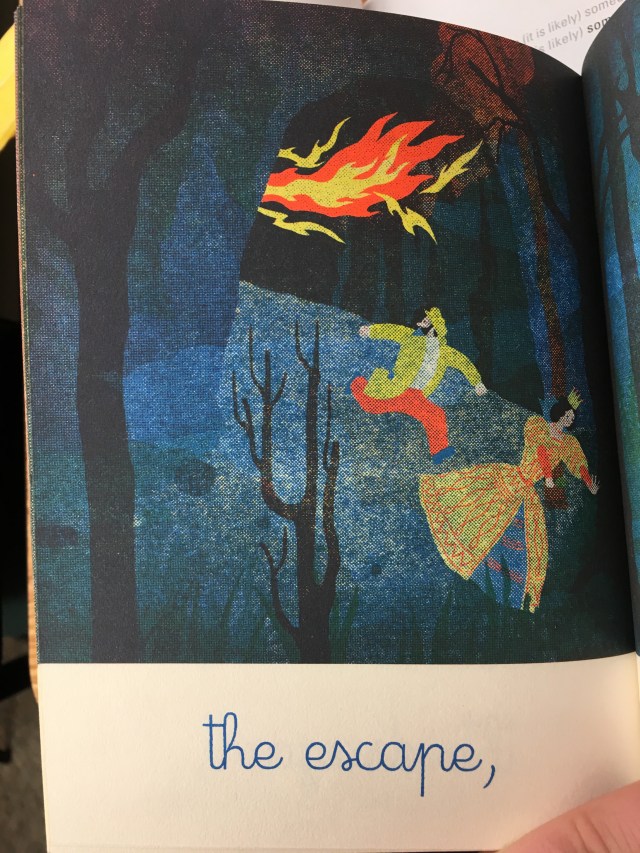
Lynda Barry’s “What It Is” Page 88.

Texture can be conveyed in many ways. Through the use of implied lines, physical textures, virtual textures etc. By including texture into something, it creates meaning, such as if a smooth texture was added to an art piece it conveys a calming message.

In Lynda Barry’s “What It Is” on page 88,  there are multiple instances where texture is involved. She uses a lot of surface manipulation and physical textures to tell her story. In the middle where all of the birds are there is a piece of actual paper, what looks like an envelope, and on that envelope there are creases that indicate surface manipulation to create texture. If I were to touch it, would feel bumpy and like paper. She uses physical textures through the use of the small red balls or gems placed along the white tree. If you were to look at the page in person it would seem like you could almost touch the red balls and it would feel grainy. Maybe she chose this kind of texture to convey the tree and how it would feel if one touched that tree. Or maybe she is conveying some sort of message that the tree is inconvenient because that is the first thing I would think of if I touched that grainy texture. She uses virtual texture with the flower like objects on the right side of the page. Through the use of contrast and depth, it gives texture to the flowers, a soft and subtle one.

I feel like theme of this page and a few other following it were themed with envelopes and postcards. So what better way to convey that theme than to actually put an envelope or at least a piece of it on the page. The texture alone people can guess that it’s an envelope and also the postcard with the monkey and ghost on it indicate that it has a theme of travel or message.

Posted in Spring 2017 Archive (336) | Leave a comment

LAYERS: GILLIAN FEJES

LAYERS:

Layers are overlapping components of an image in a sequence. Layers are used in everyday sequences in computer programs, books, nature and even on sports fields. Layers help build dimension and emphasis in a story, art piece, building or even in a market scheme. Layers help with the depth especially in screen printing, it is typical you print separately and stamp over, each layer at a time, but other examples have all layers placed on and then scans it into a one dimensional image which adds an interesting effect. There are many forms of layer forming, one of the most common ones is what we are all familiar with in our 4th grade art class, cut and paste. I recently took an art class where we made in-depth collages and it was definitely my favorite project. Adding images from different sequences really spoke to me. Layers is definitely my favorite way to add depth into some of my own personal designs.

In the book, Exits by Daryl Seitchik, he does an exceptional job layering his visual story in a way it is simplistic and dynamic. He isn’t using any colors, and minimal words so the strip layering down the page is an effective way to convey his image. On the page that I’m analyzing, he is a little sad boy hiding in grass. you can tell it is of a guy looking at grass, but he layers the grass into the eyes to imply that sight, the last layer is all black to emphasize he might as well have been dead.

IMG_6496.JPG

Exits by Daryl Seitchik

Posted in Uncategorized | Leave a comment

TEXTURE: GILLIAN FEJES

TEXTURE:

Texture is the textile of everything in our lives, and helps us understand the nature of things. When it comes to art textures some times they are intentionally contrasted and manipulated with how they look as an art compilation. Texture can be elegant, ugly, slimy, fury, fuzzy, ect.. Textures are used to help tell a story for the ultimate visual description. Using textures correctly can convey emotional bonds to a story or object, it can bring back memories or convey moods, it is relevant in all mediums of art and can be used to stack on top of each other or one eliminated to complete a whole new texture, not familiar. There are a few types of textures that are the most relevant in design. Concrete texture is the physical quality resulting slicing, burning, marking ad extracting. It creates a robust appeal, as if something was roughly glowing. Surface manipulation artfully reflects the active process featured. This method is crisscrossing lines on a cutting board r something similar to represent an urban touch. Textual Harmony and contrast is a very visually satisfying application. The textures used on the objects also directly work with color for opposites or analogous color to satisfy ones eye looking at this objet.

For my example I am using Ballad written by Blexbolex. This book is filled with texture harmony and pattern. The artist does a really good job convincing its reader of the emotions thought images. This book has tops 3 words on every page, s the visual aspect is insanely important. Especially adding and utilizing texture in a successful way. One the page I’m analyzing, “the escape” are the only words written on the page, and it is of a man and the queen escaping a cave with what appears to be flames shooting at them. Just by looking at it , and the use of texture with the fire and dark night cave I can kind of imply t that there is a dragon chasing them out. But since I read the book, I know that it is a dragon. I think having that critical accuracy in a book just by looking at one page is a success on the artist’s part.

IMG_6494.JPG

Ballad written by Blexbolex

Posted in Uncategorized | Leave a comment

Texture: Logan D. Quaranta-Rush

texture

Linda Berry, What It Is, page 81, Image

Texture is apart of everything, it is “the tactile grain of surfaces and substances” as described in Graphic design the new basics by Ellen Lupton and Jennifer Phillips. We often look at texture as how an object feels or a physical experience between ourselves and the object we are touching. Texture is a visual experience along side it being a physical one, we see this when working with different designs that have a repetition of objects the begin to lose their individuality. The use of text can create a different visual feeling of texture on a piece of paper, changing it from a smooth, clean surface to a rough and broken one as we see in Linda Berry’s comic What it is on page 81. Linda’s comic does not follow a “normal” approach when it comes to framing, instead we see a disorganized and confusing collage of doodles and typed or written texts. This somewhat random repetition of sentences placed around the page creates a visual feeling of texture that if one were to touch it, the page would feel rough rather than smooth like paper should be.  

Posted in Spring 2017 Archive (336), Uncategorized | Leave a comment

test

screen-shot-2017-02-15-at-9-32-35-pm

Enter a caption

Posted in Uncategorized | Leave a comment

Time & Motion: Cass McKay

The image I selected that uses motion is from Dr. Suess’ “The Cat In The Hat”.

(see below)

catinthehat.jpg

“The Cat in the Hat” by Dr. Suess

The first item that shows motion on this image is all the characters hair and especially thing 1 & thing 2’s, it is jetting back to give the affect they are moving quickly forward and their hair is out of control.  This is the easiest way to show motion because its the first thing people associate that with is going forward.  Same for the wire on the back of the vehicle it is bowing backwards to give the same effect as the hair.  Another thing thats showing motion is the lines heading backward from the front wheel, wing, and back end of the vehicle.  Even though in reality we cant see wind or we cant see air rushing past us this trick allows us to believe there is friction there and in fact they are slicing through the sky.  This trick can also be used to give the falling affect, position the lines vertically instead of horizontal on this image and it would appear the cat and his companions were falling downward instead of flying. One aspect of the picture I didn’t consider until know that shows movement is the placement and posture of the goldfish.  He’s set up leaning forward and out of his bowl to show movement forward as well.  From the surface you never really think about whats going into the movement of this still image until you sit down and spend some time analyzing the different factors.

Posted in Spring 2017 Archive (336), Uncategorized | Tagged , | Leave a comment

Color: Cass McKay

The page I selected is from the comic “Transformers: Lost Light” by Roberts, Lawrence, LaFuente, and Bove, it isn’t a physical comic but one of the digital medium.  The reason I selected this one in particular is because I believe its a good representation of color (was more vivid before I scanned and transferred to here).  This page has balanced itself very well because the background is a lighter cool tone and it allows for the focus to be directed in front of it at the richer colors.  Factors that also aide in the contrast of the background and the characters are the dark shading that gives a shadow effect and the much darker tones that make them pop from the page.  The light coming from the red characters chest is complimentary of his own color as it adds more warmth to the very cool colored scene.  If the scene wasn’t dark and a blue color the beam of light coming out of his chest wouldn’t of looked as fitting because it wouldn’t of contrasted enough with the backdrop. This technique is a very popular one as people all the time use these colors to work alongside each other.  If you have a character who is bland and his color can resemble the background that people eyes wont focus on it because its not contrasting its surroundings. A lot of action movies or video games use these colors to give a certain feeling to the viewer, games such as Tekken, Pokemon, and more use this color scheme on their covers.


comic11.jpg

Transformers: Lost Light

Posted in Spring 2017 Archive (336) | Tagged | Leave a comment

Color: Conor Reich

The first colored comic is believed to be published in 1895 under the name of, “Hogan’s Alley”. Since then, the comic book industry has never been the same. Color has no become an integral part of comic book storytelling. The first thing a reader sees when picking up a comic is color. The inclusion of color breathes life into the various stories illustrated on the page.

Most comics use the method of optical color mixing in order to add color to the page. This process is founded upon basic color theory. The printing process involves four different colors stacked on top of each other in flecks to mix together visually. This is known as CMYK At first glance these colors seem to seamlessly blend together, but if you were to take a closer look, one would discover pixelated dots of only yellow, blue, red, and white.

Take the picture below as an example. Before color is introduce some of the lines seem messy and unclear to discern and interpret. Notice how the smoke seems almost non existent in the first image compared to the second. After the color is added the image sharpens and breathes with a sense of intensity not as easily identifiable before.   The intensity was always there it was just more difficult for the reader to pick up on. In fact, I  am certain it would take me a few minutes to discern who the character was in the first image. Whereas, in the second the character is easily recognized by the colors that are associated to them.


Posted in Spring 2017 Archive (336), Uncategorized | Leave a comment

Color: Andrese Collins

This cover art from Pete Bagge’s 6th issue of “Neat Stuff”provides a variety of colors that compliment, oppose, and reflect each other in order to support the intended tone and situation being displayed in the image. Pete doesn’t keep any of the colors he uses fully saturated. Pete doesn’t display many primary colors but presents them in different tones and shades in order to give the reader some type idea of a personality towards each character. As the characters are spaced and balanced from each other we notice a clear interaction of colors, especially when taking note of how each character blends or looms with the only primary color, the yellow background.

screen-shot-2017-02-16-at-8-13-17-am

Cover Art from Peter Bagge’s comic, “Neat Stuff”

Notice that Pete mixes the primary colors with secondary colors in order to develop unique tertiary colors like the reddish-orange hue used on the title of the comic which is also the identical color for the characters tongues and gums. The characters clothes are also tertiary colors.

Notice that their clothes all resemble a primary color (blue, red, yellow) but are altered in order to display opposites attracting and complimenting each other. The characters are yelling at each other so Pete uses the colors to help bring a bold and argumentative energy. The women at the bottom’s clothing is like a very desaturated yellow in order to avoid her blending in within the yellow background.

Posted in Spring 2017 Archive (336) | Leave a comment

Color : Gilian Fejes

In Ellen Lupton and Jennifer Cole Philips’ chapter of color they highlight the concept of color and the remarkable tricks it can play on the eye. Color has a remarkable role in moods, it can differentiate, camouflage and high light different aspects of an image. The first tool within the color world they point out is the color wheel. The color wheel is extremely helpful, and there are many of these wheels that emphasis primary, secondary, complement, tertiary and analogous colors. These wheels are the helpful to see what colors are opposite, next to, the same hue or adjacent to the others. Within these colors there is a dynamic system to completely customize a color from the value, shade, tint, saturation, hue and intensity. These are described as the aspects of colors and relate to the range of attribute within these colors. Knowing how each color works with each is a great and required skill to have in successful graphics. A way a color is placed next to each other can completely change a color or shape to the eye. So, knowing how to work with color can really benefit you. Especially in marketing, if you emphasize a certain part of something that needs to stand out. Color is the perfect way to do that because it draws the eye to that area. My personal favorite aspect to graphic design is color and playing with the different variations. I think different colors can make or break an image to being subpar to great. I have always had an acute obsession with mixing colors and brightness’s together to make my own.


My comic is of Jimmy Corrigan The Smartest Kid On Earth. I particularity chose this pictures because the comic itself does an excellent job at using colors at appropriate time for the audience. The title itself is just blue and white which bring the viewers in aesthetically, but it takes a second to see the graphic picture itself. When I first looked at this picture, all I saw was the blue and a kid but re looking at it I was he was basically killing an older man and his assumed mother is screaming in the background. Besides the cover I think the actual comic in this piece does a good job drawing in the focal points. The comics are a light chromatic green and dull colors, but the key factors of the comic are bright red and yellow to keep the audiences eye on it. I think it is good to have good color coordination in graphic novels because the book is all visual there are not description boxes it wat you see. So color can truly help or hinder an image and story.


Screen Shot 2017-02-15 at 9.32.35 PM.png

Jimmy Corrigan The Smartest Kid On Earth by Chris Ware

Posted in Uncategorized | Leave a comment