Texture: Jessica Colvin

AcrylicWeb

Photo of the many textures in one of my abstract acrylic paintings.

I am a painter, so the chapter on texture in “Graphic Designs: The New Basics” broke down and explained concepts I use regularly in my art.  In painting texture has always been my obsession.  I love experimenting with different mediums and tools that can be used to achieve different physical and optical textures.  With paint you use color and contrast to optically add texture.  This invites your viewer to imagine the object as it is in reality.  The same thing is done in virtual and computer designed art.  However, the aspect I enjoy most about painting is physical texture.  In this acrylic painting you can see several ways I applied and manipulated texture.  First, there is the base texture of the canvas that is consistent throughout the entire piece.  On top of this I added globs of paint with a palette knife and achieved two types of texture: a physical texture with the dimension of the body of the paint, and a visual texture with the variation and blending of color.  Once I established this background, I changed mediums to a metallic paint and used a brush to add a splash of contrast.  This silver line and the silver splatters I feel enhance the base texture by adding a contrast of color and shine.  Unfortunately, I was unable to capture how glossy and metallic the silver appears in real life compared to the semi-gloss/matte of the varied blue background.  I prefer manipulating metallic paint with a brush so I am able to create more smooth and flowing textures that mimic how real metal objects look.

These next two images are from one of my oil paintings.  Oil paint is a much thicker medium than acrylic and I enjoy the textures it can make.  The following two images show two different textures I created with oil paint using a brush vs using a palette knife.  As you can see from the images, using the palette knife I was able to make a much thicker physical texture.  However, while the brush didn’t add as much body to the texture it did add a unique and interesting pattern to the texture in the many fine lines.

OilKnifeWeb

Photo of the texture achieved with a palette knife in my oil painting.

OilBlendingWeb

Photo of the texture achieved with a brush in my oil painting.

Posted in Fall 2017 Archive (336) | Leave a comment

Texture: Kira Norman

So I chose to take pictures of textures I found in my room. It was interesting to find what was appealing to me visually. The felt fabric and the cork board are not uniformly organized but  for some reason, they almost seem to work better because of that.  In the context of the chapter on Texture in Lupton’s book, Graphic Design: The New Basics, the texture of the physical object this digital image is based on can be seen. The felt material would be soft, which is evident from the loose yarn texture and the soft baby blue color. With the cork material, the roughness of it’s surface is felt in the crowded space. The cork texture was definitely machine made and cut, but the felt material was actually part of an old stuffed animal that was handmade. It’s pretty evident that the material is worn from the loose strands popping up and being tossed around.  I chose these two because they are opposites in terms of what they’re made of and their origins. The harmony in each texture can be seen in the monochromatic nature of the two textures. Both stick to one color but some pieces of the overall image are darker or lighter versions of that color. I would use the cork texture to communicate the image of a classroom or a college bedroom. For the felt material, it would work best for an ad for a crafts store that sells materials for sewing. I also think of a baby’s blanket, so it could also be used to communicate childhood and safety.

Posted in Fall 2017 Archive (336) | Leave a comment

Texture: Sample Post Kristin Becker

This is an image I took of my daughter painting at our kitchen counter.

In “Graphic Design: The New Basics,” the authors make a distinction between virtual texture and physical texture. Virtual texture is the “optical appearance of a surface:” As a viewer, we can learn something about an object or image without actually having to touch it. Physical texture refers to the literal surface: A magazine might be printed on glossy or matte paper, depending on the message it is trying to convey (think of holding a tabloid paper in the check out line at the grocery store as opposed to a fashion magazine). Even in the case of the magazines, the texture informs our eye before we touch the pages themselves. Painting with my two-and-a-half-year-old at home reminded me of the difference between visual and physical texture. I encouraged her to paint with a paint brush, but she quickly gave that up and began painting with her hands. The marks on the paper were clearly distinct, even though the paint color was all the same: you could tell which ones were smeared with her hands or painted with the brush because of their unique and distinct visual presence.

This is a silkscreen print I have in my house, which I created at an artist’s residency in January 2017.

I also thought it was interesting that the chapter on texture talked about letterforms/typography/fonts in relation to texture. Different typefaces (or fonts) have inherently different textures, depending on how they are designed, spaced, and scaled. Some are very bold and some are very fine, some have little contrast and some have no contrast. In this example, the very bold font stands out against the green patterned background in part because it is so thick. The book notes that texture is often most powerful when contrast (visual difference) is used as part of the design. In this case, color contrast is also part of what makes a visual distinction.

Detail image of Chinese artist Xu Bing’s “Book from the Sky” installed at the Blanton Museum of Art in Austin, TX in January 2017.

The visual nature of letters and words are often even more obvious to us when we look at foreign languages. In this final example, invented Chinese characters by the artist Xu Bing are presented on giant scrolls, which fill a large room in a museum. In this case, the characters begin to feel like a fine, delicate overall texture. Likewise, linear pattern emerges as the characters start to group into vertical columns. This happens in part because of the consistent white space between each column. Also, the characters do not line up into horizontal columns.

Posted in Fall 2018 Archive (336), Sample Posts by Your Professor | Leave a comment

CES 444

2Pac “White Mans World”


[Sample from Malcolm X (1992)]
“You go bustin’ your fist against a stone wall. You’re not usin’ your brain. That’s what the white man wants you to do. Look at you! What makes you ashamed of bein’ black?”

[Intro: 2Pac]
Nothin’ but love for you, my sister
Might even know how hard it is, no doubt
Bein’ a woman, a black woman at that, no doubt
Shit, in this white man’s world
Sometimes we overlook the fact
That we be ridin’ hard on our sisters
We don’t be knowin’ the pain we be causin’
In this white man’s world
I ain’t sayin I’m innocent in all this
I’m just sayin’, in this white man’s world
This song is for y’all
For all those times that I messed up, or we messed up

[Verse 1: 2Pac]
Dear sister, got me twisted up in prison, I miss ya
Cryin’, lookin’ at my niece’s and my nephew picture
They say don’t let this cruel world get ya
Kinda suspicious, swearin’ one day you might leave me
For somebody that’s richer
Twist the cap off the bottle, I take a sip and see tomorrow
Gotta make it if I have to beg or borrow
Readin’ love letters; late night, locked down and quiet
If brothers don’t receive they mail, best believe we riot

Eatin’ Jack-Mack, starin’ at the walls of silence
Inside this cage where they capture all my rage and violence

In time I learned a few lessons, never fall for riches
Apologizes to my true sisters, far from bitches
Help me raise my Black nation, reparations are due

It’s true, caught up in this world I took advantage of you
So tell the babies how I love them, precious boys and girls
Born black in this white man’s world—and all I heard was

 [Hook]
Who knows what tomorrow brings
In this world where everyone’s blind?
And where to go, no matter how far, I’ll find
To let you know that you’re not alone

[Collision: 2Pac]
Only thing they ever did wrong (yes!, yes!) was bein’ born black (no doubt), in this white man’s world. All my ghetto motherfuckers, be proud to be black if you proud to have this shit like this, ’cause ain’t nobody got it like this (all my little black seeds, born black in the white man’s world). All these motherfuckers wanna be like us. They all wanna be like us, to be the have-nots: all hail. God bless the child that can hold his own, no motherfuckin’ doubt.

[Verse 2: 2Pac]
Bein’ born with less, I must confess
Only adds on to the stress
Two gunshots to my homie’s head, died in his vest
Shot him to death and left him bleedin’ for his family to see
I pass his casket, gently askin’, is there a heaven for G’s?

My homeboy’s doin’ life, his baby mama be stressin’
Sheddin’ tears when her son finally ask that questions
Where my daddy at? Mama, why we live so poor?
Why you cryin’? Heard you late night
Through my bedroom door
Now, do you love me, mama?
Why they keep on callin’ me nigga?

Get my weight up with my hate
And pay ’em back when I’m bigger
And still thuggin’ in this jail cell, missin’ my block
Hearin’ brothers screamin’ all night, wishin’ they’d stop
Proud to be black, but why we act
Like we don’t love ourselves?
Don’t look around, busta, (you sucka!) check yourselves

Know what it means to be black, whether a man or girl
We still strugglin’ in this white man’s world

[Hook & Ad-libs (2Pac)]
Who knows what tomorrow brings
(Born black in this white man’s world)
In this world where everyone’s blind?
(In this white man’s world)
And where to go, no matter how far, I’ll find
(In this white man’s world)
To let you know that you’re not alone

[Collision: {*megaphone*}]
We must fight for brother Mumia
We must fight for brother Mutulu
And we must fight for brother Ruchell Magee
We must fight for brother Geronimo Pratt
We must fight for [?], Zulu, [?]
We must fight for the countless political prisoners
Who are locked up falsely by this white man

[Verse 3: 2Pac]
So, tell me why you changed to choose a new direction
In the blink of an eye?

My time away just made perfection
Did you think I’d die?

Not gon’ cry, why should I care?
Like we holdin’ onto lost love that’s no longer there
Can you please help me?
God bless me, please keep my seeds healthy
Makin’ all my enemies bleed while my G’s wealthy

Hopin’ they bury me with ammunitions, weed and shells
Just in case they trip in Heaven—ain’t no G’s in Hell
Sister, sorry for the pain that I caused your heart
I know I’ll change if you help me, but don’t fall apart
Rest in peace to Latasha, Lil’ Yummy, and Kato
Too much for this cold world to take, ended up bein’ fatal
Every woman in America, especially black
Bear with me, can’t you see that we under attack?
I never meant to cause drama to my sister and mama
Hope we make it to better times, in this white man’s world

[Hook]
Who knows what tomorrow brings
In this world where everyone’s blind?
And where to go, no matter how far, I’ll find
To let you know that you’re not alone

[Collision: Khalid Abdul Muhammad]
“You’re out of touch with reality! There are a few of you in a few smoke-filled rooms, calling that the mainstream, while the masses of the people—white and black, red, yellow and brown, poor and vulnerable—are suffering in this nation.”

[Collision: 2Pac]
Never that, in this white man’s world, they can’t stop us
We’ve been here all this time
They ain’t took us out, they can never take us out
No matter what they say, about us bein’ extinct
About us bein’ endangered species
We ain’t never gon’ leave this
We ain’t never gon’ walk off this planet
Unless y’all choose to
Use your brain, use your brain
It ain’t them that’s killin’ us, it’s us that’s killin’ us
It ain’t them that’s knockin’ us off
It’s us that’s knockin’ us off
I’m tellin’ you better watch it, or be a victim
Be a victim, in this white man’s world
Born black, in this white man’s world, no doubt
And it’s dedicated to my motherfuckin’ teachers
Mutulu Shakur, Geronimo Pratt, Mumia Abu Jamal
Sekou Odinga, all the real OG’s, we out

[Minister Farrakhan — Oct. 17, 1995]
“The seal, and the constitution, reflect the thinking of the founding fathers, that this was to be a nation by white people; and for white people, Native Americans, Blacks, and all other non-white people were to be the burden bearers, for the real citizens of this nation.”

Posted in Spring 2017 Archive (336), Uncategorized | Leave a comment

Archives visit: Noah Martin

The example that I have chosen from our visit to the library archives comes from a 15th century book. This Book is titled “Legenda aurea sanctorum sive Lombaridica historia” A German book written in 1488. The main elements in this book are the text, hand colored illustrations, and illuminated lettering. These illustrations were created by someone placing blobs of color on the page and then using a woodblock or some other printmaking device to create a layer that is the outlines that form the image. You can tell this by how the colors bleed out and are not as uniform as the black outlines. The image in this example is of an angel that is aligned to the left of the page raising its sword about to strike some sort of demon whose bright red contrasting color and center alignment cause it to stand out vs the other demon whose brown coloring causes it to blend into the ground. The other important elements of this piece are the text and illuminated lettering. The illuminated lettering compliments the image nicely because it follows a similar color IMG_0194
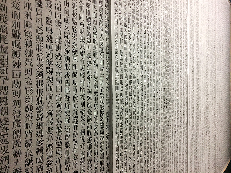
palette, this is a nice element because it ties the image and text together in another way. Using similar artistic style and color is something that I will use in my poster so that the elements in my poster appear more cohesive and not just cut and pasted on. Another thing that this example has made me think about in my poster in the use of layering, Layering will be important for me because the image I am creating has depth and dimension that layering is essential too. Aside from what I will use in my poster I also simply appreciate the craftsmanship of this book. It’s amazing the level of detail that was captured in this 14th century book and how it continues to inspire mine and others work today.

Posted in Archives, Fall 2017 Archive (336), Spring 2017 Archive (336) | Leave a comment

Archives Visit: Aaron Scofield

Page 2 from James Neel’s comic, The Wishbone (Published in 1985)

In his comic, The Wishbone, James Neel uses a variety of different design concepts that we have been learning over the course of the semester. The comic is rather short, eight full 8.5″ x 11″ printer pages to be exact, and he published this comic in 1985.

This comic stood out to me from the rest of the comics that I looked at during our visit to Manuscripts, Archives, and Special Collections because all of the drawings in the comic are made up of points, lines, and planes, but when you look closely, it just looks like a bunch of lines scribbled together to form shapes. The different shades of lines provide the comic with different visual textures. I believe that the comic was based on the movie, The Gremlins, which was released in 1984, one year prior to the release of this comic. The gremlin also appeared in comic books shortly before this, but Gizmo was one of the gremlins that I remember from the movie and the gremlins were stirring up ingredients in order for their species to multiply. The comic is supposed to be read from top to bottom and left to right similar to a normal page from a book. However, the biggest image on page 2 of the comic is in the bottom left corner, and although that’s probably the first thing that you see when glancing at this page, that is not where the page actually begins. James Neel uses visual hierarchy to tell a narrative by placing the images on the page in the order of their importance and making sure that there is a clear separation between each of the layers on the page. He uses frames around some of the images as well as implied frames around some of the other images. These are all some of the things that have influenced my poster comic. I will be using hierarchy to tell a story from top to bottom and left to right, but there are going to be other images on the page that will catch your eye before reading the beginning of the narrative in the top left corner. I will also be using a variety of different textures while layering different images and text over each other. I also like the idea of implied frames, as well as regular frames around some of the images, so I am going to try and incorporate that into my comic as well.

Posted in Archives, Fall 2017 Archive (336), Spring 2017 Archive (336) | Leave a comment

Archives Visit: Jasper Barbosa

As one could imagine, the visit to the library’s archives provided a smorgasbord of material to digest and process, especially having been given the chance to use our immediate inspirations in our poster comic. The first comic that I sat in front of upon entering the room was The Sojourn, which had different authors with different comics within, but

IMG_4627

The Sojourn, Vol. 1, featuring the likes of “Tor” by Joe Kubert, and “The Smooth” by Dick Giordano (1977).

what drew me in was the character Tor by Joe Kubert, and how reminiscent he was of old Tarzan comics. My father used to read Tarzan comics when he was younger, and when I was really young, he brought his old comics for me to read, so having Tor jump out to me wasn’t a big surprise. It inspired me to make the character I was planning to portray even more attune with wildlife. After all, the character is vegan, so naturally he would be… well, nature-inclined. Another thing that inspired me to incorporate into my poster comic was the strong use of vibrant colors, and the power-poses done by characters like Dick Giordano’s The Smooth. While I’m not at all tempted to give my character a goofy costume, billowy sleeves and all, I am wanting to give him a powerful, almost anti-hero stance and more contrasted colors. Originally, I was going to use hues of brown and green, but I feel like that is too expected from the subject matter I’m dealing with. I’ve always been a supporter of using a lot of color, so I’m upping the use of blues, yellows, reds, oranges, etc., as seen in The Sojourn, as well as Will Eisner’s The Spirit.


Other examples I really wanted to incorporate were the indelible use of texture within this mini-comic,

IMG_4635

“Valentine” by A. Freeman (2005).

IMG_4637

“Beware of the Hole in the Ozone” from Maximum Traffic, Issue #1 (1990).


and the weaponry and sheer-awesomeness of the character portrayed in the spread to the right. I know I want to use a lot of color, so I wouldn’t copy the black and white format they have, and I think, given the size we’re dealing with for our poster comics, I want to use a lot of textures to fill the space to its maximum potential. I think texture, color, and scaling are the three main components I’m working with for my poster comic, and I’ve been finding that they will be crucial for the size of the poster itself. Without texture, things will appear flat or uninteresting to me, and the colors will give more life to the piece, which is a proponent I want to convey, given that the character is a hero for the life of animals and the earth.


Posted in Archives, Fall 2017 Archive (336), Spring 2017 Archive (336) | Leave a comment

Archives Visit: Cesar Rubio

WP_20170406_09_41_24_Raw_LI

“Cross Currents” Comic from out visit to the archives and special collections.

This particular example really caught my eye when we visited the archives last Thursday. I liked how it looked like someone physically cut out different pieces from other comics to make a new one. I think this is an excellent way to have a lot of texture in our own works. The use of cut out text was the most unique to me, no other comic in the archives had this.

Hierarchy is really important in this particular comic book cover, there is a lot going on so the creator needed to emphasize the right parts so the reader does not feel overwhelmed. I will try to do the same by adding some depth to my comic by adding small drop shadows to each layer.


Posted in Archives, Fall 2017 Archive (336), Spring 2017 Archive (336) | Leave a comment

Archives Visit: Ted Nikolov

IMG_1703

One of the larger comics from the archives found, however I do remember the exact name/creator

After our trip to the manuscripts, archives, and special collections in the library, I was inspired and really enjoyed a couple of particular styles I noticed while browsing all the comics. What I liked about this one was the action lines created. When the characters are fighting I like how the artist imagines the fight and emphasizes the power through lines that are meant to signify their brawl. I think I will most likely include action lines like this in my poster comic. However, these lines are not the only things that led me to further discussing this comic. Overall I really enjoy the art style compared to a lot of the other comics. Some of the comics found in the archives visit had very interesting graphics, and this comic had artwork that I enjoyed because it reminded me a lot of superheros. I might try to mimic this art style in my project and will be including a lot of design techniques seen from this comic into my own.

Posted in Archives, Fall 2017 Archive (336), Uncategorized | Leave a comment

Archives: Angelica Tibule

During the trip to the archives, I have seen a collection of different

unspecified

The Clock Strikes by Anton Makassar 

types of comic styles that gave me some inspiration and ideas that I could incorporate into my poster comic. The comic, “The Clock Strikes”  by Anton Makassar, uses different design concepts such as: layering, scale, texture, hierarchy, and framing. For my poster comic, similar to the title of this comic, I plan on creating a visual interesting font to make “Guam” and “Seattle” or “Washington” pop out. In addition, if I come up with an interesting title for my poster comic, I will apply the same idea I have for the font. In this comic, I liked the idea of how scale and framing is used to determine the hierarchy of the story. I will be using these design concepts towards my poster comic, and use speech bubbles or clouds to frame the text for each image.

Posted in Archives, Fall 2017 Archive (336) | Leave a comment