Texture: Sulaiman Ambusaidi

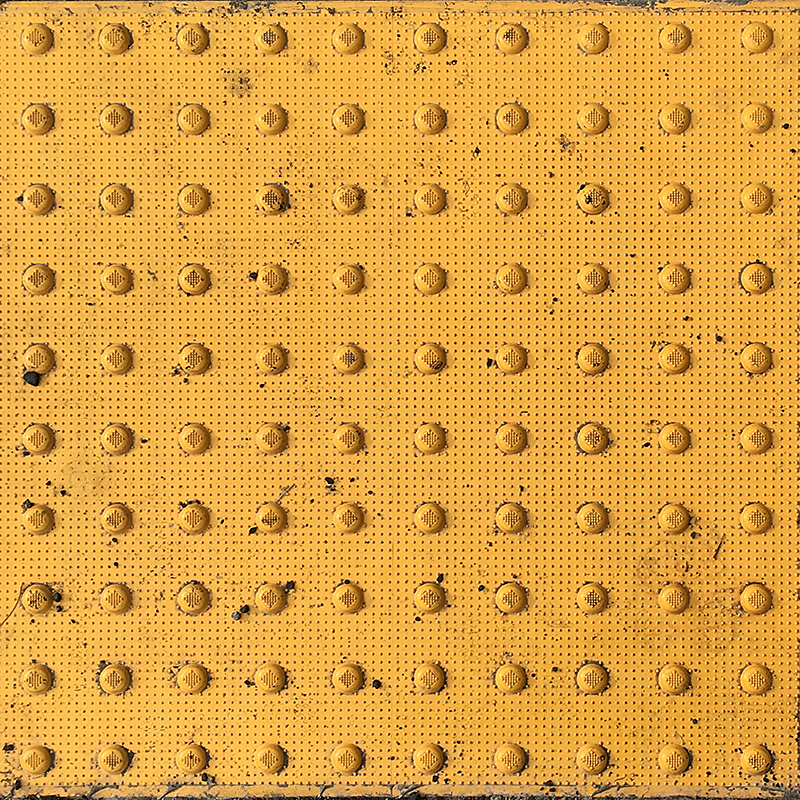
I took this picture in the street while I was walking to my apartment.

This picture I took while I was walking to my apartment. I found this as an interesting example of a pattern design. This pattern follows some of the examples that I have read in the book “Graphic Design: The New Basics.” The example was about dots and grids and I think this is a very close example to the book’s example. Also, I noticed that this picture has two patterns. One is the big dots and the other one is the small dots pattern. I will consider this pattern to be repeating elements pattern because all elements are dots which having the same shape. Moreover, this is also a good example of a texture because it has a feeling when someone is touching it.

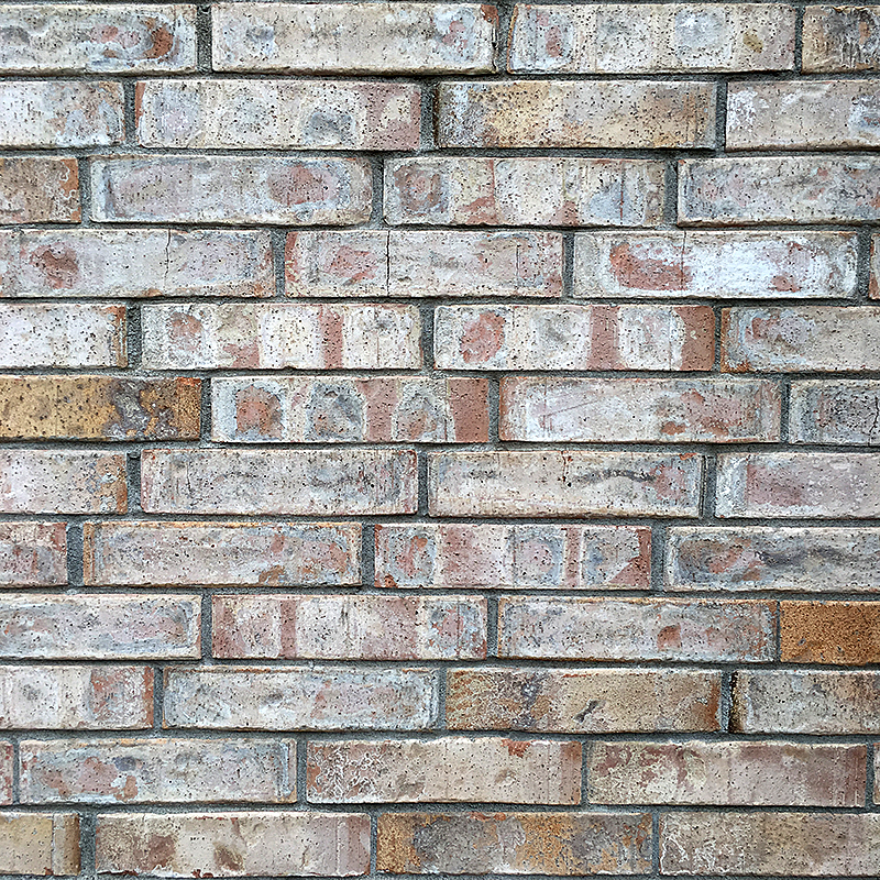
I took this picture from a building near to my WSU campus.


I took this picture from one of the buildings near to the campus of WSU. This example is a good example of pattern and texture. It has a pattern of bricks and each brick seems to have its own texture. The texture of each brick is rough and we can tell it is rough by looking at it even if we did not touch it. Also, I think it is a repeating elements pattern because the bricks having the same shape which is a rectangle shape.


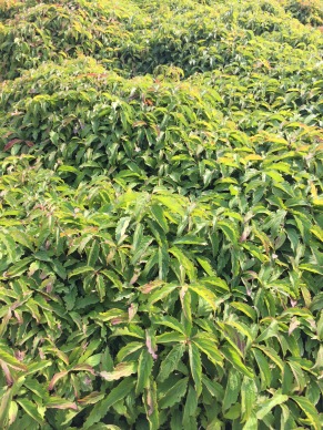
I took this picture of a tree branch in my WSU campus .


This last example is a tree branch that I took in the campus of WSU. In my opinion, this is a perfect example of a texture because it looks rough and organic and by looking at it, you will directly know how rough it is.

Posted in Fall 2017 Archive (336) | Leave a comment

Texture – Riley Cagle

I searched for patterns as I walked through campus on my way back, but decided to wait until I got home. I wanted to search for things I see everyday and don’t really notice on a regular basis. So I searched for small things and cool designs around my room and house.

IMG_2763

Top of old Xbox One

This is a picture of the top of my xbox. I like to look at the difference and contrast in the two sides. The contrast though comes more from the pattern rather than the design. One side is sleek and shiny while the other is more textured and structured which adds a different shade of black for a color. The whole thing looks like a smooth texture, but a sharp pattern. The left side looks layered, like it goes up/down and side/side. It is an appealing design that makes me appreciate its sleekness and patterns that make it look so smooth.

IMG_2760

Floor design in my house

The second picture is that of the floor in my house. It’s plastic, but the color and design give it an implication of being a type of wood. I love to look at the design of wood underneath bark. The rounded edges and different shades of brown are very appealing to me. It is interesting to try and imagine the design be more then 2-dimensional. If it were to stand out and come up off the floor, how would the different shades of brown and rounded points turn out looking? The rounded corners of darker brown shades give it a very smooth and sleek look, if it had texture. The brown wood floor design really stands out from the house too. It contrasts with the white walls and the boring designs around the house very well, and gives the house a much better look with the wood design.

Posted in Uncategorized | Leave a comment

Texture- Joshua Yi

I asked myself few questions when I was looking for examples of texture.  I wanted to find a design used in real life that was tangible, but that was not always noticed.  We are surrounded by designs that we’re not fully aware of when we pass by them.  You don’t notice the texture of a design unless you take time in actively looking at the material.  These were the designs that fit into these categories.  The textures of these designs are complex and intricate, but mostly go unnoticed.

_DSC1507

The carpet of my room.

I guess the first pattern I noticed and wanted to input was the pattern of my carpet.  Carpets have some of the most interesting patterns and their texture is intentional.  Carpets need to serve the purpose of providing more tension versus a floor.  The yarns on this carpet is weaved more tightly, providing less attraction compared to other types of carpets.  I was trying to research on the pattern itself as well.  I learned that carpets are designed to have this disorganized and not orientated to one side because that makes it harder for dirt to be apparent.  I think carpets have the ideal texture in a room because they hide away scratches and dirt through their craves, and aides in trapping heat.

_DSC1508

Bathroom tiles

Bathroom tiles have simpler designs.  Their main focus is simplicity and cleanliness.  Tiled floors are effective in pushing water so they do not get easily slippery when cleaning the bathroom.  The surface is smooth, allowing better flow of dirt.

Posted in Fall 2017 Archive (336) | Leave a comment

Texture: Lillie Williams

I explored the Washington State University campus to find my inspiration of various textures and patterns. Looking at my surroundings I kept thinking about the endless cycle that makes a pattern. The book mentions that almost any pattern is made from dots, stripes, or grids. Dots join making linear elements/ other shapes resulting in stripes colliding into each other. This collision makes a grid and new figures are formed due to cuts in the grid. These new forms are the beginning of another cycle that grows into another grid. I learned that the grid is made of smaller components that establishes a larger texture. The book says that “creating a larger texture is what a grid is all about”.

IMG_1963

Bushes outside the Murrow building (a)

In my first photo (a) the image shows irregular forces creating the pattern. When thinking about the texture of the photo the contrast on the leaves edges creates an optical appearance, the virtual texture of the piece. The contrast creates a sharpness, but the literal surface of the leaves tells that the texture is actually soft. The optical and physical textures can be different (think about people that have short hair that spikes up). Halle Berry‘s physical texture in her hair is different than her virtual texture.

IMG_1990

Bushes outside the Academic Media Services building (b)

My second image (b) has irregular forces from nature that make their pattern as well. The physical and virtual texture are rather similar in this piece though. My hypothesis is that since there is less of a contrast between the two main colors on the leaves, then the image gives a smoother presence. The way the leaves are cut is rounder, giving a softer display.

Posted in Fall 2017 Archive (336) | Leave a comment

Texture: Camille Oppedal

The carpet of my apartment.

The reading mentions how texture, a property through either perceived or physical depth, often plays as backstage to pattern. Therefore, texture is not the key focus of a design but a way to enhance pattern or further the impression the pattern gives. I noticed this in the design of my apartment’s carpet. Up close, the floor is clearly composed of tightly wound, raised knots of fabric, but from a distance, it is clear to see that the linear variance of color among these knots forms a pattern that overwhelms the texture with it’s loudness. The texture is still perceived by physical touch, but it acts more as a supporting role visually to the aesthetics of the carpet’s pattern. However, if the carpet lacked any texture, it would not only feel much different, but it would look different as well, possibly becoming a noisy collection of random flat lines that is now muffled by the knotting. Removing the texture would also transform the environment into one that lacks the warmth that a knotted, almost “knit-like” texture implies, and potentially create a flat, cold, less inviting space. These impressions that certain textures give are an interesting thing to consider, especially when it becomes my turn to create a pattern.

My cheap pleather jacket.

Texture is beneficial to an overall look not only by enhancing pattern, but also by utilizing contrast when color remains the same. This image of my leather jacket shows the texture difference between the cotton-based hood fabric, and the faux-leather fabric of the main jacket. The two materials are both black, but the difference in finish–a matte and soft fabric against a textured and slightly shiny material– creates a juxtaposition that separates the jacket into what appears to be two pieces that compliment each other but are unified at the same time. This effect would not be the same if the two textures were the same. If the whole jacket was the leather texture, it may be a bit overwhelming or give the impression of the hood not being very comfortable/flexible to wear. If the jacket were all the same material as the hood, then it wouldn’t even be a leather jacket to begin with. It is only the marrying of these two opposing textures that creates an intriguing aesthetic that is varied and has depth. The power of just varying texture to create noticeable difference is another interesting thing to remember for project 1.

Posted in Fall 2017 Archive (336) | Leave a comment

Texture: Whitney Demarest

Texture and pattern is super fascinating to me when discussed as translating to a digital space. No, 3d design isn’t on trend today, but using design to communicate depth has always been intriguing to me. The pictures I have chose are things from my house that I find beautiful.

With my friends, I am often referred to as the “crazy plant lady”.  I don’t always have a million plants around the house, but recently I have earned the name with the 30 succulent planters I am growing for the centerpieces I will use for my wedding in January.

This is a photo of a cactus I am growing in my house.

This particular succulent is the smallest I have, but also my favorite. The spikes are pokey, but provide an interesting texture. laid out flat, I think the would be complex, and provide its own cool pattern.

This picture is one i took of a dress in my closet.

This next picture is of a dress I own. The pattern itself isn’t that interested, but the texture of the linen fabric, and the stay navy colors that bleed into the white squares is. If you look at the pattern from far away, you miss out on the intricate textile features. Close up, the pattern provides good inspiration for my own pattern design.

This is a photo of a blanket in my house.

My favorite blanket is this mustard yellow knit one. The pattern shows interesting depth, and shadows. if you look inside each stitch, you can imagine the 3d pattern it would create if rendered digital.

This is a photo I took of my DIY yarn wall hanging.

This last picture is one of a DIY wall hanging project I made. The yarn is supper interesting because of everything that makes up a single piece of it. If you look at the white stands closely, you’ll notice that they are made up of both white, grey, and brown pieces of cotton.

Posted in Fall 2017 Archive (336) | Leave a comment

Texture: Lloyd Proctor

When I was looking for textures to take photos of, my initial thought was to capture obvious textures, but I thought textures with contrast and pattern was more interesting in the end. The first image that displays the different fabric options related to specific points made in the reading such as, the grid of repeated lines, stripes, and woven pattern. I found that to be the most interesting element in the image because there were patterns in the fabric weather it was intentional or not by the designers that made the fabric types.  The texture is interesting in the image because the contrast between the flat, low toned fabric and the reflective granite counter gives perspective on how the two different elements might feel without them being physically in form you you.

The second image in black and white showed texture very differently in comparison to the previous image because there is less drawing your attention. There are no colors, no pattern, and limited variety. The image is black and white because I wanted to explore the relationship between objects that were different materials and had different textures, but also had the same color relationship. The texture changes even with the same material. The fabric used as a background changes based on the distance it is from the camera and and its focus. The pattern in the way that the fabric is woven has a different texture in the foreground then it does in the background. The camera has a very distinct texture, its metallic and has a solid and smooth surface. These two objects even with similar colors do not share textural characteristics.

Posted in Uncategorized | Leave a comment

Texture: Zach Prybell

In order to find my pictures for the first part of project one I decided to do a mixture of man mad things, like clothes, plastic objects, and jars, or in other word things I would find around my house. I also wanted to do more natural things to get both ends of the spectrum, so I took a few photos of different trees, grass, and my yard. From the various photos I took I picked the three with the most unique textures and patterns. I also tried to keep in mind what the book “Graphic Design the New Basics” by Ellen Lupton and Jennifer Cole Phillips, says about both texture and pattern.

Tree800Res

Photo by Zach Prybell

The first photo I took was of a tree in my backyard, it has a very unique look to both of its patterns and textures. The pattern it shows is very natural, it looks imperfect and almost like it’s very layered rather than just one dimensional. The visual and physical texture is also interesting, it looks and feels very rugged and tough to the touch, which I one of the reason I really like this photo. I also really enjoy the contrast between the light and the dark side of the tree, and how there isn’t any moss of the dark side but as you look toward the light side it gradually gets more and more mossy.

Wood800Res

Photo by Zach Prybell

The second picture I picked is of some ply-wood that is laying around my yard. The reasons I chose to include this one is because I find the pattern to be very sporadic and jumbled which for some reason is pleasing to me. The texture of this also looks very bumpy and ridged, but its physical texture is much smoother than that of the tree’s. Another reason why I picked this was because it’s something that in between man made and natural, because it’s made of something natural like wood but it is obviously been re-shaped and re-purposed into a piece of ply-wood.

Pick800Res

Photo by Zach Prybell

The last picture I have is an up close of my guitar pick, this one is obviously man made and has a completely different texture and pattern that the other two. The pick’s pattern has a lot of contrast and use of light and dark to display its unique and metallic pattern. The texture of the pick is very smooth and flexible, which is unlike either of the two before.

Posted in Fall 2017 Archive (336), Uncategorized | Leave a comment

Texture: Rachel Bigler

When I was looking for textures and patterns in the physical world I tried to keep in mind what the readings had to say about them. For instance, how the section on patterns talked about how it was a grid of repeated dots, or stripes. Which is something that can be seen within this first photo which is a picture of the window shade from my work. It shows a crisscrossing pattern of material, which is one of the types brought up in the section as well. One thing that I found interesting about how this translated over digitally into the photo is that the texture has an almost glossy look to it when in reality the curtains texture is more soft like a fabric, not a metal or plastic.

My second photo was taken right outside my house of a tree. I thought this showed a perfect example of texture. Because the picture gives off that illusion of rough and scratchy edges, which is what the tree feels like. It also however, has texture which the book would describe as contrasting because it is very crisp in some portions with big chunks of bark, but then in the center it is sort of smoothed off. If this were to be a picture of the whole tree the barks texture would help support the image as a whole ans serve as good detail.

For my last photo, I chose to show a pattern of some leggings I just bought that shows a repeating of roses intertwining with the same repeated images of Thumper and Bambi from Bambi. I like this because it wasn’t necessarily exactly what was shown in the textbook because it isn’t exactly dots or stripes but it is still a pattern that probably started from a grid of isolated dots, because the text book points out that most patterns can start from that point. It also reminded me of the pattern that shows “random repeat” (193), which is what this basically is. Which the book says are repeating tiles with the same patterns in them.

Posted in Fall 2017 Archive (336), Uncategorized | Leave a comment

Texture: Sophie Stoltman

I chose to find examples of texture and pattern around my home here in Pullman. I think that my examples show the complexity of simple things around us and the contrast between organic and man-made texture.

In my image of the blinds I like how the texture is created out of the repetition and simple curve the blinds have. The smooth and shiny texture the plastic has stands out against the blurry background outside of the window. The uniformity of the color within the window also adds to the structured look the blinds create. With each layer of the blinds the separate parts edges slice through the neighboring piece making a pattern of horizontal lines getting closer together as the blinds cascade down to the windowpane.

The next photo I took was of the frayed edge of my roommate’s shorts. I loved how the tightly woven denim contrasted with the frayed and almost organic looking raw edge. The more weathered and washed out edge of the jeans makes the small details and intricate patterns of the denim stand out even more clearly. I think that it is cool how the raw edge that was originally just as tightly knit weathered down over time and started to look more like a natural texture, like hair or grass.

My final photo is of a plant that I keep in my room. I chose to share this image because of the relaxing and beautiful texture that naturally is found in the plants leaves. The leaves look soft and smooth even in a digital format. The edges of the leaves become sharper and more excited looking towards the center, giving off an energy that is happy and exciting. As you look further out to the edge of the plant the leaves are more relaxed and have a calming purple hue to them. The difference between the inner and outer leaves make the overall texture of the plant more interesting, creating movement inwards towards the center of the plant.

Posted in Fall 2017 Archive (336) | Leave a comment