Texture: Sara Nielsen

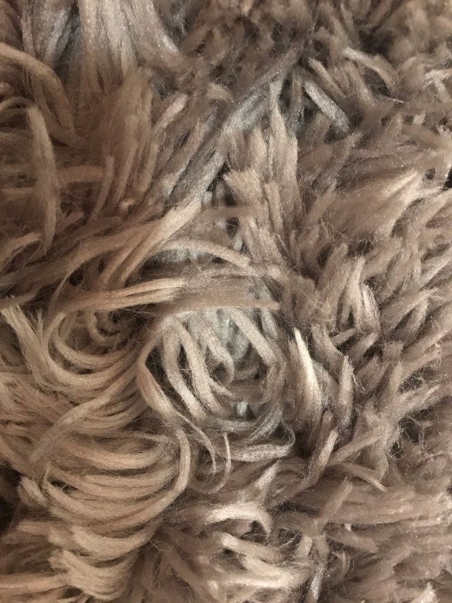
I find the following four images relevant to the topic of our courses first project regarding pattern design. Our readings covering Texture and Pattern from Graphic Design: The New Basics. The first image I included is a wooden surface of a desk. Texture is apparent in the wooden design since you can feel the grain from the wood. However, pattern is also somewhat apparent differentiating between the dark and white wood. The second image I added is my JBL speaker. Texture and pattern are both made present since you can feel the bumpy plastic that covers the speaker. This plastic also features an almost minuscule circular pattern that contributes to both the sound and physical design of the object. Next, I added a zoomed in image of a craft painted gold with glass shards glued over the top. Multiple textures are utilized in the artwork between the smooth painted gold canvas and the jagged sharp pieces of glass placed on top. Pattern is less apparent and more abstract given the glass is placed sporadically over the canvas. Finally, my list image features the fabric of one of my sherpa jackets. The jackets texture is very soft and incorporates pattern with how the individual “fluffs” are sewn into the sherpa.

Posted in Fall 2017 Archive (336), Uncategorized | Leave a comment

Texture: Joshua An

When I went out searching for patterns and textures, I was greatly inspired by the piece shown to us in class called Britta Maj cotton linen fabric.

The first picture I took was of a pillow that caught my attention in the lobby at my apartment complex. The pattern from the pillow might not be as colorful, but it does have a repetitive pattern like Britta Maj’s piece. Just like what it says in the reading, this pattern has a mechanical grid look to it.

Another picture I took was of the couch at my friend’s apartment. The reason why I felt this design was so interesting was because it seemed to be repetitive and somehow not repetitive at the same time. This pattern consists of the isolated forms in the readings like dots and stripes.

The last picture I took was of a chair in Goertzan Hall on campus. This pattern is pretty repetitive and the use of polygons in these patterns reminds me of Britta Maj’s piece. I feel as if every other ring shape on the design is identical. This pattern also reminds me of a picture from the pattern reading with red and blue pills with a caption under it called One Element, Many Patterns. The pattern changes over throughout the piece. The pattern from the reading has the shapes growing and shrinking throughout the image and the pattern from the chair has its shapes constantly being mirrored.

The textures from these three patterns are all similar. They are from furniture and have a thread-like texture to them.


Pattern1

A throw pillow from the lobby at my apartment complex.

Pattern2

A couch inside my friend’s apartment.

Pattern3

A chair inside Goertzen Hall on campus.

Posted in Fall 2017 Archive (336) | Leave a comment

Texture: Katrina Bittner

For this assignment I found myself looking at everything in my room differently. There are so many different textures and patterns that I had never noticed before. When I think of texture, I think of how something feels. How even when you aren’t touching the object, it suggests physical characteristics and sensations. I found myself looking deeper at the simpler objects I see in everyday life and examining them further. There is so much more to texture than what I previously thought. Texture is not just how something feels but also how it looks. It can be concrete, physical, and virtual. The first image I included in this post is of my blinds. The image suggests a horizontal pattern repeating singularly, while also implying ideas of movement. The texture creates emphasis on the horizontal pattern, including dust and drop shadows that imply dimension. Before this assignment I would have never considered something such as blinds, to have a pattern or texture unless it was a super obvious print. katrina-bittner-dtc336-04

The second image is one of my favorite textures. This is a photo of the fuzzy rug next to my bed. My carpet is very rough and hard so I wanted to add a nice rug to give my room contrast and comfort. The various directions and lengths of the faux fur suggest movement. Although the surface is not uniform in pattern or direction, the blurred gentle ends of the fabric give it an illusion of being soft and plush. The stray strands of faux fur help blend it together and give the texture a soft appearance. katrina-bittner-dtc336-02

Posted in Uncategorized | Leave a comment

Texture: Steven McCracken

When I started searching for textures to use as inspiration, I knew I wanted to find some that could be interpreted in multiple ways since that’s always been interesting to me. I wok as a graphic designer in my off time so I have quite a bit of experience working with textures and I have a pretty good size library of them saved up. I went through and decided to choose my favorites from over the years.

This first texture is an up close view of some glass, but at first glance it may appear to be fog or smoke, which is why I love using it since different people see different things.

gray-swirly-glass-texture.jpg

My next texture is another example of one that could be perceived in different ways. It’s black leather, but with some effects on it I’ve often used it to create a space-like effect for backgrounds.

shiny-black-leather-texture-on---------a-suitcase.jpg

This last texture isn’t very similar to my other two, since I feel like it’s hard to interpret it as anything other than fleece, but I decided to include it since it not only provides a texture that’s nice to look at, but it instantly reminds you of what it feels like, which can add a whole new aspect.

fabrics


Posted in Uncategorized | Leave a comment

Texture: Elvira Alvarez


texture one

My shirt: taken on the bus

When I took these pictures, I was looking for everyday patterns and textures that are ignored. I believe that they have beautiful potential to become something greater.  The picture on the left hand side is the shirt that I was wearing.  I felt that it was an interesting pattern because it can be interpreted to be a different object other than its original form.  This pattern reminded me of something that was mentioned in the book “Graphic Design: The New Basics.” over the concept of lines and how they are formed by linear paths.  Linear paths can be made up from different elements whether it be smaller lines that form a bigger one and brings everything together or dots that form into lines. My pattern and texture consist mostly of thinner and wider lines.

texture two

Boyd’s frappe from Todd Hall

The picture on the right is a good example of texture.  This is a texture that forms on a solid base or a texture that takes the form of its container.  As was stated in “Graphic Design: The New Basics.” Texture is a form of conveying a physical presence and that is exactly what this kind of texture does. It conveys a message of the temperature of the drink, the time it was taken and what it is made out of as well.  It also has dots as a pattern, but they are all clumped together so they become a virtual form of texture.


Posted in Uncategorized | Leave a comment

Texture: Mary Gerber

Over a series of several days, I did my best to examine the textures and materials surrounding me and take photos of the textures in the moment I first witnessed them. I never had really reflected on how prominent texture was in the materials I use and see in my every day life until I received this assignment, which allowed me to observe these more in depth.

ivory-bedding

A picture of the embroidered texture of my duvet cover in my bedroom.

I snapped this photo of my duvet cover in my bedroom the other morning when I woke up. Ellen Lupton explains that texture adds detail to an image, providing an overall surface quality, as well as rewarding the eye when viewed up-close. The duvet in its entirety varies in pattern and texture, as it had a woven quilt-esq appearance with the same simple, ivory shade throughout. My favorite texture is the polka-dots, which I focused on in this photo. Observing this texture up-close allows me to appreciate the effort and detail that the designer must have committed to this material.

floral-sculpture

A close-up of the floral texture in an elephant sculpture in my living room.

This photo focuses on textural design on a small sculpture of an elephant in my living room. One of my roommates lived in Southeast Asia for many years, and bought this handmade sculpture there while traveling. Lupton explains that texture in our environment helps us understand the nature of things. This texture, accompanied by the bright blue and gold color, adds depth to the sculpture and upholds its level of personal craftsmanship. Without this intricate design on the sculpture, the item completely loses detail and what makes it most unique.

woven-placemat

A photo I took of the placemat on my kitchen table.

I have four of these placemats on my kitchen table. They add minor detail to our home and make for more of a warm environment. Lupton states that texture is the literal surface on a printed piece, as well as the optical appearance. Nonetheless, the blue, almost metallic color on the placemat allows the woven detail of the texture to really stand out – especially when light from the light fixture above our table reflects upon it. Dimension and continuity of this texture really catches the eye. For something that is likely mass-produced, the placemat is very intricate.


Posted in Fall 2017 Archive (336) | Leave a comment

Texture: Patricio Orozco


blog_image_1

Design of my backpack I took a picture of.

In my bedroom deciding what pictures I should take that have texture or even a pattern at the most. Looking around my surroundings for objects with these characteristics when I came across my backpack that I use to carry my supplies to class. It contains a pattern of a logo from a game that I enjoy playing which is the hylian crest from the Legend of Zelda series. The texture itself is made from fabric and you could see where they stitch the fabric in place which gives it a bump. We didn’t really get into color as much but this design has basic grey colors making easy to see the pattern. The pattern itself is linear creating a grid where the images don’t overlap each other.


blog_image_2

The plaid shirt I own.

Going through my closet I came across with one of my favorite plaid shirt I owned. What I observed from my shirt is that it is form as a grid consisting of four colors white, black, red, and blue. The colors overlap each other creating interesting colors and patterns. The pattern is repeating throughout all my shirt. You could probably tell from my image that my shirt is wrinkled and hasn’t been ironed at all.


blog_image_3

Rubik’s cube that I own.

This was the item I brought to show off to class which is the Rubik’s cube but unfortunately couldn’t show it off. But I did notice that it’s based on matching the colors making patterns. The surface is smooth for people to hold and it moves whenever you turn one of the cubes. Of course, it will be consisting of a grid pattern.


Posted in Fall 2017 Archive (336), Uncategorized | Leave a comment

Texture: Kimberley Conway

This is a picture I took of my window shades.

As you have probably noticed by these images, I am not a world renowned photographer. I attempted to find textures that I see every day that where choices made by the people who designed my apartment, and one made by a clothing designer. I never really thought about these as a texture until this class had me looking deeper into things and trying to notice what I see around me. I attempted to find some different things but my ideas of texture and patterning don’t really take me to seeing something as mundane as window shades as a pattern or texture. I was about to leave my apartment one day and noticed the light was shining through the shades and creating this really cool visual of a kind of glow coming in lines through the shades. This was the first image I decided to use since it is the most (in my eyes) different sort of perspective on pattern and texture that I found for this project.

This is an image of my kitchen floor

I was able to find one more kind of different image of pattern that I never really pay attention to on any other give day. I was looking at the linoleum on my kitchen floor and thought it was a cool example for this project. Since linoleum is essentially a plastic based fabric it has an image on it to give it a cool end look so its not just a boring single color. It is designed to look like tiles, but in each square there is a marbled sort of texture giving it more depth. I thought it was an interesting way to view patterns and textures since we will kind of be dealing with something pretty close to that in this class.


This is a picture of one of my purses.

The final texture/pattern I decided to use was my purse which is a sort of alligator scale sort of pattern, however it is black and extremely shiny. I felt like it was interesting to look at since there is sort of a gleam that reflects off of it and a sort of multiple pattern taking place in the material itself.

Posted in Fall 2017 Archive (336) | Leave a comment

Texture: Kim Santos

Everyday, I walk by these two things as I enter the CUB. I don’t find them too interesting in the context of what we’ll be doing for our first assignment, but I see potential for pattern within the tall grass and describing texture on the wall. When you take a look at the image of the wall in better quality, you’ll see a lot of flaws on the surface. There are multiple indents, aged stains, and tons of various discoloration. All that and they’re separated by another pattern of rows with different sizes of bricks.

As for the image of the tall grass, the leaves and stems act as linear elements that could form into some sort of grid with all of the interactions and crossovers going on within the photo. Rearranging the elements, changing its color, scaling them to different sizes, and perhaps even placing them in a more uniformed matter could create an entirely new piece/pattern.

Posted in Fall 2017 Archive (336) | Leave a comment

Texture: Tavia Hall

I was super excited about taking pictures, and deciding which pictures to post. Texture is found everywhere, and comes in so many different forms, rather it be physical and/or visual.

The first picture is part of a collage I made last semester in Fine Arts. I caught myself taking pictures of physical objects with physical textures. I then realized that texture doesn’t only have to be in a physical form, but it can also be in a virtual form. There’s a lot going on in this collage so I’m going to try to break it down a bit. So first off, when looking at the shoes you automatically think that someone took them off and just sat them on a painting. This form of illusion is just like any old way of viewing texture. In your mind you almost imagine what the picture feels like and that can be based off things you’ve physically felt in the past. Or with the girl’s hair you can imagine that it feels soft and light just based off the paint strokes. Then with the paint at the top you could imagine the texture being like dried overlapping paint that made accidental textures.

The second picture kind of conveys the same concept when it comes to automatically knowing what something feels like without even touching it. This is a picture of some of my clothes that were in no specific order in my closet. Just by looking at the picture you can tell that there is a lot of different textures going on. This can not only be based off a previous experience with a certain material, but with the pattern. In Lupton’s book, Graphic Design: The New Basics states that there is 3 basic forms of pattern: isolated/linear elements and criss-crossing. Isolated elements would be like the clothing on the far left that has many dots coming together to make a pattern. The clothing with the yellow stripes would be considered a linear element since it incorporates just single lines. Then the plaid shirt would be considered criss-crossing because there’s quite of few lines being criss-crossed together.

Posted in Fall 2017 Archive (336), Uncategorized | Leave a comment