
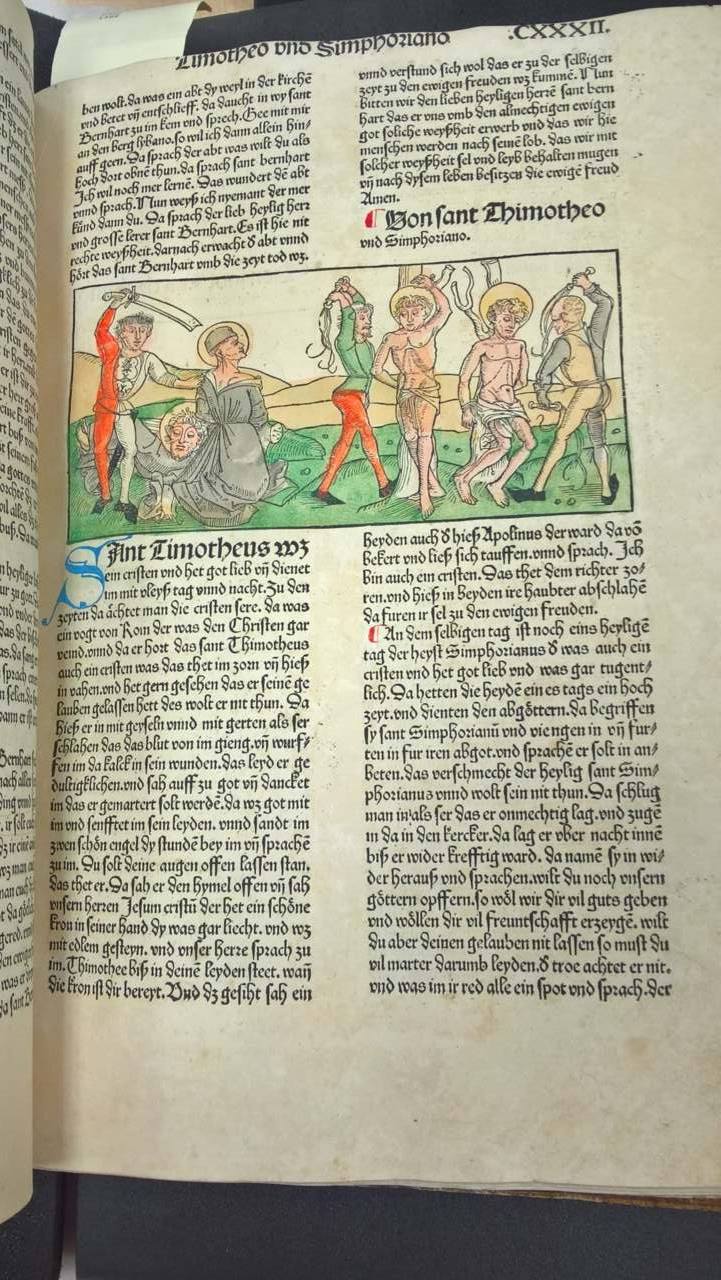
(Jacobus, de Voragine, Albrecht Duren, Anton Kobergn, Legenda aurea sanctorum sive Lombardia historia, German imprints, 15th Century, 1488)
During our class fieldtrip to the Manuscripts, Archives, and Special Collections at the library I was immediately inspired by the older texts that had been placed out for us. I had been struggling to find to a way to convey a story in my poster comic without using huge blocks of text, but after flipping through the pages of the leather bound books from the 1500’s I decided to just use bits and pieces of text instead. I love yellowed and old paper and since the rest of my poster is already utilizing a sort of cut and paste/collage design, I felt that using clippings of words or numbers would match the style I’ve already started using.

(Rafael Reyes Spindola, El Mundo, Mexico: Compania Editora de El Mundo, 1896 (1906?))
Another example from the exhibit was the Mexican newspaper compilation book, El Mundo. In El Mundo I found this page of sheet music and it also gave me an idea for how to incorporate my marching band and concert band experience into my poster comic more. As of the moment, the main focus of my poster is on bands that I listen to and how my taste in music has changed, but there really isn’t anything representing my personal experience in creating music. So I’m going to cut out notes, bars, and dynamics from music that I own and have played over the years.
When it comes to what design concepts from the semester are important, it’s difficult to split them up because each concept we’ve discussed can be important in different ways depending on what the author is trying to create. But for me, I would have to say the really important ones are emphasis, point, line, and plane, scale, and color. These are all concepts that are present in every design, you literally cannot avoid these concepts when creating something. There are more that are also prevalent in every design, but I use and appreciate these ones the most. With emphasis, scale, and color I feel that an author/designer can really create an engaging piece of work, even if those concepts are used subtly or some are not present at all. But no matter what you create you are using a least one concept, even a pure white canvas was made with the intentional choice to use no color.
I’m using all the concepts I listed in my poster comic and I feel that their addition to my design will make it all the more interesting and engaging for my audience.
