
In class archives visit, but I do not remember the name of the book or the author
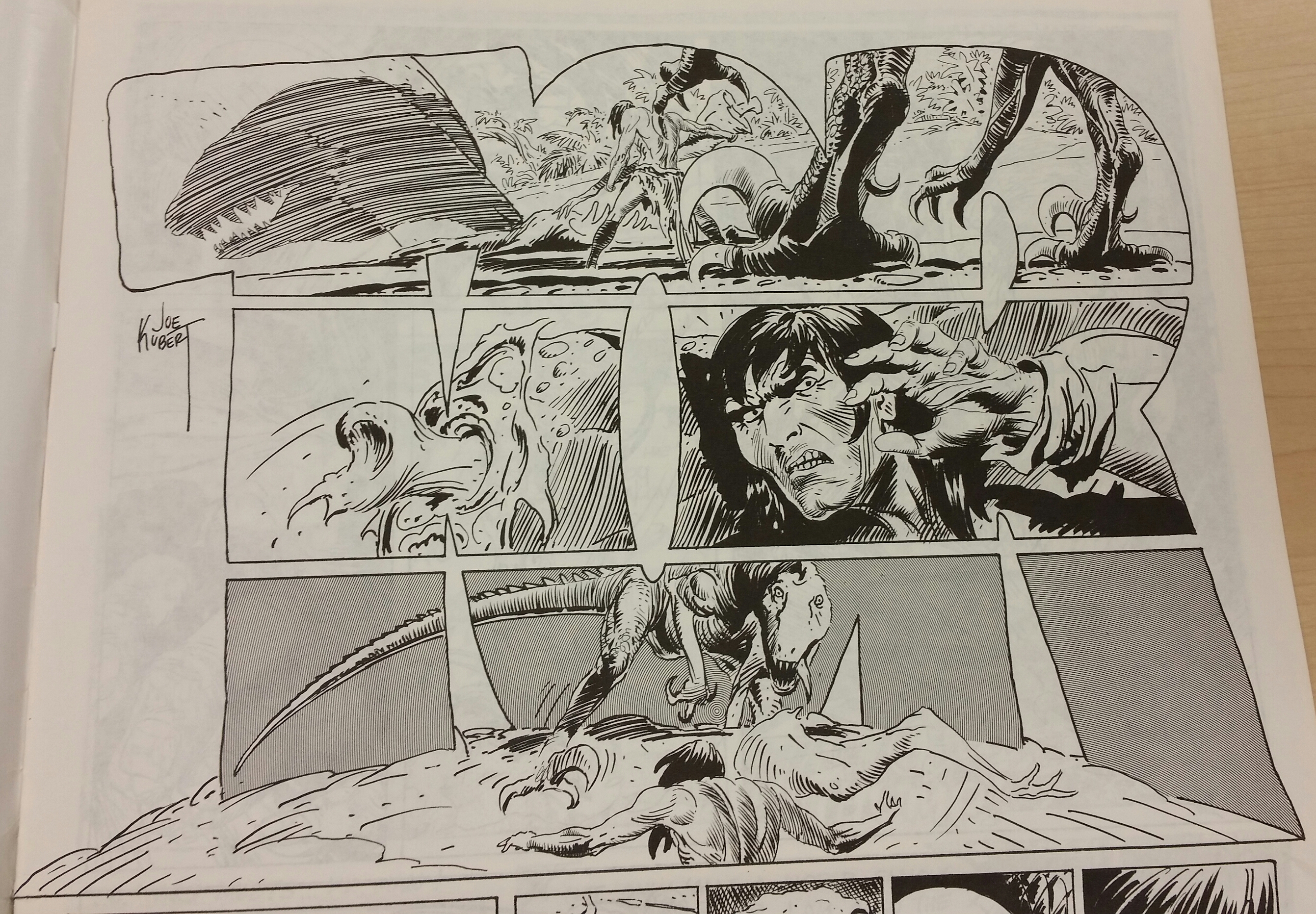
The reason that I chose this particular picture was because of the unique technique of cropping used. The three large letters in the composition are used as frames to crop the picture that is supposed to be seen. I will implement this into my poster because around, near the states that are “popped” out I want big bubble letters like these that say the names of the states and in them pictures of what those places look like. the letters will be a clipping mask so that the shape of the letter is held. Another thing about this picture that I want to point out is the fact that it appears as if the letters are stuck in the sand almost like trees. This relates to the position and font of the lettering. The idea that this sparks with my poster comic is to make the letters appear as buildings in a city a and then the pictures inside will tell the story as well as the shape of the letters themselves. Something in this composition that I particularly liked was the fact that the letters are split horizontally into three pieces and each piece has a different picture. These slices in the letters serve to create frames, I like this abstract way of creating frames. In my poster, I was thinking about overlaying on the whole composition white lines that will split the map up into sections which may help tell the story. My design is complicated to follow so I am trying to think of a way to make it easier to follow.
