Helvetica – Sean Mirts

Helvetica vs. Arial. Web Designer Depot

Helvetica was designed by swiss designer Max Miedinger along with Eduard Hoffman in 1957. As with many swiss creations precision and accuracy are held in the highest regard, Helvetica being no exception. With such a clean design the typeface spread to being used by governments to some of today’s prominent businesses.

Delving into the design of Helvetica the precision is unmatched in all aspects of the design. This makes it difficult for it to be manipulated by other designers other than simply making new variants with minor adjustments. These small changes vary from rounded edges to narrower versions with less space between the letters. The main characteristics of the original version of Helvetica are the simplicity along with tight apertures on letters such as, U and H. Some more of the characteristics are the tight display oriented spacing between the letters, which has helped make Helvetica a standard type font on most operating systems and word processers. The readability is also fantastic due to the tall x-heights found in the typeface and well as the wide capital letters. These features of the typeface have made Helvetica one of the most popular san-serif typefaces used today.

The polarization of Helvetica can be found among those that design using typefaces in their field of work. Many will use the typeface because it has become considered neutral in design and will not distract from the other elements of design due to its familiarization now. This would of course vary case to case on its use, but the film Helvetica made a great metaphor for this instance of misuse. Sometimes it is ignored like air; sometimes it is a dramatic shock to the system. Which brings light to the reason many designers disapprove of Helvetica, it is misused by some designers in scenarios that would have favored from a different typeface. The safety-net that is Helvetica limits the creativity and result that inherently impacts many designers.

Helvetica the documentary changed the way that I view typefaces now and the intricate details and thought put into each letter. Along with a greater understanding of how typeface designers go about their design processes. The anatomy of type also makes much more sense to me after watching a typographer create several letters. The sculpting of the apertures was also very interesting to see and the relation of letters when creating a typeface from scratch and using the letter h to create the letter n. As well as similar letters that can share characteristics to create a fluid typeface that looks as a complete set.

After seeing a master at work in the typeface industry my typeface that I created for this project seems to be very subpar compared to something like Helvetica. While the roots of the font all stem from similar characteristics such as x-height and apertures, the anatomy of my font is there. With a greater understanding and ample tools that are used to draw typefaces the one I created could be crafted into something rather refined. The rugged chaos that is found within my typeface I made shows the minimal amount of experience I have with typography but serves as a very useful and creative introduction into the world of typography.


Posted in Fall 2018 Archive (336) | Leave a comment

Comics Continued: Rachel Lentz

American Splendor is a popular comic series by the author Harvey Pekar. His rise to fame is an amazing story and is told in the biographical film of the same name (American Splendor). The film is about Harvey Pekar’s rise to fame as an underground comic artist. The elements of traditional comics, as explained by author Scott McCloud, are scattered throughout the film in various ways.

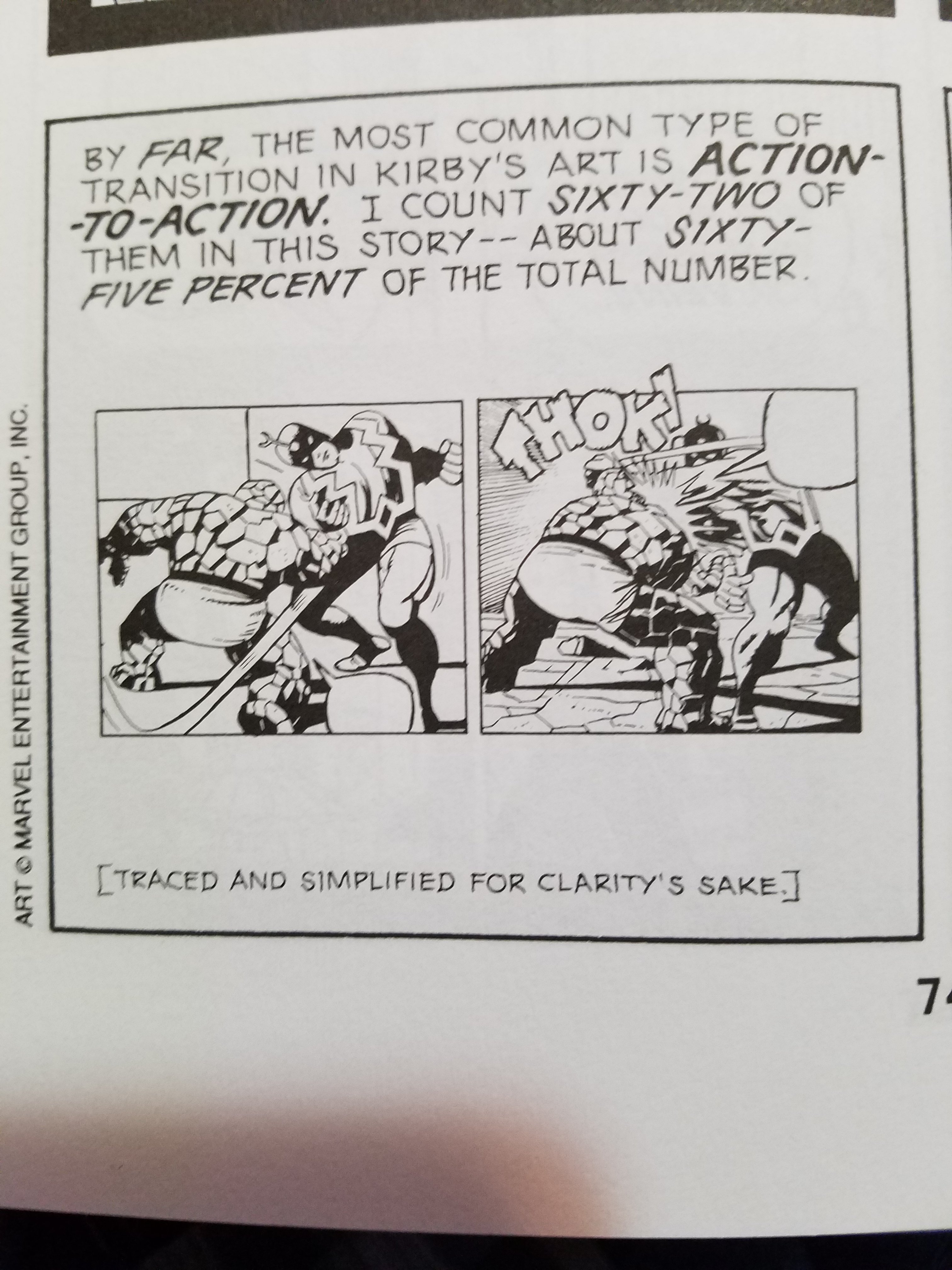
Part of McCloud’s discussion on action ratio patterns in Western (American) comics. Superheros shown in the drawings.

The superhero is an icon of American comic retelling, with characters who are “normal” get turned into something super human and heroic. Scott McCloud writes of the prevalence and establishment of comic style in his book Understanding Comics. Chapter three describes the unique ratio of scene style and content and how this is distinctive of American comics, the superhero trope being one of these distinctive features. Despite their prevalence, these are not the only stories comics have to tell. The divergence from this dominant superhero trope happens in many comics but none such as the ones found in the underground comic scene, comics produced by a small press or self-publishing artists. The underground comic biography, American Splendor, is one that works to break out of these tropes. The biographical comic of its authors life, Harvey Pekar, is a satirical and darkly comedic retelling of the average life of an average person. Someone who never gets their “superpowers”. In the film American Splendor, the audience is introduced to Pekar’s character as a group of children trick-or-treat on Halloween dressed as their favorite characters. The classic characters are recognized such as Superman, Batman, and Robin. However, the child dressed as the popular, yet underrated, character of Harvey Pekar is not recognized by the woman handing out candy. This introduction sets the tone for the movie as Harvey Pekar’s rise to fame and unique story is told as well as involving the lore of comics.

The film tries to recreate the effects of comic books in this different medium in many ways. The film inserts such traits directly such as adding speech bubbles and drawings to the film. Another way that the film recreates comics effects is by translating comic storytelling methods to film through changing the films storytelling. The film is seen to do this when it adapts the use of comic gutters using interviews with the cast. Interviews with cast members is not something seen in traditional film. However, the film utilizes this. In McCloud’s book Understanding Comics, chapter three describes the use of negative space in general art and in comics themselves. The use of negative space can be hard to accomplish with a seamless and continuous field such as film. However, a break from the biography of Harvey Pekar (the “main” story) is given in the form of interviews. These interviews were with Harvey Pekar, his wife Joyce Brabner, and other cast members. These interviews interrupt and slow down the retelling of Pekar’s rise to success, much like the gutter does in comics. McCloud describes how the break between panels allows for the reader to work and make assumptions about the plot and read further into the story then could necessarily been shown. As such, these interviews give a perspective of the story and a realism to Harvey Pekar’s life that would have been hard to achieve any other way. During the interview scenes the audience is asked hard hitting questions like how Pekar, and people in general, deal with loneliness. This interview acts as a guided gutter as the directors of the film ask existential questions and have the audience work to read further into the overarching story they are being told. The directors of the film not only translated gutters into its storytelling but other themes of comics as well, such as speech bubbles.

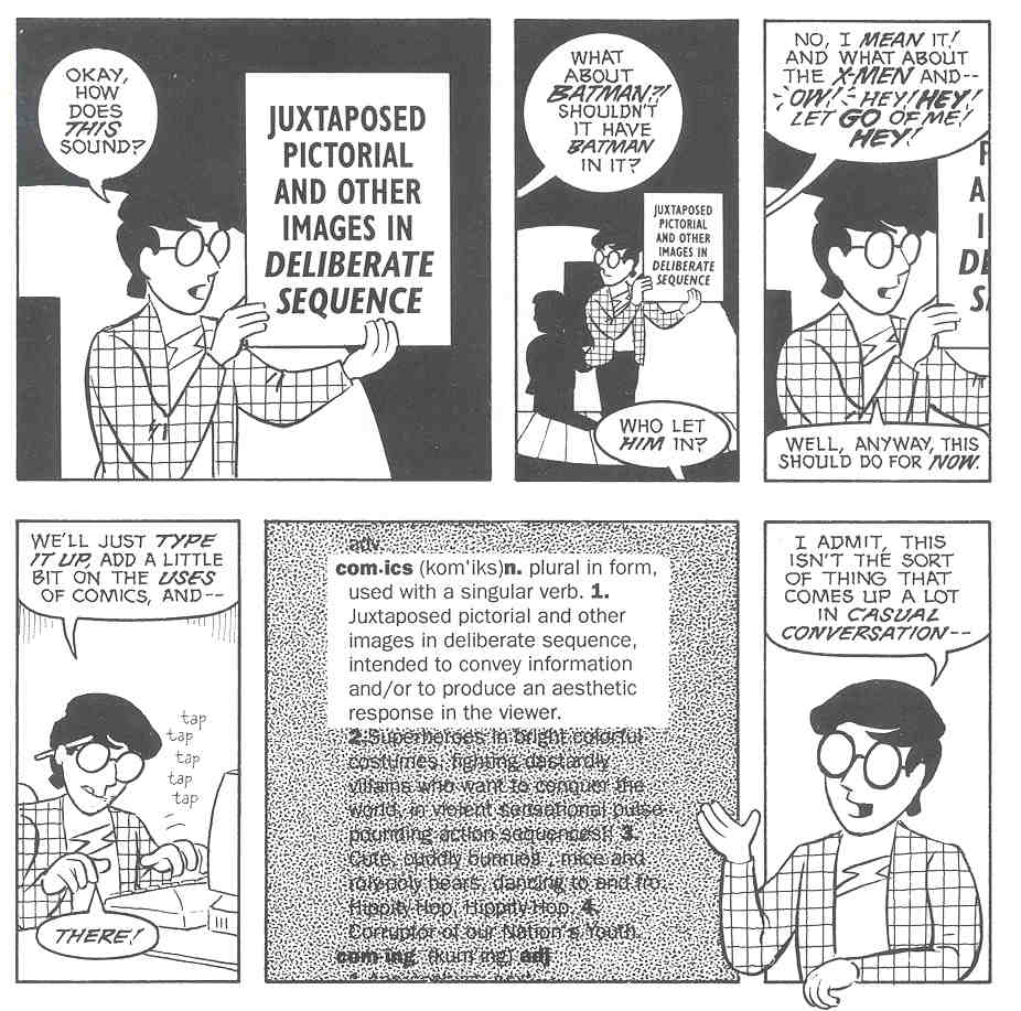
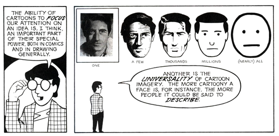
Scott McCloud talking about sound in comics and how it is delivered.

The direct use of speech bubbles in the film is a reference to comics, however, the use of a narration by Harvey Pekar is an adaption of speech bubbles as well. Scott McCloud references sound in his book Understanding Comics on page 116 and how it is relayed in comics through word balloons and sound effects. Since the film is not a comic and doesn’t have to rely on using these methods to convey sound, the audience just hears it. However, this does not take away from the validity of the use of narration instead of speech bubbles. The information of the story, sound, is still conveyed but in unique ways according to form.

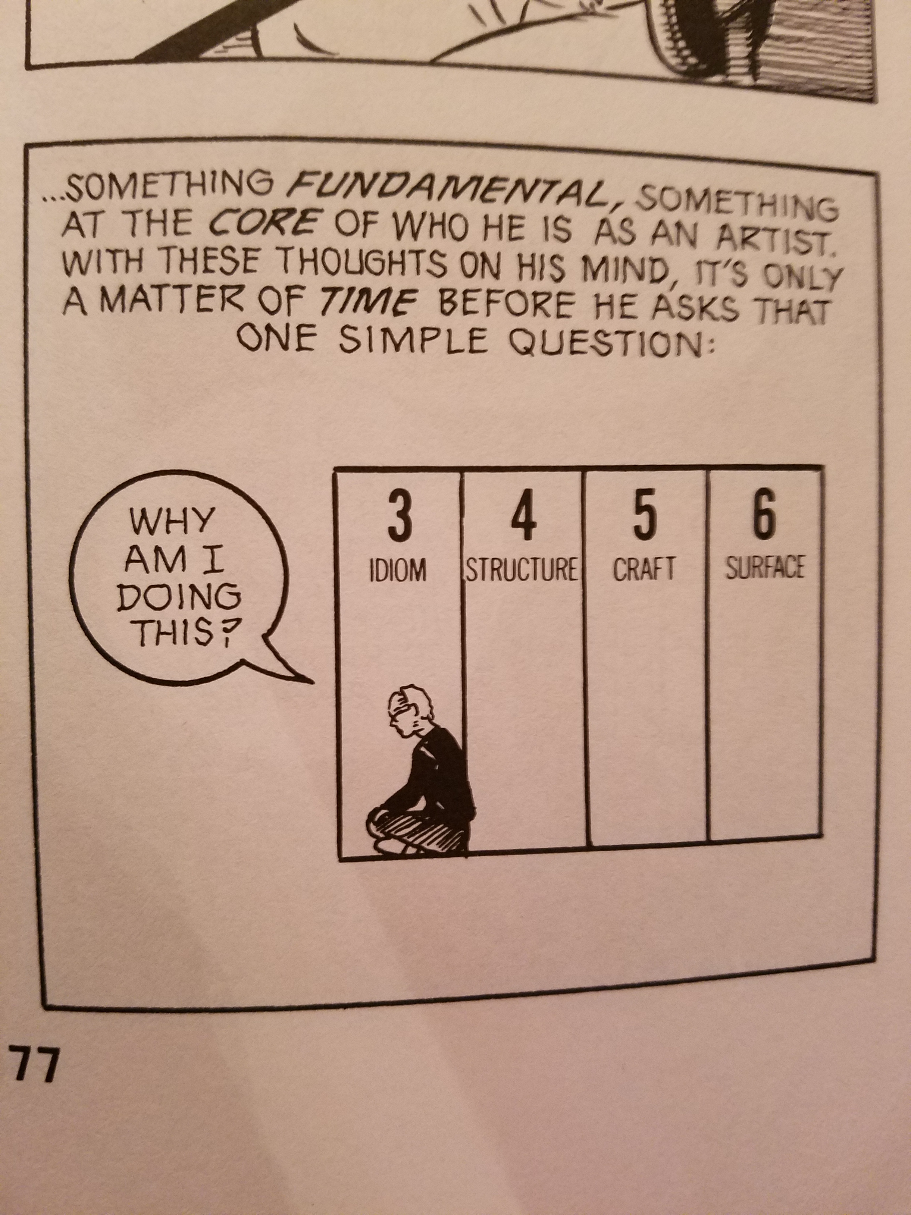
McCloud describing motivation and the series of steps for creating comics.

Narration isn’t the only way that information is conveyed in the film. While it was a useful tactic that followed the lines of comic writing, dialogue had an important part to play as well.  The plot point of how Pekar is inspired, when he is sitting in a diner talking with a comic friend, he describes his drive to create the comic American Splendor itself. He views comics as an unexplored medium that could say the things he wants about life. This is a major motivation for him and references a point by McCloud on the process of creation. McCloud describes how a comic book artist must build up their skill and story telling ability, but also much have a story to tell. Harvey Pekar was not a trained comic artist, but he did have a story to tell. Pekar outsourced his story to other artists to draw. Even though it wasn’t his exact art style the story and pacing of what he was saying were the same. The film shows Pekar drawing stick figures that would later be adapted. The art style of Pekar’s character varied from artist to artists, depending on who drew him. The film referenced this when in a conversation between Pekar and his future wife Joyce Brabner, she didn’t know what to expect Pekar to look like when they first met in person. It was an innovation on Pekar’s part to be able to sublimate his skill of writing comics into another artists style.

Overall, Pekar found a medium that could expand past what people originally thought of it. Comics were and still are fanciful stories to be told to children. However, Pekar was able to expand what comics told by relating his own experiences and who got to tell them, as he was not an artist in the tradition drawing sense. McCloud points to comics as being a multi-faceted, experimental, and expanding medium that is being explored and should be explored. Harvey Pekar was able to do this in his comics American Splendor. The film American Splendor was able to adapt these comic innovations and create a story we could watch on the screen. The film and the comic American Splendor use the many devices of comic book writing to develop a story that was ground breaking at the time. It was a biography of a normal person’s life written well and in innovative ways.

Citation

  1. P. (Director). (n.d.). American splendor [Video file]. Retrieved November 22, 2018.

McCloud, S. (2018). Understanding comics: The invisible art. Burnaby, B.C.: Simon Fraser University Library.

Posted in Fall 2018 Archive (201) | Leave a comment

Comics Continued: Ashley Cole

Understanding Comics, Scott McCloud, 1993

Throughout the duration of watching American Splendor, I couldn’t help but notice several similarities between this movie and Scott McCloud’s book: Understanding Comics. The first thing that I noticed is that McCloud refers to comics as “the Invisible Art”. This idea came to life in American Splendor in the sense that Harvey Pekar is the epitome of invisibility. No one seems to ever truly see him or his work until Joyce comes along and loves him for who he truly is—messy, unhappy, and generally unsuccessful up until that point. Once he starts to become a successful comic book author, it seems as if these traits of his are going to change for the better. However, although they do to some extent, Harvey Pekar is never going to be the jokester that Joyce thinks she married.


Understanding Comics, Scott McCloud, 1993

One very interesting thing that I noticed, which may seem obvious at first, is the idea that Harvey Pekar did not feel the need to make his comics about anything overly interesting or creative. He made all of his comic books about things that happened to him in his life exactly the way that they happened. He even sometimes made things seem gloomier than they actually were because “misery loves company”. However, this is precisely why his comic books sold so rapidly. This reminded me of Understanding Comics when Scott McCloud is trying to come up with a definition for “comics”. One panel reads, “What about Batman? Shouldn’t it have Batman in it?” Well, no, it doesn’t have to. The thing about comics is that the author gets to decide what should and should not be included as well as the overall tone of the work. This is why people refer to comics as art.

Understanding Comics, Scott McCloud, 1993

Something else that really stood out to me about this movie was the fact that Harvey Pekar could not draw at all—he could not even draw a straight line. However, he found a way to make his comics anyway. He wrote the stories and let someone else do the illustrations. This may seem rather unusual, but he got a daughter out of the deal, so I guess it worked out in his favor. We see several instances throughout the movie when Harvey attempts to draw some squares on a page with a stick figure. In Understanding Comics, McCloud actually tells us that making cartoon figures less expressionless actually makes them more universal. This means that we are able to relate more easily with a character if they look plain. We may be able to imagine that that character is us. So, in a sense, Harvey’s lack of drawing skills was not necessarily a bad thing.

I found this movie so interesting to watch especially after reading Understanding Comics. There are so many parallels between these two works, it is impossible to mention all of them. And although I really enjoyed McCloud’s book I think that American Splendor does a great job of bringing the idea of comic books alive.

Posted in Fall 2018 Archive (201) | Leave a comment

Past, Present, and Future Technology: Interview Ideas: Brandon Bliesner

I chose to read the chapter titled Augmented Reality in which the author talks about what augmented reality is, which basically boils down to being able to have things in your own reality that shouldn’t actually be there. These things would also have sensory data that corresponds to the thing you are seeing, feeling, hearing or tasting. Although there is virtual reality today, it really is not satisfying enough and a user will still know that the headset they are wearing is supplying them with this data. Augmented reality, however, would seem very real to the user, although a lot of work would have to be put into it. This relates to StoryCorps as it is basically talking about what could come in the future, whereas StoryCorps is mainly reflecting on the past. At the same time, augmented reality could also show things that have happened in the past, such as the example that was included in the chapter about the Underground Railroad. In the StoryCorps intro, the father’s story is shown in the video but as animation. With augmented reality, it may be possible to see the story firsthand, meaning you would be supplied with sensory data to create a feeling of complete immersion. With that, I lead into who I would like to interview and what I would like to interview them about. Originally, I was thinking that I would talk to my grandma about musical storage/playing devices such as a record player and its records, and an iPod with its songs. However, I have realized that my grandma is not very familiar with an iPod. I have decided that by talking to my mother instead, I would be able to get a better notion of how these two devices were used and maintained. The themes I will be focusing on are music, money, and access. I am interested in the differences of going out to buy records versus collecting music online. With that being said, I am looking forward to meeting with my mom to learn more about her life and her perspective of technology.

AR

Asus Augmented Reality Headset                  (https://www.trendhunter.com/trends/augmented-reality-headset)


Posted in Fall 2018 Archive (201), Uncategorized | Leave a comment

Blog Post Art Museum Jan Rac

Going to the Art museum was super interesting a lot of different form of arts in a different types of medium we saw videos, sculptures, and art work. I think that all the different medium and arts have a message behind them , going off of that i think it’s cool because people have a voices and speak up for what they believe if that is civil rights gender equality whatever it is we have a voice. I think that people in today society uses their platform on social media and I think that some people that uses their platform in the artsy way are very rare qualities.  I think that its super beneficial for these artists to stand up for what they believe in. So the Piece I chose in the art museum is by KEN CHU because he speaks about a heated debate in the world and that’s about LGBTQ  he specifically targets a certain group of people which is gay asian people. In today society we don’t really see that as too much the group of people is caucasian or African American people. I think that when Ken Chu made this artwork i think that people were necessarily shock but have to accept who these people are.

The font for this Chinese man is DON KAO its in super huge font I think the reason why CHU did this is because the font is very eye popping and its very attention grabbing . also going off of the text and the images i really like the Stars because it just goes with the image and I also think that displaying the information about these asian americas is showing the world how these people have lived there lives. I think that putting these items on display in the museum is putting the world on notice. what I mean by putting the world on notice is by showing the world who these people are and that who cares like what they believe in the bottom line is this treat them like a human being because they are people too.  that the artist believes in these people and plus the text and font are eye popping so the patron will have a easy time looking at the picture. 

Posted in Uncategorized | Leave a comment

Ward-Blog Post 7

IMG_2924     IMG_2925

The work I chose to evaluate from the WSU museum was the art titled, “I Beseech You” by Carrie Mae Weems. The work was published in 1996 but the photograph Weems used was originally from a French photographer in the 18th century. Therefore, the old-fashioned feeling the black and white photograph creates is a realistic effect on the viewers because it appears that the original retro styled film photography was used within this piece of art. However, Weems added a text layered on top of the image in order to create a different emotion from the viewers. Weems combined old-fashioned aspect of the photograph and combined it with a relevant text to ovelay it in order to create a modern mood. For example, although this image was created in 1996 it reminds me of Tumblr or Facebook posts from the past decade. Ultimately, Weems was ahead of her time and definitely set a trend for moody text over moody photographs in order to create emotion in the audience of the artwork. The combination of elements ressembles a collage where new and old pieces are put together to create something new with a whole new meaning. This was mentioned in the Timothy Samara reading for class.

The text is black and centered in the middle of the work. Therefore, the words blend well with the colors of the image making the viewers really work to notice that there is small text in the center of the image. The artwork frame was medium-to-small sized in comparison to others in the museum so it was difficult to notice the words and entirety of the artwork until you looked closer. When I finally noticed the text I saw that the text was in a san serifs font.

This is a relevant example for me personally because within the text there is a thick darker part at the base of each letter and then a lighter part on other ends which reflects my idea of having a thicker and more dominant part in conjunction with a lighter and reliable part of the letters. In addition, the soothing and subtle nature of the image creates a relatable mood to my source of inspiration of the special bond between a daughter and a mother. A point in the poem Woolf mentions the morning cries of her newborn daughter and I feel like this image directly reflects the same mood of the sun rising and the quiet atmosphere of dawn hours. Therefore, this artwork is an important reference piece for me as I am finishing up my letters and moving towards the completed poster.


Posted in Uncategorized | Leave a comment

Art Museum: Peyton Taffe

During the visit to the WSU art museum, I found Robert Rauschenberg’s Autobiography,  to be the most interesting. It features three large lithograph prints that tell a narrative of his life. The first image is of his astrological birth chart overlaying an x-ray of himself. It also features images of a bike and an umbrella which are commonly seen in many of his pieces.  The second piece is of him on a boat as a child, with circles of text surrounding it. The text seems to be excerpts from his life The third piece, is a photograph of his 1963 performance piece, Pelican. It also features a nautical map of the area surrounding the Gulf of Mexico.

Robert Rauschenberg, Autobiography, 1968
Taken by Peyton Taffe at WSU Art Museum

Robert Rauschenberg, Autobiography, 1968
Taken by Peyton Taffe at WSU Art Museum

Robert Rauschenberg, Autobiography, 1968
Taken by Peyton Taffe at WSU Art Museum

I found this piece to be interesting because I’ve never thought of an autobiography to be told over illustrations. I think that the combination of text in all three images helps convey what the artist wanted you to know about his life. In this case, the medium is the message in many ways. An autobiography told over pictures is completely different than one in a book and shows that he was a visual artist. The decision to make some of the images into a collage, as mainly shown in the first piece, forces the viewer to add a degree of meaning to a piece. He uses a mix of photography, drawn text, and printed text in the pieces to also add another degree of meaning.

For my project, I found this piece to be relevant and helpful because it shows how by using different types of media, it can add a lot more meaning to the piece. Next, it showed me how font choice really makes a difference as all of the pieces have different fonts and therefor convey a different meaning. Lastly, I noticed how even though the viewer sometimes has to work to read the text, it can still be successful. It will influence my ideas for the typeface project by influencing me to play with how my illustration and text can really interact.

Posted in Fall 2018 Archive (336) | Leave a comment

Art Museum Visit: Victoria Henry-LeMaster

I think that this piece by Jenny Holzer holds a lot of power, the use of all capitalizations

by Jenny Holzer

and the close proximity by each letter brings the text together to create almost an image of a book of poetry. The two pages being placed next to each other and on the ground almost creates a relaxed and “homie” aesthetic in comparison to if they had been hung high on the wall.  Personally, I really like this piece, but I don’t think it will influence my own design as much as I would have thought. I used this piece for this blog post because I was interested in the content and the alphabetized statements, in addition to the overall composition of the two pages together. However, I do not think that the composition of the individual pages will inform my own; their simplicity can be informative, yet I think it had moved me in a direction away from the content. There is not really any form alteration or an abstraction like Timothy Samara mentions, other than the text being all capitalized and left-aligned there is little change.

It seems as though Holzer focused on the content of what the words would specifically say in comparison to the overall placement, there might be an inference in that the viewer could possibly see their reflection in words. Perhaps, this is a comment on the hypocrisy of societal norms that are held within the words of the piece. For example, how would one feel if you saw your reflection and then the first line within the piece that you say would have been “Stupid people shouldn’t breed” vs. “It’s good to give extra money to charity,” this piece most definitely creates a different experience for each viewer. With my idea for my design, I want it to be very clear, no matter who is looking at it, what it means.

Posted in Fall 2018 Archive (336) | Leave a comment

Art Museum Visit: Emily Deichmann

Artist: Nancy Spero WSU Art Museum

WSU Art Museum

One of the pieces in the art museum that stuck out the most to me was “ We Are Pro-Choice” by Nancy Spero. Nancy Spero used stylized representational images to touch on the darker subjects of humankind. I find this piece engaging because of the way the text and images go together. These two elements create something else. I think the text and words bring out the images and help tell a story. To me, the text kind of looks hand written and that it could maybe be something seen on a protesters sign. Once I though about that, I noticed that all of the women in the piece look like they could be protesting about something especially this subject. The illustration style for this piece is a screen print. Screen prints always look like paintings to me because they are always so colorful and leave room for imagination. I would say that this piece is a mixture between abstract and realistic. It is realistic because it is representing a real event that is still happening today, but the screen print itself looks abstract. Also, some of the women look very real and what a woman actually looks like, but some of the women look abstract. This style is appropriate to the subject matter because it looks like a protest poster, which theoretically could be what people used it for. The words and images feel visually integrated. The text looks a bit like cursive because the letters are attached but not all the way. Some of the images are overlapping each other. I think the artist is trying to communicate that women should stick together to stand up for what they believe in. That is why some of the elements are connected to one another.

Posted in Fall 2018 Archive (336) | Leave a comment

Art Museum Visit: Rumnik Cheema

The piece I ended up choosing was the Tong Zhi/Comrade : Out of Asia America. There was many different reasons I went with this piece, one of the most prominent is related to the modern society issue in the Asian LGBTQ+ communities.  I have seen some of my closest friend be affected and have their lives flipped when they felt safe and confident to come out. So to me it really is powerful to use societies least accepted groups and plaster them for attention and making them the center. The post does a great job achieving it goal due to the slight difference in the pressed letters. As well as the ability to capture so many different stories and create a uniform style is some thing I really liked. The style seemed as if it was a more uniform cutout letter then the example provided in our reading by Timothy Samara. It has a feeling of letter “blocks”  but is much more aligned. The style of this piece is similar to what I have in mind for the poster but with much less smaller text at the bottom.

IMG_5290

Photo by Sanna Wright, November 2018

Posted in Uncategorized | Leave a comment