
Helvetica vs. Arial. Web Designer Depot
Helvetica was designed by swiss designer Max Miedinger along with Eduard Hoffman in 1957. As with many swiss creations precision and accuracy are held in the highest regard, Helvetica being no exception. With such a clean design the typeface spread to being used by governments to some of today’s prominent businesses.
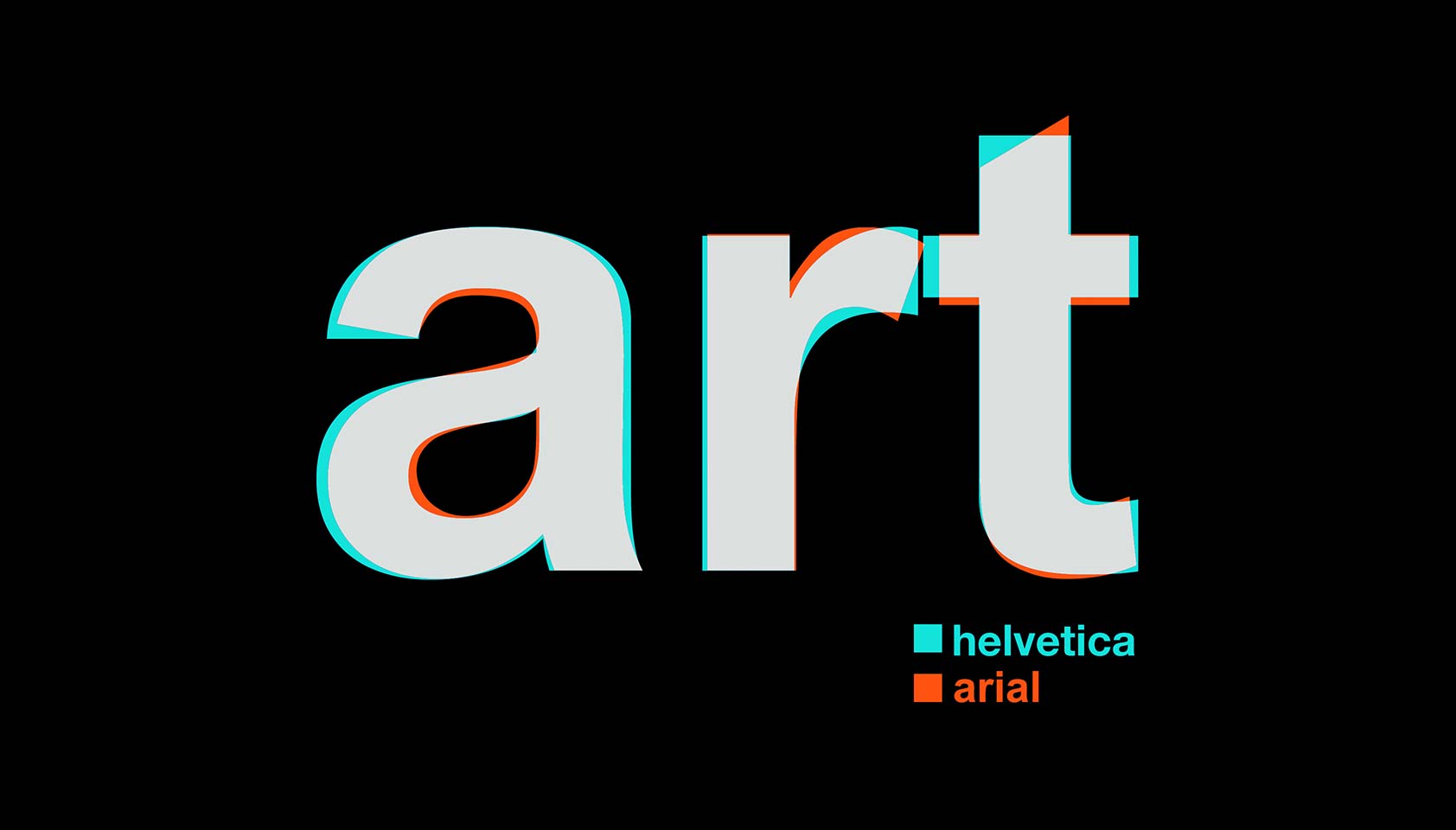
Delving into the design of Helvetica the precision is unmatched in all aspects of the design. This makes it difficult for it to be manipulated by other designers other than simply making new variants with minor adjustments. These small changes vary from rounded edges to narrower versions with less space between the letters. The main characteristics of the original version of Helvetica are the simplicity along with tight apertures on letters such as, U and H. Some more of the characteristics are the tight display oriented spacing between the letters, which has helped make Helvetica a standard type font on most operating systems and word processers. The readability is also fantastic due to the tall x-heights found in the typeface and well as the wide capital letters. These features of the typeface have made Helvetica one of the most popular san-serif typefaces used today.
The polarization of Helvetica can be found among those that design using typefaces in their field of work. Many will use the typeface because it has become considered neutral in design and will not distract from the other elements of design due to its familiarization now. This would of course vary case to case on its use, but the film Helvetica made a great metaphor for this instance of misuse. Sometimes it is ignored like air; sometimes it is a dramatic shock to the system. Which brings light to the reason many designers disapprove of Helvetica, it is misused by some designers in scenarios that would have favored from a different typeface. The safety-net that is Helvetica limits the creativity and result that inherently impacts many designers.
Helvetica the documentary changed the way that I view typefaces now and the intricate details and thought put into each letter. Along with a greater understanding of how typeface designers go about their design processes. The anatomy of type also makes much more sense to me after watching a typographer create several letters. The sculpting of the apertures was also very interesting to see and the relation of letters when creating a typeface from scratch and using the letter h to create the letter n. As well as similar letters that can share characteristics to create a fluid typeface that looks as a complete set.
After seeing a master at work in the typeface industry my typeface that I created for this project seems to be very subpar compared to something like Helvetica. While the roots of the font all stem from similar characteristics such as x-height and apertures, the anatomy of my font is there. With a greater understanding and ample tools that are used to draw typefaces the one I created could be crafted into something rather refined. The rugged chaos that is found within my typeface I made shows the minimal amount of experience I have with typography but serves as a very useful and creative introduction into the world of typography.
