
After watching the documentary Helvetica, I have come to understand the controversy behind the typeface and why it is both revered as well as hated. To understand why this type has such a strong effect on people and designers, the documentary first dissects the anatomy of this type. Helvetica is clear, modern, and neutral, which in turn makes it extremely versatile. The documentary describes how the type is all about the figure ground relationship. The negative space tightly surrounds each character securely which creates a strong statement in the words formed by the letters.
From the film ‘Helvetica’ directed by Gary Hustwit

From the film ‘Helvetica’ directed by Gary Hustwit
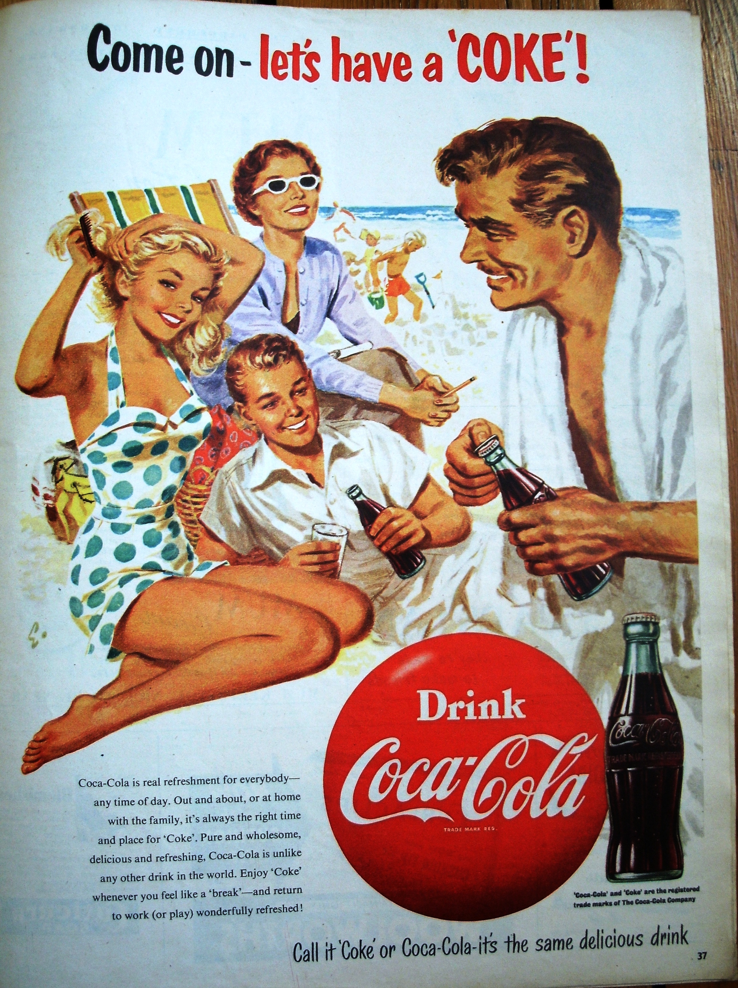
Helvetica was the answer to the issue of 1950’s advertising being too flashy, cluttered, colorful, with zany hand lettering and too many different typefaces being used that didn’t need to be there. Companies transitioned to Helvetica to clean up their brand. The type transformed their image into something professional that makes a clear statement. A great example of this in the documentary was Coca-Cola going from cursive wedding typography and an extensive description accompanied by an image of a family, to a clear image of the product and the company’s name and slogan in Helvetica. This was also one of the most impactful parts of the documentary for me because I am an advertising major and the logic behind that decision struck me as brilliant. I also currently hold a graphic design position on campus so this technique and mentality can be applied to my work. Governments and corporations love Helvetica because it makes them seem neutral and efficient, while the smoothness of the letters make them seem human. These are qualities they want because they come off as more accessible, transparent and accountable despite an image of seeming oppressive and authoritarian. It was used so widely that it became part of every-day life in America. It became basic and lost its visual potency. People began using more expressive typefaces as a form of pushback and tried using other sans serif fonts that could be a substitute for Helvetica. Nowadays people consider Helvetica to be a basic font and is often seen as boring. The type has become such a large part of every-day life that people need something different in order to be eye catching. However, many campaigns continue to use the type because when used correctly, it can be just as effective as when it was introduced.
This documentary provided valuable insight into the world of typography and graphic design and I have learned a lot that I can apply to my type and poster design. One of the biggest takeaways I had was that just because something is legible doesn’t mean it communicates, and more importantly it doesn’t mean it communicates the right thing. Remembering to be intentional with every decision made throughout the design process is the best way to create something meaningful. If an artist does not have a reason or significance behind the creative decisions they make, then viewers won’t receive a message from the piece.
