
During the visit to the WSU art museum, I found Robert Rauschenberg’s Autobiography, to be the most interesting. It features three large lithograph prints that tell a narrative of his life. The first image is of his astrological birth chart overlaying an x-ray of himself. It also features images of a bike and an umbrella which are commonly seen in many of his pieces. The second piece is of him on a boat as a child, with circles of text surrounding it. The text seems to be excerpts from his life The third piece, is a photograph of his 1963 performance piece, Pelican. It also features a nautical map of the area surrounding the Gulf of Mexico.
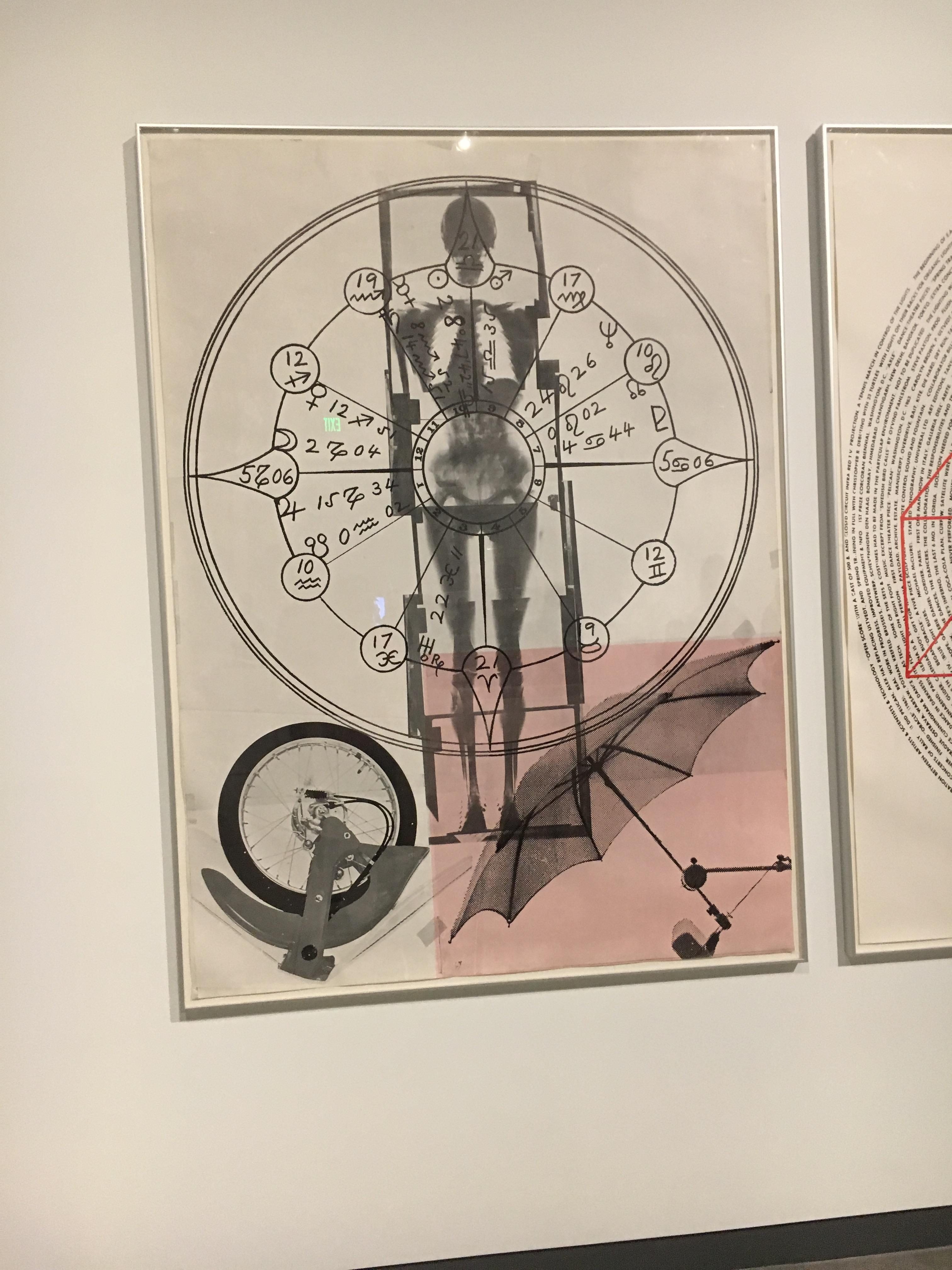
Robert Rauschenberg, Autobiography, 1968
Taken by Peyton Taffe at WSU Art Museum
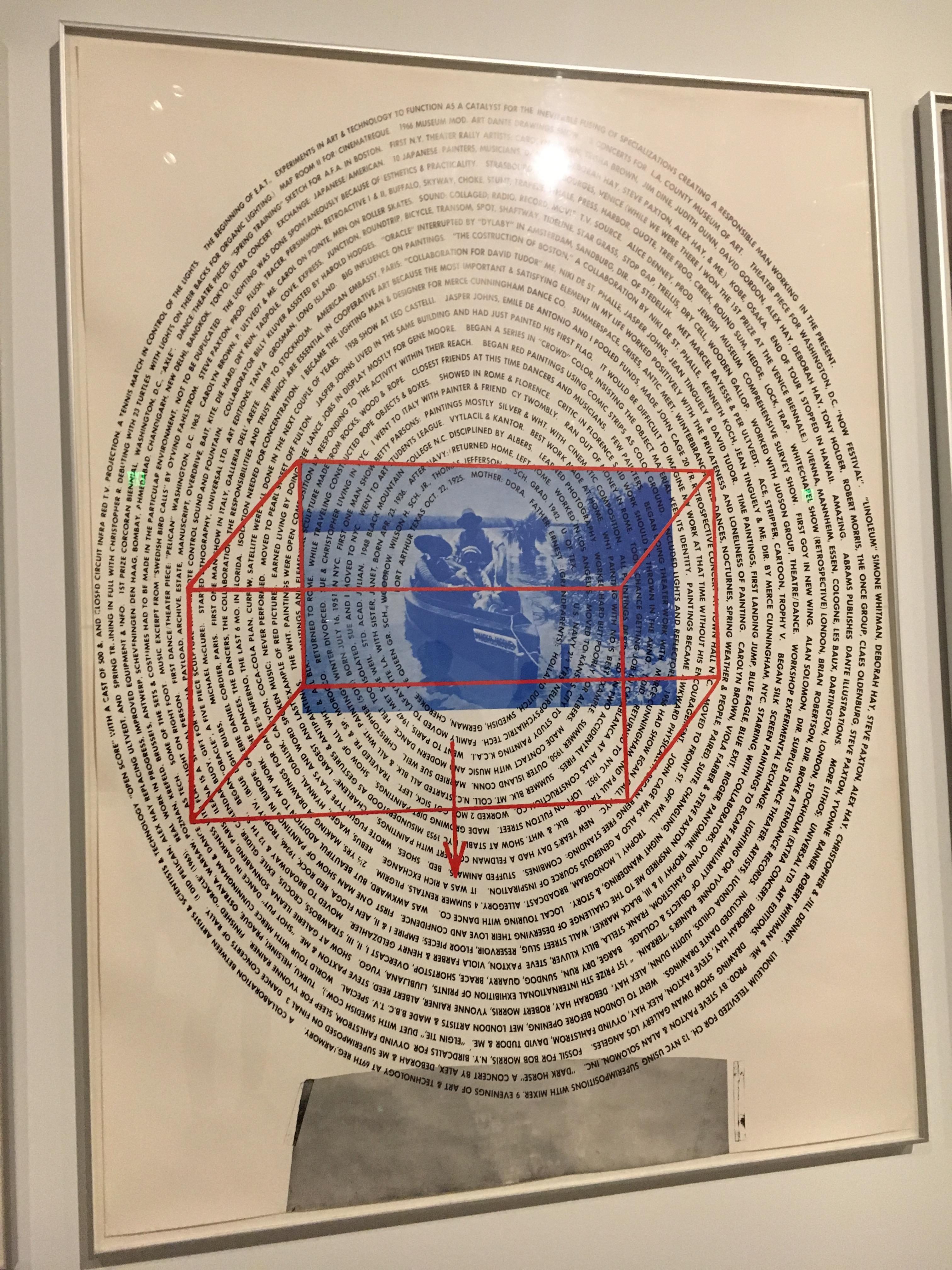
Robert Rauschenberg, Autobiography, 1968
Taken by Peyton Taffe at WSU Art Museum
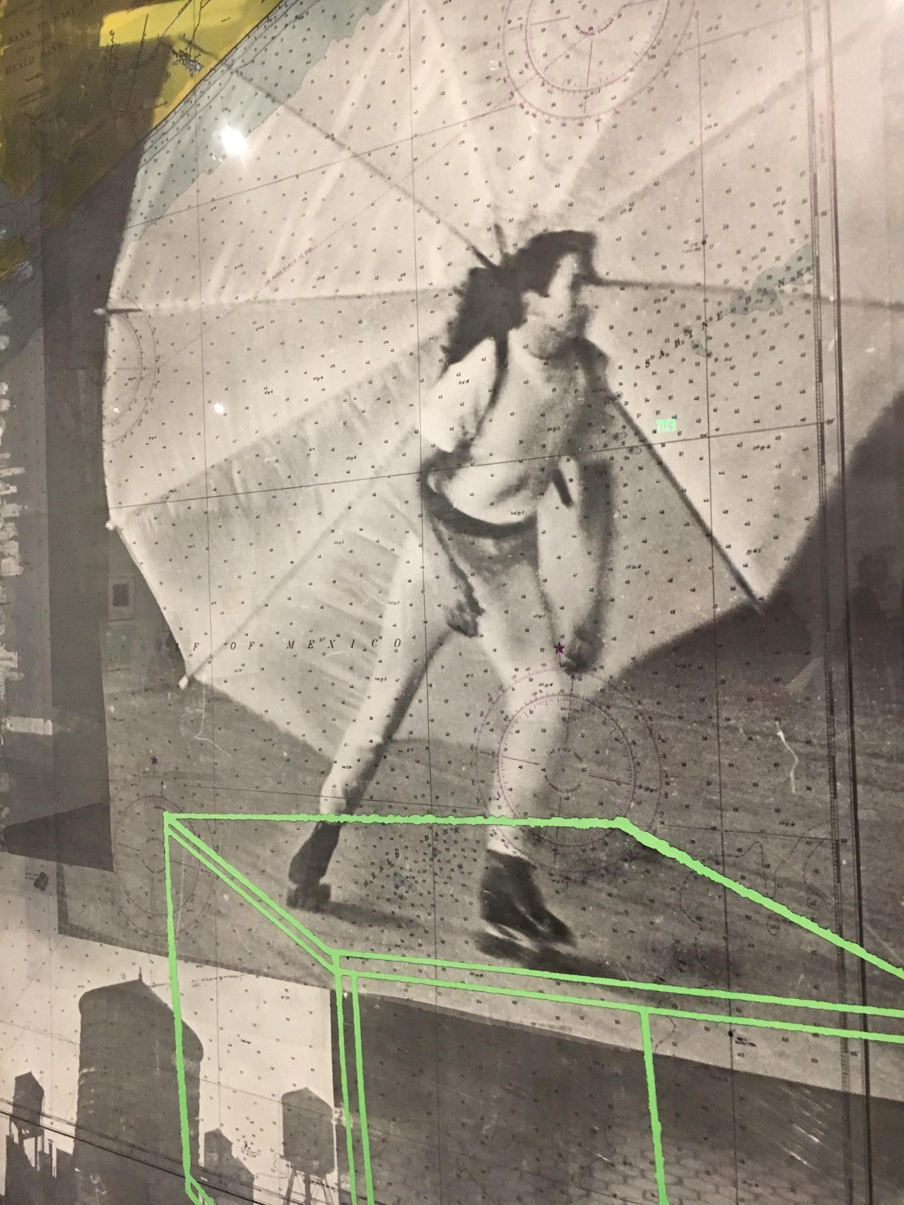
Robert Rauschenberg, Autobiography, 1968
Taken by Peyton Taffe at WSU Art Museum
I found this piece to be interesting because I’ve never thought of an autobiography to be told over illustrations. I think that the combination of text in all three images helps convey what the artist wanted you to know about his life. In this case, the medium is the message in many ways. An autobiography told over pictures is completely different than one in a book and shows that he was a visual artist. The decision to make some of the images into a collage, as mainly shown in the first piece, forces the viewer to add a degree of meaning to a piece. He uses a mix of photography, drawn text, and printed text in the pieces to also add another degree of meaning.
For my project, I found this piece to be relevant and helpful because it shows how by using different types of media, it can add a lot more meaning to the piece. Next, it showed me how font choice really makes a difference as all of the pieces have different fonts and therefor convey a different meaning. Lastly, I noticed how even though the viewer sometimes has to work to read the text, it can still be successful. It will influence my ideas for the typeface project by influencing me to play with how my illustration and text can really interact.
