Final Digital Comic Collage: Nicholas Kawaguchi

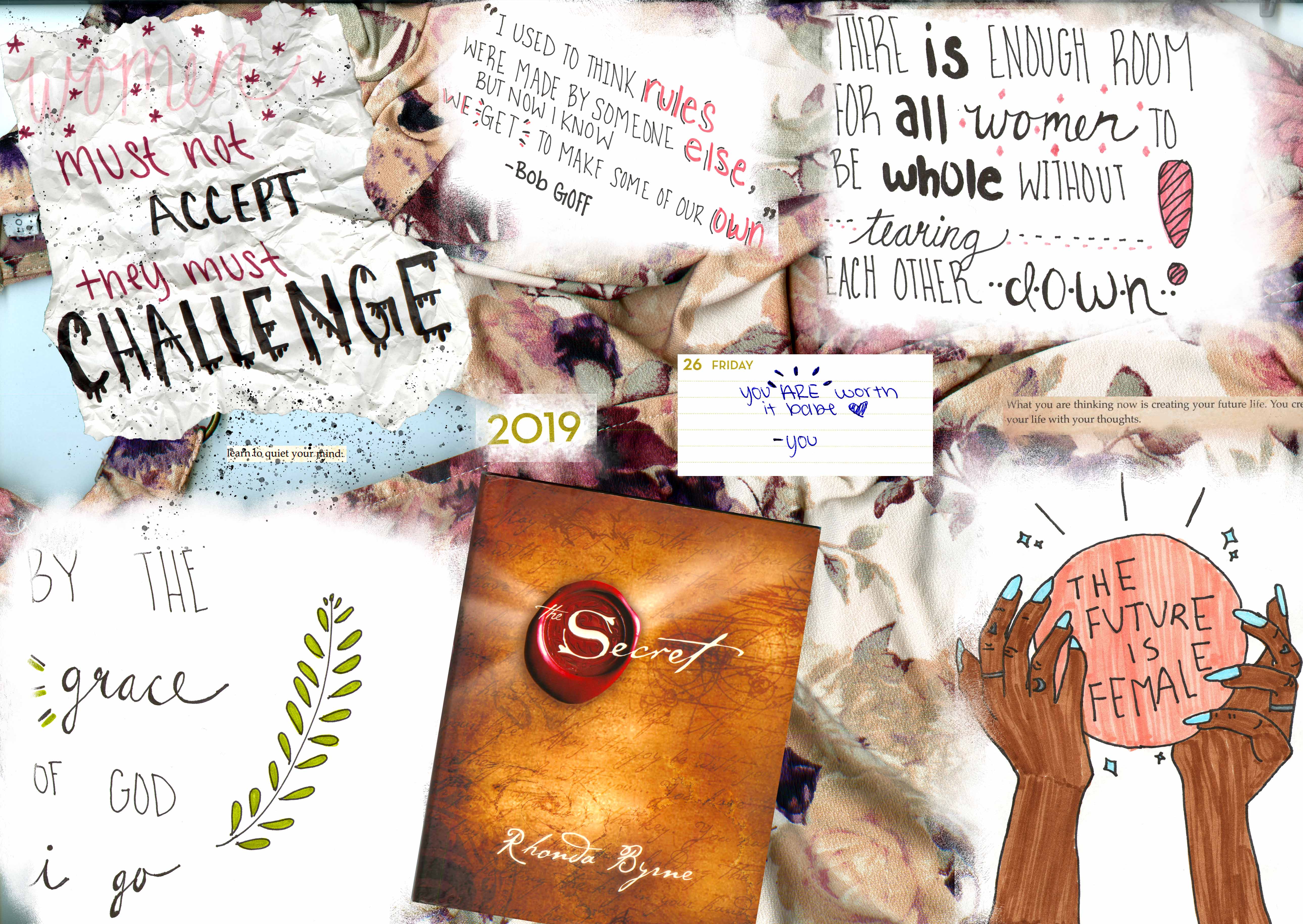
Digital Collage Comic (Nicholas Kawaguchi, 2019)

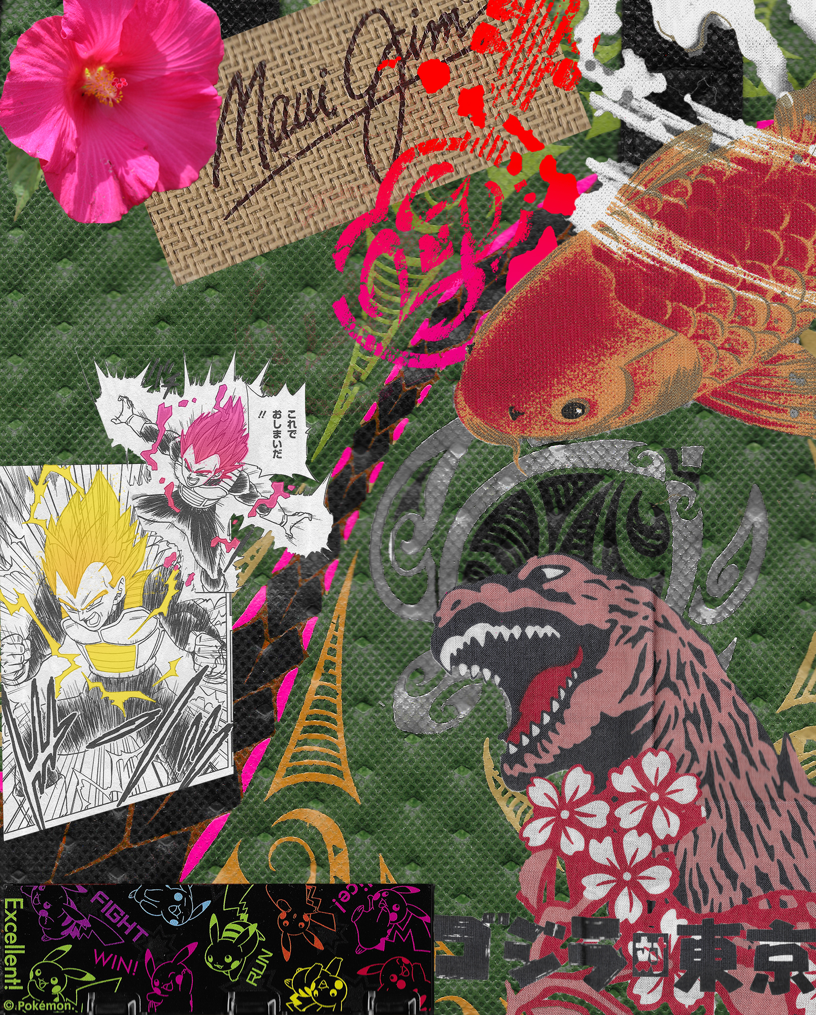
With this project, I sought to combine elements of my home and heritage/culture, specifically Hawaii and Japanese culture. The objects from Hawaii are situated more towards the top half of the collage, excluding the background which is a design from a lunch bag. These include things such as a Hibiscus flower, the logo from a local sunglasses company and a design from a T-shirt. Obviously for the sunglasses logo, Maui is stated right in the name, but as for the t-shirt logo, it is from a brand known as “MauiBuilt.” I would say that the majority of shirts that own are from that company and, overall, have that signature local type aesthetic to it. As for the Hibiscus, this is Hawaii’s state flower, however, this is the pink variant rather than the yellow. Then, in the background is the lunch bag with designs commonly seen in Hawaii and other Polynesian cultures. One last element on the top is the koi fish. Although not an uncommon sight to these fish in some areas of Maui, they are more closely associated with Japanese culture and thus I used it to represent the idea of myself in this comic. The koi fish seemingly enters from the right and, by creating a greater contrast with color in the design on the lunch bag, implies movement through that leading lines. That line leads to and goes past the Japanese elements on the bottom. These include images from a manga, a game holder, and a design from a Japanese noren (sign curtain). Each of these items were bought in Japan, over the few years I was lucky enough to travel there. As the koi fish travels along that fuchsia colored path, holding those strong ties to Maui close, it picks up those items of Japanese entertainment culture and continues along that path. In other words, symbol of the fish represents me traveling along my path maintaining strong links back to home while also embracing and picking up elements of Japanese culture. Juxtaposing these elements in a way where it lines up with Lovett’s ideas of harmony and unity were key. Many of the items possess a warmer hue which was intended to contrast the darker greens in the background. Also, looking at it with a diagonal split, I attempted to balance out the upper right portion of close proximity items with very saturated colors with the bottom left portion that has less color to it, but has the white to balance out the weight of the whole design.

Although this was not my first time in Photoshop, I had not used it for a long time so it did take some time to get used to things again. Many of the early tutorials were good refreshers and as it got into the later ones, I learned a lot of valuable tools that helped a lot, especially in this project. Once such tool was the adjustment layer and using that with a selection to get a specific portion of an image. I had not realized I could use this tool until halfway into making the collage comic so some images were just selections that were copied and put onto another layer.  Another helpful tool was clipping masks. Theses especially helped with altering specific portions of images that I already cropped using a layer mask, but still had certain details that did not need to be altered. Overall, it was a good experience in using and learning some intricates of Photoshop, although I do wish that some functions were a little more simpler to carry out, such as completing more complicated selections that require a good amount of precise detail.

Posted in Uncategorized | Leave a comment

Final Digital Comic Collage: Ivy Padayao

For this comic collage, I wanted to create a sort of emotional/aesthetic response for my audience. The theme is woman empowerment, and I felt the best way to convey this was by

digital comic collage

using various quotes and pictures I created by hand. As for it fitting into Scott McCloud’s definition of a comic, I believe it does. I put the images in deliberate order for the reader to view while using the . In the top left corner I began with an inspirational quote crumpled up along with a quote from the book The Secret stating “learn to quiet your mind” with both being splattered in black paint in a sort of inferred frustration. I wanted the viewer to infer the progress of a person learning and struggling through the idea of woman empowerment. As the images progress though different Ideas, the final product is finally understanding that the “future is female” and feeling they they have the world at their fingertips. In the image leading up to before the final understanding of woman power, the viewer comes across the cover of the book The Secret which is a literary platform that explain how the law of attraction works. I thought this was very relevant with the idea of woman empowerment, and that is why I chose to include a couple of scans from various pages around the book to emphasize the idea of law of attraction. I also used texture vicariously especially with the background of the whole piece being a floral short being wrinkled in many different sports throughout the collage.

This is my first time using photoshop, so this project definitely had a lot of trial and error throughout it’s entirety. Overall, I am happy with how this piece turned out and I feel a lot more comfortable with navigating and using the platform. The tools I used a lot within this project that I learned from the tutorials was definitely the selection and the select and mask tool to select the exact things I wanted to go into the collage. For example, in the top left corner the crumpled paper was pretty tricky getting the exact aesthetic material I wanted to use within the collage, but the select and mask feature made it a lot easier to navigate and see exactly what I was selecting and what I was leaving out. Another tool I used a lot was the brush tool to sort of fade out and blend in the various quotes instead of having them all just have hard cornered edges. I really enjoyed creating this digitally, because you have so much more opportunity to make things exactly how you want to pixel by pixel!

Posted in Fall 2019 Archive (201 Blog) | Leave a comment

Final Digital Comics Collage: Justin Pardini

Final Collage

Creating this collage was a process filled with trial and error, however, I am happy with my end product. I created a collage with a multitude of different images, as well as drawings and writing of mine, which I made sure to include. I think it most satisfies McCloud’s aesthetic portion of his definition. I intended to create a pleasing image filled with satisfactory colors and symmetrical images. I also believe that, especially in the cards and the two square images, they are very juxtaposed in their appearance. One side shows the fron of a card, while the other shows the back of a completely different card, from a completely different set of cards. I meant for this collage to include many things that can be seen to describe me as a person, and my hobbies and interests. I saw this collage as a sort of reflection of myself.

I attempted to use tactics discussed in John Lovett’s article many times. I used contrast of color, as well as size and direction. I made sure each image was sized to fit into certain spaces, which helped me utilize the collage to it’s entirety, and gave me a more spacious canvas. For the background, I used an original image on the left side, and contrasted the colors to create a more abstract looking image, which I then placed on the right side. I initially did this out of curiosity, however, I thought it belonged nicely within the collage. Each image I included in the collage has a special meaning to me in my life, whether big or small. I chose these specific images because I believe they are aesthetically pleasing, as well as representative of who I am. I also chose to include words in this collage, as I am a writer. I thought including words would make this look less clunky and would open it up to more interpretation. I didn’t include linguistics that were too straight forward in order to create ambiguity within the viewer. Although my collage is mostly in the visual mode, with all of the images and drawings included, I thought it was necessary to include linguistics.

This was one of the first times I had used Photoshop, and there were many struggles in the beginning. It took me awhile to figure out how each tool was used and how it could be used to it’s best ability, however, once I was able to put the pieces together, this project was much more enjoyable. I learned mostly how to make precise selections, as well as how to change the size, color, and opacity of each image to fit into the collage. The tools from the tutorial that were most helpful were the discussions on layers and layer masks. I had no idea what layers were, but after watching the tutorials, it helped me understand Photoshop a lot more. I did enjoy composing in this digital environment, however, I prefer physical more. I feel I have more tools and opportunities to create better art and colors digitally, yet I still enjoy drawing on paper more than a computer. With that being said, I did enjoy this project and I believe it will lead me to working and designing digitally more often.

Posted in Fall 2019 Archive (201 Blog) | Leave a comment

Final Digital Comic Collage: Janet Okeago

Having moved from Kenya to come and study abroad i have always wanted to retain my culture and it has been a great opportunity to be in W.S.U and gain different experiences where i can share my culture with people from different places. And being among the students who were fortunate enough from my home town i feel the need to motivate my community by representing my school because i am proud to be a coug and this is an achievement for me. my collage is kind telling a story of a Kenyan girl from a society with a variety of cultural practices and getting the opportunity to encounter a different culture where they value pets.

project 1 comic collage By: Janet Okeago, October 3,2019

This comic collage fits McClouds definition of comics where i have used a variety of pictures that describe culture by using fashion and i wanted it to attract my viewers using some colorful items that are so decorative. I also tried blending in the colors since i love trying out different colors on my work with a mixture of different sizes to the images i have. Some of the pictures are photos that i took and thought it would be unique to give a brief view of working with photo montage on my collage that display visual mode.

i was so excited to learn how to use Photoshop since it was my first time doing it. At first i did not think it would be much confusing for me since i had a hard time with understanding the tutorials by myself. However, with the professors explanation i found it easier to understand and that is how i practiced with the rest of my assignment. I played around with the selection tool which at time it was hard for me to be able to select an image but with time i feel like i have learnt something new and it is something i want to use after graduating and joining the workforce. I learnt also about adjusting some pixels which i got to use it to apply for the green card and i was exited since not everyone know how to use the Photoshop.

Posted in Fall 2019 Archive (201 Blog) | Leave a comment

Final Digital Comic Collage: Bruno Signorelli

My comics fits Scott McCloud’s definition of a comic because my images are in a deliberate sequence, and provide information to the viewer, which in my case is the journey that my subject goes through in the image. It also has the intent to give off a aesthetic response for the viewer. My comic also uses a lot of the design elements talked about in John Lovett’s Design Overview. One example is the use of texture in my project with the multiple real life objects I used. The backdrop itself also adds texture throughout my project with it being a crumpled up magazine page. My comic also has a direction that the viewer is suppose to follow, and the start of it is indicated with the title that sticks out from everything else on the page. I also use repetition in my project with the same subject showing up multiple time but every time it shows up its in a different space and doing something different. I think the objects I chose help with what I was going for which was just something you might see on anybodies desk at anytime, and then taking that background and creating a simple sketch story out of it. Like something you would see a kid doodle in class, but it interacts with the background, and makes the background become part of the story being told in the sketch. The only bit of linguistic mode I used in my project was with the title, which I gave a superhero kind of vibe to which fits with the subject and story of my comic. It also is used to show where to look first on my project.

This is not my first time using Photoshop but its my first time doing a major project on it, and definitely doing anything to this scale. I didn’t necessarily learn any new tricks or methods in Photoshop, I more so learned how to use Photoshop to tell a story, and to create something of value. I think out of all the stuff I learned from the tutorials the one that I took the most from was how to properly use the lasso tool to isolate and image from the background. I’ve always known the basics to it, but the tutorials really helped me get better at it, and I feel like my isolated images look better in this project then any other project I’ve done before. I do like parts of working in a digital environment because it just allows you to do so many more things that you could never really do on a piece of paper, but I also just feel so much more comfortable using a pencil then a mouse, and I just feel like I have much more control with what I am doing on a piece of paper then on my computer.


Posted in Uncategorized | Leave a comment

Final Digital Comics Collage Jake Bailey

My creative influences for my collage come from my own personal experience as the two sides are a big part of my life. My family has Seahawks season tickets and big Mariners fans so I’ve been going to games since I was 6 months old sand the overall aesthetic goal was to try and show a big of those 2 worlds. The connection to McCloud with my collage is the difference but similarities between the two teams. Both sides of the collage show a jersey, player, song, and action as that’s how I associate them to me, they are both my teams but they are exact opposites of each other. They are contrasted as the Mariners side is more lightly colored while the Seahawks are a lot darker as well in terms of color. The textures of each jersey are very different as well and I’m pretty proud how well they separated because to me is looks really cool. I used shape and size to help both show off the jersey numbers and names of very popular players but allow the to still be seen easily. Each part of the collage has meaning from the songs both being the ones played before each game, and the quotes being of famous plays in the teams history are all real events that mean a lot to me as I’ve been there for all of them and I’m trying to convey that same sense of knowing by using them. In terms of the modes, for the linguistic mode besides the words meaning as i previously mentioned I tried to find font that seemed like spoken words as that’s what they really were, call by announcers. As in terms of my visual choices I tried to make everything seem as mirror image as possible to try and create a “2 sides of a coin” style of organization.

In terms of Photoshop, this is the first time I’ve ever had to do a project using it so I was learning the basics from the very beginning. The tutorials that were most that were most helpful were the ones helping understand selections as that’s what I used for a lot of my project, different shapes and portions of my images. I has a specific image in my head and they made it easy to get only what I wanted from each scan so my collage could be organized how I wanted it. The main confusion parts was just the trial and error of it all, figuring out which buttons edited which parts of the photos, overall less of what did what but learning how each tool worked with each other. While I would say that I prefer doing print projects as I like having a specific idea in my head and making exactly that, for someone that isn’t very artistically skilled, it was very nice to do it all on the computer and not have to worry about how the drawings looked since they were all scanned images.

Posted in Fall 2019 Archive (201 Blog) | Leave a comment

Final Digital Comic Collage: Tom McLean

For my Digital Comic Collage, what I wanted to show the viewer was a glimpse into who I am as a person by using objects and symbols that help to show that in a collage form. The reason for the symmetrical formatting of my collage was to show the viewer how my life is structured and how there is some form of organization with everything that defines me as a person. The way that my collage fits Scott McCloud’s definition is that there is a purpose of positioning and information to give the viewer information about who I am without any words. This sense of conveying information without using any external words was important to me because I wanted the viewer to look at this not as a top-down collage but as a singular image that has meaning to it.

Comic Collage – Completed on 10/3/2019

From John Lovett and his Design Overview, I took into account the use of texture and color. The ways that I used texture was in the layering process of using my images. Having a background that sets the stage of the collage is extremely important in my comic collage because it helps with the color and texture imagery of my comic. All of my images have a purpose to them and the things that make them not perfect make them perfect to use in my comic collage.

This was my first time using Photoshop in any capacity. I feel like I have learned the basics of Photoshop and have become a novice at best. Learning all of the different tools and adjustments with Photoshop was difficult to learn at first, but after practice, I became better at using everything including the color and shading tools in Photoshop. Trying to find and use the correct tool was probably the hardest part of the entire project. The most useful tool for me was the magnetic lasso tool in order to arrange my pixels in the correct sequence. That was the easiest tool to use as well as the most used tool used when creating my comic collage. The only real confusing tool that I used was the window tool. I had tried to use it earlier in my creating process but I had decided that it was not necessary for my comic collage. Overall I really enjoyed using Photoshop in the creation of my comic collage and have a better understanding of the tools needed to compose something digitally.

Posted in Fall 2019 Archive (201 Blog), Uncategorized | Leave a comment

Final Digital Comics Collage: Maria Alvarez

First photoshop project

This collage fits into Scott McClouds definition of comics because I tried to make it kind of aesthetically pleasing to the eye with the pops of color and the colorful backround. When it came to the readings of Design, I was influenced by some lines, shapes, textures, and colors. I tried to make the backround wrikinly so it had more texture, I also tried to make the “poem” with lots of texture to add to the flatness of the other images. I also used shapes when it came to this collage. I made some of the cutouts like the fish and the lips more circular to add more to the image. I added a lot of color to this collage, like in the peom and in the “eat local” tittle. I wanted more pops of color to attract the eye. I also used balance, since I have a lot on the left with the note, I added a bunch of little images to balance out the image as a whole. When it came to the words on the collage, I added “secret” and “news” together to add some sort of mystery. Why does it say that? What are the secret news?

This was not my first time using photoshop, I used it one time for my COM 210 class. I learned a lot of new things in this project, I learned how to adjust lightning in my image using the magic tool. I also learned how to do layer masks. For my collage, the most useful tools I used were the magnetic lasso and the optical lasso. I used that tool a lot to cut out my images. The brightness and contrast panels were very usefull as well, I used that to brighten up the skyline so the images I put on top would pop more. Over all, I really liked making this project, it was a lot of fun to make a collage and just have fun with the program.

Posted in Uncategorized | Leave a comment

Final Digital Comic Collage: Grace Kannberg

Traveling outside of the country is one of the most rewarding experiences that I got to be a part of after graduating from High School. Two weeks after graduating, I boarded on a plane for a month-long adventure that took me to over thirteen different countries. I was trying food I didn’t know how to pronounce, doing things I didn’t think in a million years I would ever do, and meeting people with the most diverse backgrounds. For my digital comic collage, I wanted to make the viewer feel the feeling of wanderlust as well as the surprise that comes with traveling. I was able to complete my collagewith the help of MacCloud’s definition of comics, John Lovett’s Design Overview concepts, materials I used, and how these materials were used in my collage.

Project One-Comic Collage-By: Grace Kannberg- October 2, 2019

My comic fits into MacCloud’s definition of comics by the way I have sequenced the items to look as if they were falling out of the bag. This imagery conveys the information that I have been traveling and what I have collected on my travels. I deliberate sequenced these imagines falling out of the bag by the order of the places I have gone. Starting with the postcard and Bus from Edinburg, Scotland and ending with the card I got in Greece.

Our readings from John Lovett’s Design Overview helped me think about composition on the page by how each image interacted with each other. For example, I used the element of design in tone when editing the digital scan of my computer. I highlight the stickers that mean the most to me and hide the overwhelming collage that was already there. This contrast between light and dark also affects the surrounding images, allowing them to be more pronounced. Such as the postcard and blue wallet with transit passes. I learned that the composition on a page is affected by all elements. How one image is used (texture, size, color, shape) affects the image next to it.

The materials objects, textures, and images I juxtaposed for my project helped make meaning through the collageprocess because it added a dimensional element for the viewer. Most elements in the collageare from paper materials, but each has unique weremarks and texter elements that make the repetition have variation. A diverse textual element I used is the plastic bag I got from Paris. It is isolated from all the other elements in the collagebecause of its shiny features. It allows the viewer’s eyes to pull to the corner and away from where most of the action takes place. Like my Paris bag, the tan train ticket centers the eye of the viewer and the collagedue to its size and placement.

For the use of linguistic mode in my comic, I made the choice to change the color of the logo on my Hard Rock Café bag to a different color. I was inspired to do this after reading John Lovett’s element of design in color. When choosing a color to pop out the words, I chose to use the tertiary color (a blue/green mix) because of the contrast it had with darker colors around it. Moreover, the blue/green color complements the pops of red I isolated out on my computer. I found that when I did this my collagelooked less flat.

This has been my first time using photoshop. Needless to say, getting started was difficult. The tutorials helped somewhat, but I also found them to be confusing. I am not someone who learns well from videos, I am a more hands-on type of person. It became difficult for me to find the time to watch the videos and follow along on photoshop because I did not have the software on my computer. The time I did have in the computer lab was restricted because of the times it was open, my class schedule, and my workload from other classes. Despite this setback, I think that my project turned out the best with the skills that I have.

The most useful tools and techniques that I took away from the tutorials was how to create layers and masking layers. Creating layers and the significance of layers was unknown to me until watching the tutorials. It allowed me to create an organized collagethat allowed me to focus on one aspect of my collageat a time. Moreover, the masking layers completely changed how I was working at my collage. At first, I would erase the extra pixels from an image to get the small portion that I wanted. This was not the best idea because I was getting rid of pixels that I could have needed later on. After watching the tutorial and getting assistance from the professor, I was able to use a layer mask to hide the pixels I didn’t want. I used this technique for every photo that I added to my college. This gave me the desired effect that I was wanted for the viewer to experience.

After composing in a digital environment, I did find that I liked it. I got to get out the image that I had in my head for what I wanted my project to look like. I am not able to do this with drawing because I am not so good at it. Although, I did find photoshop challenging to use and know that I need to spend more time using the platform to become better skilled at using it.

Posted in Fall 2019 Archive (201 Blog), Sample Posts by Students | Leave a comment

Final Digital Comic Collage: Kristine Zorn

This is my final for the digital comic collage. It shows a group of people going on an adventure. Created by Kristine Zorn, September 2019

I went with the more traditional idea of what people think when they hear the work comic, meaning that I organized my comic into panels. I would say my comic fits Scott McCloud’s definition because it is composed of a series of images placed in a specific order and when those images are read/looked at in that order they convey the story of a group of people going on an adventure. One element of design I used would be direction. While most of the panels are read and drawn in a horizontal and vertical fashion, there are two panels that I drew as triangles. The triangles introduce diagonal lines and direction into comic. Since diagonal direction tends to represent movement and action it made sense to use it for the panels where the battle is taking place. Even though the second to last panel is once again a rectangle there is still an implied diagonal line in the way Erza’s (the red-haired girl) body is placed as she goes in for the final attack.

I think one of my favorite textures was the scales from my glasses case. Even though the dragon in my comic is drawn in a very 2D way with no shading the scales help give it texture and drive home that it is, in fact, a dragon. The scales in a way replace the shading to give the viewer the ability to imagine the dragon as a 3D object. The text I chose has perhaps a bit more of a smooth or curly style. When I think of adventures and the type of text I might see in them, it tends to be very fancy or similar to cursive. Cursive would have made the comic more difficult to read but the text I chose still has a similar feel to it as cursive does while still being easy to read.

This was not my first time using Photoshop. I used it extensively last year in DTC classes and I had used it a few times before that. Before I used Photoshop, I had used other very similar resolution-based programs for a few years for digital illustration/painting, so I have a fairly strong understanding of the basics in Photoshop. Since I use Photoshop more for digital painting and not photo editing one new thing I learned in the tutorials was how to fix color cast which did come in handy for one of my objects in my comic collage. I had used most of the selection tools before but had never explored Select and Mask. Select and Mask was very useful when I was cutting out the characters from the background because they had detailed complicated edges compared to my other scans and images.

While collage is not my thing, in general I enjoy composing digitally. As I said earlier, I love to do digital painting. In particular, I like how I can paint with color digitally. I still prefer to draw and sketch traditionally, but I like how digital color typically looks compared to traditional color. Often it is also easier to fix mistakes digitally than it is traditionally at least for me.

Posted in Fall 2019 Archive (201 Blog), Sample Posts by Students | Leave a comment