Individual Voices: Jack Kay

Zine retrieved from Northwest Alternative Comics exhibition (Fall 2016).

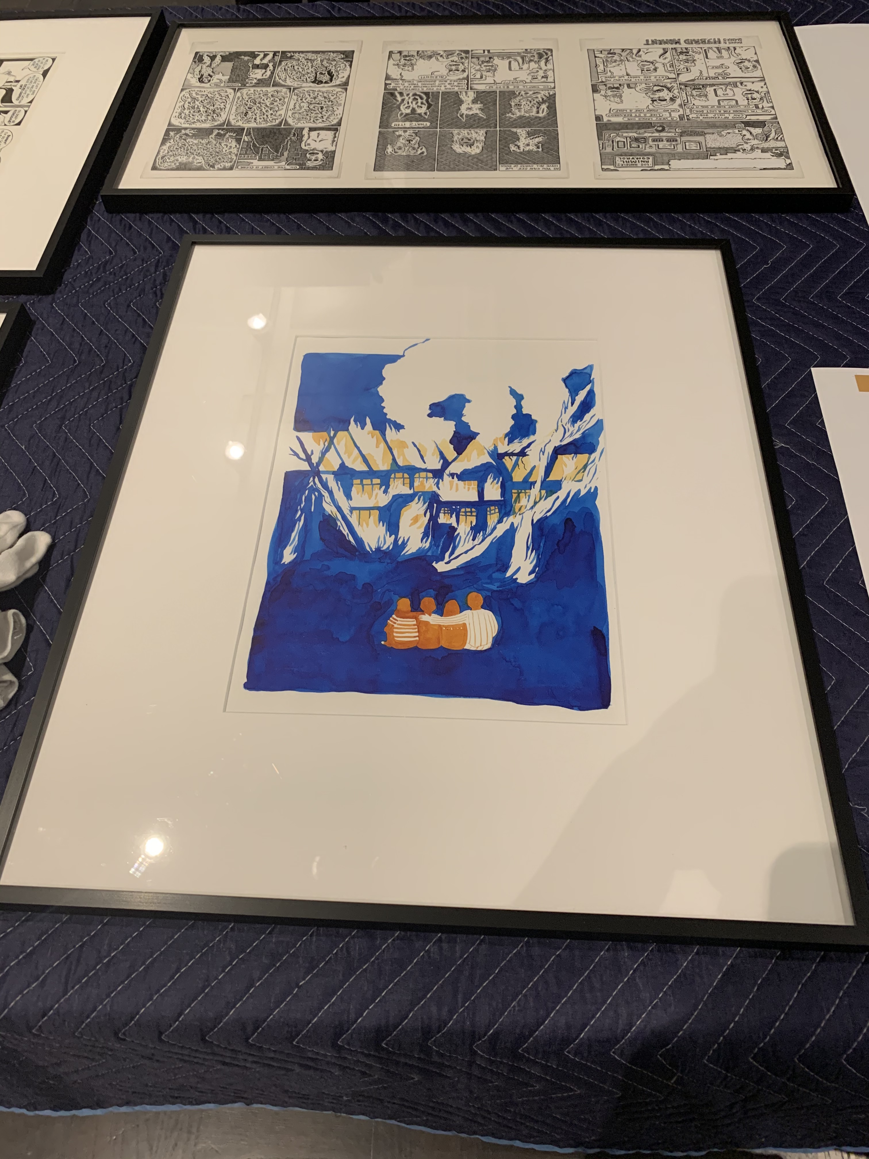
Silhouette from Another Glorious Day at the Nothing Factory

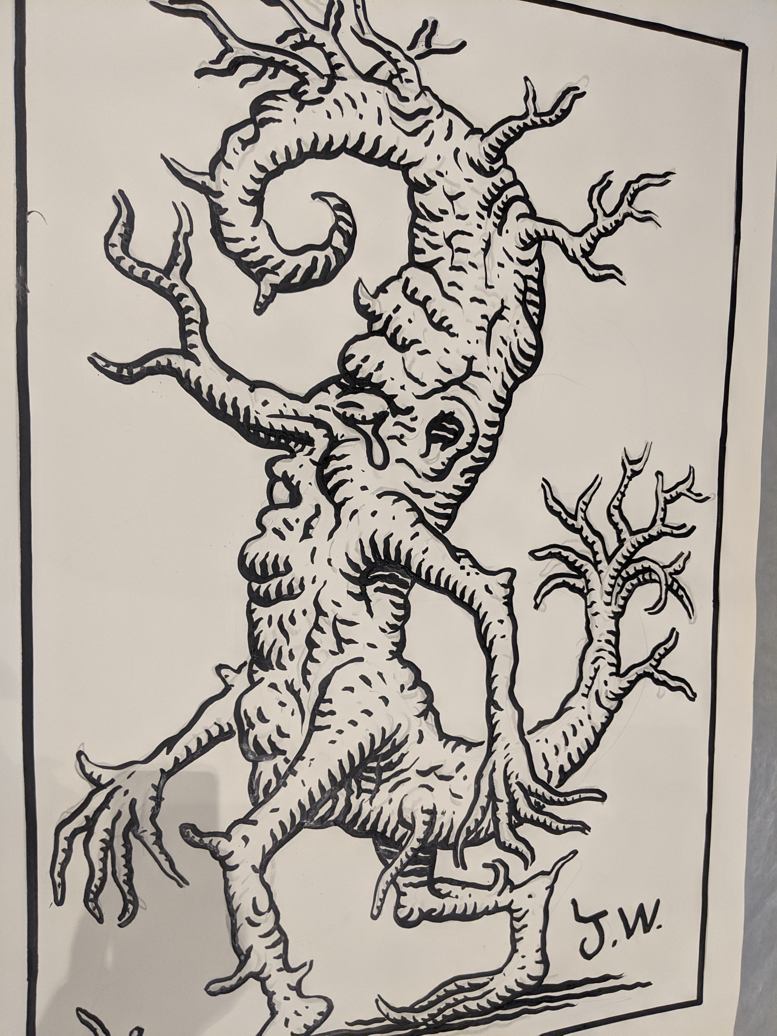
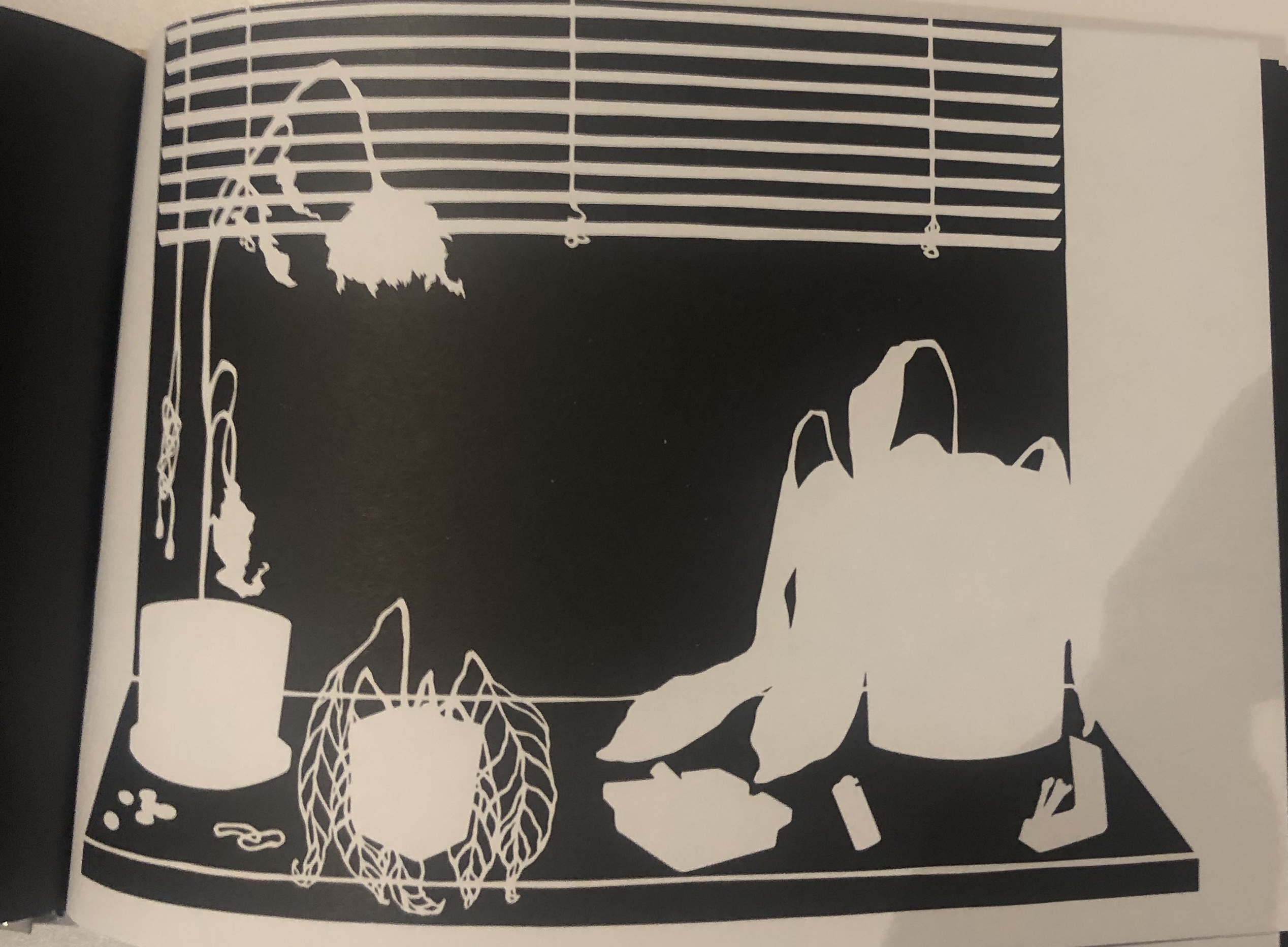
Left page next to plant silhouette from Another Glorious Day at the Nothing Factory

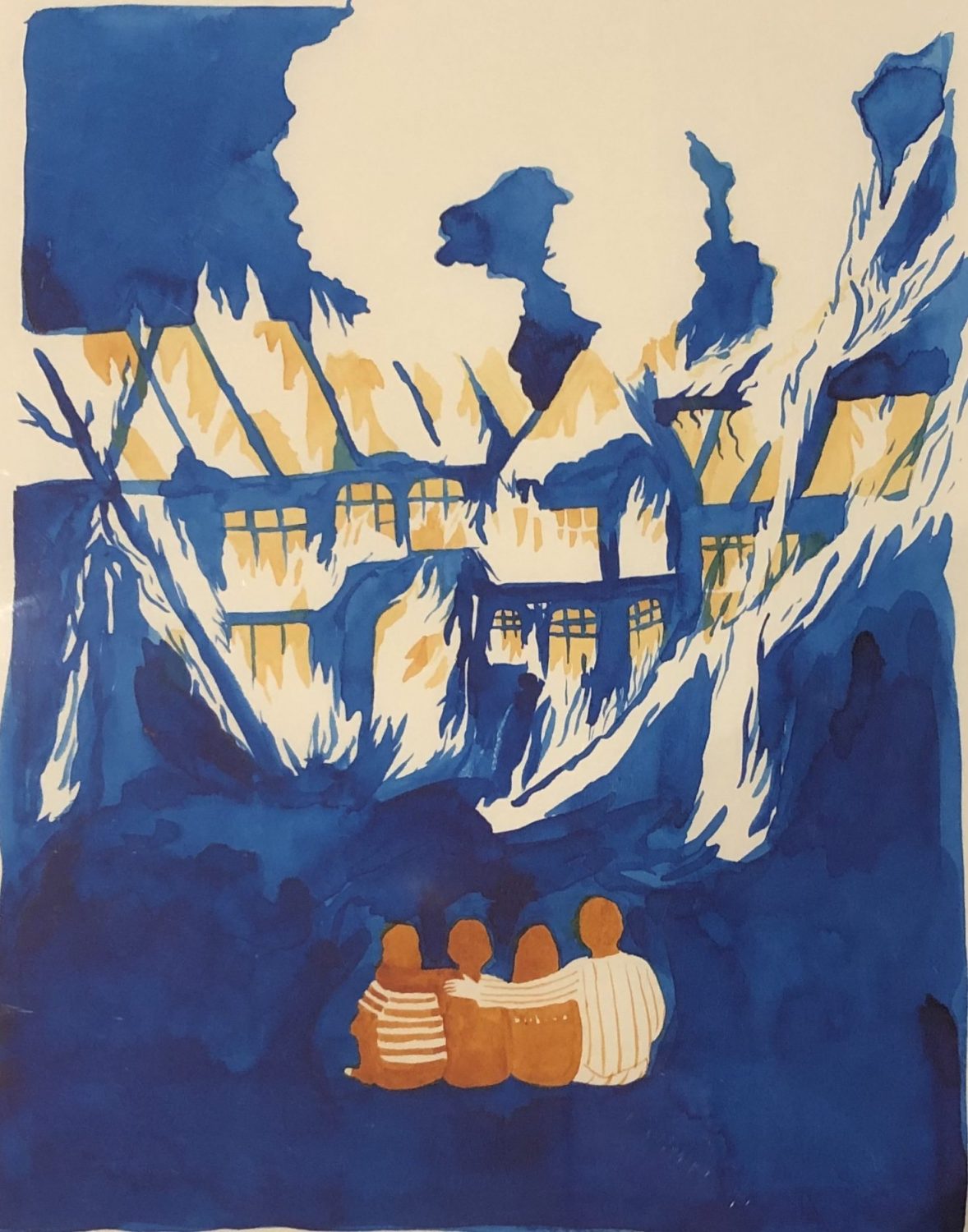
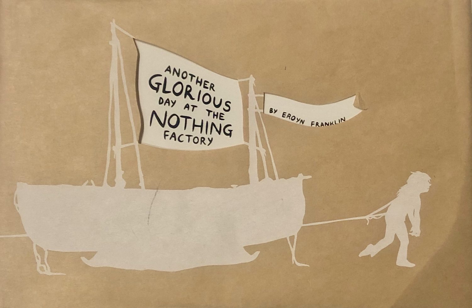
While searching through the many zines at the art building, I stumbled upon a book called, “Another Glorious Day at the Nothing Factory.” The books cover intrigued me because it displayed someone pulling a boat while on the backside there was people pulling the same boat, but the opposite way. The book was by Eroyn Franklin, who is a Seattle-based artist who pushes the boundaries of the traditional approaches t0 comics. This Zine was created to narrate her life from being a child to her Adulthood. The pages feature a text on the left and a silhouette on the right. The interesting benefit of doing this in my opinion; added to the depressing story she had told. It seemed pretty dark, but that was because she had pushed herself to be something she really was not. I did not read the whole book, but I read a few pages about her describing her marriage and how it fell apart even from the beginning. She married because of benefits and believed she was in love, when she truly knew deep down that she was not. The Silhouettes displays such a little scene, but still adds such in-depth image to what her texts says. My favorite wording to her story belonged to a page that was about her dying plants in relation to her dying relationship with her husband. Of course, this moment in time was very sad for her, but the way she described the plants in her apartment had me hooked. The succulents and orchids were a symbol of their dying relationship that helped convey that she was really just auto-piloting through the worst of her life. Franklin really displayed her individual voice to me because of her wording as well as her simple yet complex silhouettes.

Posted in Fall 2019 Archive (201 Blog) | Leave a comment

Individual Voices: Tom McLean

Image from Jim Woodring – picture taken on 10/22/2019

During my time at the WSU Art Museum Collection Study Center, I got to see many works of art from many different artists and designers. After looking around I came across this large poster image from Jim Woording. This stuck out to me because of the simple use of line and spacing on the work. From what I can see, it looks like the tree is walking and just minding its own business. That is a great use of time shows that the image has a sense of motion to it. It’s an action shot. I feel like it was a good idea not to use words in this because it would take away from what Jim Woording is trying to show the viewer. And I believe he is trying to show the viewer a sense of life and complexity in natural life. His use of lines gives the tree a face and some facial expressions that a normal tree would not normally have. The tree looks like it is crying to me. Overall I really did enjoy my time at the WSU Art Museum Collection and I am glad that I got to see this work of art.

Posted in Fall 2019 Archive (201 Blog) | Leave a comment

Individual Voices: Bailey Tompkins

Illustration by Max Clotfelter in the graphic novel ANDROS from 2011, Located in WSU Art Museum Collection Study Center.

This illustration by Max Clotfelter was displayed in the WSU Art Museum Collection Study Center from the Northwest Alternative Comics exhibition. In this image, Clotfelter made me feel sympathy yet relatability to the character in the comic. I interpreted the graphic to be a representation of the bird like figure trying to reach something that appeared to close within reach yet impossible to grasp. The bird is being held back by a leash that is making it impossible to reach the object it is striving for. The first two images show movement of the bird walking forward, so I interpreted that as the figure moving forward towards the food, but the food kept moving as well. The last image is when the bird realizes the resembles between the creature being pulled by a leash and the leash that is holding the bird. The voice that spoke to me about this comic is that the bird had a goal that seemed impossible, but that the lesson learned is that sometimes you can do everything right, but somethings just weren’t meant to happen.

This comic utilizes many concepts that have been discussed in our course so far. An obvious reference is the use of time and space. Time and space are used here because the sequential order of how the events of each illustration occurred is very clear. The image on the left occurred first, and then the image on the right, and then the image on the bottom. This is decided by the authors choice rater than leaving it up for the reader to decide on their own. The relation between images and words are also displayed. The only words in this comic are onomatopoeia’s.  These words help emphasis the exhaustion of the bird and therefore adds emotion to the comic. I would describe the relation between words and images in this comic as picture specific.

Posted in Fall 2019 Archive (201 Blog) | Leave a comment

Individual Voices: Kristine Zorn

A short comic by David Lasky from his collection of comics in “Manifesto Items 5”

There were several comics that I enjoyed at the Art Museum Collection Study Center but my favorites were from “Manifesto Items 5” by David Lasky. The zine was a collection of several comics made by David Lasky. What caught my eye first was the use of cats in several of his comics. If I were to pick a pet I would prefer a cat and I just like cats in general. The use of frequent use of cats by David Lasky gave me the impression that he was trying to communicate that he likes cats as well. My first example from David Lasky also includes a knight looking for treasure and the cat mentions that he is a wizard. This appealed to me because I enjoy the fantasy genre. The artist also expressed a sense of humor that I feel like I connect with and enjoy. It is already humorous for there to be a talking cat inside a treasure chest but the artist really portrays the humor when the knight marches away angrily, annoyed that he once again only found a cat. Even though it isn’t illustrated as a frame I immediately picture the knight looking in several other chests and only finding cats. That one line “Another cat!” effectively lengthens the timeline of the story without the lengthened part even being drawn.

I found this example from David Lasky interesting as all although for different reasons. The artist created this meta-type comic about how cartoonist isn’t sure how to finish the comic. I related to this concept heavily as an artist and writer in my free time I often end up with half-finished works with no idea how to proceed. A form of communication was created between me, as the reader, and the artist through this shared experience that the artist depicted. Another thing I find interested is how the artist used several small lines to represent the dark instead of just black or a dark gray. Without the candle the boy is holding in the first panel I wouldn’t have realized he was in the dark. However, with the candle and all of the small lines closely compacted together, the mind uses closure to see one shade of gray and understand that it is dark. Another minor thing I liked and was surprised by was the actual texture on the page. While the feeling of the ink isn’t as noticeable in other places the close placement of all the lines makes it easier to feel the slightly raised areas where ink was laid down on the page. It creates an interesting, almost imperceptible texture as the reader runs their finger down the page.

Posted in Fall 2019 Archive (201 Blog), Sample Posts by Students | Leave a comment

Individual Voices: Ivy Padayao

During the trip to the fine arts display, I feel like a lot of the pieces of art resonated with me. I think the idea of the pieces being “alternative” and having the descriptions of the artists, really helped me look at the comics in a different light than I would have originally. I think when the pieces are made to be more alternative the artists create a deeper meaning with the pieces they are creating and seem to be a little more personal than a mainstream artists would create.

One piece that really stood out to me throughout the exhibit was Ellen Forney’s pieces. By just looking at the pieces I could tell right away there was a sort of self reflection in her

“Strip Poker” by Ellen Forney

“Sweet and Sexy” by Ellen Forney

artwork. The first piece titled Strip Poker and the second piece Sweet and Sexy seem to tie together in the idea that it seems like an “advertisement” to find men and the other to find woman. It seems like the author is struggling with her sexuality or is struggling mentally on her emotions. Ellen Forney’s voice within these pieces I think speaks very loudly, and that’s what really made it stand out to me. When first looking at these pieces you can see that those works of art speak for themselves in a way. You can tell that there is a deeper meaning to the works than just when you first look at them. After reading through Ellen Forney’s background, it explains that she is struggling with bipolar disorder and that a lot of her artwork shows the journey, struggle, and acceptance she has gone through after being diagnosed with this disorder. This is prevalent in even just these two pieces of work being that she seems confused on exactly what she wants and is making that clear to her audience.

Posted in Fall 2019 Archive (201 Blog) | Leave a comment

Individual Voice: Emily Bartholomew

For my blog post, I decided to use Dirtbag by Eroyn Franklin. I decided to use this artwork because it was the first one, I saw on the table that drew my attention. The one reason why that might be it is that my favorite color is blue and when I saw that blue painting on the table, I didn’t care about any other comic and just wanted to see what it was. When I got closer to the artwork, I realized that this was going to be the one that I write about.

Eroyn Franklin Seattle-based artist.

The one thing that caught my eye was the way that the smoke was drawn in the artwork. Since that artwork is mainly blue with a couple of hints of orange in as the people sitting down watching the house on fire, the white of the billowing smoke catches my eye because it blends in with the framing. Now looking at the painting it looks like it was a watercolor painting. Because when you look at the bottom of the painting with the darker blue colors it kind of has that water stain color. Like when you spill water on paper it adds that different texture to the paper and blends colors together. But to be honest it didn’t really look like a watercolor painting but when I looked it up on the internet, I could tell that it was a watercolor. I don’t know if it was the lighting in the room or what, but it didn’t look the same in my picture or while it was in the case compared to what it looked like on the internet.

When I first saw this it instantly reminded me of the movie ‘What’s eating Gilbert Grape’ directed by Lasse Hallstrom. In the movie, the overweight mom dies in her bed and the only way they can get her out of the house would be by a crane. But they don’t want the town to come and make fun of her so instead of her being made fun of while she’s dead. They take everything outside of the house and put it on the lawn and sit together and watch the house burnt to the ground.

Posted in Fall 2019 Archive (201 Blog) | Leave a comment

Individual Voices: Maria Alvarez

Comic by Tom Van Deusen (2016)

This comic was one of the first ones I read and it made me laugh. It is by Tom Van Deusen, made in 2016, and he is from Seattle, Wa. I like his work because he draws comics about pricing in Seattle (for housing) which interests me because I understand the struggle of finding cheap housing there. I am also from the Seattle area so I can relate to some of his work. He also touches bases on casual dating and other relatable topics. I thought this comic was really funny because the grandpa gives his talking head to his grandkid as “estate,” and all he does is wake him up when he is trying to sleep. He just bothers him and creeps him out but he has to keep it because it’s his estate. His work makes me want to read more because it is so fun and relatable in a sense. I like also like this comic because I can imagine what the voices sound like which brings out the creativity in me and gives me inspiration for my own comic.

This comic is a good example of closure because we mentally fill in the gaps whenever we read this comic. Like at the beginning of the page when there is just a building (second panel) we can tell someone died and that Bobby is getting some sort of estate. I would say that this comic is additive when it comes to word-image combinations because the words amplify or elaborate on an image or vice versa. I think that with the words or without the words, you can still see the context of the comic. At first, I thought that this was interdependent but I realized that I can still understand the comic without or without the text and vise versa.

Posted in Uncategorized | Leave a comment

Individual Voices: Helena Matheson

Dirtbag by Eroyn Franklin

The image I chose was from the graphic novel Dirtbag by Eroyn Franklin. This painting looks like its been done with water  color, which is one of my favorite mediums in art. I think water color is really expressive of emotion and gives a really rich and organic display of colors. This particular painting shows a family of four sitting together, holding each other. They are painted in shades of orange, with who is supposed to be Franklin herself in the horizontal stripes and her father in the vertical stripes. In front of the family is a large house being burnt to the ground. The majority of this painting is similar, if not the same, shade of blue, including the ground, the house, and the sky. Within the windows of the house and rising from the roof are shades of light yellow and white, signifying the fire and smoke within. The movement of the image pulls your eyes into the family, and then to the dark background.

I think what drew me to this image is the contrast between the family and the burning house. Her father has his arm wrapped around his family, and his posture almost seems calm watching this massive house fall. I think there is some symbolism in this image. What it makes me feel is that you can never know what is going on inside someone. They can look pristine and like they are living the best life possible, when inside they are broken and crumbling. The blue of the house surrounds and envelopes them, trapping them within something bound to fall apart. I think this image is really important when showing someone’s real authentic truth, no matter how dark and twisted that it may be. I think it brings more attention to the reality of people’s inner demons and how they have the capability to overtake someones life, and the implications that may be caused by your own family. I am glad there are no words included in this image, as I think it is far more powerful standing alone and letting the viewer interpret the art in their own individual way.

Posted in Uncategorized | Leave a comment

Invisible Emotion: Sydney Seay

Image from “Copy That” Zine by J.R. Williams, published in 2018. Accessed in the MASC at WSU.

This monster-looking creature is created using almost only lines. As McCloud says, this use of lines create emotional and sensual responses in the reader. The lines used by the author in this creation parallel many of the things McCloud says these lines evoke. The spikey lines around the creature can show anxiety or loudness according to McCloud, and I would agree that these are representing the loudness and intensity of the shock that we presume is going through the monster from the lines coming out of the two large objects in the corners. These lines are showing what McCloud would call sour, but I see the intensity of the electricity. The author chose to shade and detail the character through the use of lines and dots, as he does to decorate the edge of the frame and the space around the character which is demonstrated on page 133.


Image from “Crazy Men Deluxe” Comic by Michael Roden in 1985. Accessed in the MASC at WSU.

This image shows how words and pictures can be interdependent through the alternate use of the ‘hole no. 36’ piece. If that was just on its own, while there is no hole 36 in golf unless you are playing multiple rounds, one would assume they were talking about golf. The image contributes to that thought with the characters holding golf clubs, so one could assume this image is referring to golf. However, when the rest of the image is considered, it becomes apparent the author is referring to a black hole in space. The double meaning of a hole, in golf and in space is played with to create a need for the text and images to be displayed together. If the words were not there, it would be confusing as to why the characters were holding golf clubs looking at a black hole in space. These words allow for the double meaning to be clarified and a third message to be conveyed through the interdependency of the words and pictures.

Posted in Fall 2019 Archive (201 Blog) | Leave a comment

Invisible Emotion: Dawson Bolen

The lines in an image can be made to evoke an emotional response or set a certain tone for a viewer. During my visit at the MASC, I looked at many comic books, but one that stood out to me was a story called the Breaks. In the photographed page, the two guys are breaking into a house because the owners are on vacation. It uses heavy and dark lines to portray anxiety, and high stakes in this situation as they are breaking into a house. 


In comics, text also plays a huge role. Text itself is very effective, however if it’s used the right way with imagery, it can be way more powerful. I spent a while flipping through a comics magazine called Raw. There was a huge variety of images and comic sequences but one page caught my attention in the way that it utilized text and implemented it with images. This page shows a picture-specific relationship between the image and text. The text isn’t a huge part of the page but it gives the images some context that wouldn’t be there without text. The sequence on this page is no doubt image dominant but the text does a good job of adding a little bit of context. 

Posted in Fall 2019 Archive (201 Blog) | Leave a comment