
A short comic by David Lasky from his collection of comics in “Manifesto Items 5”
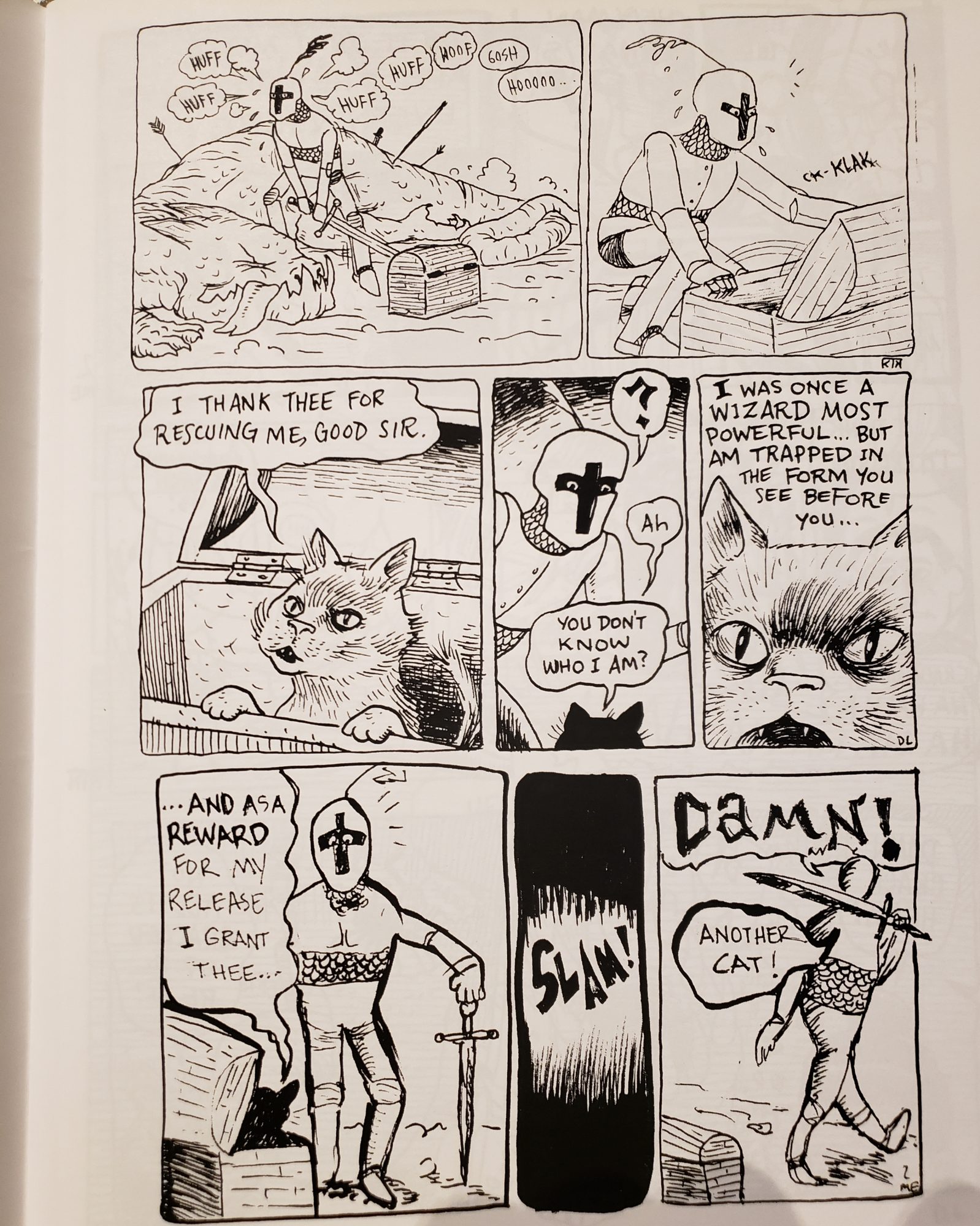
There were several comics that I enjoyed at the Art Museum Collection Study Center but my favorites were from “Manifesto Items 5” by David Lasky. The zine was a collection of several comics made by David Lasky. What caught my eye first was the use of cats in several of his comics. If I were to pick a pet I would prefer a cat and I just like cats in general. The use of frequent use of cats by David Lasky gave me the impression that he was trying to communicate that he likes cats as well. My first example from David Lasky also includes a knight looking for treasure and the cat mentions that he is a wizard. This appealed to me because I enjoy the fantasy genre. The artist also expressed a sense of humor that I feel like I connect with and enjoy. It is already humorous for there to be a talking cat inside a treasure chest but the artist really portrays the humor when the knight marches away angrily, annoyed that he once again only found a cat. Even though it isn’t illustrated as a frame I immediately picture the knight looking in several other chests and only finding cats. That one line “Another cat!” effectively lengthens the timeline of the story without the lengthened part even being drawn.
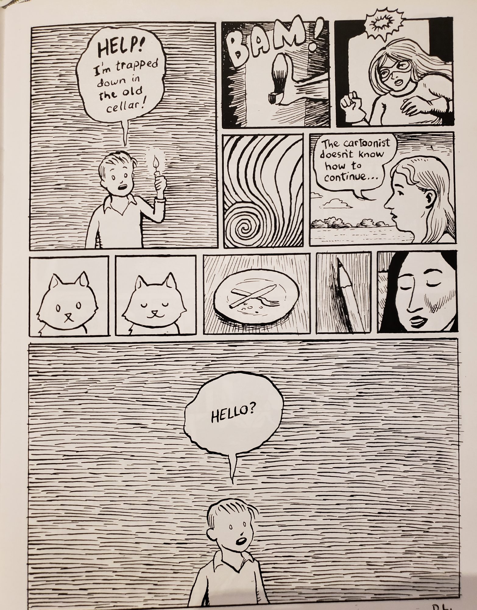 I found this example from David Lasky interesting as all although for different reasons. The artist created this meta-type comic about how cartoonist isn’t sure how to finish the comic. I related to this concept heavily as an artist and writer in my free time I often end up with half-finished works with no idea how to proceed. A form of communication was created between me, as the reader, and the artist through this shared experience that the artist depicted. Another thing I find interested is how the artist used several small lines to represent the dark instead of just black or a dark gray. Without the candle the boy is holding in the first panel I wouldn’t have realized he was in the dark. However, with the candle and all of the small lines closely compacted together, the mind uses closure to see one shade of gray and understand that it is dark. Another minor thing I liked and was surprised by was the actual texture on the page. While the feeling of the ink isn’t as noticeable in other places the close placement of all the lines makes it easier to feel the slightly raised areas where ink was laid down on the page. It creates an interesting, almost imperceptible texture as the reader runs their finger down the page.
