I am a fan of mythology and remember reading about Thor’s battle with Jormungandr, the world serpent. I originally wanted to make the poster much bigger but found it way too difficult so I stuck with my original sketch which is just about setting the bait to fish for Jormungandr. My comic challenges the readers left to right top to bottom reading because there are few discernible gutters. The closest thing is a line dividing the top right and bottom panels but I filled it with random Nordic runes to offer more immersion. Jormungandr’s tail also seems to be almost trans
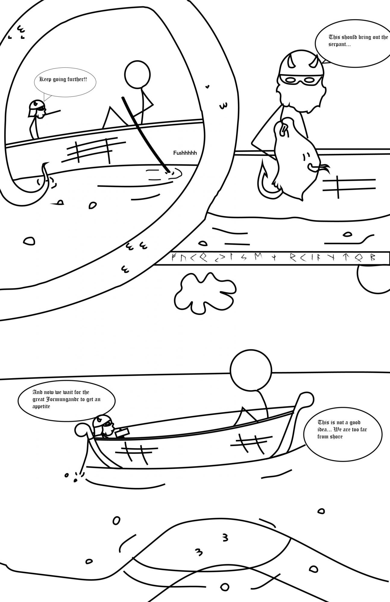
Thor setting bait for Jormungandr (the world serpent).
dimensional as it divides panels and is present and interacting with multiple panels while seemingly being one object not replicated in other panels like other objects such as Thor and the giant. This also plays into emphasizing the size of Jormungandr and eludes to how he may encircle the world in a more abstract way than literally how the mythological stories describe him. Regardless of the confusion that may occur by the obstruction of gutters it still reads left to right, top to bottom. The comic panels generally follow the subject to subject closure method as the scene and idea remains the same it just switches to different times and actions to fulfill the idea of setting the bait. I chose the font style to seem more transcript like. In the top left panel I used the word “Fushh” to indicate that the boat is moving. This also plays into the passage of time. I also believe the way Jormungandr is present in the panels at different times in while still being one, un-replicated, entity is inventive.
This was my first time using illustrator. Everything was new for me and thats also why I resorted to stick figures as my characters as they are easy to draw out. i just went into more detail for Thor’s helmet and beard. I still prefer drawing by hand as I feel it is much faster. I used Iconography in almost everything. The characters are stick figures which obviously represents people, the slashes on the boat represent the texture of boards used for the construction of the boat, the bump like thinks on Jormungandr’s skin is there to represent the texture of scales. Selection, Copy, and paste where the most useful as I thought it was pretty quick for replicating lines and then just slightly changing them.

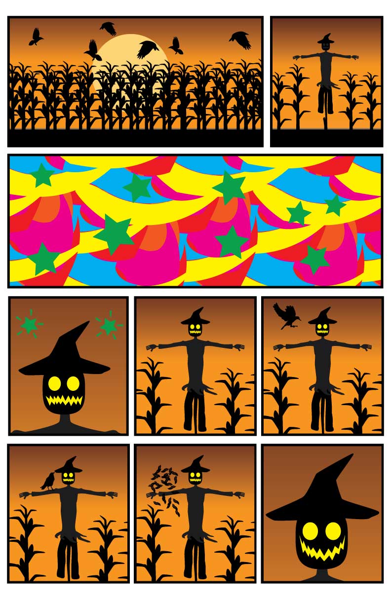
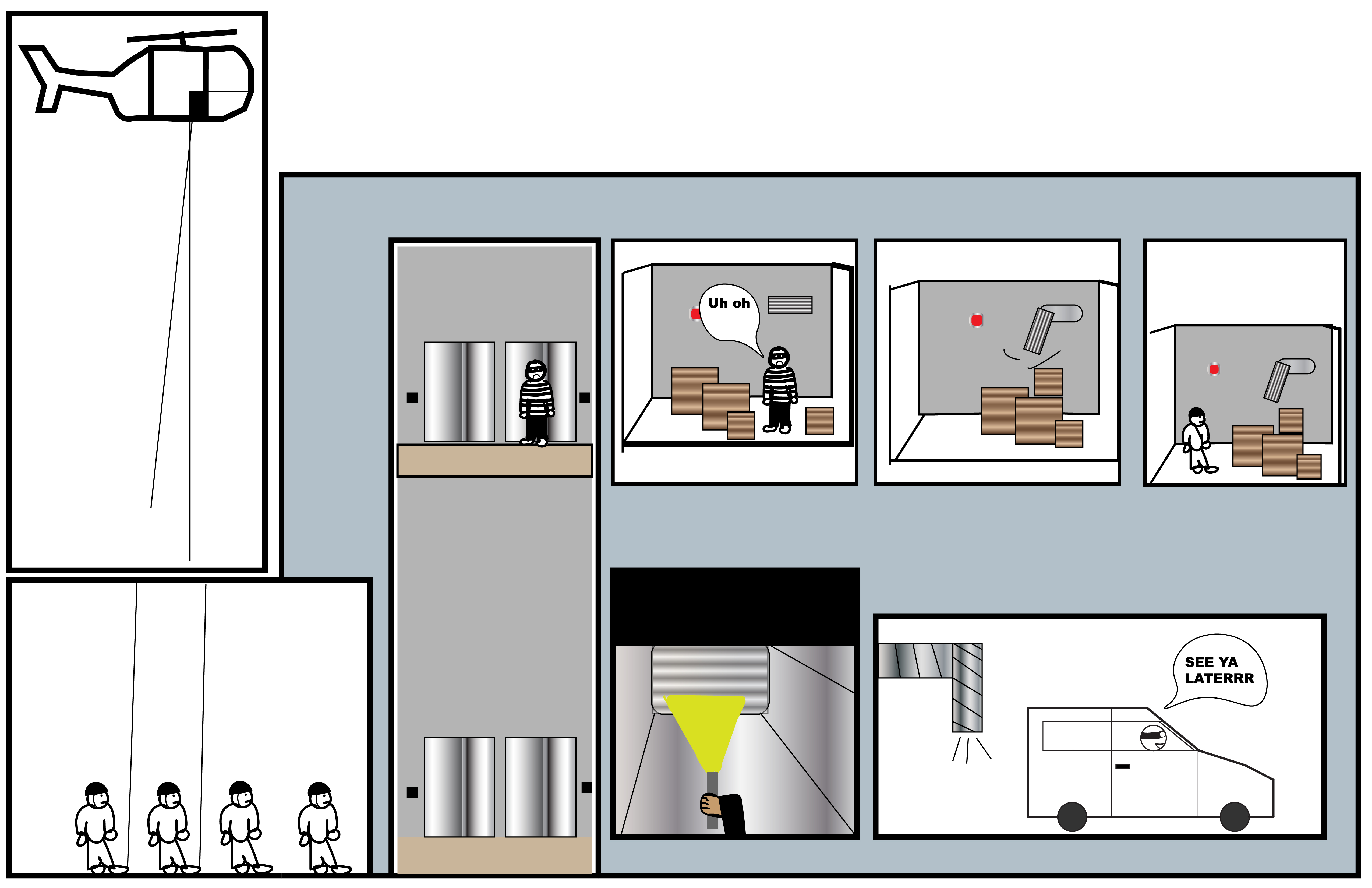
 When it came to the creative plan for my comic I started with making a layout and then trying to think of what I wanted to put in it. I didn’t want all my panels to be squares so I started with angled panels that fit together which went through multiple variations. To challenge the direction of how readers read panels fit into this as well, the first three panels reading direction is left to up right then down. The slanted panels have the space in between adjusted to be wider that the top panel to nudge readers towards that desired reading direction, after that however the next four panels can be read in any direction. Clockwise or counter clockwise the reader will read each of those 4 panels in any direction they want before moving down to the panel at the very bottom that is centered. Closure from each one of my panels is mostly subject to subject and scene to scene. The first three panels are subject to subject as the reader needs to read between the lines to find meaning while the scenes staying in a scene or idea. Scene to scene applies to the four panels that can be read in any order as they travel an unknown amount of time and distance. I used linguistic mode to establish a small amount of dialogue, and to infer to the setting and time without actually straight up telling the reader. Under Scott McCloud’s definitions the dialogue is mostly picture specific or additive, as I believe the reader can figure out whats going on without the dialogue, the dialogue is merely “soundtrack” or helping. This was my first time using illustrator in somewhere between 4 and 5 years. I used illustrator for the first time in a web design class in my freshman high school year. I never mastered the program and barely learned basic tools. This time around I learned more tools, and more quickly with the better understanding built on digital tools in general and on past knowledge like already understanding what vector graphics are. For Iconography I used pumpkins, nighttime, and going door to door to let the reader understand it’s Halloween without actually saying that it is Halloween. I also used a bunch of references to Horror movies in each of the 4 any-direction panels, that could be viewed as icons of there referenced movies. Clipping masks were helpful for some panels and layers and grouping were great for specifying what I wanted to move and use. I also used some effects to get things like lighting and the like looking better. I just wish I had better art skills in general so I could do perspective more properly.